The Brand Monograph
Fitbit Ace LTE brand identity by Koto
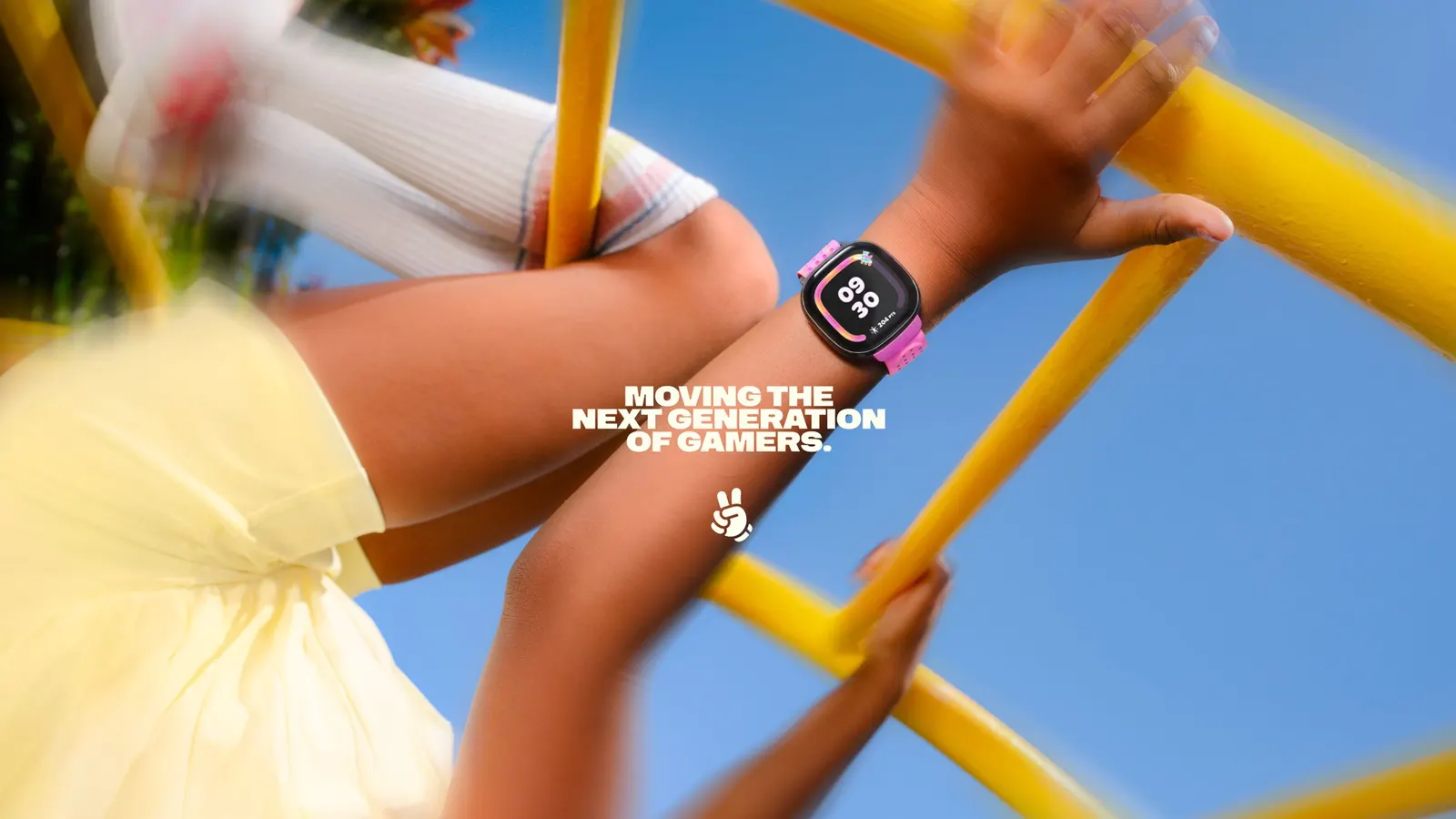
↗Most kids' wearables sell health to parents and hope children go along with it. Koto's work for Google's Fitbit Ace LTE does the opposite. It presents the watch as a gameband, a rival to the console rather than another fitness tracker. The brief had two audiences to win: kids who want thrills, and parents who want reassurance about screen time.
The identity grows from the watch's squircle shape, used as a modular building block, and from Eejie Sans, a custom typeface drawn from in-game avatars and the band's design. Halftone illustrations modeled on in-game collectibles help the sustainable packaging rely less on full-color printing. Koto worked with STEL Design on design and 3D, Nexus Studios on motion and film, and Kuhl + Han and Tonje Thilesen on photography. The tone stays gleefully absurd, with chickens racing through space and dolphins chatting in supermarkets.
Why it works
The strongest move is the category shift. By avoiding the fitness-tracker comparison, the identity sidesteps everything kids associate with chores. The custom typeface gives the product a voice that feels native to games, and reusing the squircle makes the watch itself the brand's signature shape. The halftone treatment turns a packaging constraint into a collectible-style look. Because the product carries the reassurance for parents, the identity is free to be as silly as kids want.
Applications
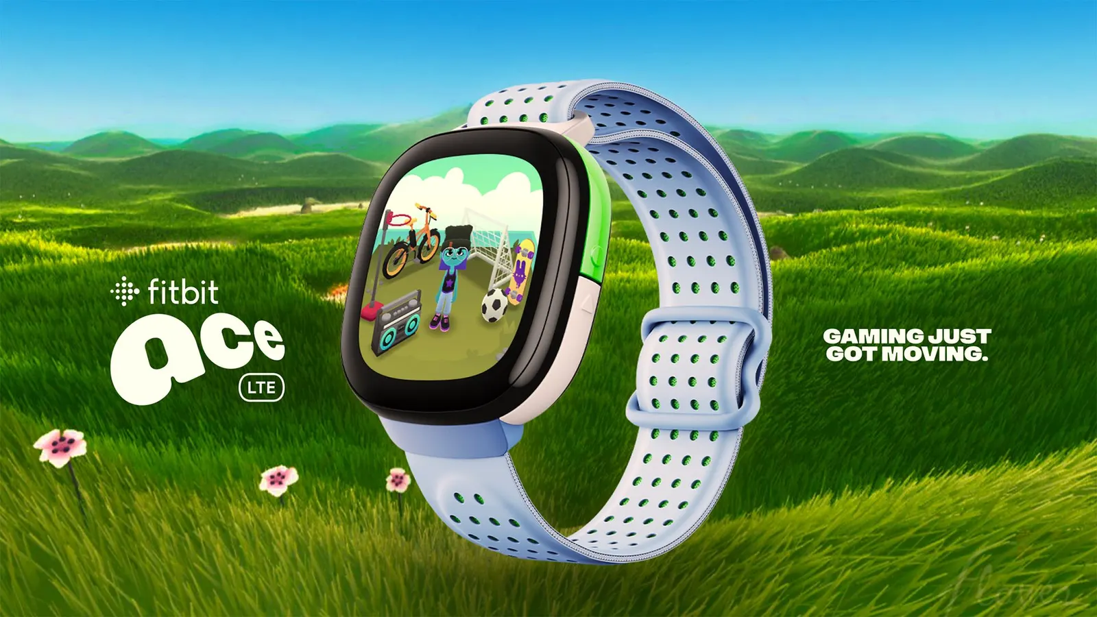
Logo
Typography
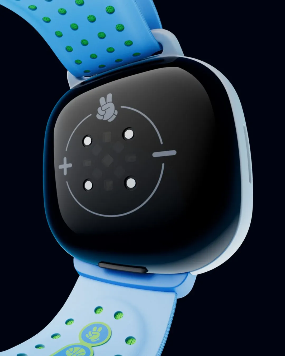

Images and video from koto.com, by Koto.