The Brand Monograph
→ Lovo brand identity by Area.Studio
↗Private labels set the tone in the egg aisle, and most of what surrounds them looks interchangeable. Area.Studio's identity for LOVO, the brand formerly known as Nutri, is built to break that pattern. The brief came from a collective of farming families that wanted shoppers to look at eggs differently and to leave room for products beyond the carton.
The studio designed the logo and packaging first, treating them as the foundation for a range that needed to read as one family. Barbara Jacques, Louis Chapdelaine, and Pigeon led the design, with Nathalie Houle on strategy and Amandine Léveillé and David Purkis on copy. From there the system moved into communication materials, apparel, promotional items, warehouse signage, and video animations.
Why it works
The rename does a lot of the work. LOVO is four letters with two round Os, a compact word that is easy to read from a few steps away and quietly echoes the product it sells. Putting the logo and packaging at the center means every new product inherits the same recognition, which suits a brand that wants to grow its range. Extending the identity to warehouse signage and apparel also keeps the collective's own people inside the brand, not only its shoppers.
Applications
Logo
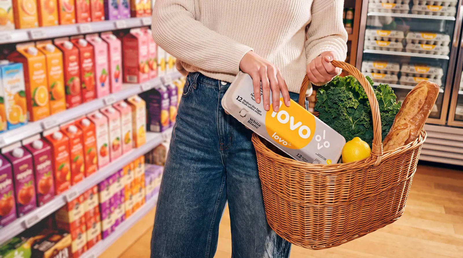
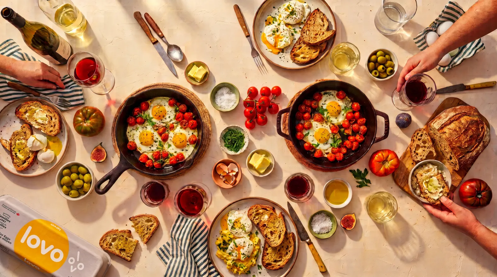
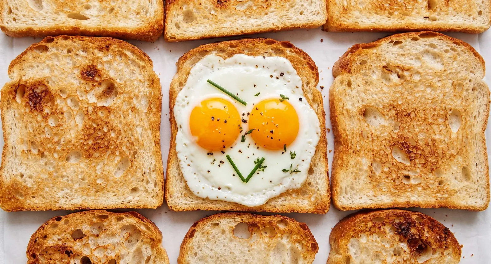
Images and video from area.studio, by Area.Studio.