The Brand Monograph
Labatt brand identity by Sister Mary
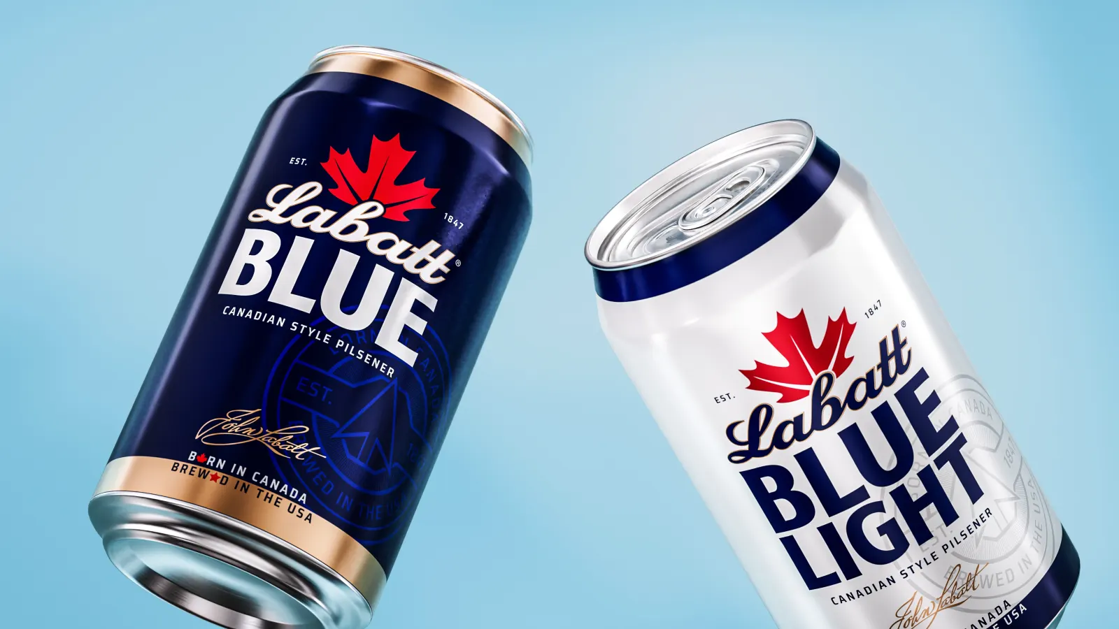
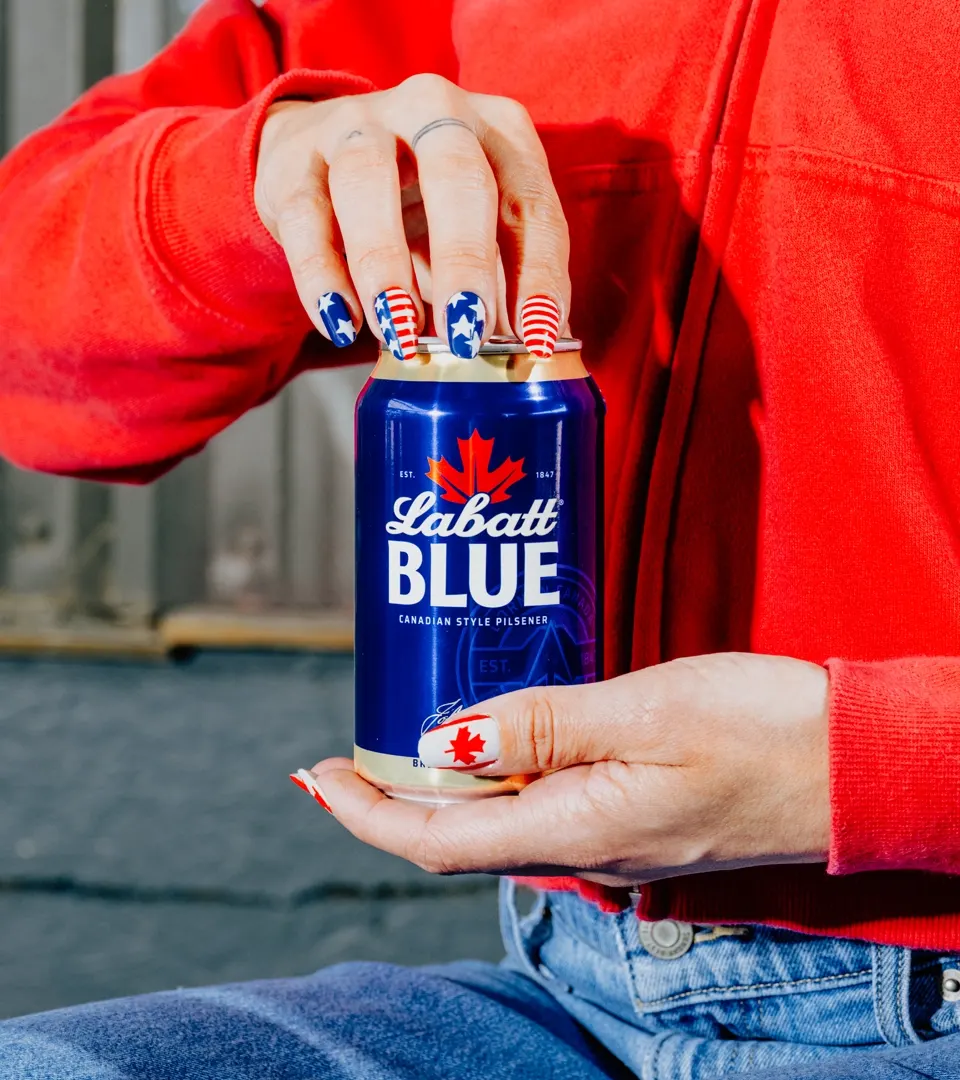
↗Sister Mary's work for Labatt turns an awkward fact into the brand's best asset. The Ontario-born beer, first brewed in 1847, is now made in the US, and instead of smoothing over that split, the studio made it the point. Labatt becomes the beer for cross-border needling, whether the argument is Canada versus America or Bills versus Jets.
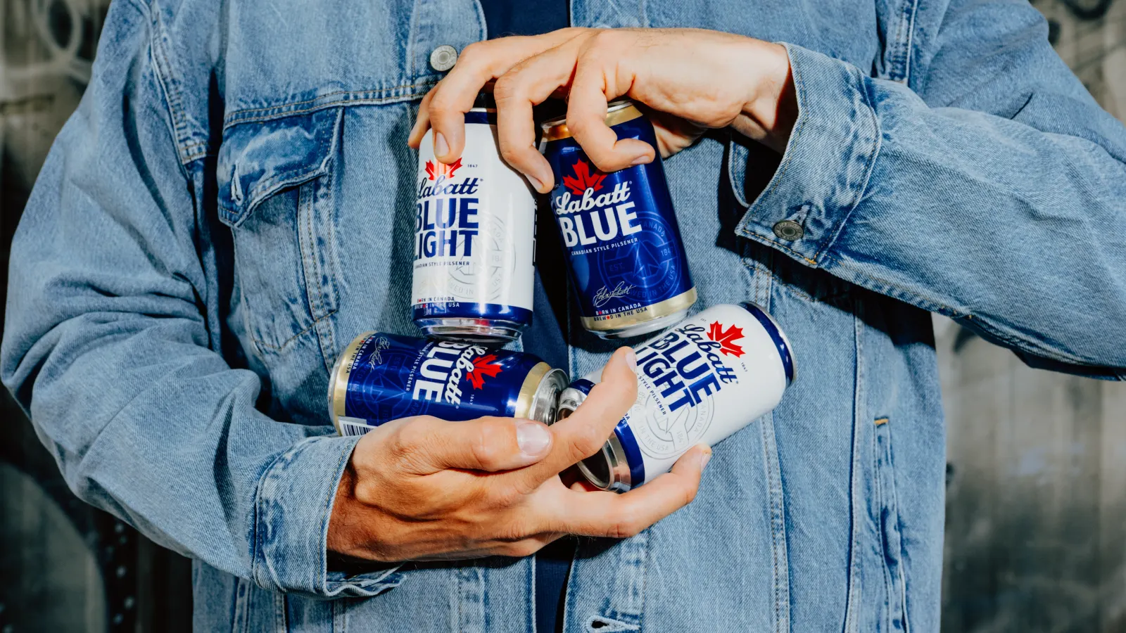
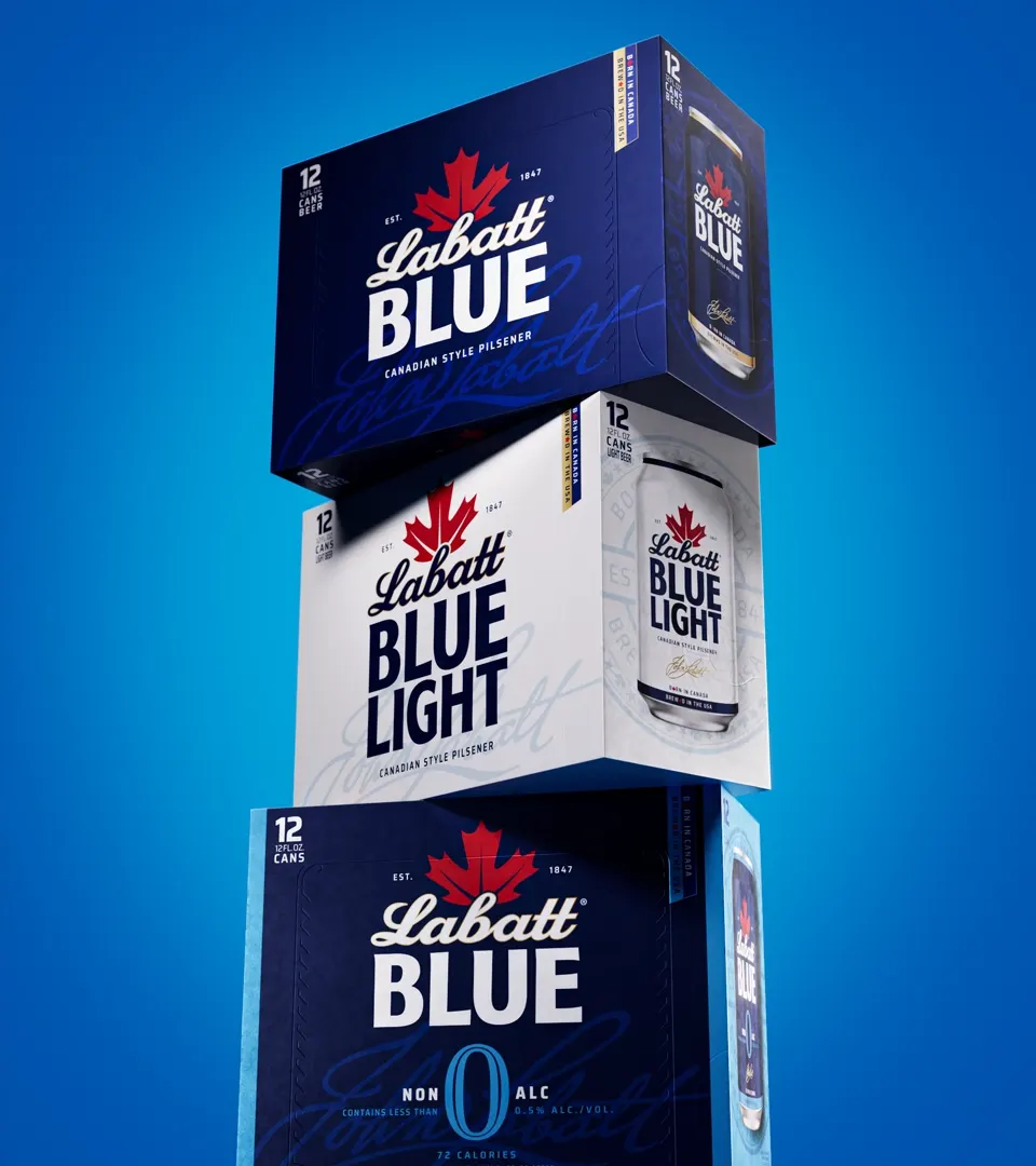
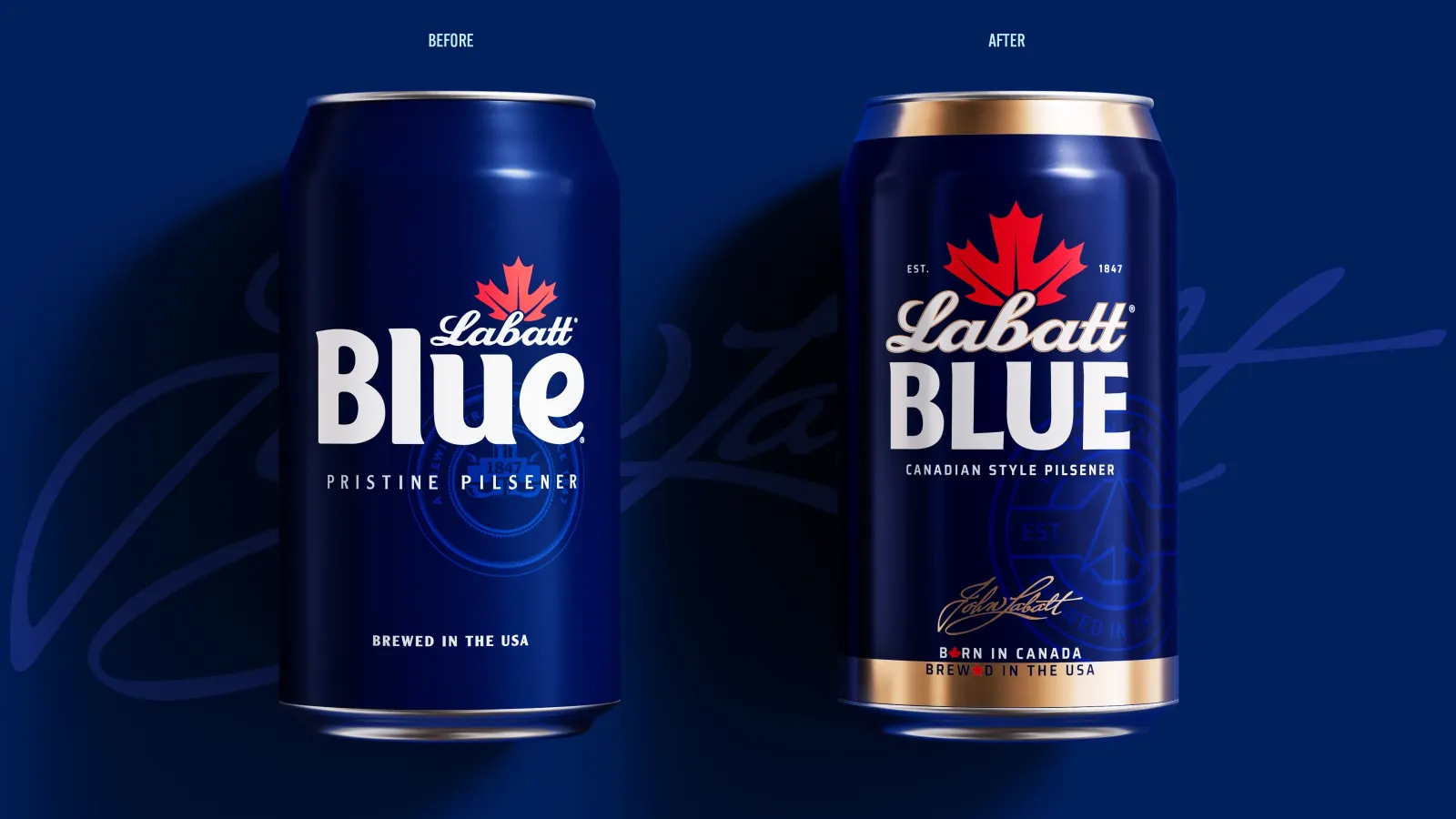
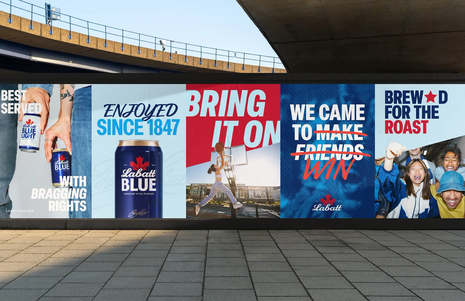
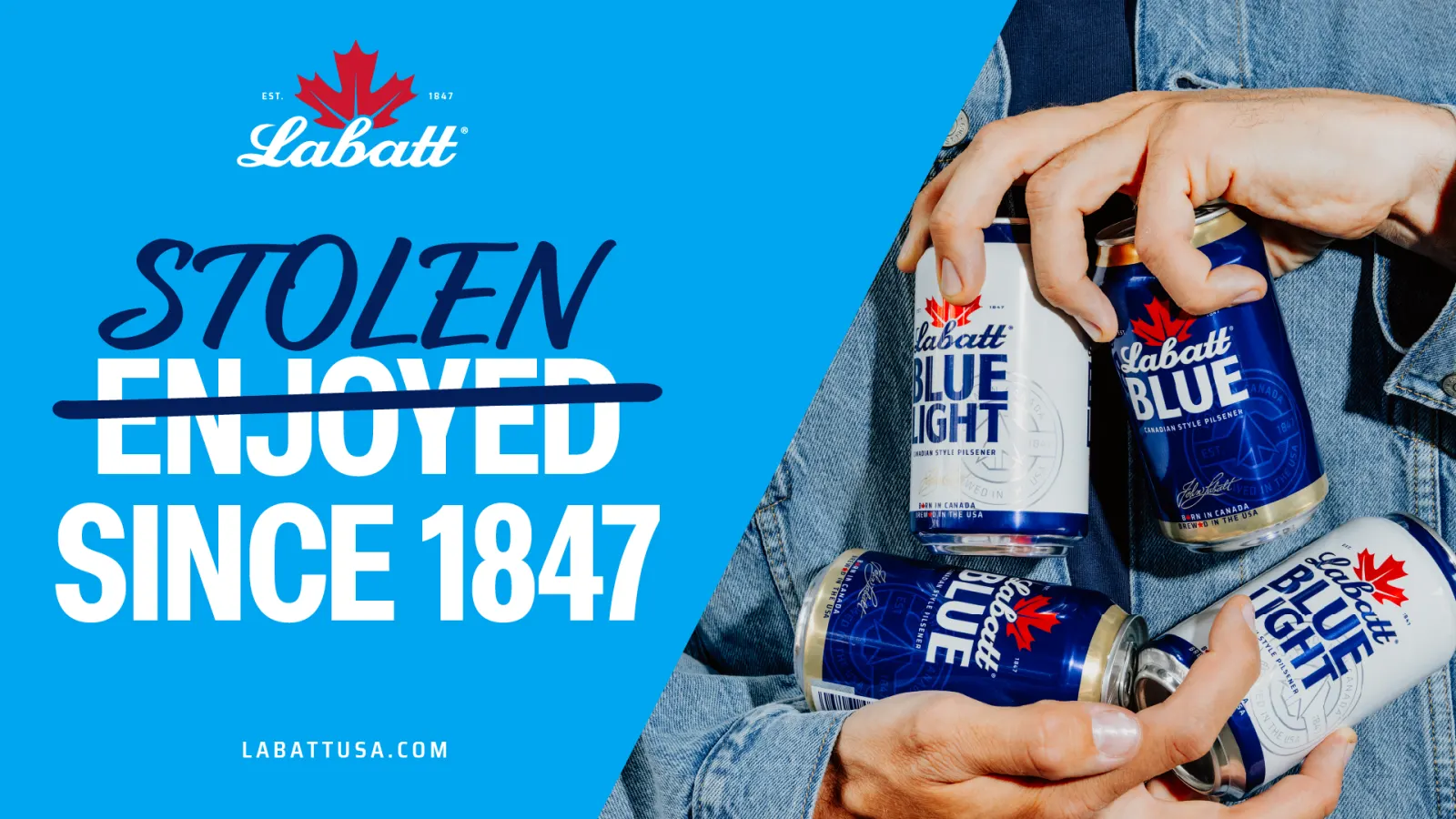
The brief was to modernize Labatt U.S.A. and make it noticeable among look-alike blue domestic beers. Sister Mary kept the script wordmark and maple leaf, re-crafted the lettering so Labatt outranks "Blue," and revived archival pieces including the John Labatt signature and a northward arrow. New elements include stars set against maple leaves, bold iconography, a diagonal device that cuts across borders, and custom typography from Luke Ritchie. Cole Wilson contributed photography, and the packaging system, launched in May 2026, carries the attitude to the shelf.
Why it works
The smartest move is restraint with the equities. Keeping the script and leaf preserves recognition, while the reworked hierarchy fixes the real problem, a sub-name that had overshadowed the brand. Stars against leaves is shorthand anyone can read at a glance, and the diagonal divider works as border, scoreboard, and layout device at once, so one gesture can flex across cans, cartons, and game-day activations. The signature adds provenance without stiffness, which suits a beer meant for backyards and tailgates.
Logo
Applications
Images and video from sistermary.nyc, by Sister Mary.