The Brand Monograph
Arthur & Sons New York Italian brand identity by Madonna+Child
↗Arthur & Sons looks like a restaurant that has been feeding the Bronx's Arthur Avenue for generations, but Madonna+Child created the identity from scratch. The brief came from Chef Joe Isidori, a third-generation New York chef and cofounder of Black Tap, who wanted an Italian American restaurant grounded in his family's history rather than in borrowed nostalgia.
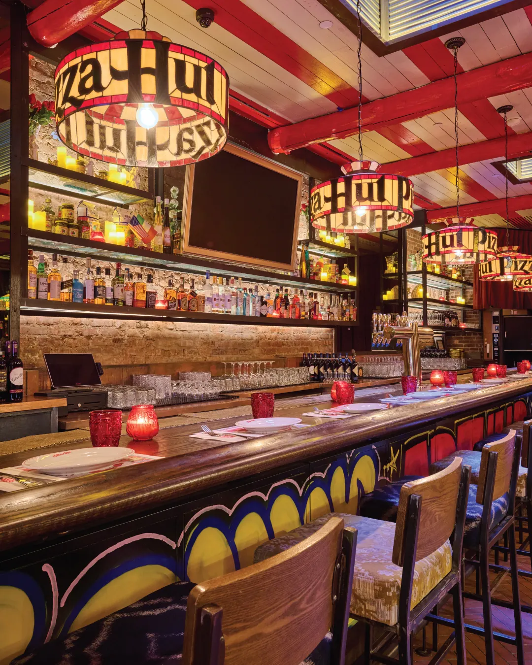
The studio anchored the system in a rose, a tribute to the chef's grandmother, and paired heavy sans-serif lettering with typewriter type that recalls the typed menus of old neighborhood spots. That language runs across awnings, menus, and interiors, with film-look photography holding it all together. Madonna+Child still leads creative direction, producing video, photo, and interior art for new locations while running a social presence of more than 150K followers.
Why it works
The rose turns a personal story into a simple, ownable symbol, which gives the brand something warmer than a name on an awning. Pairing sturdy sans-serif with typewriter type keeps the look relaxed enough for a neighborhood dinner and sharp enough to feel current, and it steers clear of the checkered-tablecloth clichés of the category. Because one system covers the storefront, the table, and the feed, each new location can read as part of the same house, and the film-toned photography makes the Instagram account feel like the dining room itself.
Applications
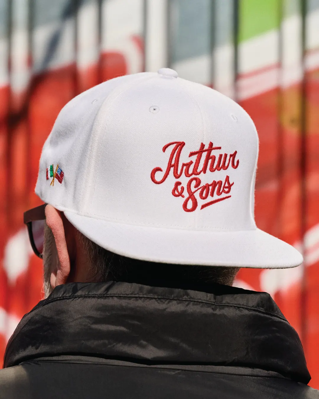
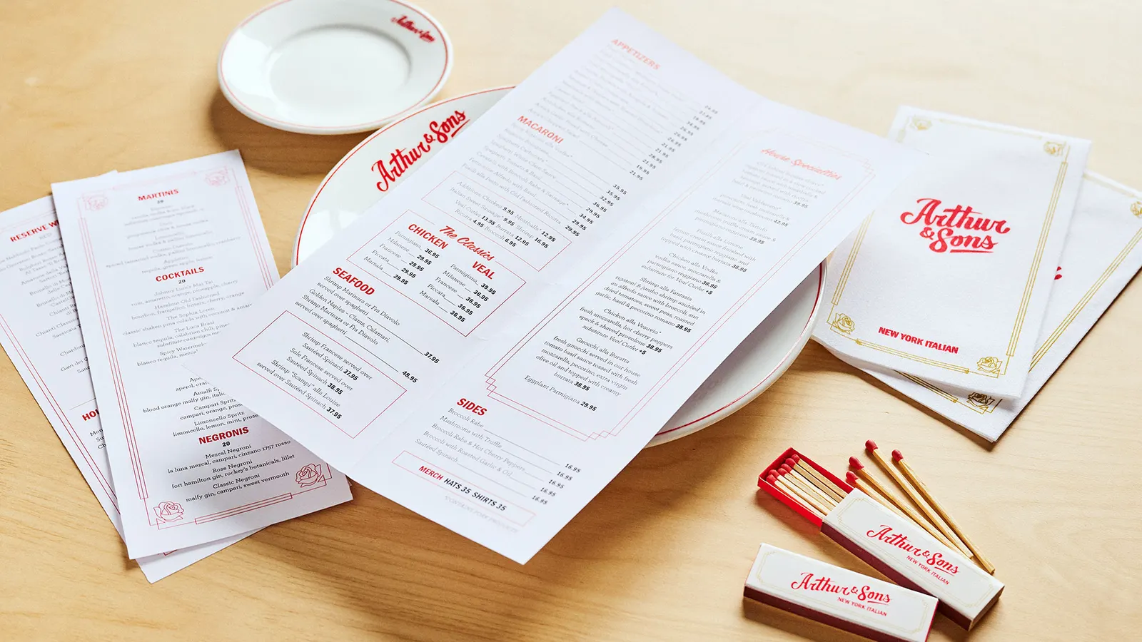
Images and video from madonna-child.com, by Madonna+Child.