The Brand Monograph
Wana brand identity by Stout Design, Inc.
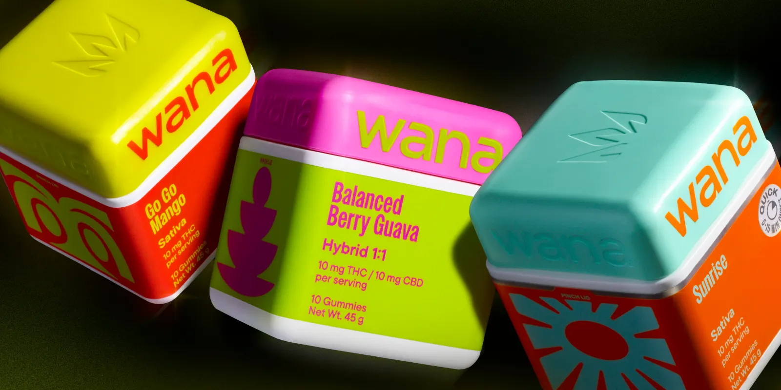
↗Stout Design's work for Wana treats a leading edible brand's reputation as something to build on, not walk away from. Wana had earned its standing through quality and consistency, but newer competitors and shifting consumer tastes meant the brand's look no longer matched its ambition.
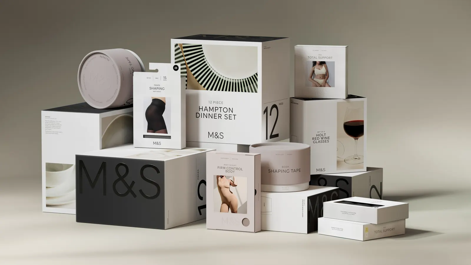
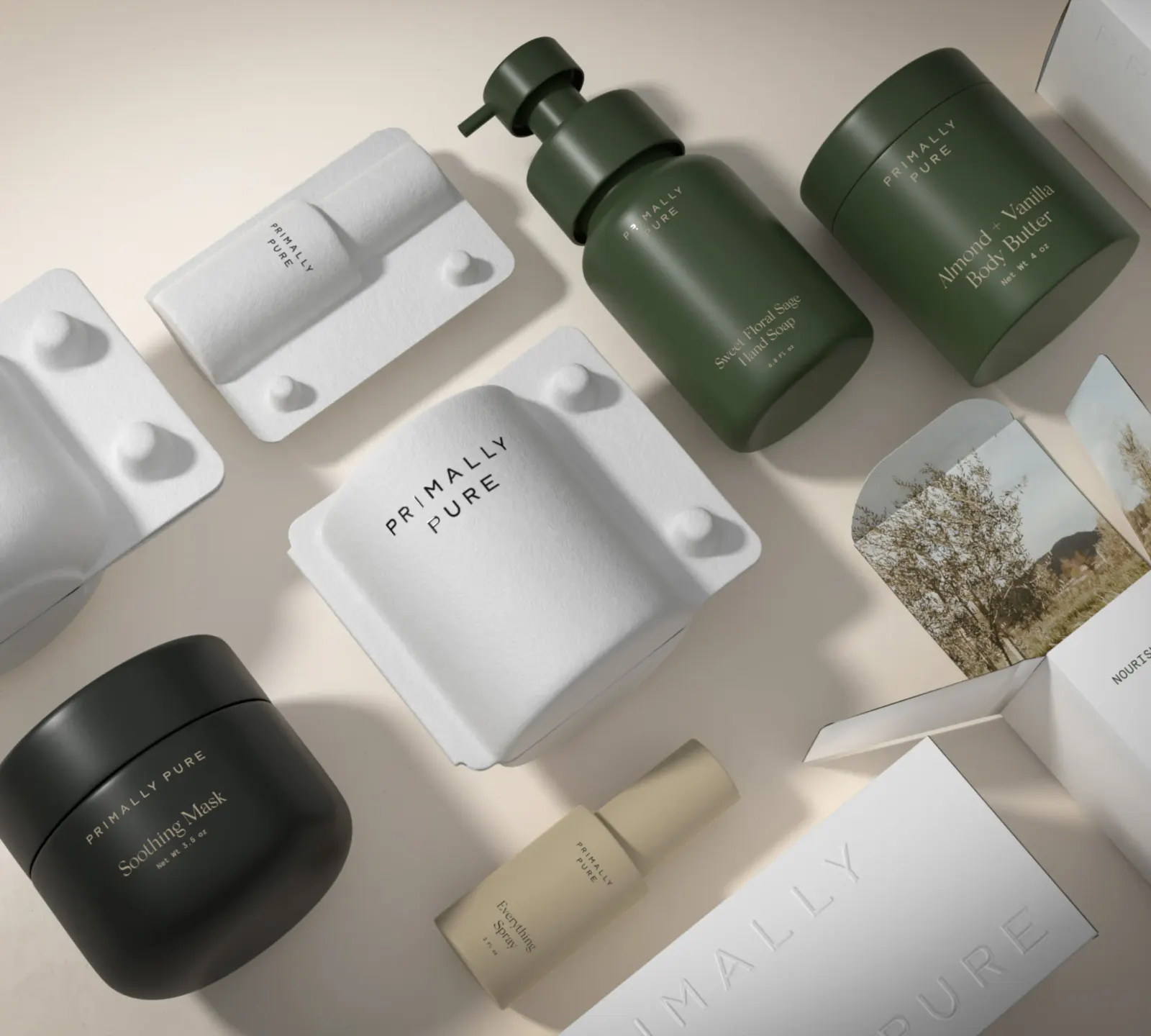
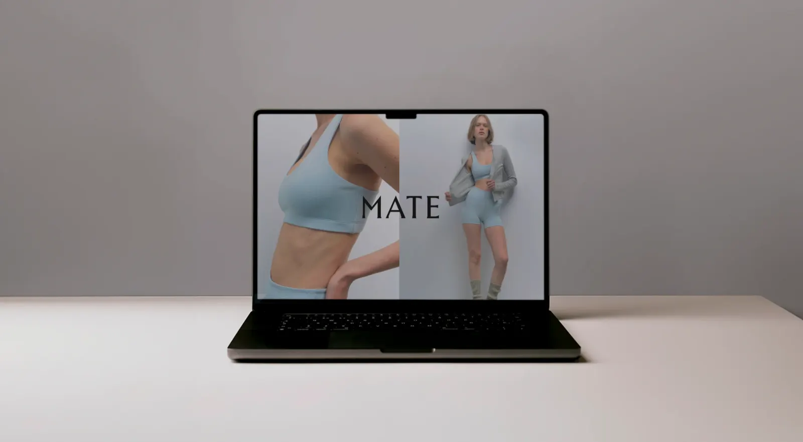
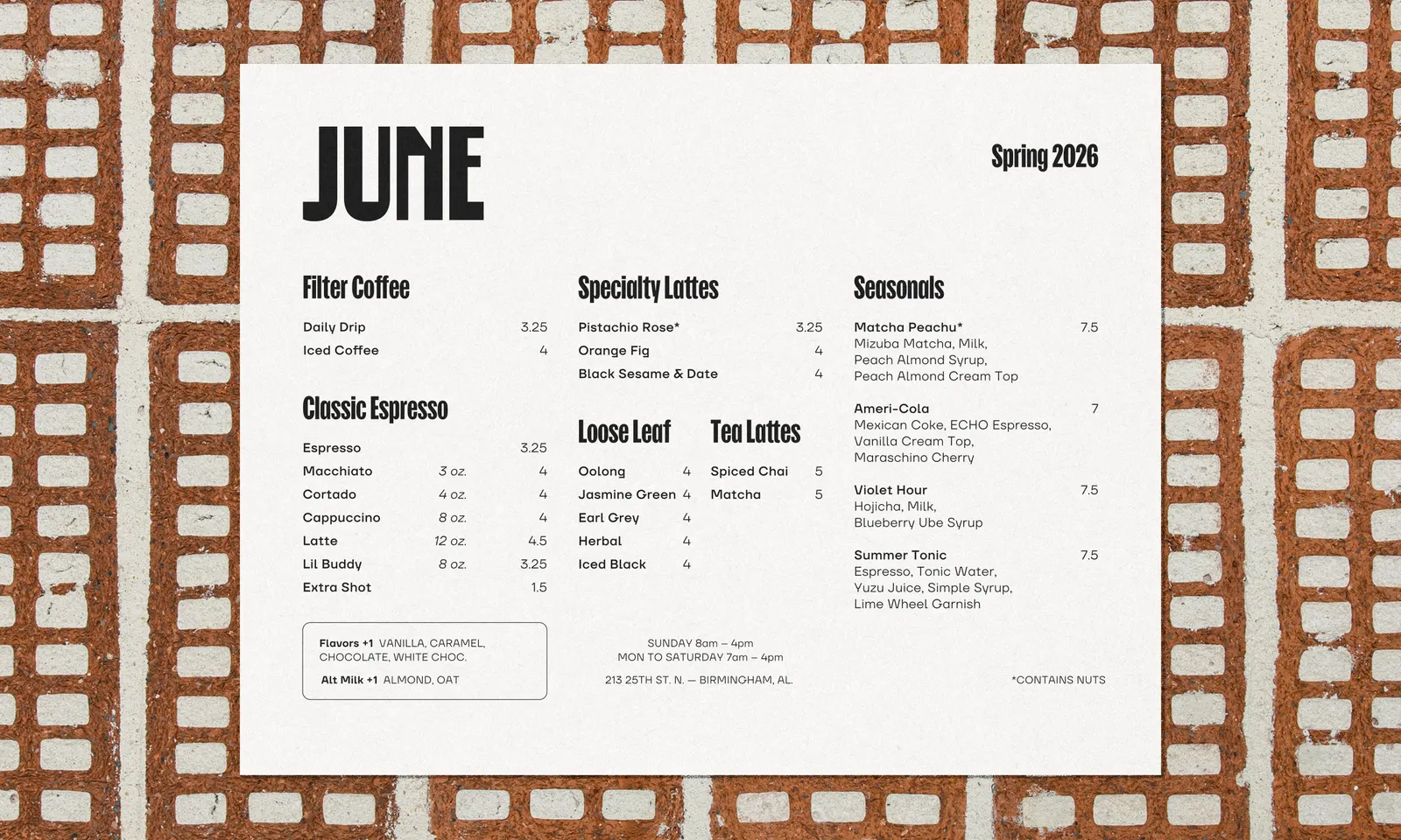
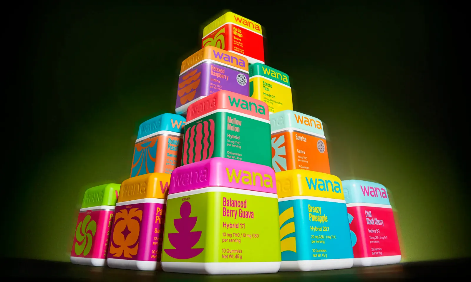
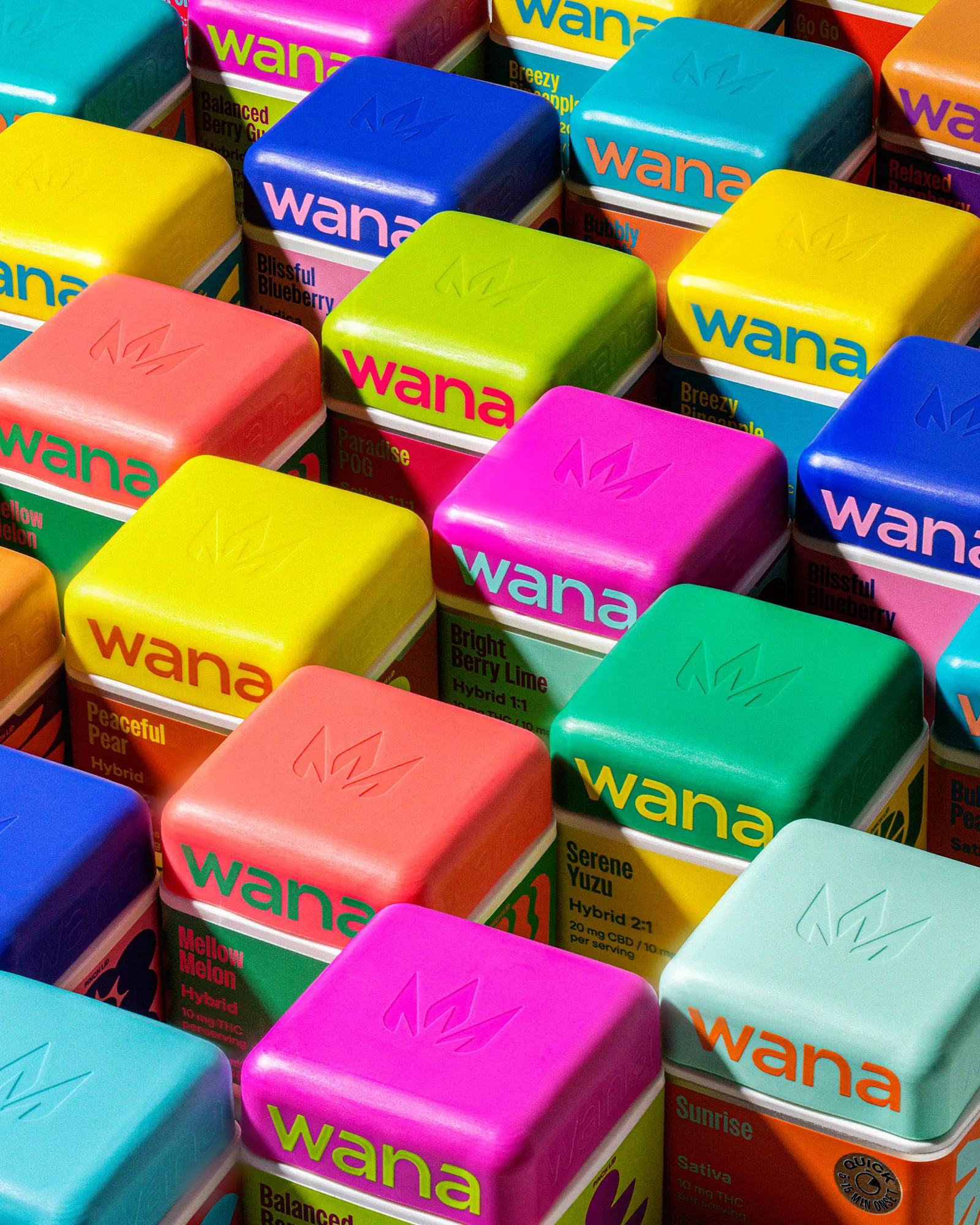
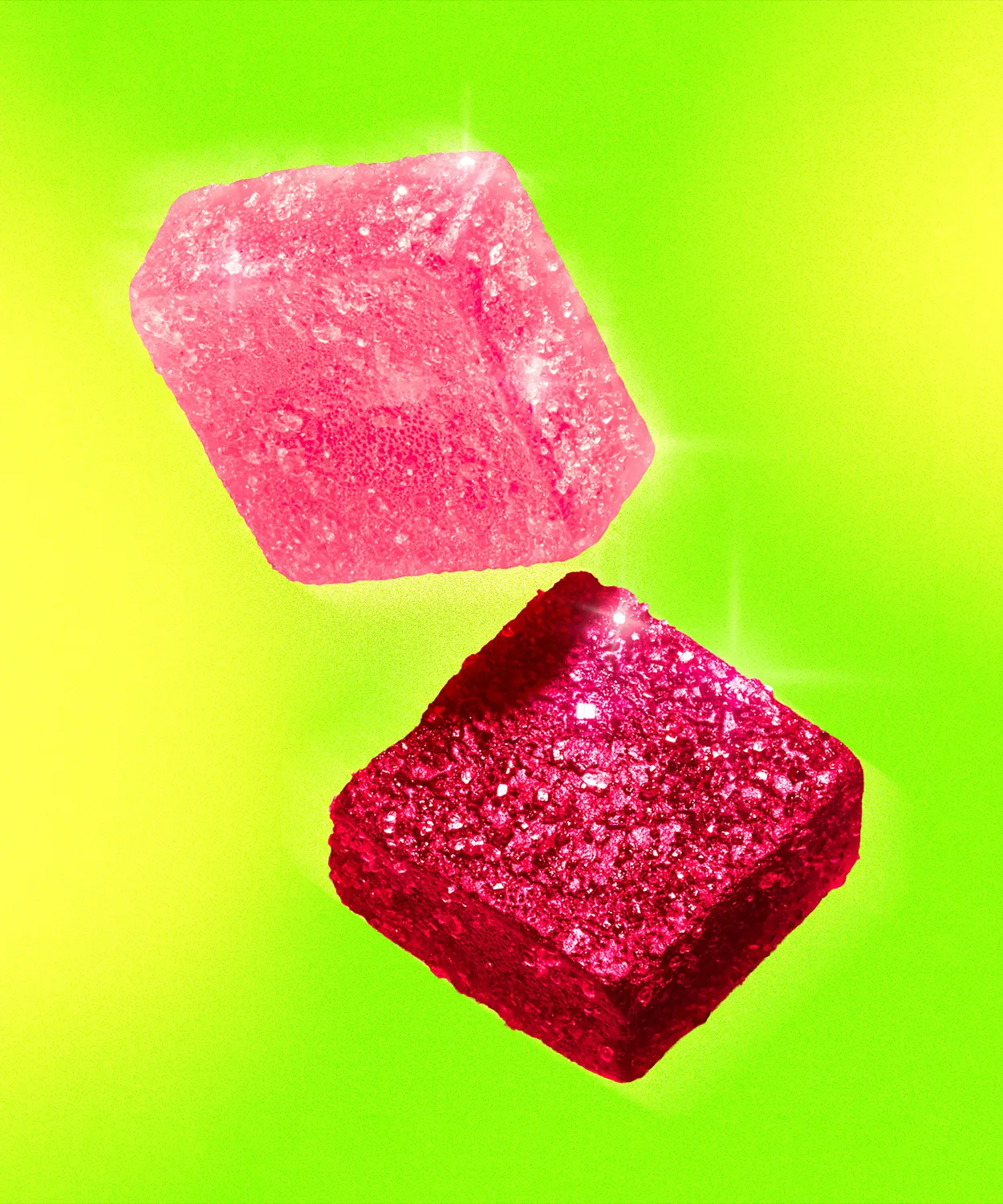
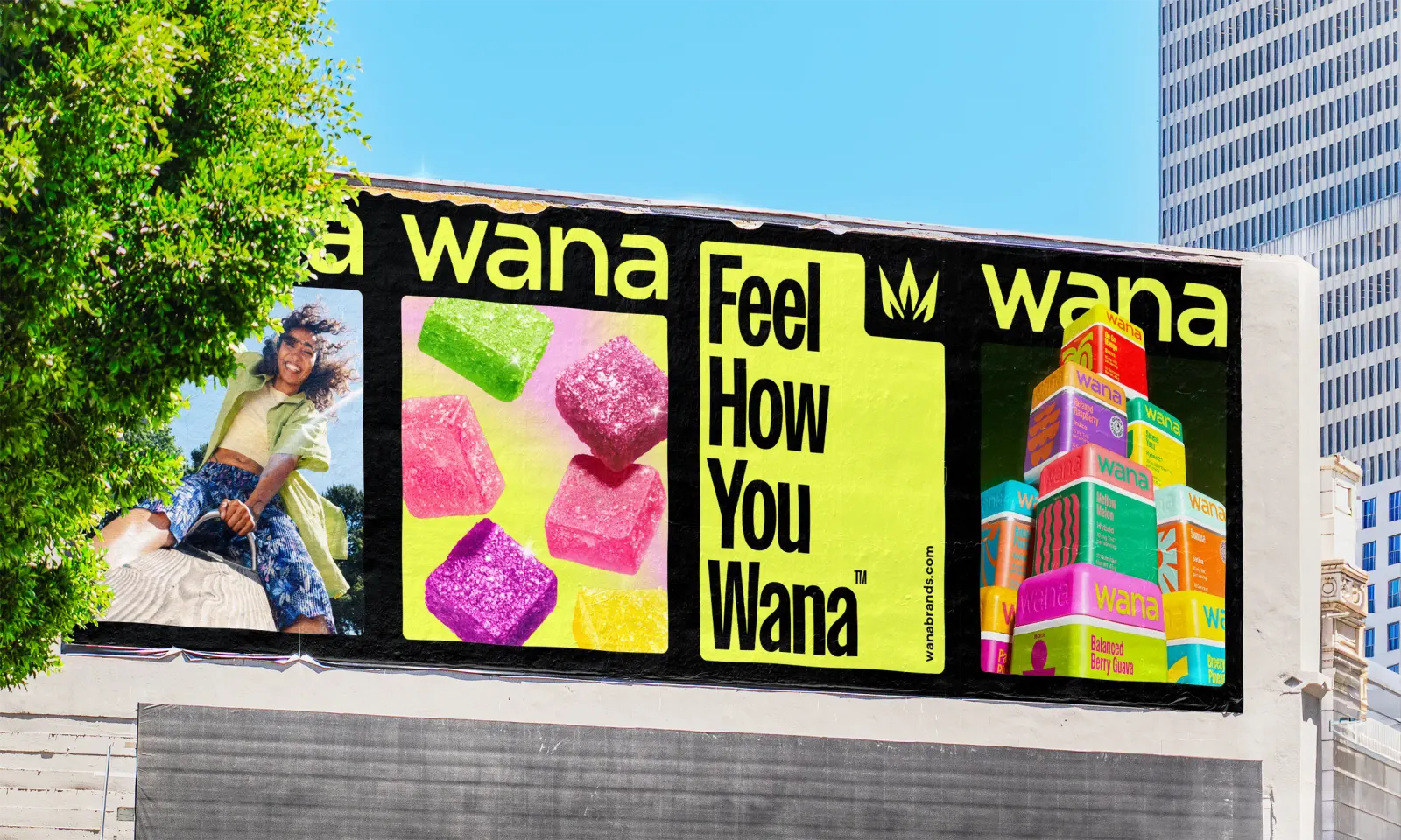
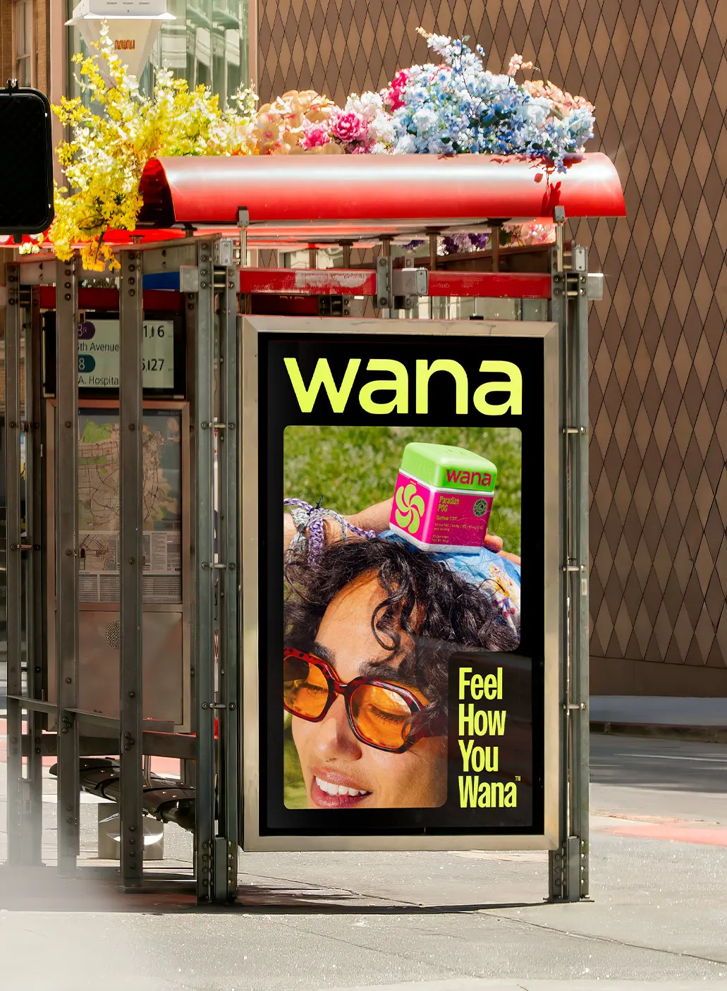
Stout rebuilt the whole brand, starting with an identity system meant to stretch across formats without losing its core. The logo is evolved rather than replaced, the typography is reconsidered, and the packaging is rethought at a structural level. Photographer Jules Davies shaped a distinct image style, and copywriter Erin Bosik worked with the studio on a voice that gives the brand something to say as well as something to show. The result stays recognizable in a shelf lineup and in a social feed.
Why it works
The smartest move here is restraint where it counts. Evolving the logo instead of discarding it keeps the recognition a longtime brand has already built, while the packaging overhaul carries the sense of something new. Photography and voice are treated as part of the identity, not add-ons, so Wana reads as one personality whether it's a box in a store or an image on a phone. In a category where shoppers compare options quickly, that coherence makes a brand easier to spot and easier to trust.
Applications
Logo
Color
Images and video from stoutsf.com, by Stout Design, Inc..