The Brand Monograph
Wide Eyes Coffee brand identity by Studio Nice One
↗Studio Nice One's identity for Wide Eyes Coffee gets a lot of mileage from a single pun. The name covers both the alertness of a strong cup and the look on someone's face when a friend leans in with gossip, and the studio gives both readings equal weight.
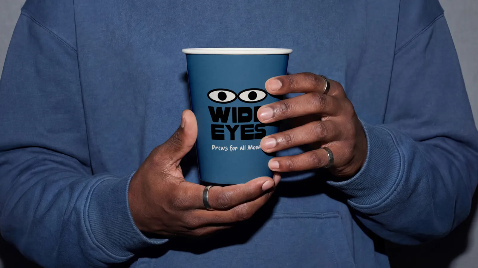
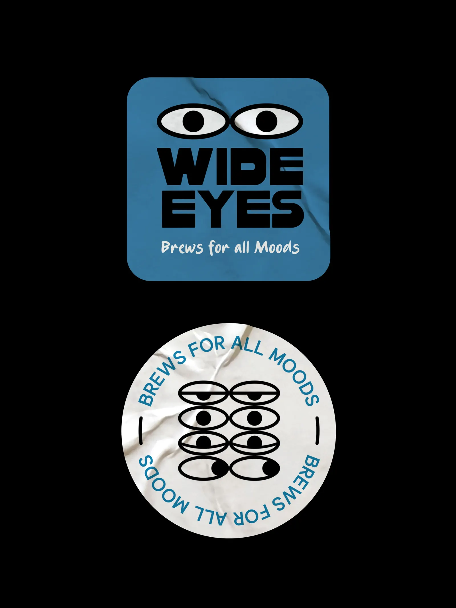
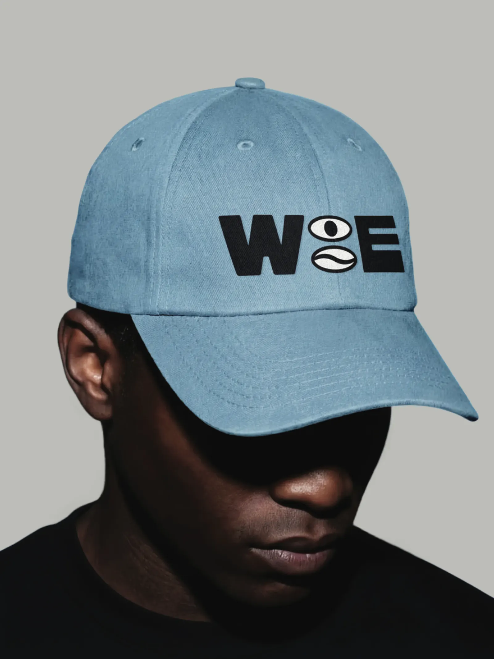
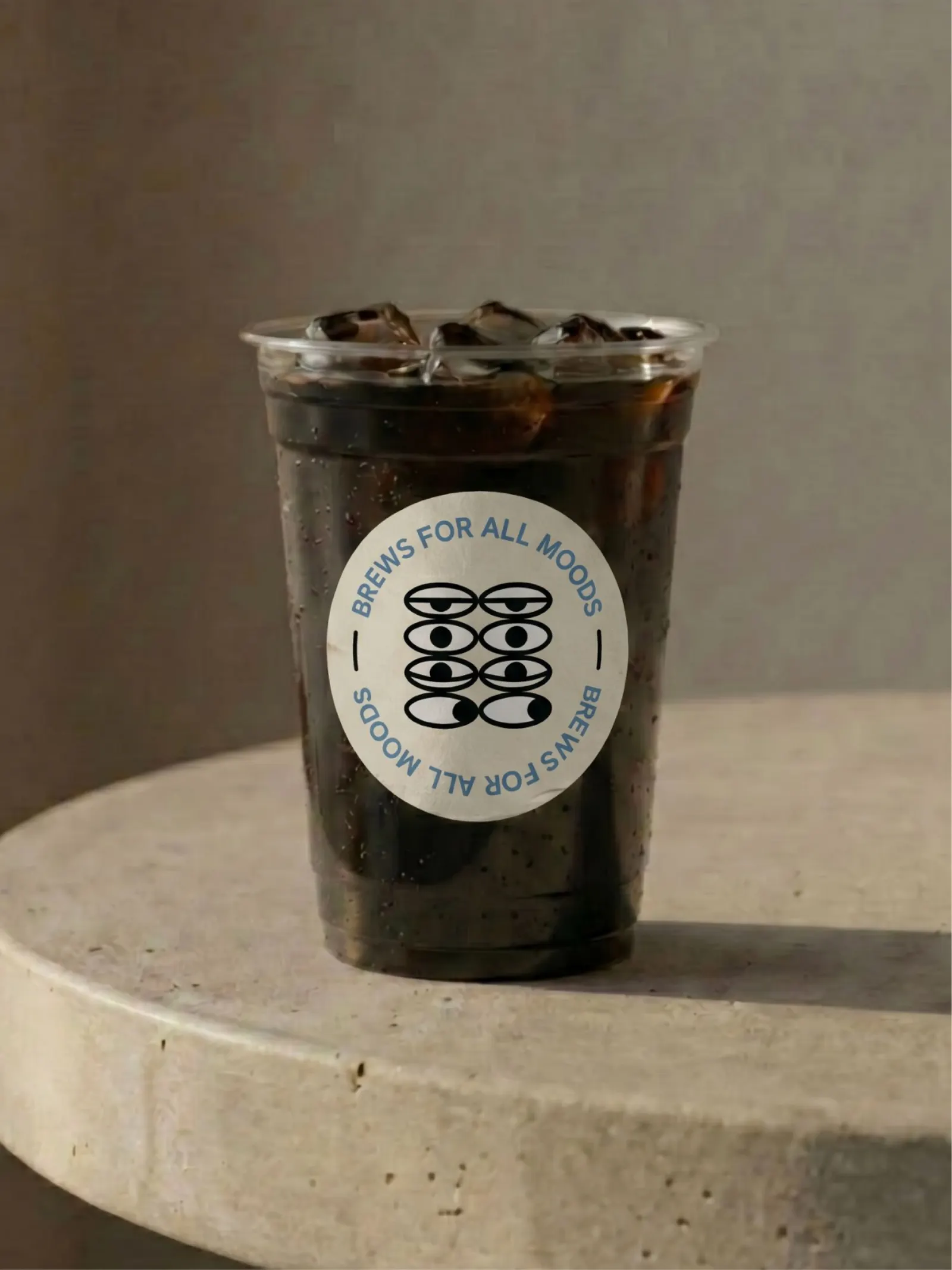
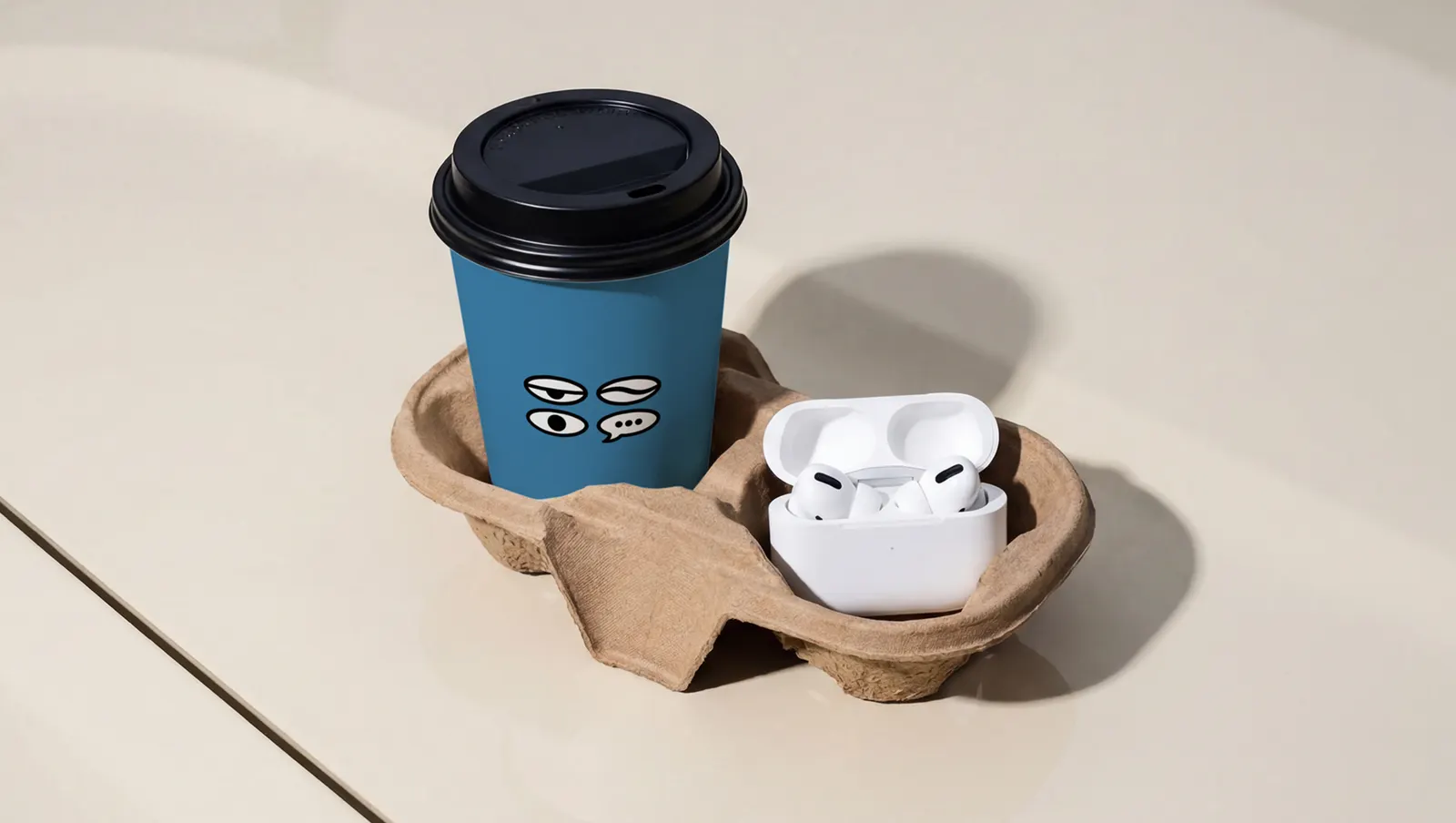
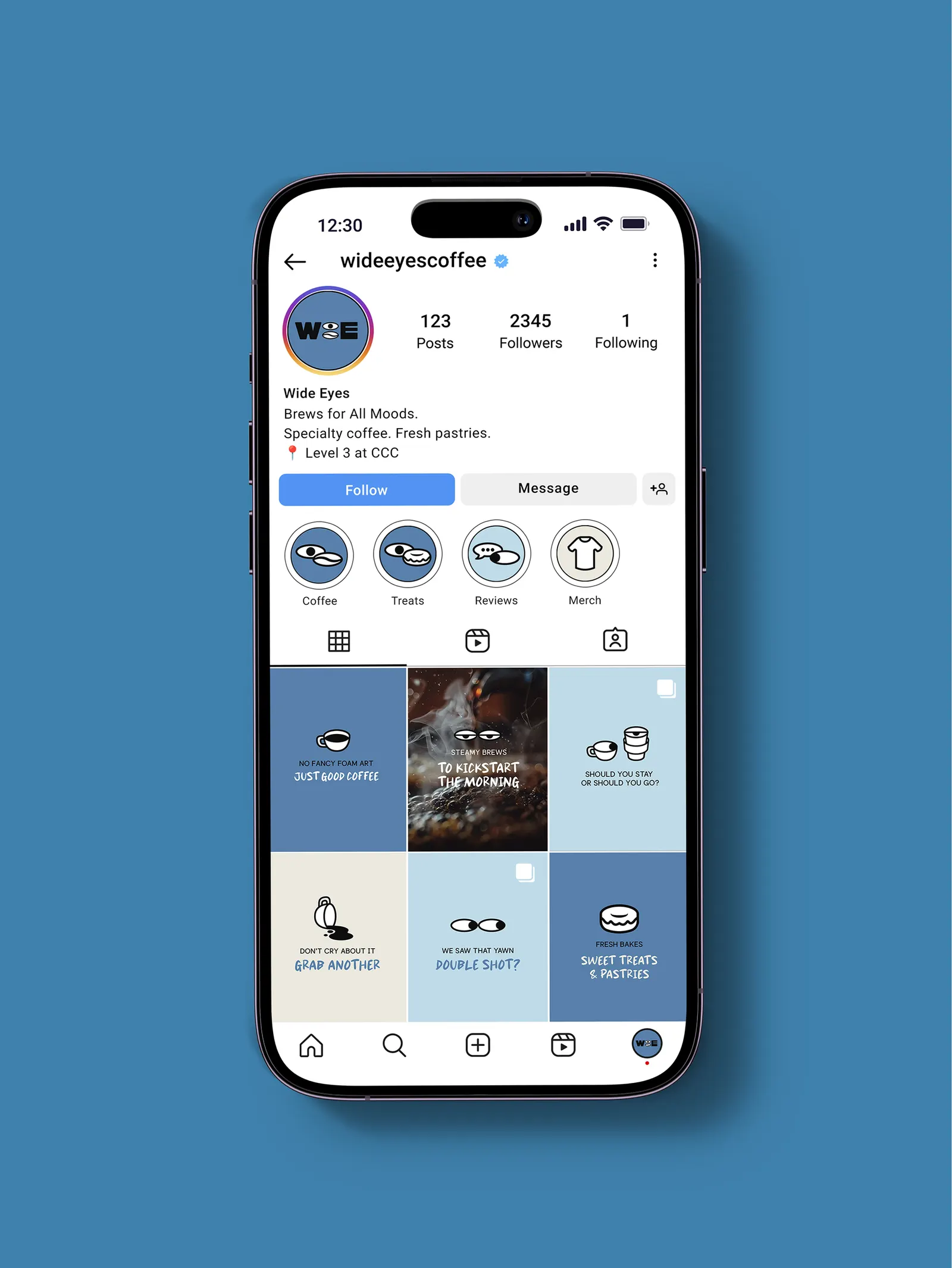
The brief was a coffee brand that treats the café as a place to meet people rather than a pit stop. Studio Nice One answered with a bold wordmark, type that echoes the quick handwriting you'd find on a cup, and a set of eye motifs and small illustrations that capture the different reactions around a table. The eyes are animated, opening wide and then glancing sideways as if catching something overheard. Packaging, collateral, and merch carry the idea beyond the counter, so customers take the brand with them.
Why it works
Coffee branding often leans on provenance and quiet minimalism. Wide Eyes builds on human behavior instead. A pair of eyes is simple enough to sit on a cup, a sticker, or a tote, and expressive enough to carry personality without a mascot. The loud wordmark and the casual, handwritten-feeling type also play well against each other: one is confident, the other personal. Together they suit people who come to a café for company and who like carrying a bit of that atmosphere around.
Applications
Logo
Images and video from studioniceone.com, by Studio Nice One.