The Brand Monograph
Above Water brand identity by ChoChoi
↗Most coconut water looks like it was shot on the same beach. Above Water looks like something unearthed from a temple. The drink is livelier than its category, sparkling and fortified with vitamins and minerals, and ChoChoi built on that by turning to the coconut's place in sacred offerings, where it has stood in for the human head. The studio treats that history as a living tradition rather than a tropical backdrop.
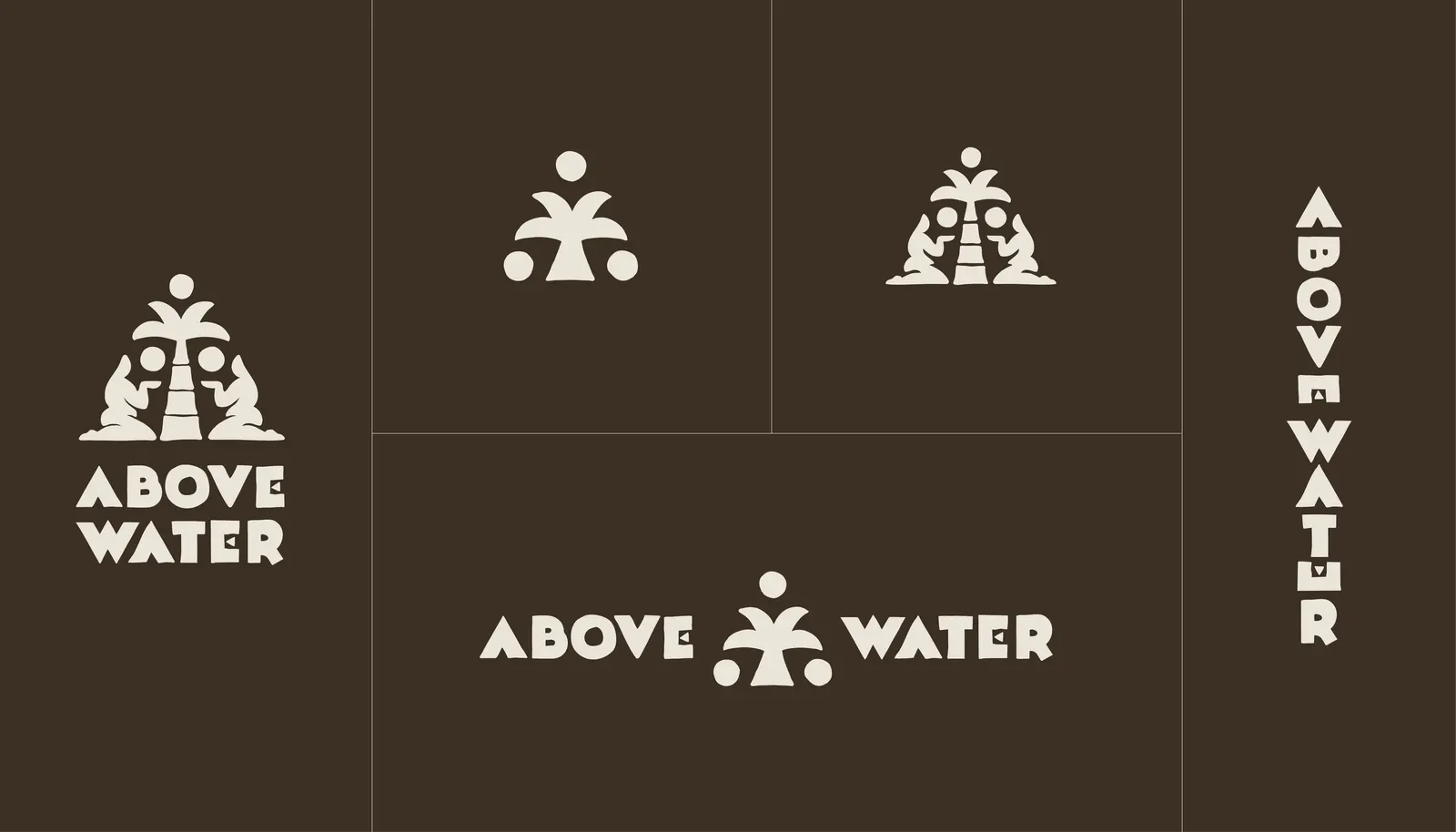
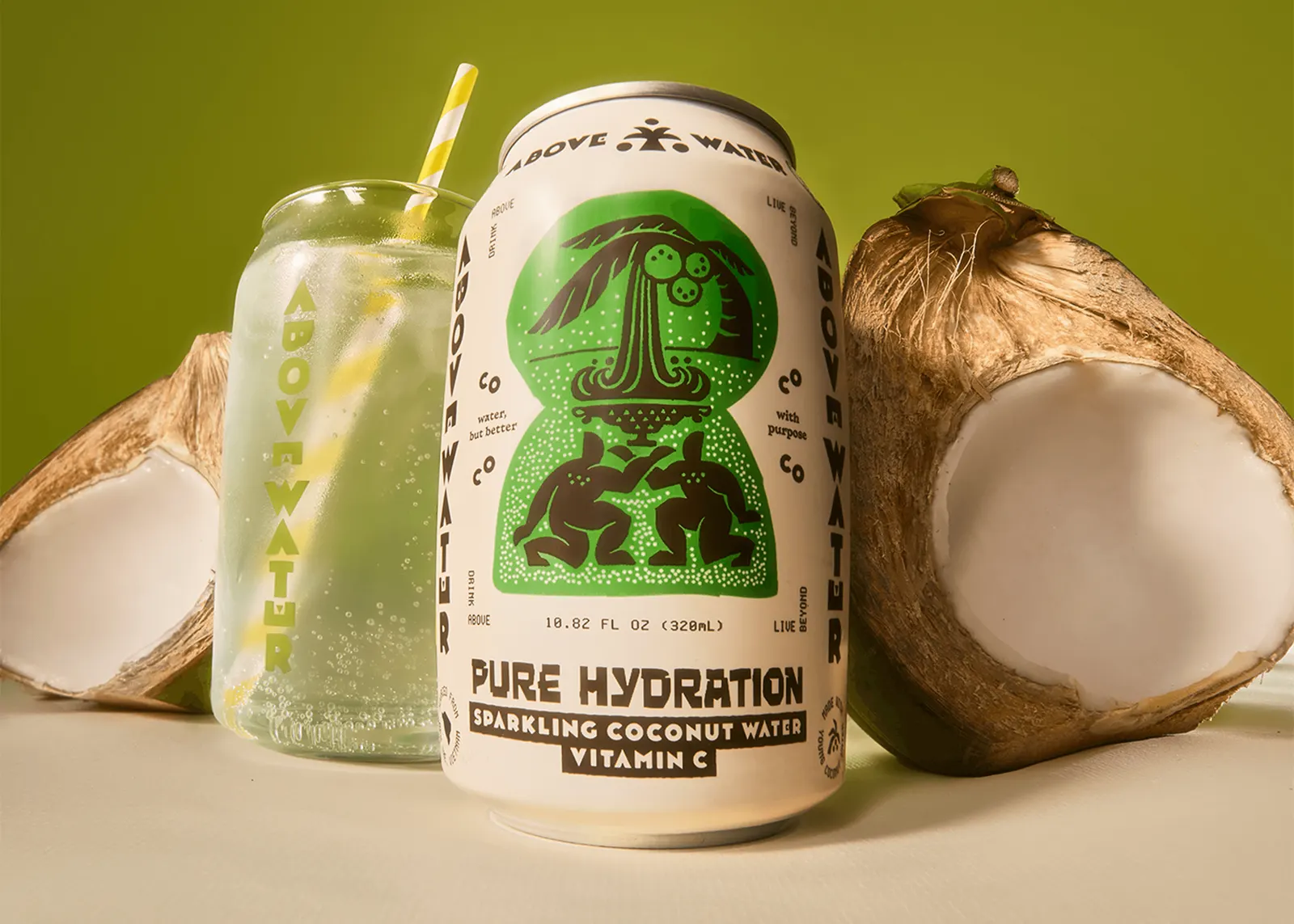
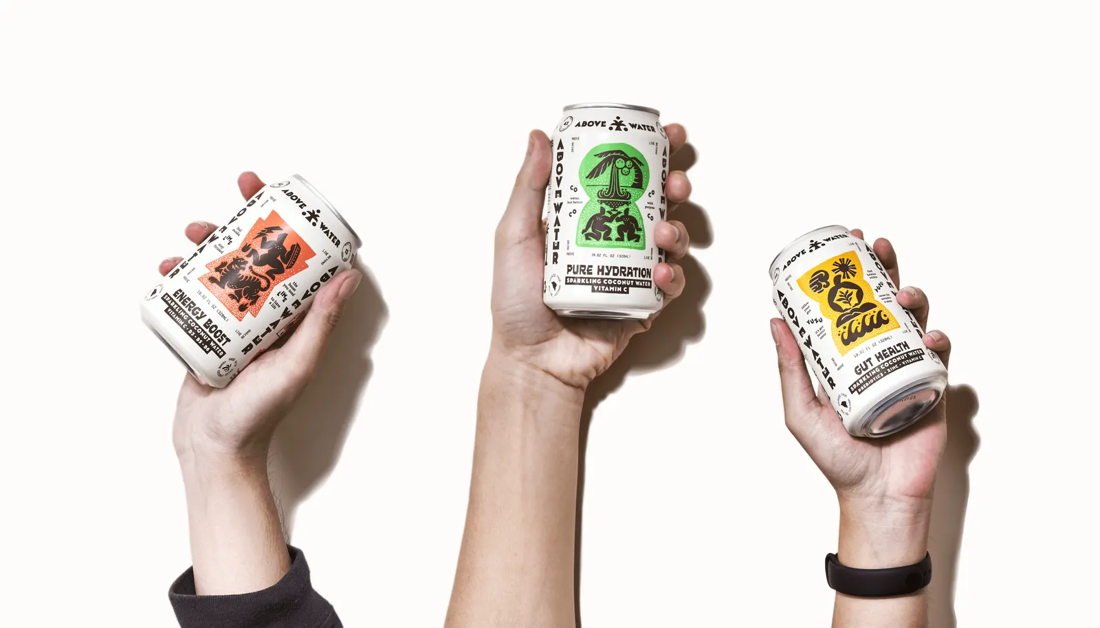
The identity sets chunky, totem-inspired letterforms against technical monospace, with illustrations modeled on carved stone reliefs. Audrey Tran, Chang Be, Tin Lai, and Trang Ka designed alongside Mikeyokei, who contributed typography, including Coco, a custom variable typeface. Its height stretches or compresses so names of different lengths fit a small can. The copy describes benefits as everyday scenes, like getting through a 3 p.m. meeting, and specimen-tube icons carry the lab-meets-relic idea across the system.
Why it works
The strongest decision is committing to contrast. Heavy, carved-feeling letters and clinical monospace give the can two clear voices, so it reads as both artifact and formula, which suits a product that is neither a wellness tonic nor a soda. Coco is the smartest detail: a practical fix for tight packaging that also becomes a recognizable signature. The deadpan, relatable copy keeps all the mythology from turning solemn, and it speaks to buyers who want character on the shelf.
Applications
Logo





Images and video from chochoicreative.com, by ChoChoi.