The Brand Monograph
Brahma brand identity by FutureBrand
↗Brahma is a beer that ended up with its own noun. Brahmosidade is the word for its creaminess, and FutureBrand's task was to make the brand look the way people already say it tastes. The studio had 138 years of history, a broad portfolio, and plenty of recognizable assets to work with, but no single system holding them together.
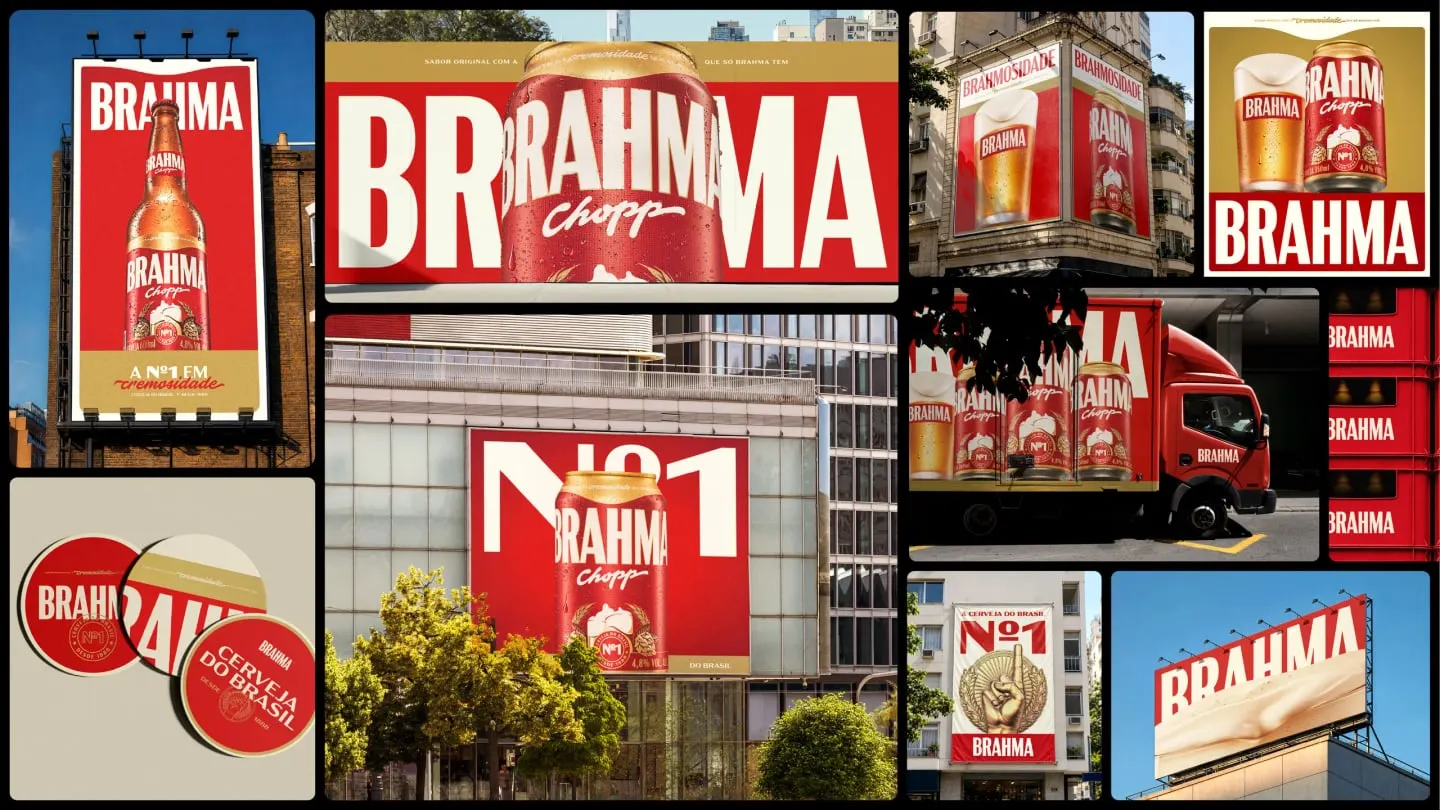
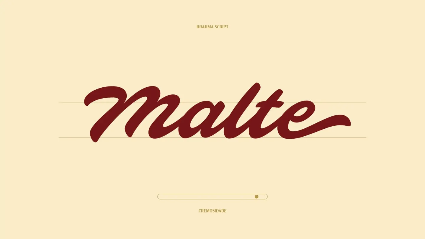
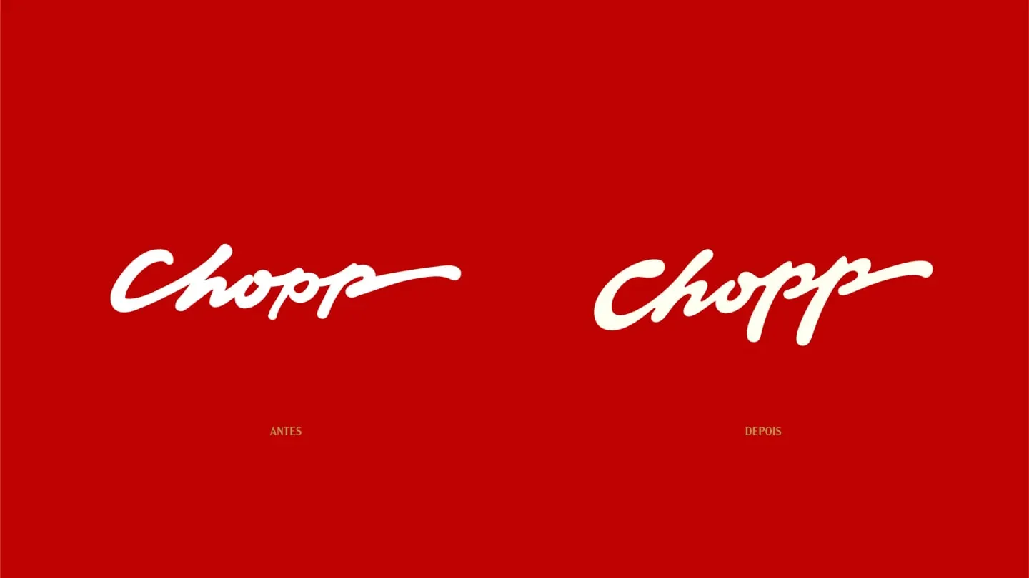
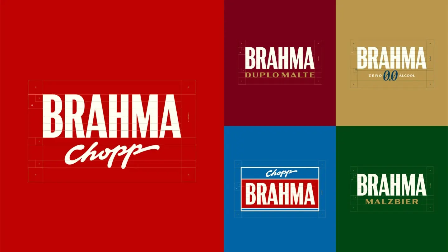
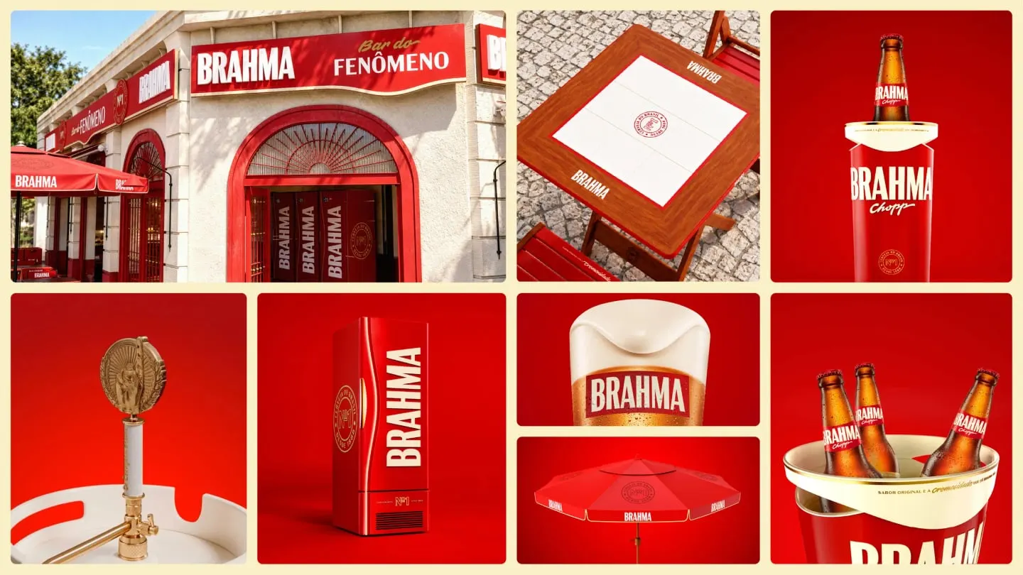
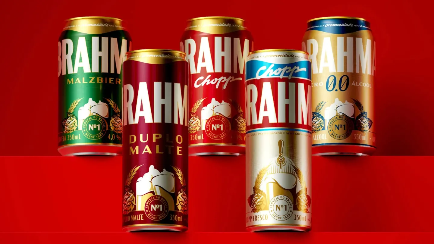
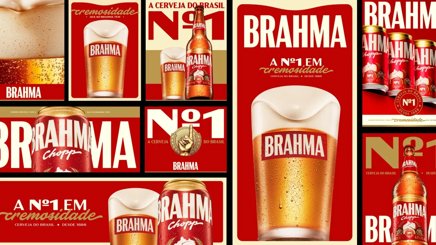
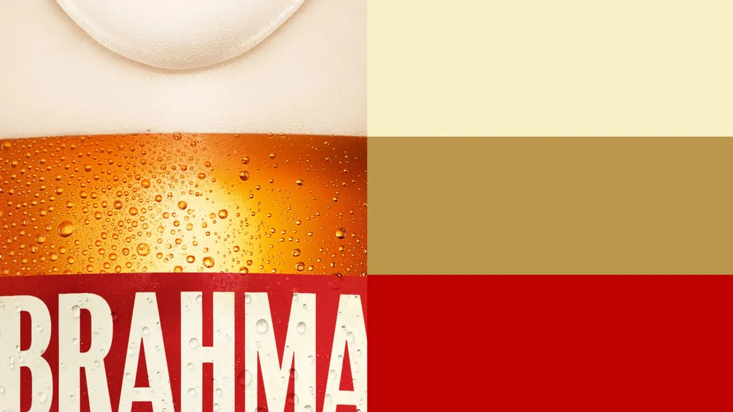
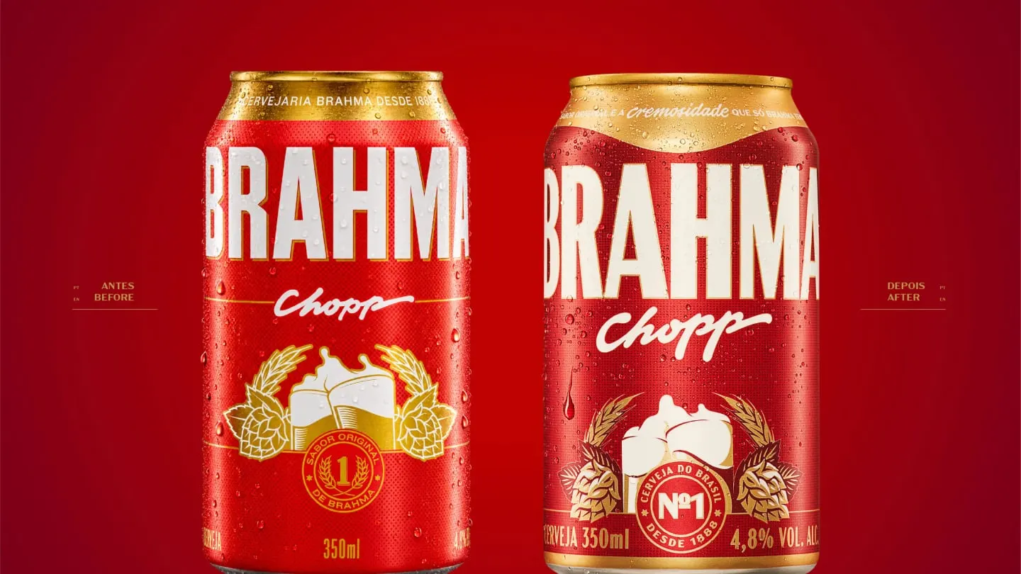
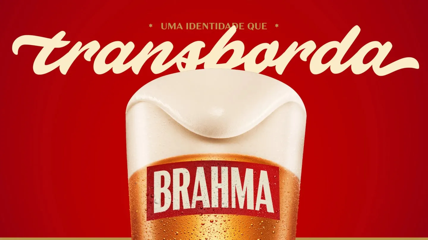
With Plau, FutureBrand built Brahma Script, a hand-drawn proprietary typeface with six weights, contextual alternates, and swashes, so the same soft, rounded letterforms can run quiet or loud. Around it sit an Art Deco-informed logo, the returning Nº1 seal, a palette taken from draft beer, and illustrations that trace the movement of foam. A new packaging architecture gives each product its place in the family, a point-of-sale kit extends to fridges and signage, and slow vertical motion carries the idea onto screens.
Why it works
The smartest move is putting the sensation in the type rather than in a literal foam graphic. Letters that swell and join softly make creaminess something you read, and because the typeface is proprietary, no competitor can borrow it. The Art Deco logo and Nº1 seal keep the brand's age and authority intact, while the beer-toned palette stays close to the product on the shelf. It is a restrained set of tools doing one job, which is why a large portfolio can still look like one family.
Applications
Typography
Logo
Images and video from futurebrand.com, by FutureBrand.