The Brand Monograph
Barsk brand identity by Heavy
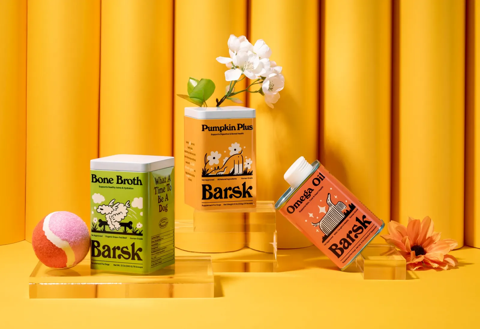
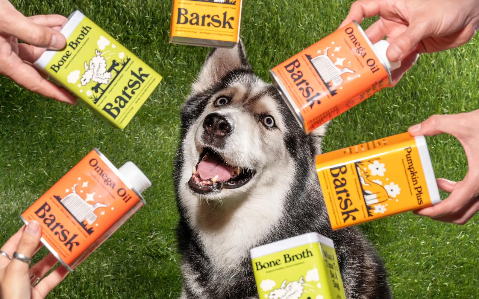
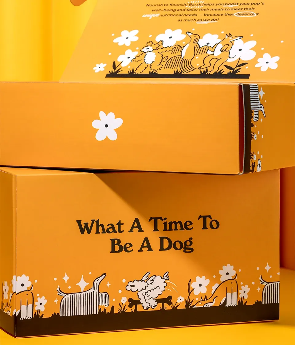
↗Barsk, a pet supplement brand from Singapore, could have gone one of two familiar ways: sterile and clinical, or sugary and cute. Heavy took a third route. The studio paired the seriousness a health product needs with a loud, cheerful look drawn from small, 1970s-style thumbnail illustrations, and the tension between the two is what makes the brand memorable.
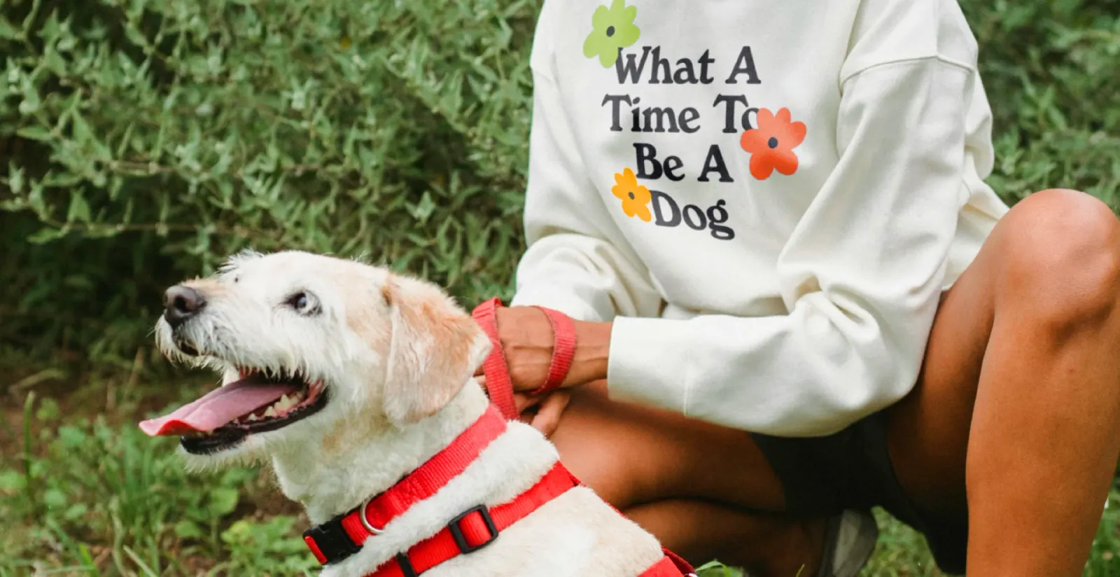
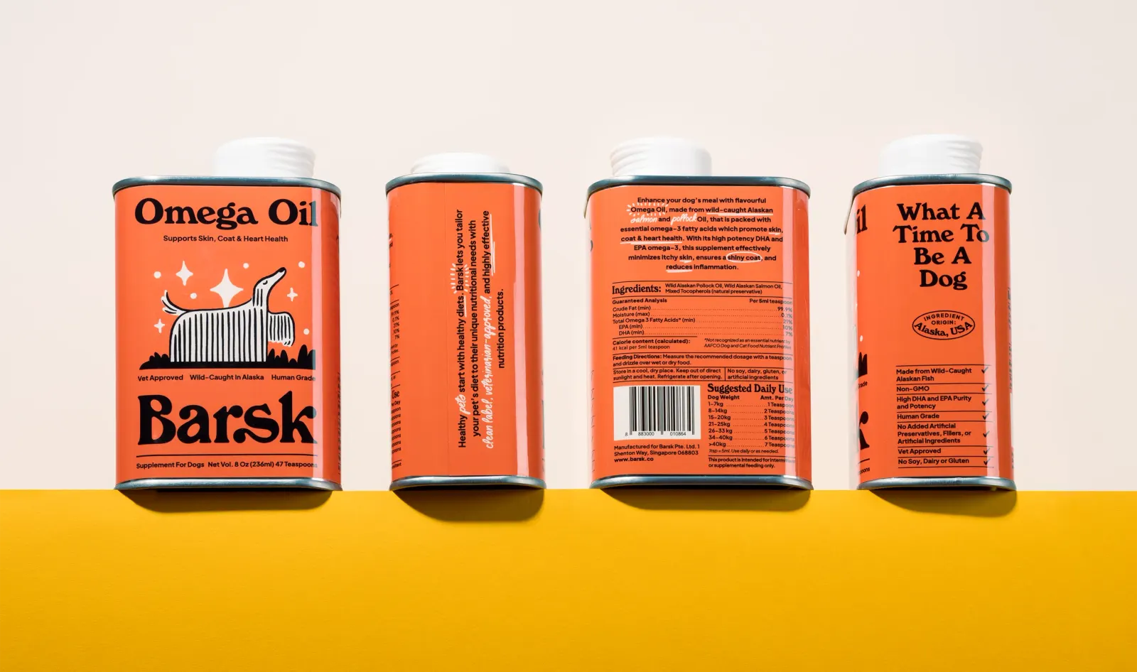
Heavy developed the whole identity, from the logo and color palette to the illustrations and a set of packaging pieces. The illustrations give the brand a consistent hand across every format. Alice Muzellec, Diego Rocha, and Laura Mariaud led the design, with Lane Cope on strategy and Liliana Barraza on photography.
Why it works
Supplements ask owners to trust something they give daily to an animal they love, yet the category tends to look like either medicine or a cartoon mascot. Vintage thumbnail illustration gives Barsk a warmth and point of view that is neither. It reads as handmade and affectionate, which suits a product bought out of care, while the saturated palette helps it stand out on a crowded shelf. Keeping the personality in the illustration and color means the brand can be playful without seeming careless about what's inside.
Applications
Color
Images and video from heavy.mx, by Heavy.