The Brand Monograph
Big Rock Brewery brand identity by Helms Workshop
↗Few craft breweries earn the word "pioneer," and fewer still risk it by getting louder. Helms Workshop's rebrand of Big Rock Brewery, one of Alberta's earliest craft names, shows a veteran deciding to stand out again instead of settling into the category.
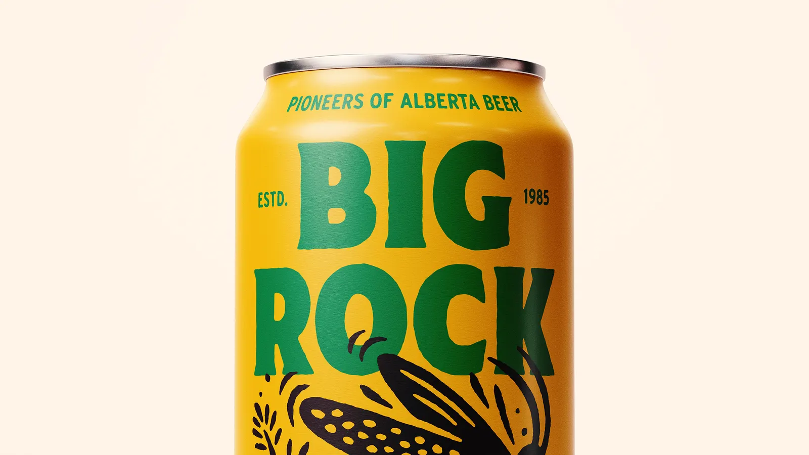
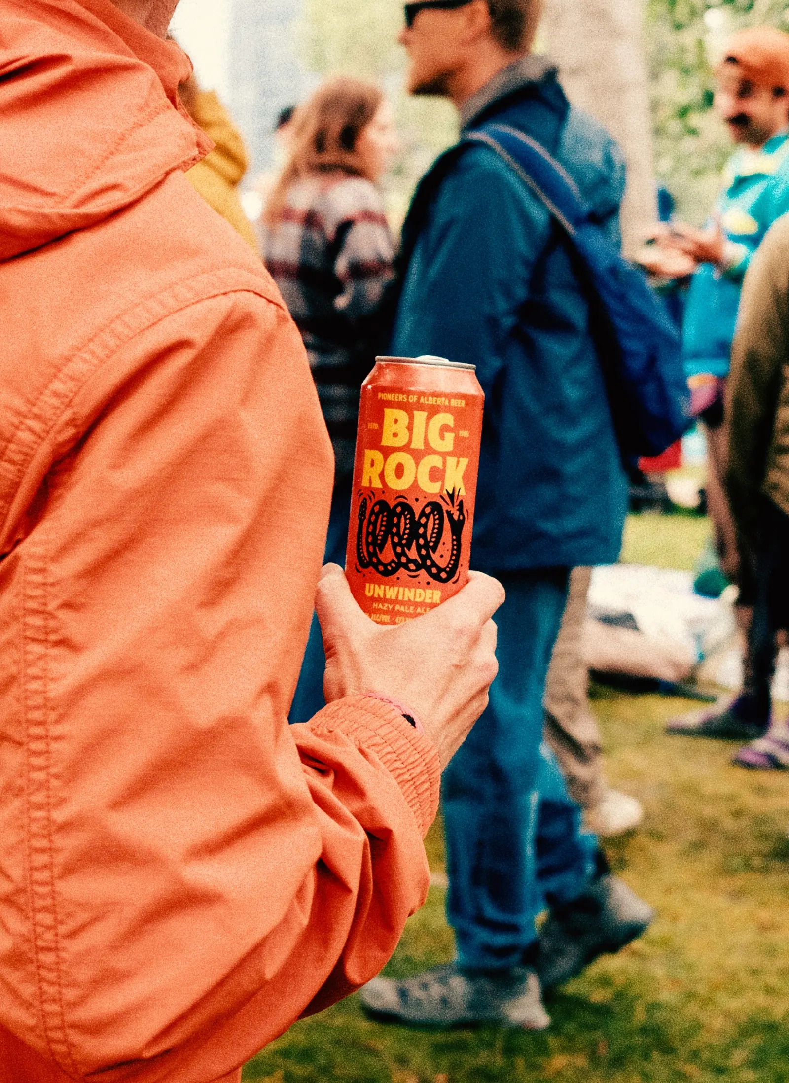
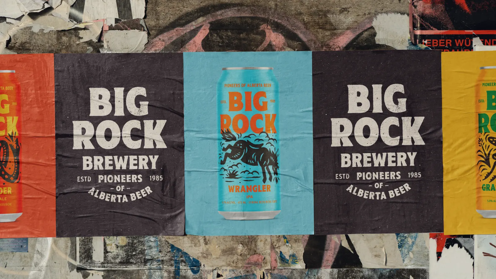
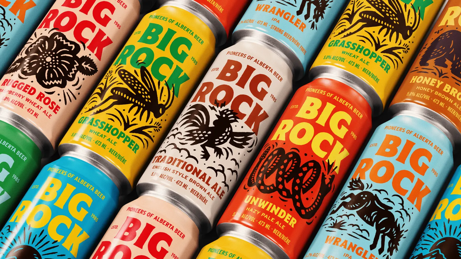
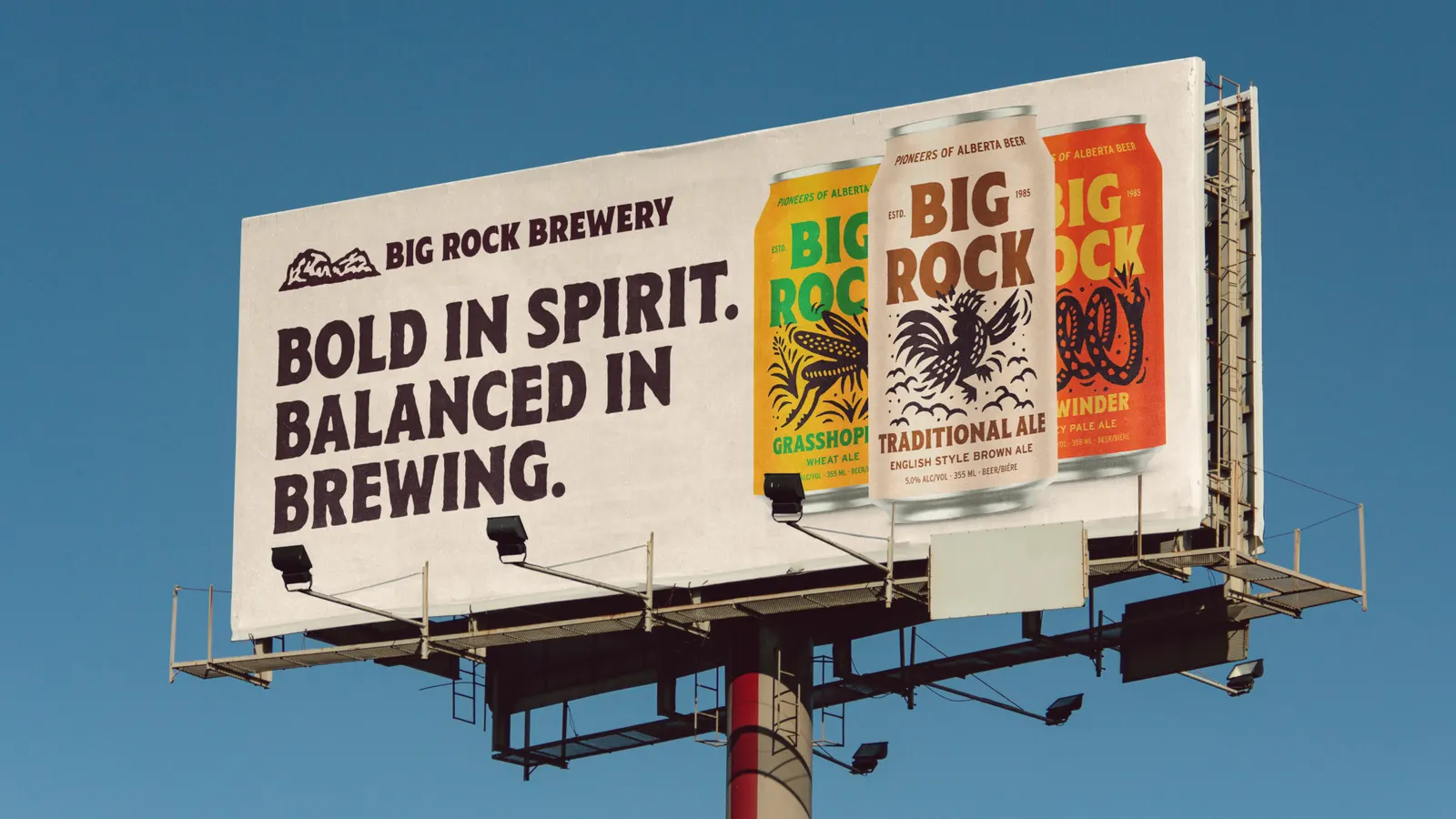
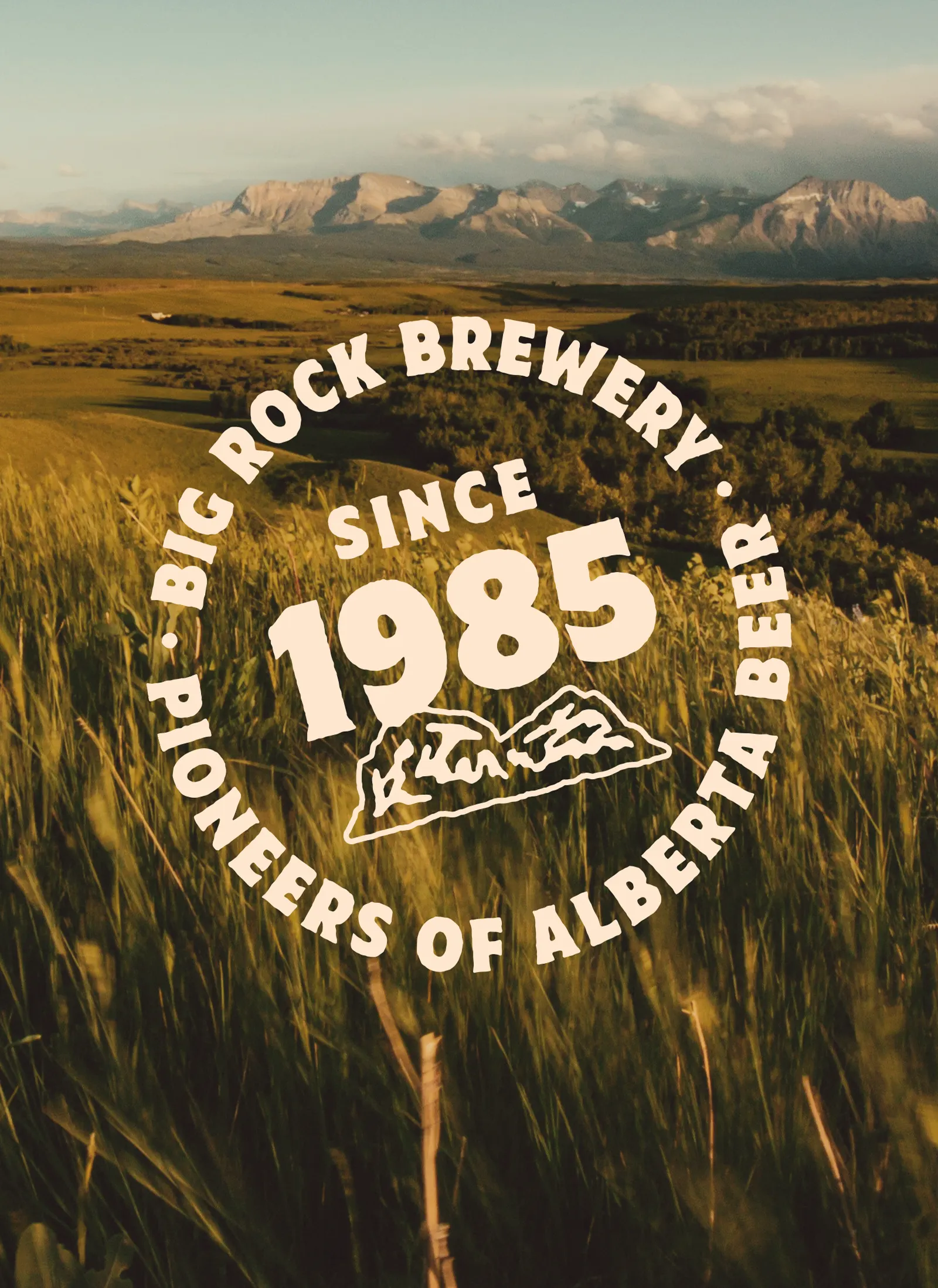
The brief was to steer the brewery back toward its roots in unusual ingredients and a willingness to be different. The studio started from the boulder behind the name, something immovable and hard to walk past, and carried that attitude onto the cans. Saturated color, rugged, expressive illustration, and assertive typography do the work, while the tone leans on wit and irreverence. Helms Workshop assumed drinkers would get the joke. Sales rose 47% in the quarters after the relaunch.
Why it works
Craft beer shelves often share a vocabulary of tidy badges and muted, earthy palettes, so saturated color and heavy illustration read as different at a glance. The rugged drawing style suits a name taken from a rock: it looks hewn, not polished. Forceful type keeps the cans legible and gives the humor a voice. Most of all, the system treats the drinker as an equal who doesn't need reassurance, and in a category full of it, that confidence is the real point of difference.
Applications
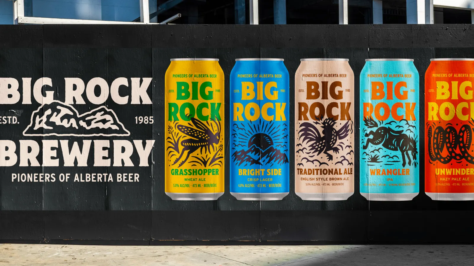
Images and video from helmsworkshop.com, by Helms Workshop.