The Brand Monograph
air up brand identity by Mother Design
↗air up's central trick is hard to show: sip plain water from its bottle and your brain reads flavor from scent alone. Mother Design had to build a brand around a sensation most people have never felt, and the result is one of the more confident and funny identities in the hydration category.
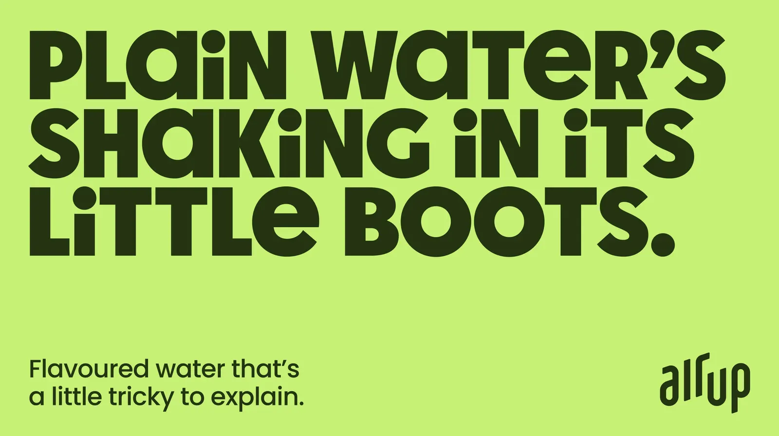
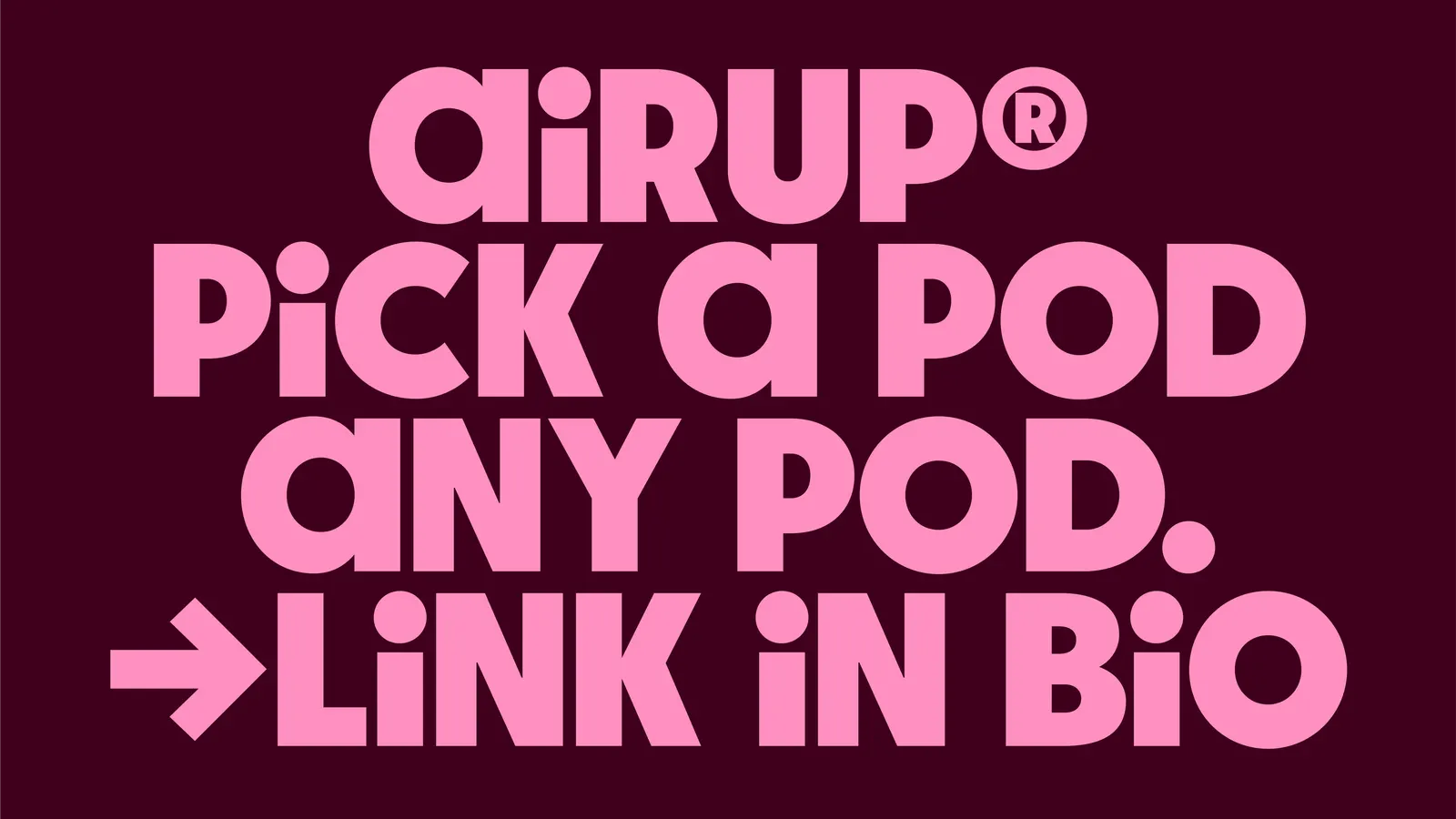
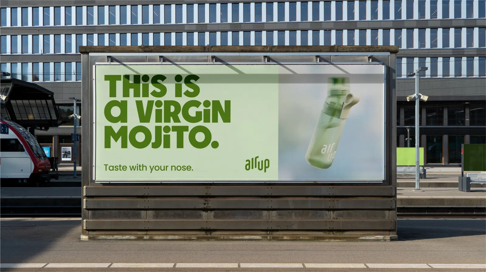
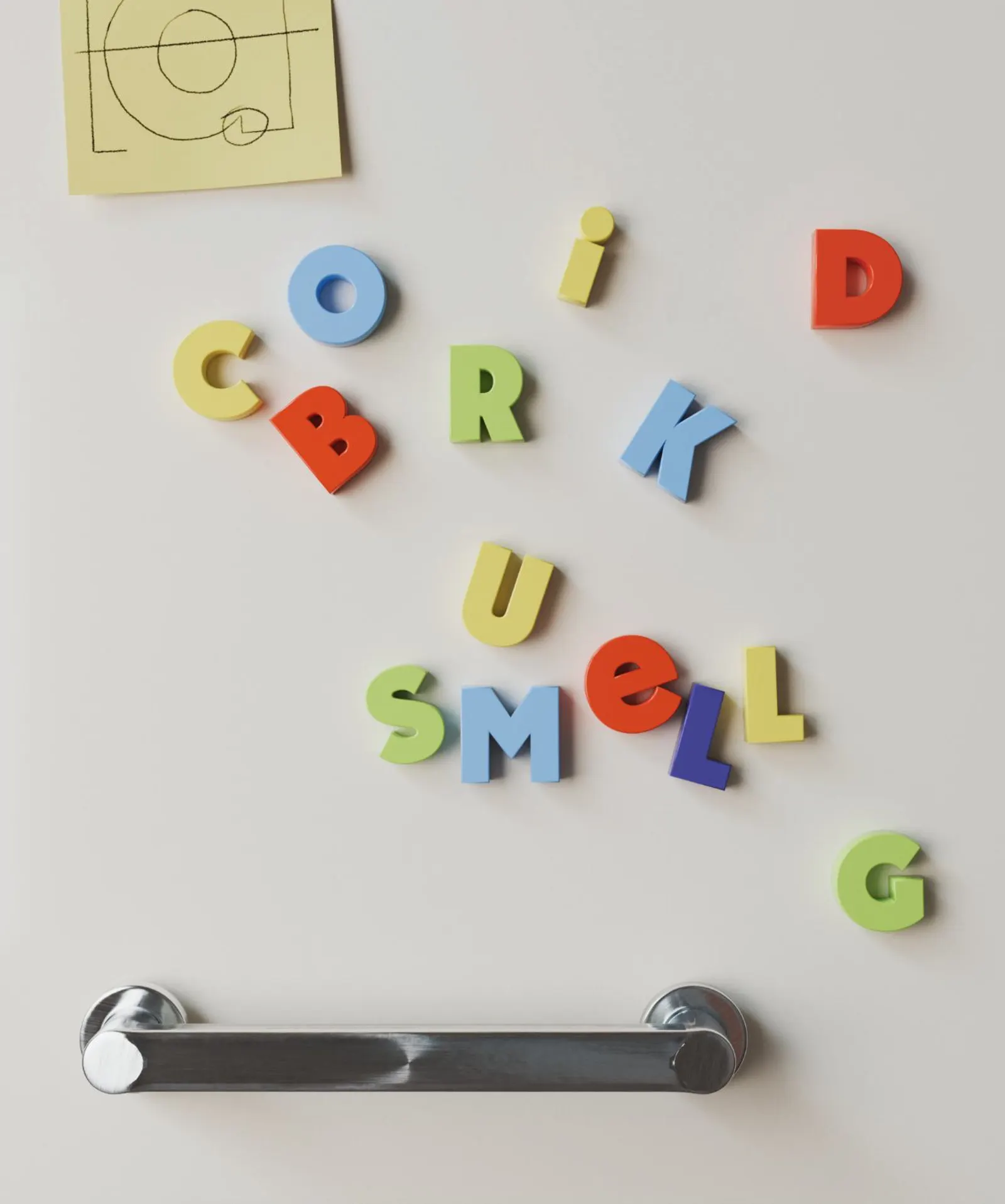
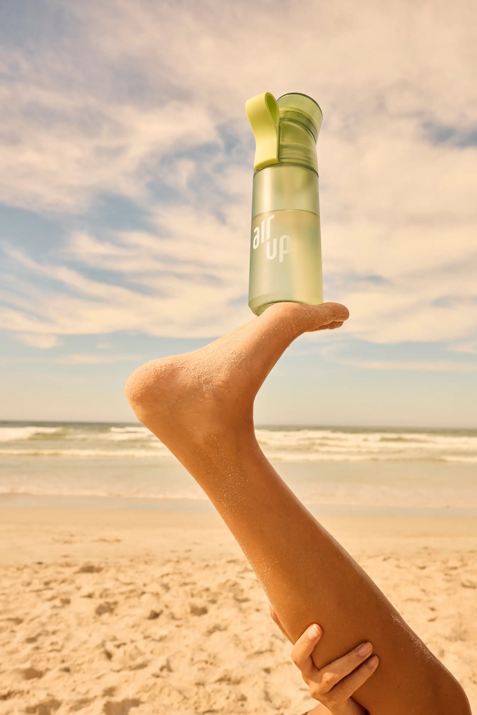
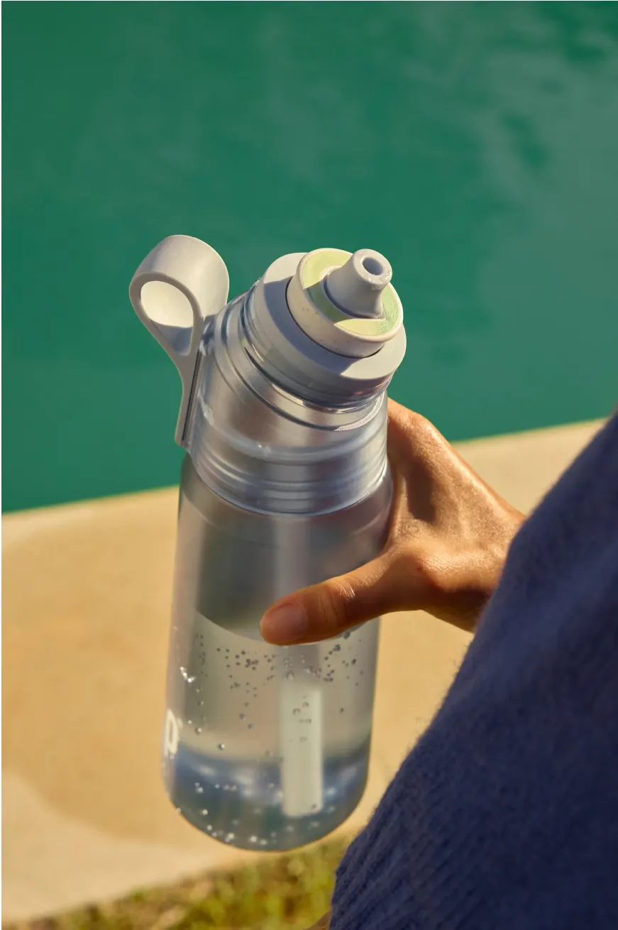
The studio shaped the whole system around a tug-of-war between a kid who wants to play and a grown-up who wants to do the right thing. That tension drives the voice, the layout, and the imagery. Working with Hot Type, Mother Design developed air up® sans, a bespoke typeface with mixed-case setting and quirky glyphs, balanced by a quieter secondary face. Under the Scentaste™ name, gradients mark the shift from water to flavor. Photography keeps natural tones and adds a surprising turn to everyday scenes, while 3D and floating motion carry the brand beyond the bottle.
Why it works
Taste can't be photographed, so the identity wisely stops trying. Gradients suggest a sensation instead of depicting an ingredient, which sidesteps the fruit imagery crowding the flavored-water category and makes air up read as a sensory brand rather than just a drink. Pairing loud custom type with a restrained secondary face makes the silliness feel deliberate. Natural-toned photography keeps the bright palette from tipping into candy. Health-minded adults get permission to play without feeling they've traded away their values.
Applications
Logo
Typography

Images and video from motherdesign.com, by Mother Design.