The Brand Monograph
Nuud brand identity by Mother Design
↗Most people don't realize gum contains plastic, so Nuud had to explain the problem before it could sell the fix. Mother Design, working with strategy partner Broody, made that explanation the personality of a plant-based, biodegradable gum entering a category where a few big names hold over 90% of the market.
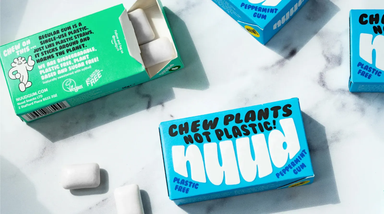
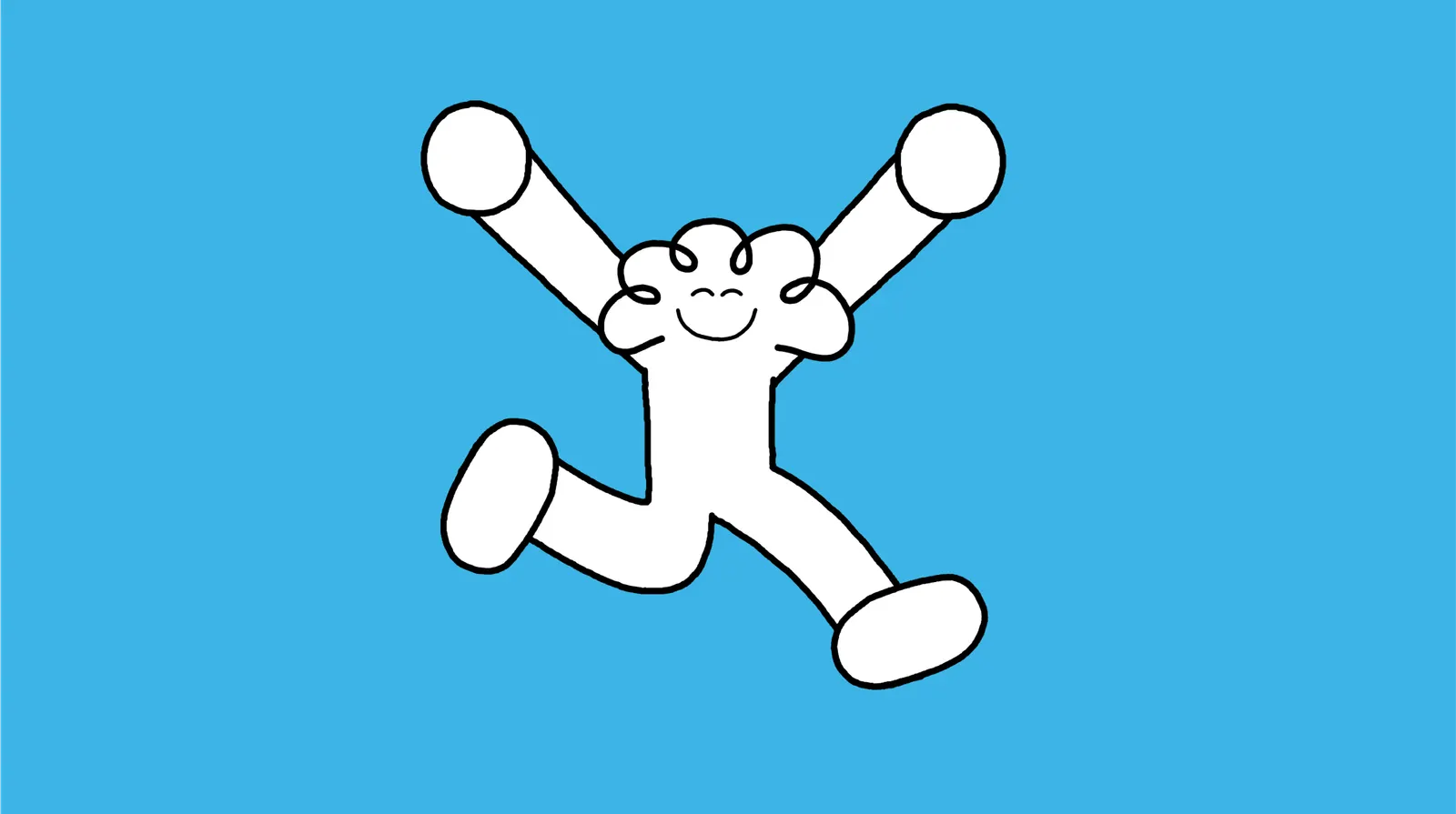
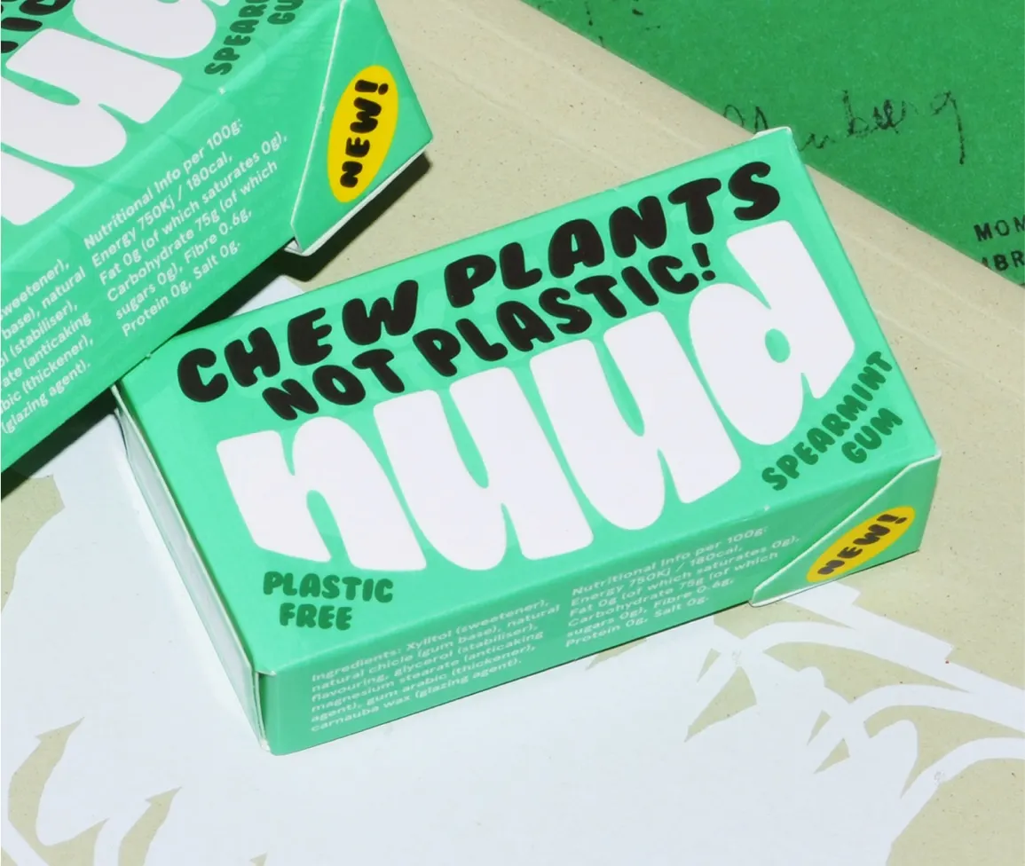
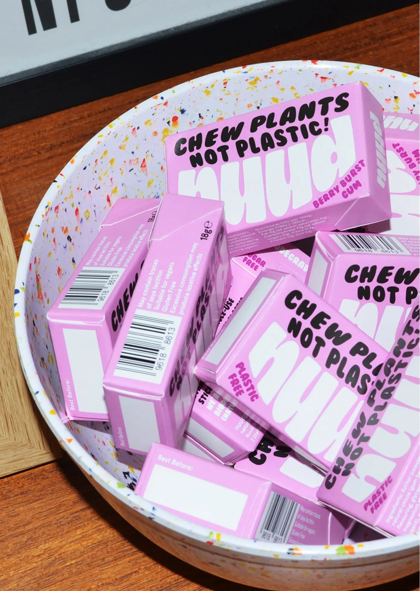
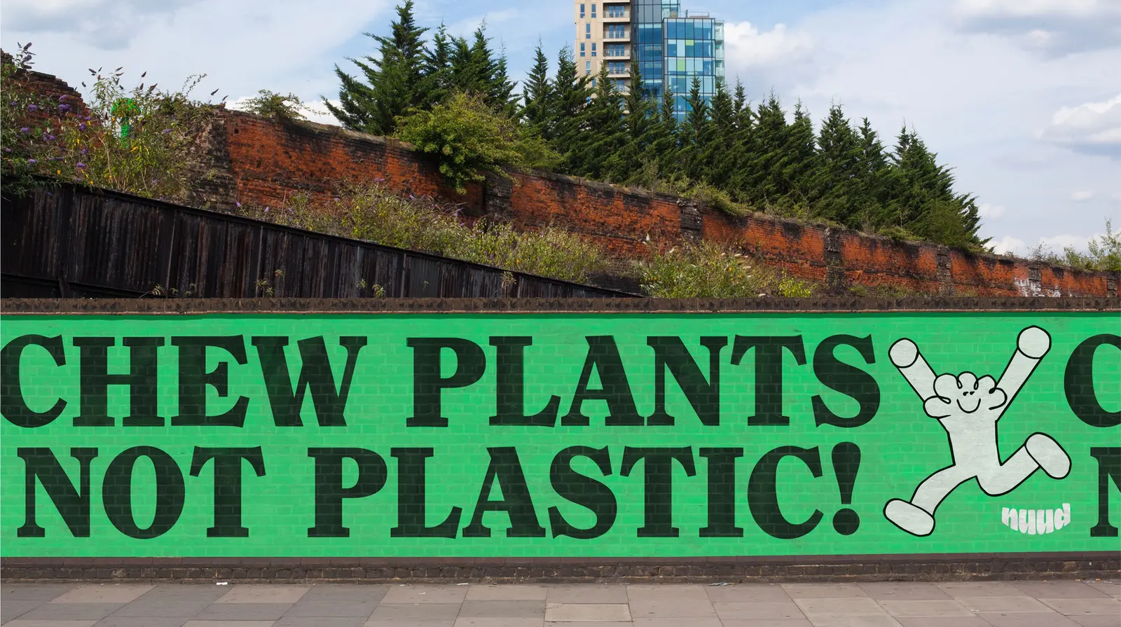
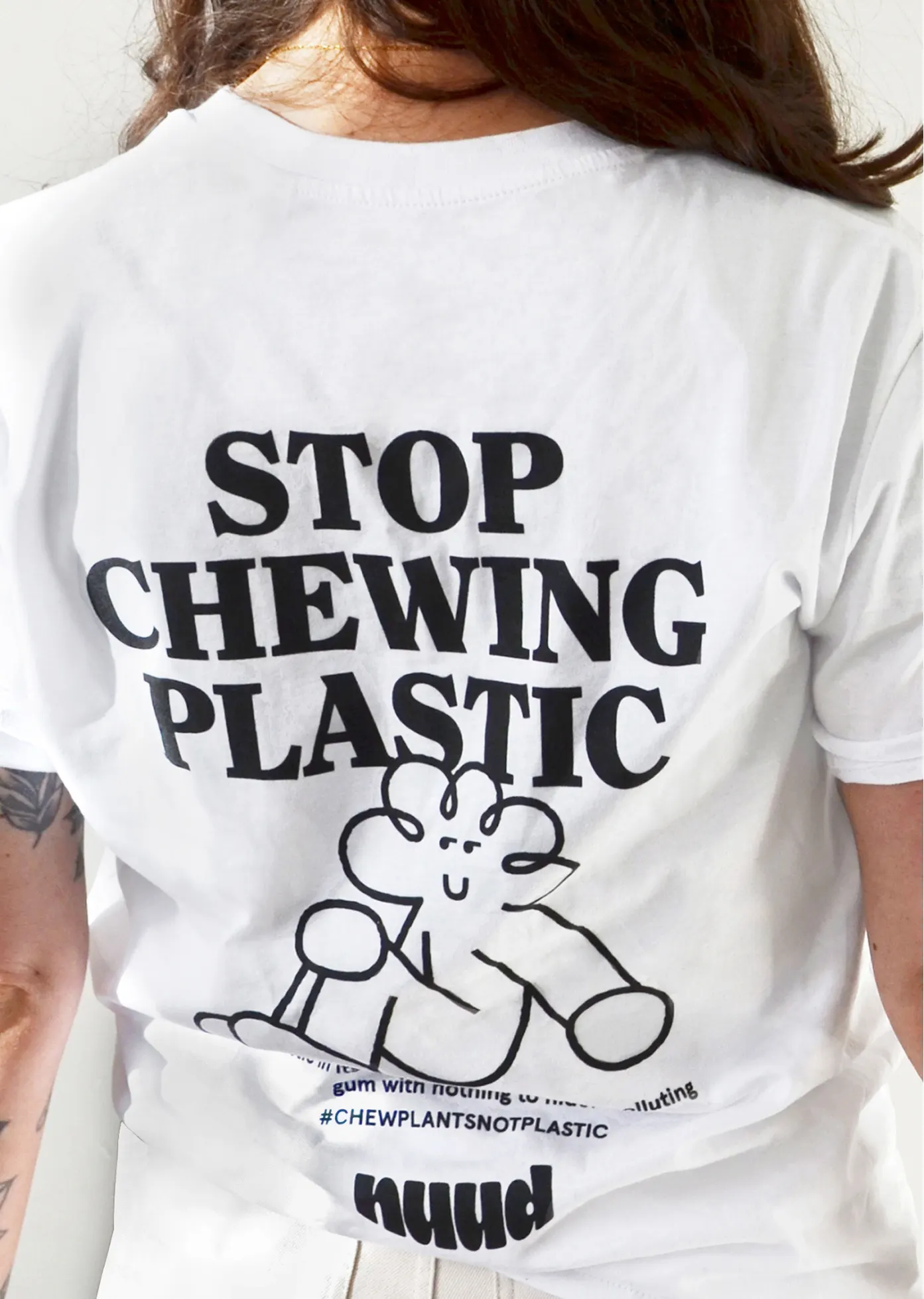
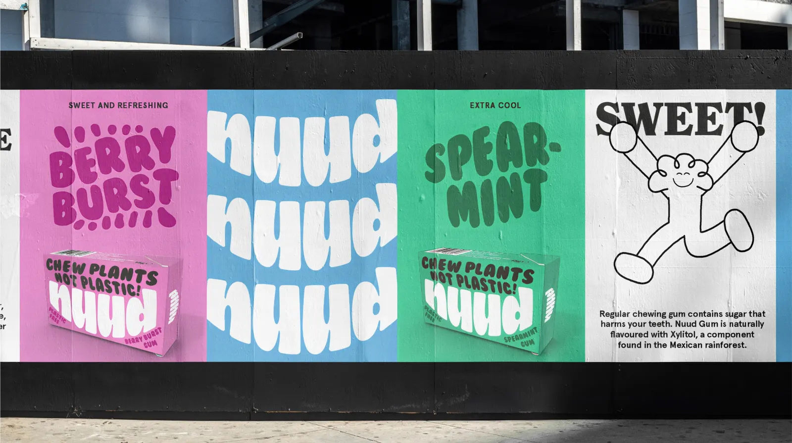
The studio kept flavor colors familiar but turned up the saturation, and used nearly every surface of the pack to make the case. A grinning logo sits beside a bubbly custom typeface, while Charlie the mascot, with illustration by Daye Kim, keeps the subject light. Distribution grew from 100 retailers to 2,500, sales jumped 900% year over year, and 2022 purchases kept the plastic equivalent of 3,750,000 straws out of the environment. D&AD shortlisted the work, and it took silver at the DBA Design Effectiveness Awards.
Why it works
Gum is an impulse buy, so the pack has about a second to land. Familiar flavor colors let shoppers read it as gum instantly, and the extra saturation lifts it above a shelf of lookalikes. The smiling logo and rounded type do the quieter work: they soften a message that could easily sound like a lecture, so the plastic point reads as an invitation. It's a confident choice to put the argument on the front of the pack, and the friendly tone keeps it from feeling heavy.
Applications
Logo
Images and video from motherdesign.com, by Mother Design.