The Brand Monograph
Cadillac brand identity by Mother Design
↗Mother Design's Cadillac identity stands out for pairing a disciplined, pared-back crest with photography that is anything but restrained. The brief came from a century-old American luxury marque going all-electric, with a lineup expanding to new markets and a younger audience that thinks differently about luxury.
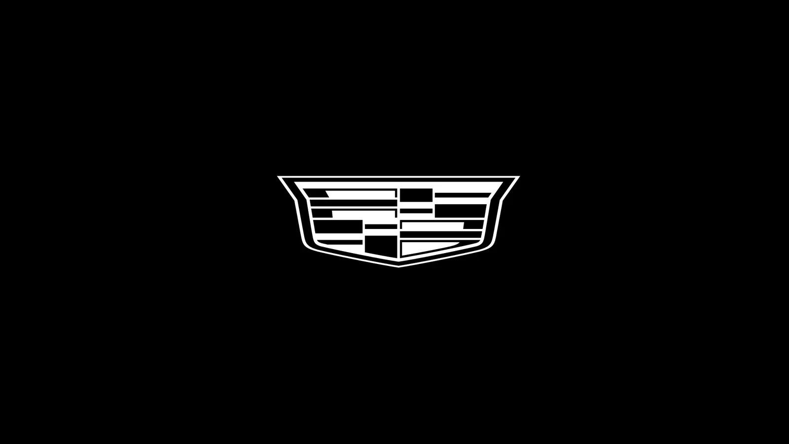
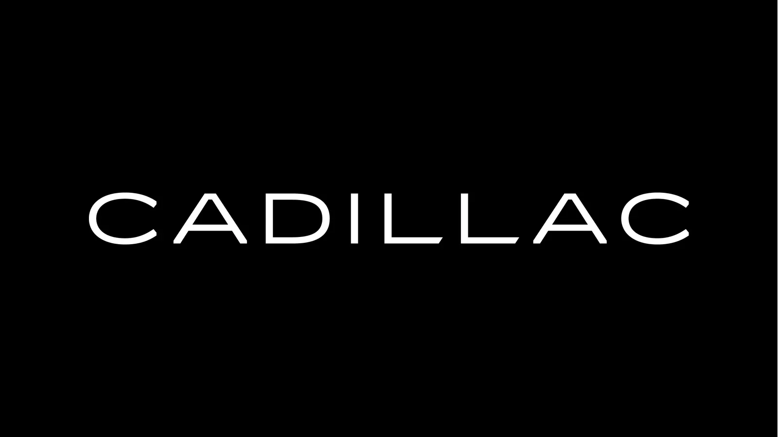
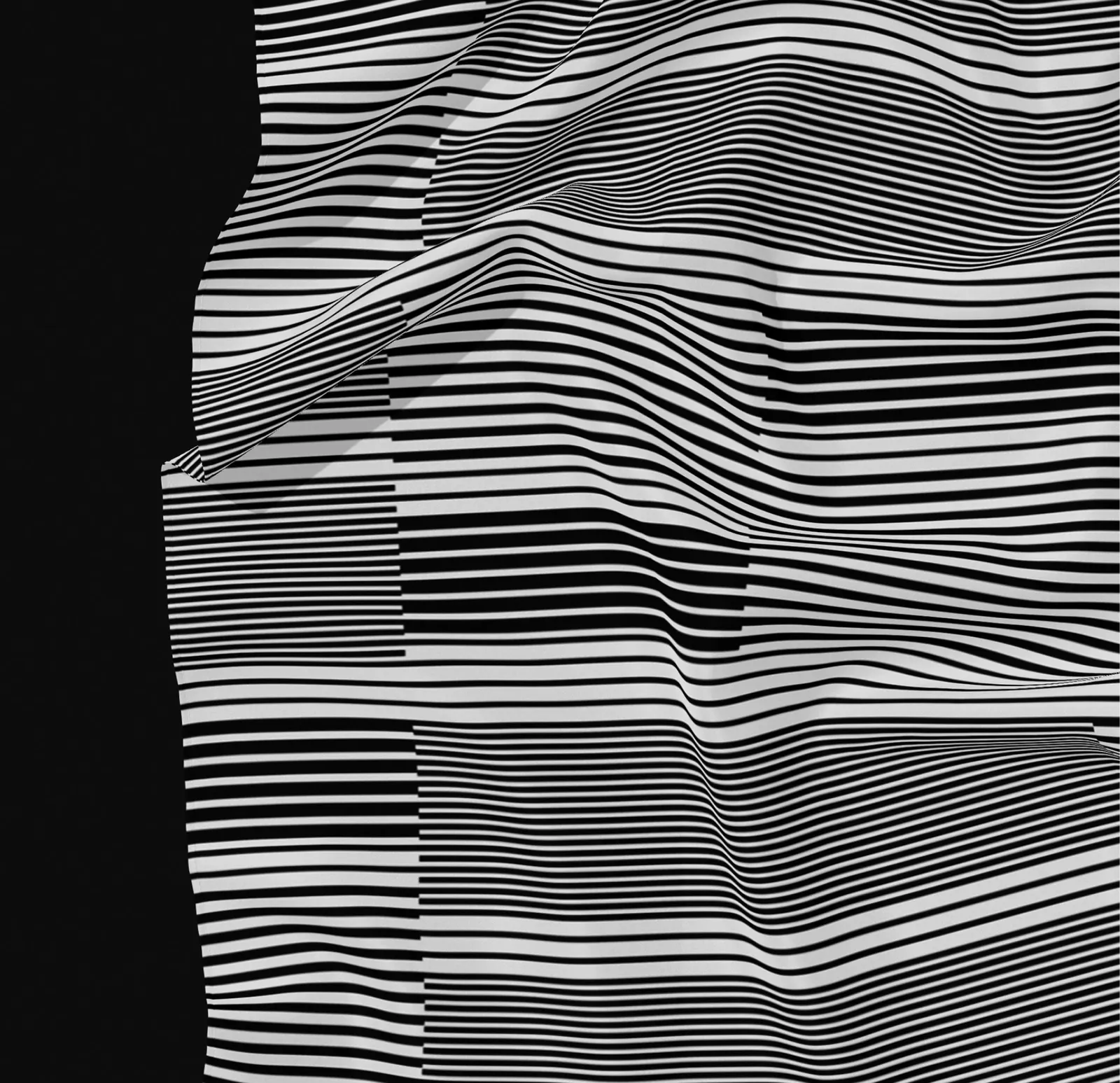
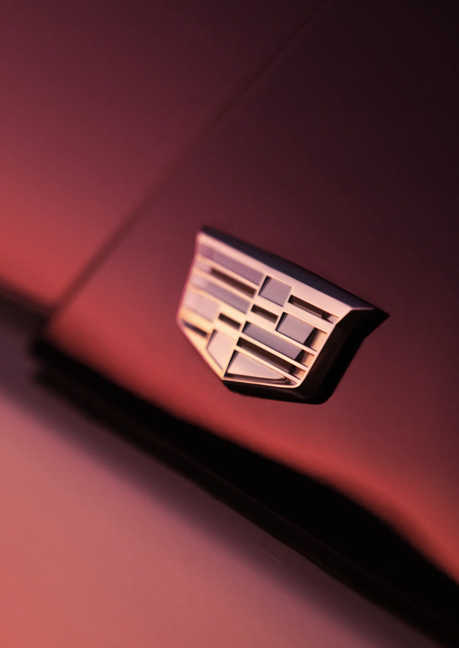
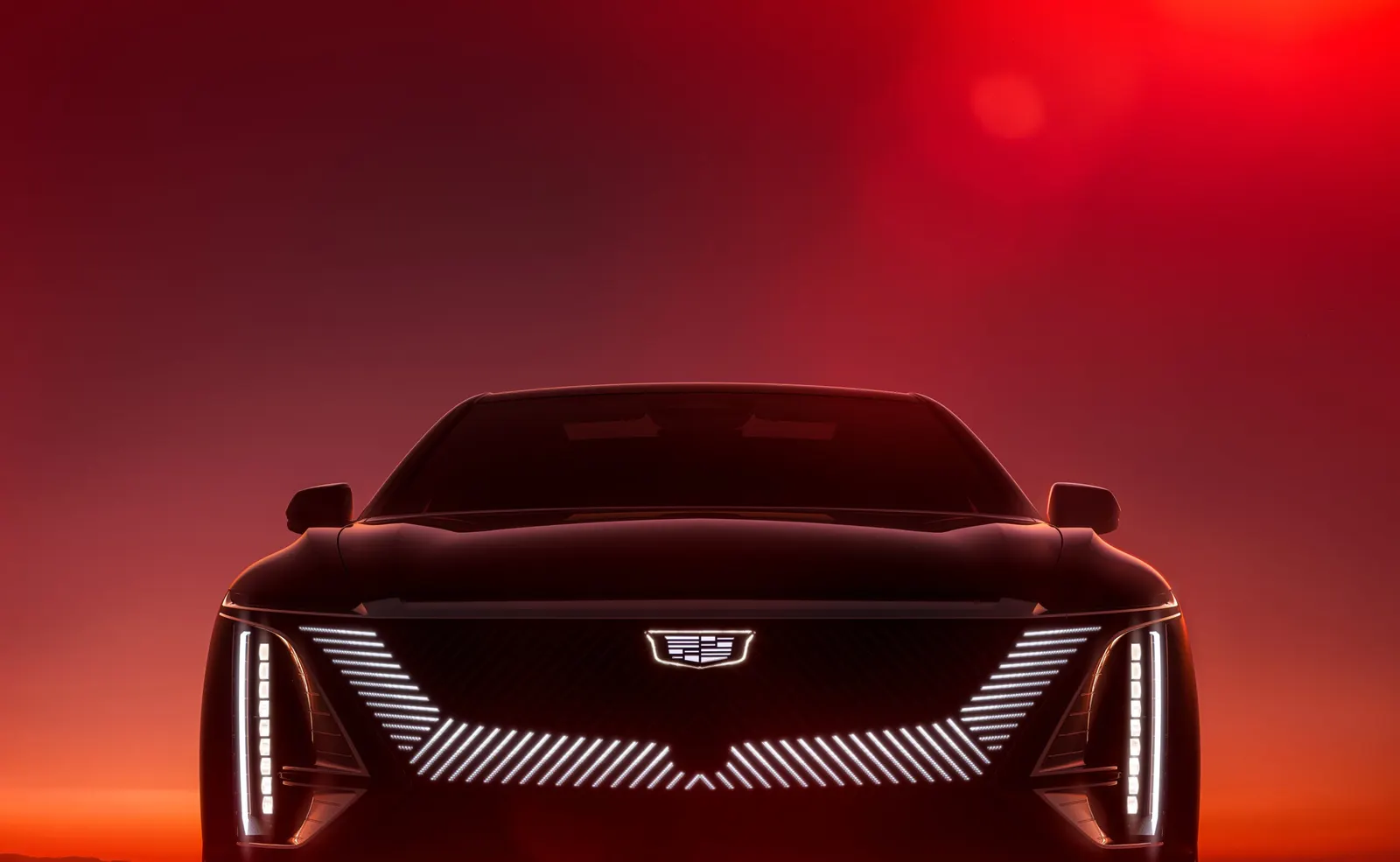
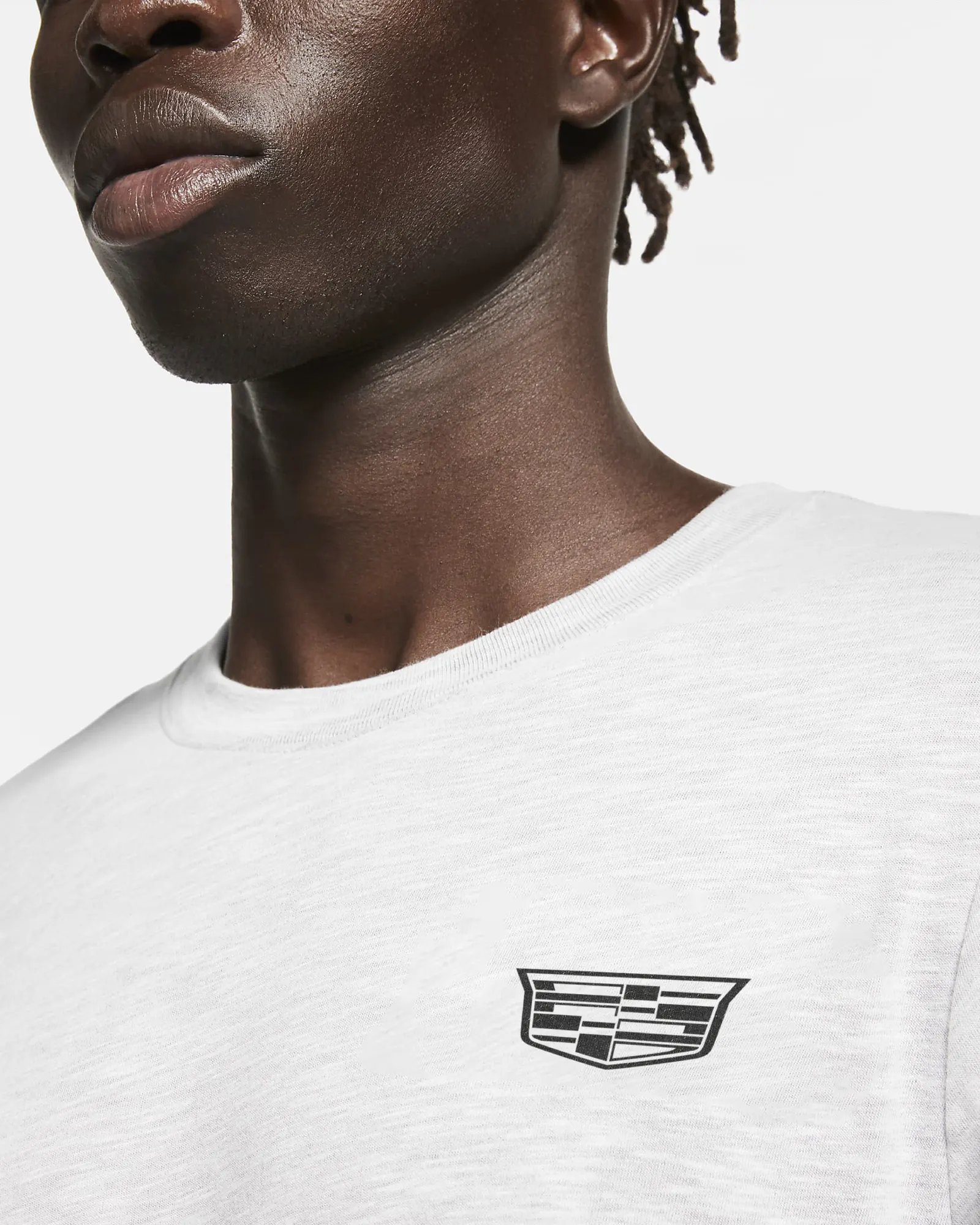
The studio redrew the crest from the family arms of Antoine de la Mothe Cadillac, simplifying it for screens and echoing the illuminated badge on the newest vehicles. Working with Colophon Foundry, it built Cadillac Gothic, a bespoke type family modeled on the width and presence of the cars. The blue, red, and gold palette now appears in flat and gradient forms, and a Precision Pattern drawn from vehicle design and architecture extends the crest across layouts. Photography places cars in open evening landscapes tinted in brand colors, with close detail shots for contrast.
Why it works
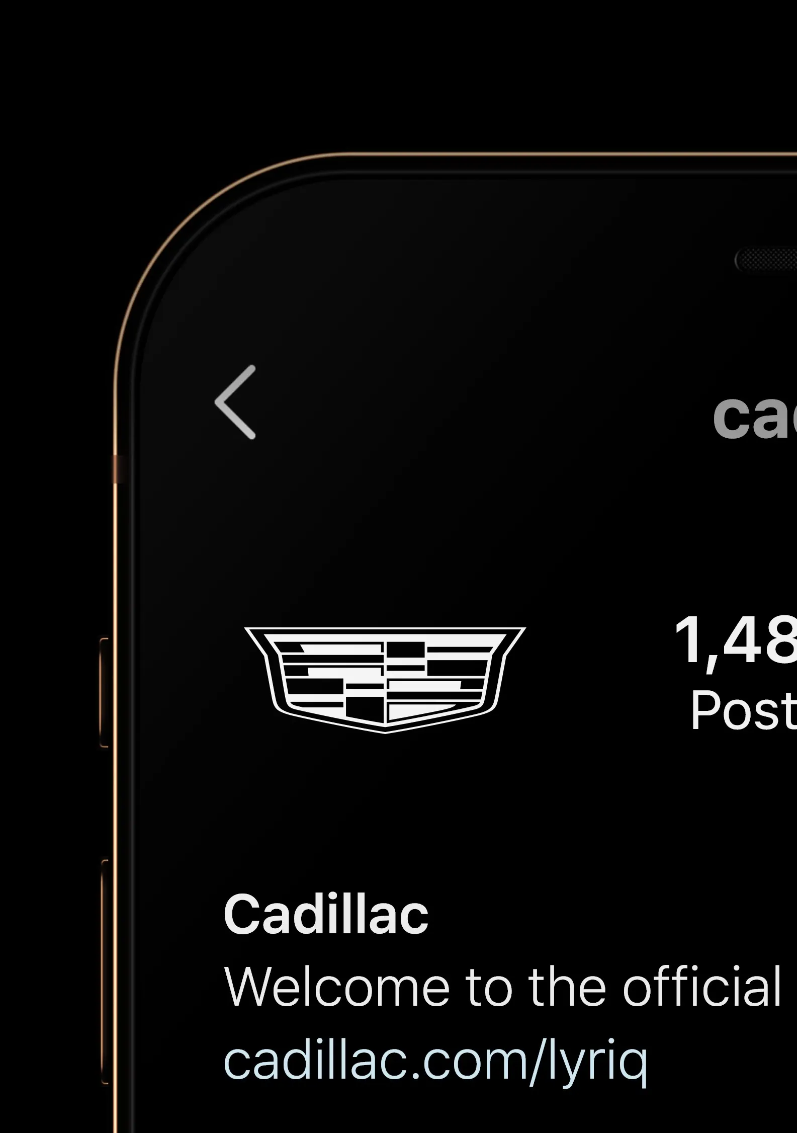
The strength here is how closely the identity follows the product. A crest that can be lit on a car and still read on a phone makes the badge and the brand feel like one object. The wide, custom typeface gives the name the same low, planted stance as the vehicles, and it is ownable in a category full of similar sans serifs. Most of all, tinting the landscapes in the brand palette turns color into a recognizable signature, even without a logo in the frame.
Applications
Logo
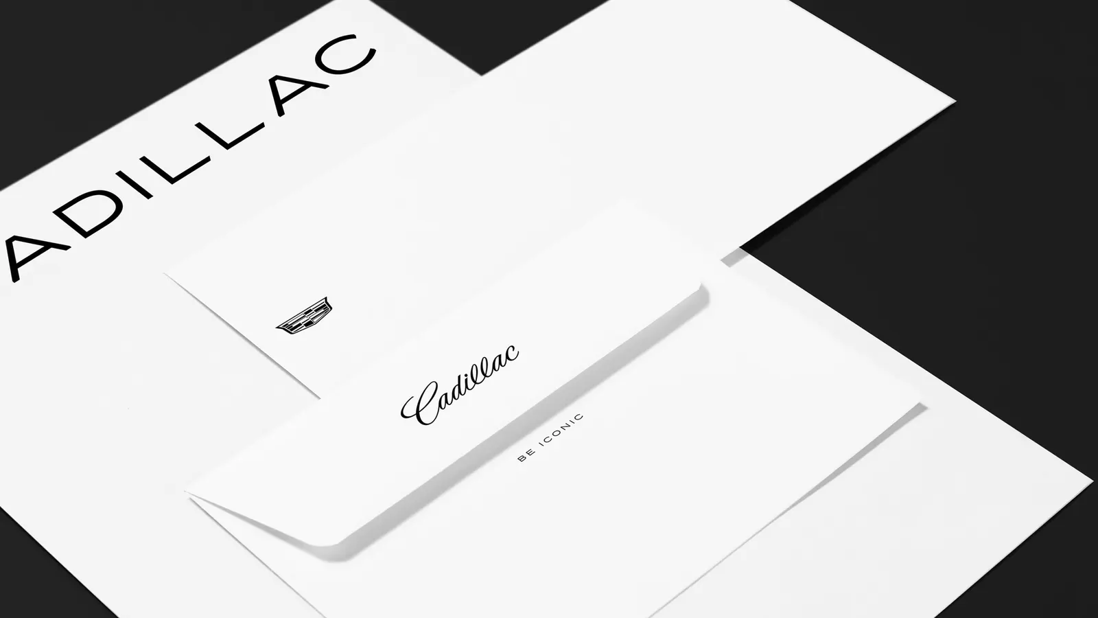
Images and video from motherdesign.com, by Mother Design.