The Brand Monograph
The Rampant Club brand identity by M — N Associates
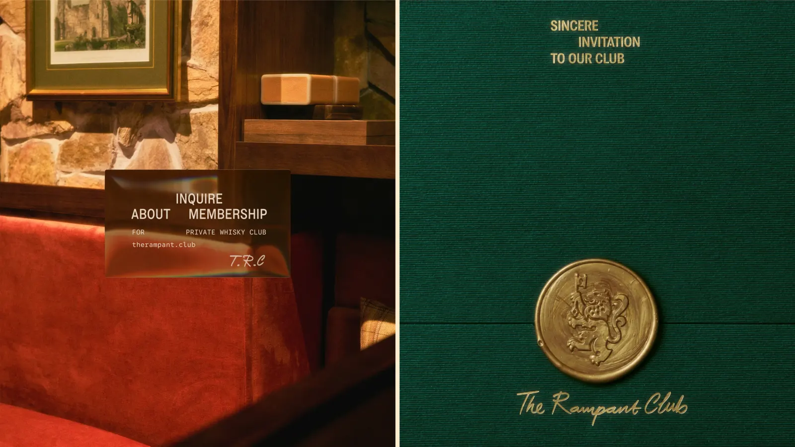
↗M — N Associates has given The Rampant Club, a referral-only whisky society in Ho Chi Minh City, an identity that treats Scottish heraldry as a working toolkit rather than a costume. The club was born from a Scottish whisky house, and the studio's task was to make that lineage feel natural in a Vietnamese city, across a five-floor clubhouse and its digital presence.
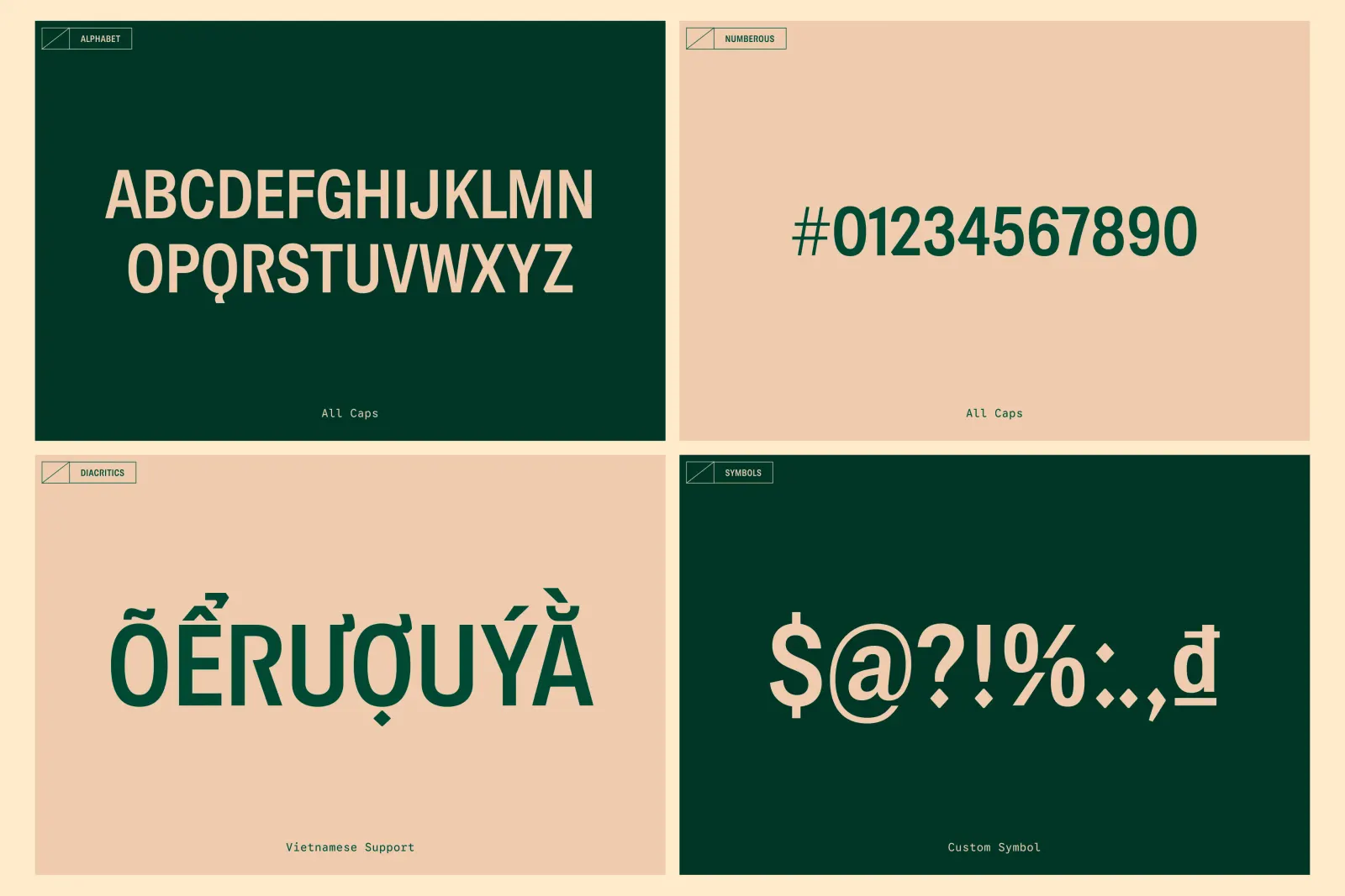
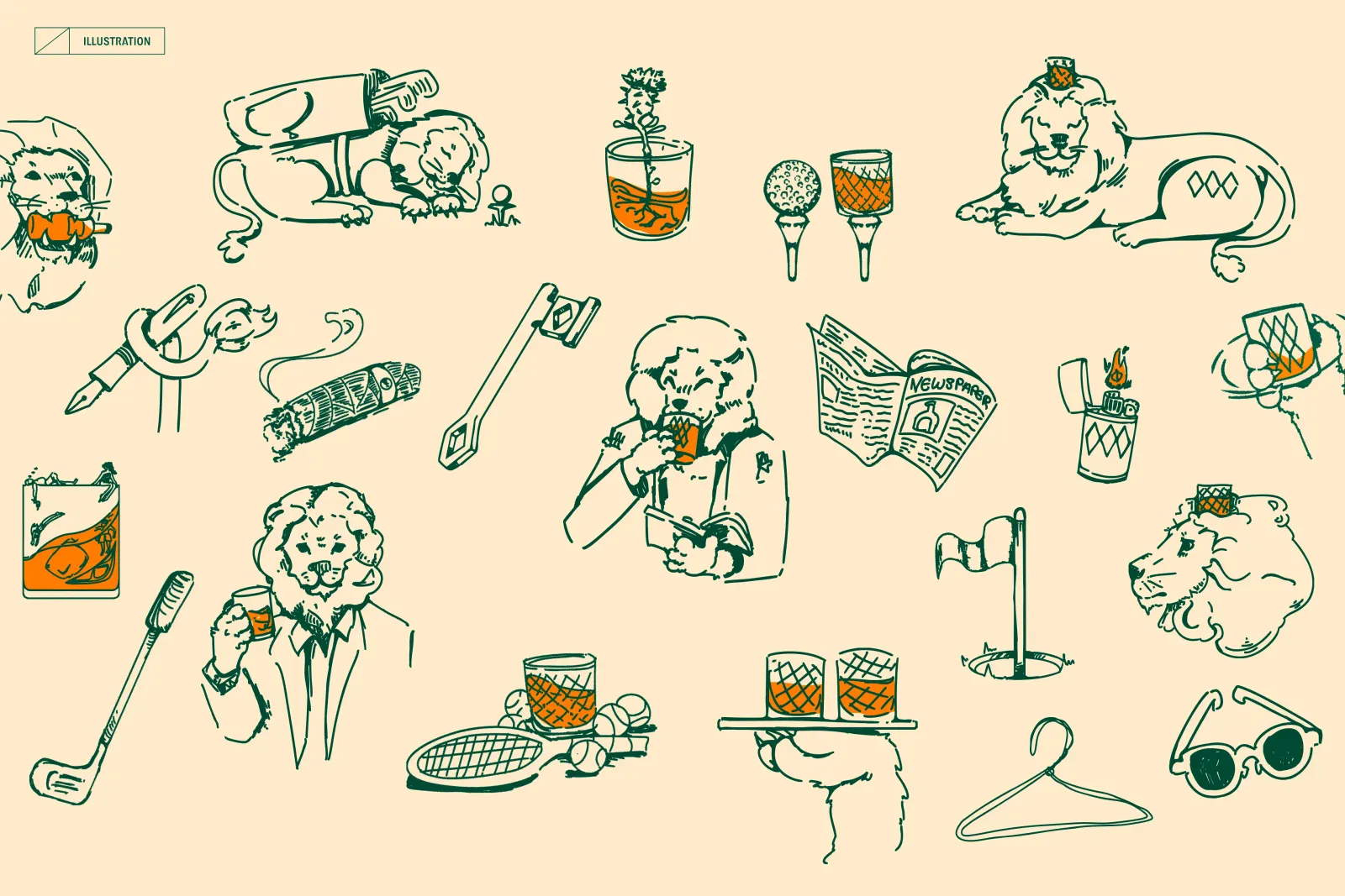
The Lion Rampant keeps its upright stance, but the mane now nods to bagpipes, and the tail and triangular details borrow from the Duncan Taylor Whisky mark. A custom typeface, MN Rampant Sans, turns pieces of the lion into letterforms and supports Vietnamese diacritics. Layouts draw on old Scottish newspapers, with wide margins and plenty of white space. Painter Amanda Moeller's illustrations add orange and recurring diamonds, and Khôi Nguyễn contributed photography.
Why it works
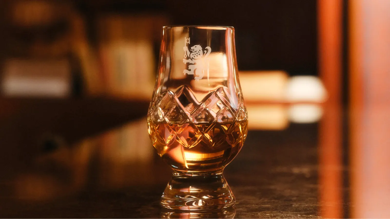
Whisky branding often leans on the same tartan, stag, and oak shorthand. Here, nearly every reference comes from the drink or the house behind it, so the heritage feels earned rather than borrowed. The diamond pattern is a good example: it comes from the glass members actually hold, so it works as both ornament and object. Full diacritic support tells Vietnamese members the club is theirs, not an import. The restrained newspaper layouts suit a private club, and the orange keeps that restraint from turning stiff.
Applications
Logo
Typography
Images and video from m-n.associates, by M — N Associates.