The Brand Monograph
Crux brand identity by Order
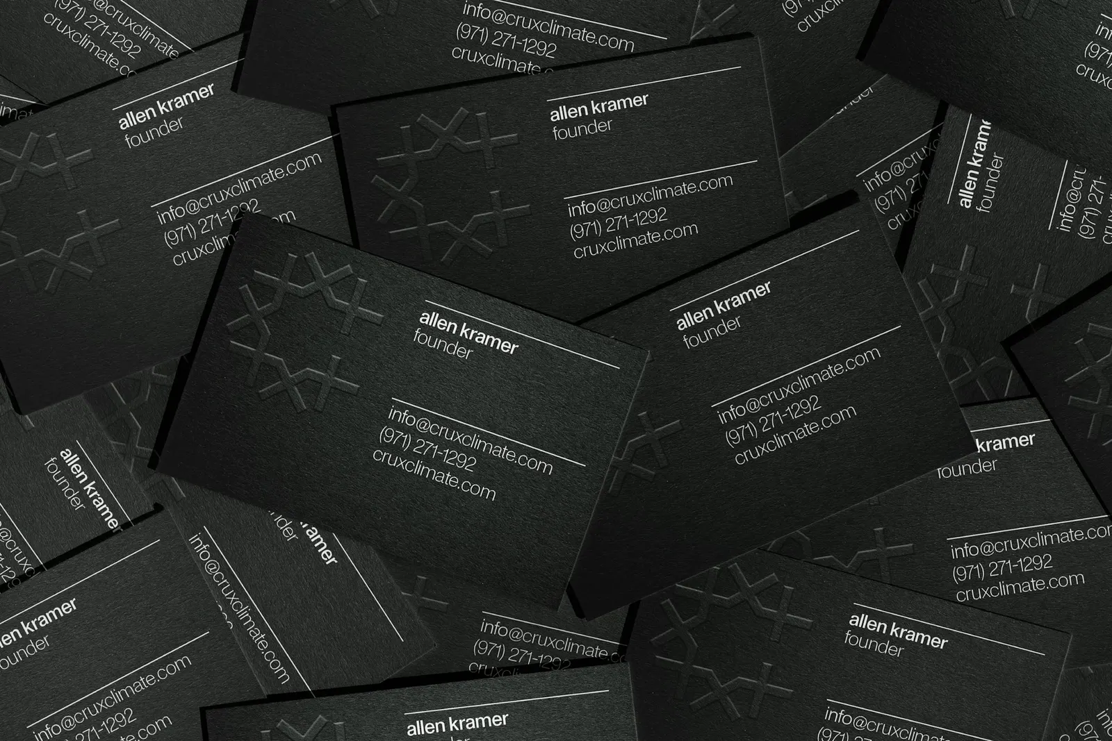
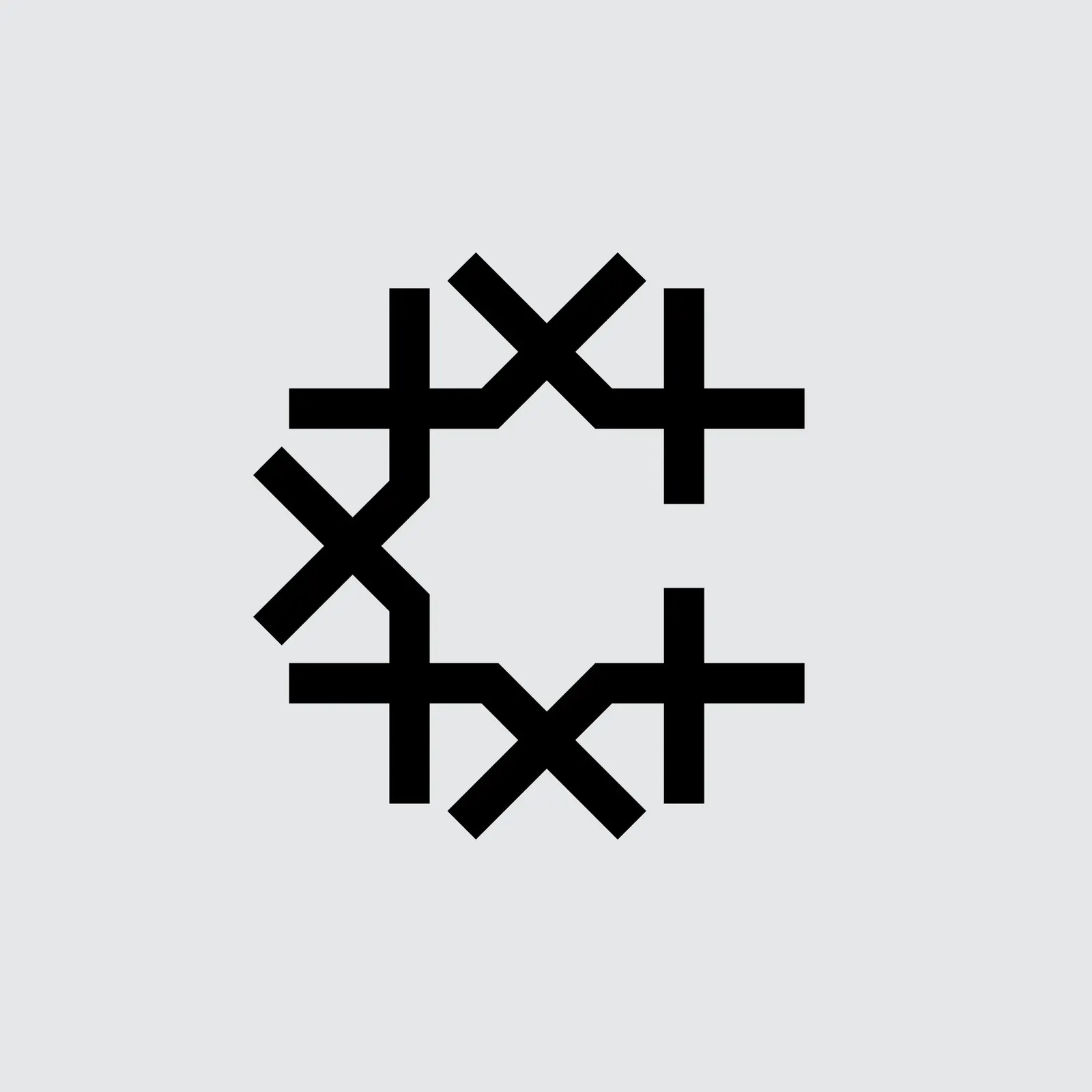
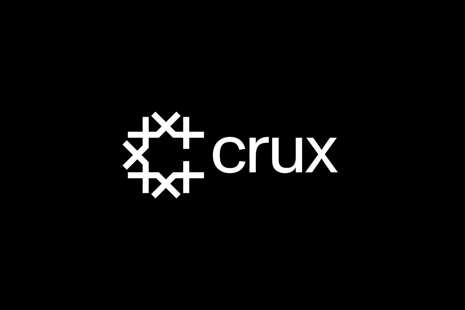
↗Most fintech identities borrow the same vocabulary of gradients, arrows, and abstract shapes. Order took Crux somewhere more grounded. The platform lets developers, tax credit buyers, and financial institutions trade and manage transferable credits tied to clean energy projects, and the studio gave it a symbol drawn from the waterwheel, an old machine for turning moving water into power.
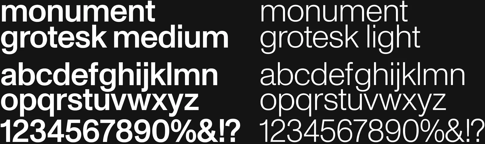
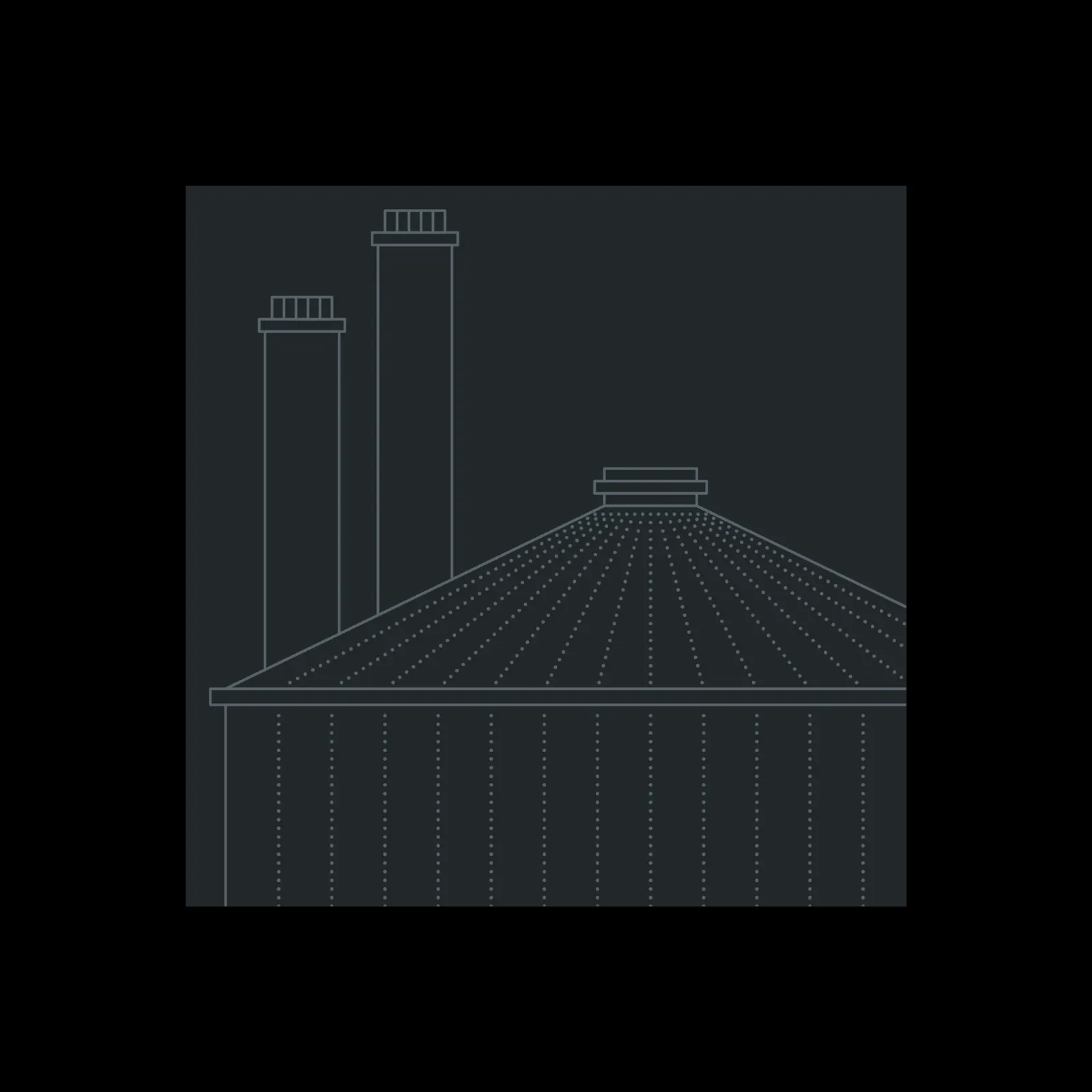
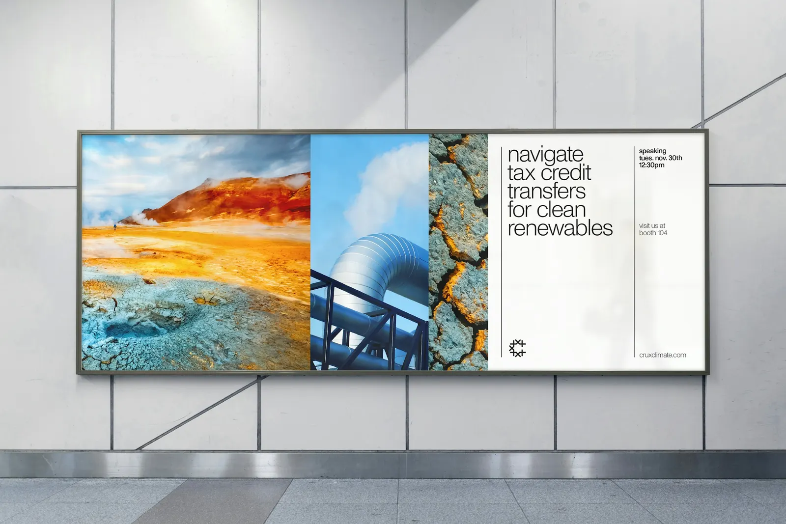
The typography stays plain, with Monument Grotesk from Dinamo as the supporting face. Where most platforms would commission an icon set, the studio used photography in motion to represent each energy category, then added drawn diagrams that carry the linework through the system. Black and white anchor everything, and brighter colors are saved for infographics and interface components. Emily Klaebe worked on design and Jesse Reed on strategy, and the guidelines were built for interactive use in Standards.
Why it works
Tax credit markets are complex, and the identity doesn't try to decorate that complexity. The waterwheel gives Crux a believable origin story in a category full of generic marks, and its geometry is simple enough to hold up at small sizes. Keeping the core palette monochrome lets the brighter colors work as information rather than ornament, which suits charts and dashboards. Photography in motion makes abstract energy categories feel physical, and it still looks serious enough for financial institutions.
Applications
Logo
Typography
Color



Images and video from order.design, by Order.