The Brand Monograph
Mindful Chef brand identity by Ragged Edge
↗Few challenger brands keep their core assets intact for a decade, and fewer still carry them through an acquisition. Mindful Chef did, with a signature and a deep aubergine purple that Ragged Edge created before the company had shipped a single box.
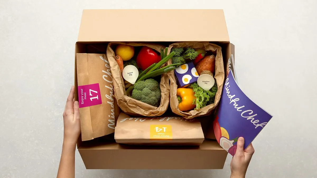
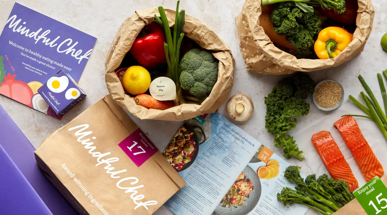
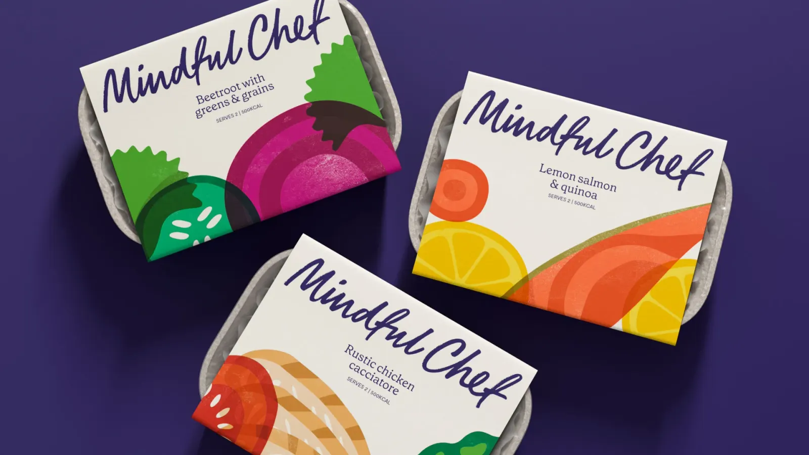
The studio started work with the founders in 2015, when the brief was to make healthy eating easy in a category led by much bigger players. Instead of competing on speed, Ragged Edge built the brand around provenance and balance, and designed a box meant to be noticed the moment it lands at the door. Rob Clarke contributed typography. In 2021, the studio returned to keep the signature and color front and center while rebuilding the supporting system to stretch from the digital product to printed recipe cards. Ragged Edge stayed involved through Nestlé's majority investment in 2022.
Why it works
The strength here is restraint. A personal signature gives a logistics-heavy business a human voice, and a single saturated color makes the box easy to spot among other deliveries and easy to remember. Because those two assets stay fixed, everything around them can flex. The 2021 system could grow with the business without the brand ever looking like a different company.
Applications
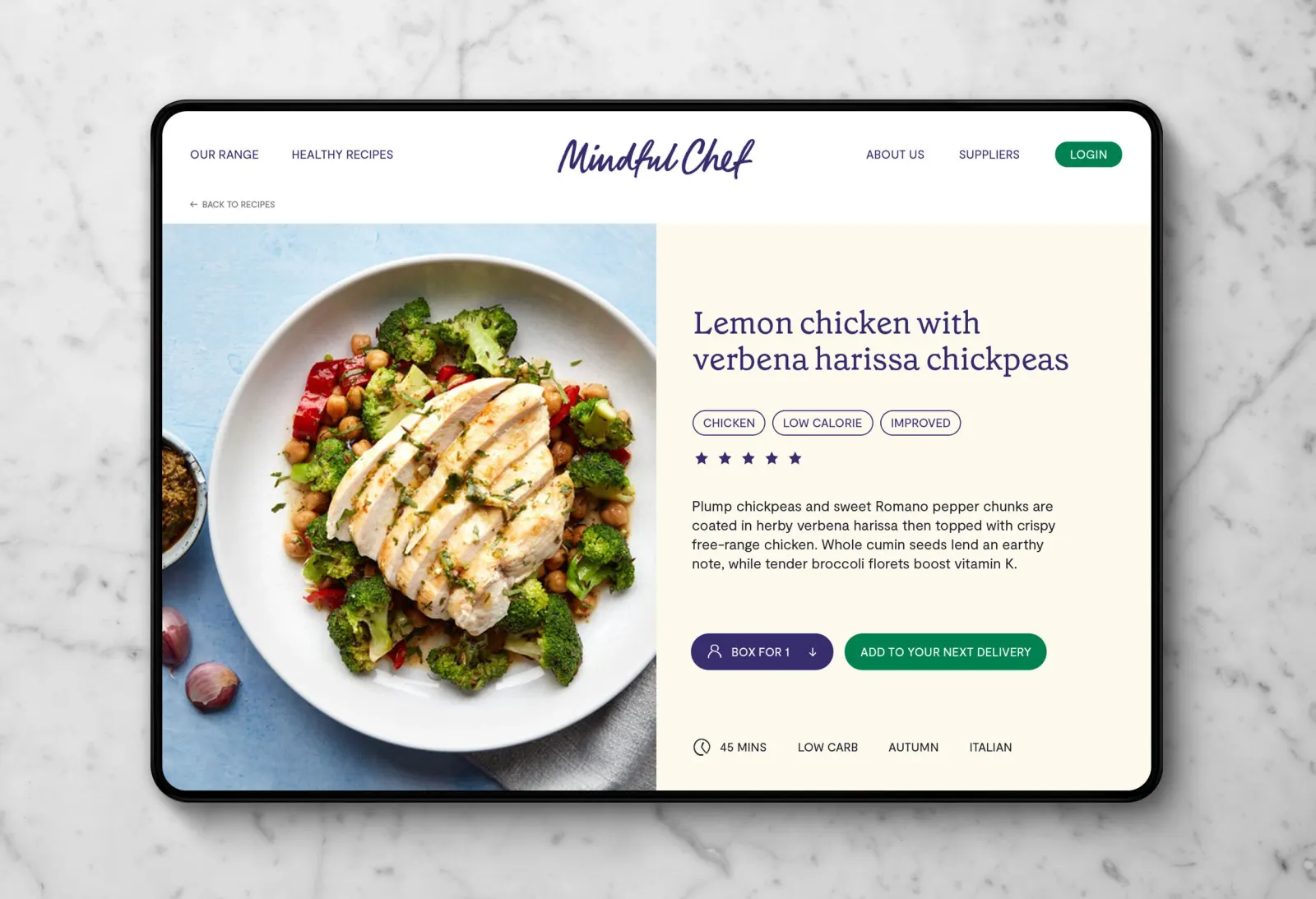
Images and video from raggededge.com, by Ragged Edge.