The Brand Monograph
Gustini brand identity by Koto
↗Koto's work for Gustini shows how a food retailer can feel like a place you want to be, not just a shop you order from. The German D2C business buys directly from producers in Italy, but with rivals multiplying, a dated identity, and a customer base that skewed older, it needed a reason for new people to care.
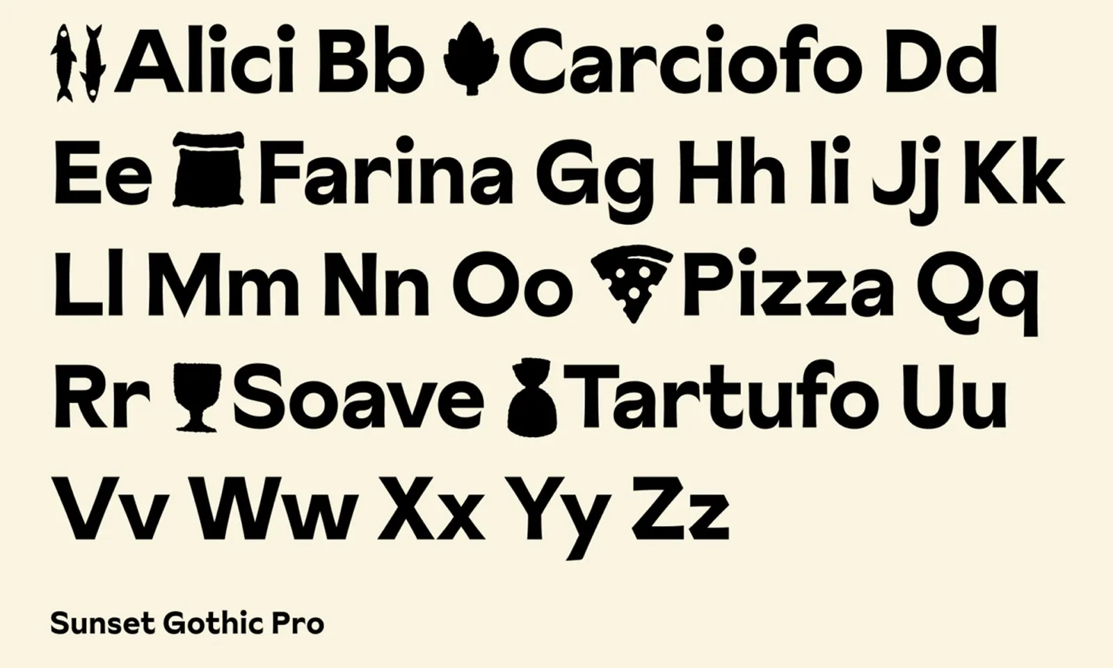
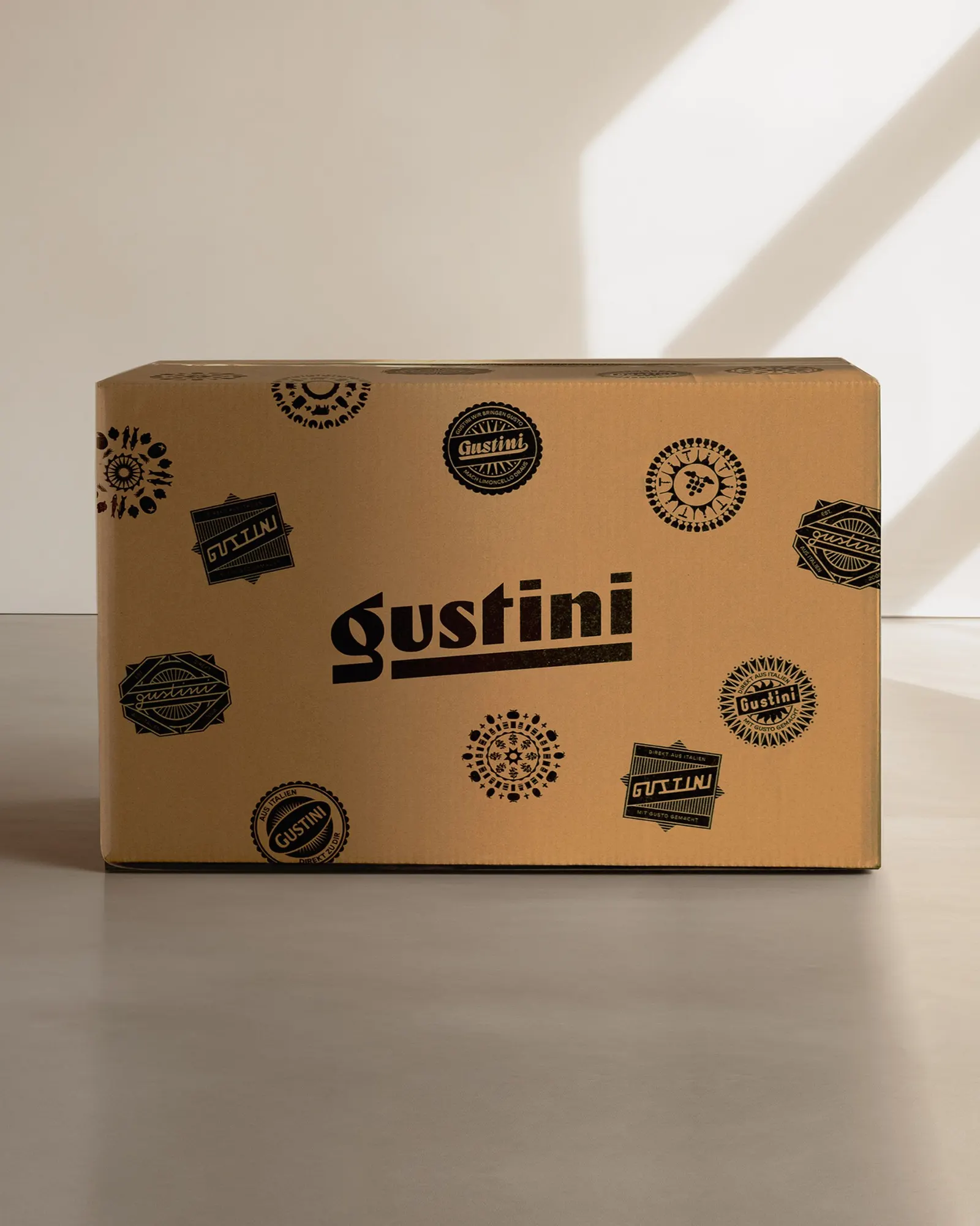
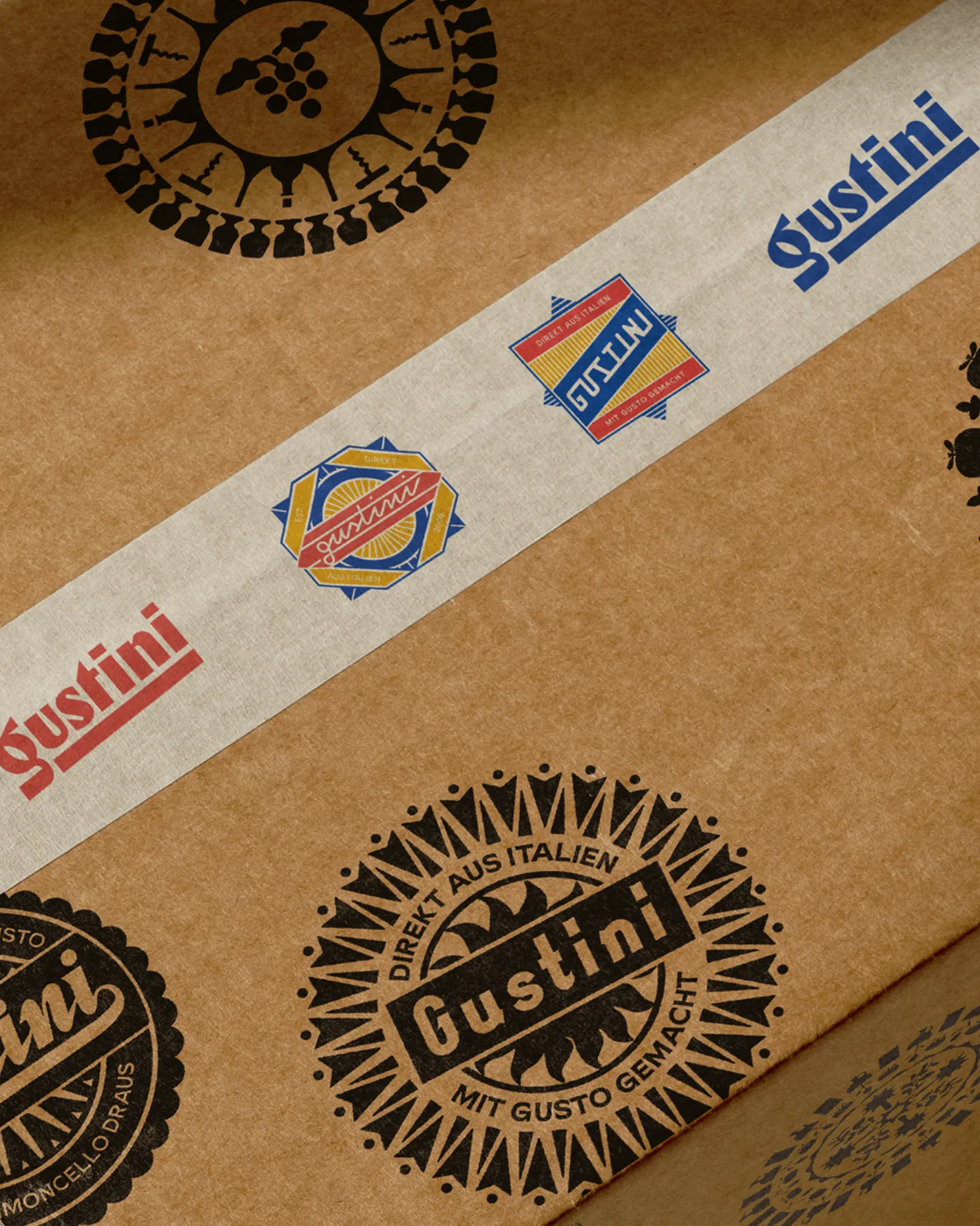
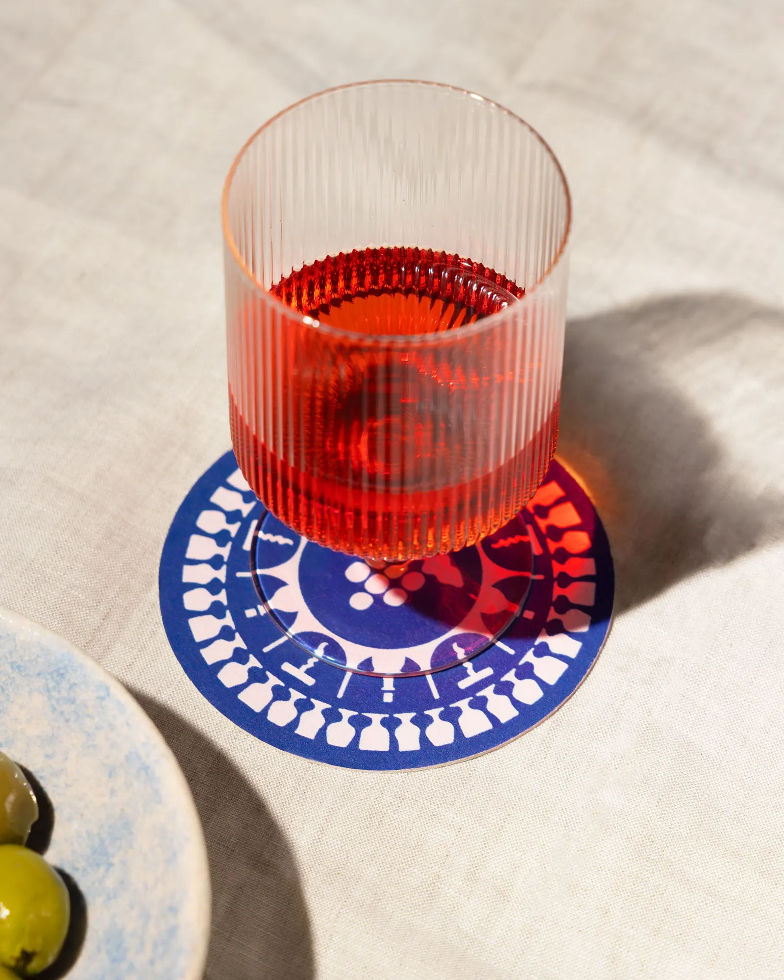
Koto found it in the team's enthusiasm for Italian food and the makers behind it. The brand idea, The Good Life, puts those producers' stories alongside the mood of long lunches and sunshine. The visual system borrows from classic fruit tissue wrappers, a nod to craft set in a contemporary frame, with Leo Field handling typography. A relaxed verbal voice runs through a rebuilt website and refreshed packaging and print, where small playful touches reward a closer look.
Why it works
The wrapper reference is the smartest move here. It's a cue people already associate with Italian produce, so it signals provenance without leaning on clichés like flags or checked tablecloths, and it makes packaging feel like part of the product's story. Pairing that heritage with a modern site and a casual voice keeps the brand approachable rather than precious, which matters when courting younger shoppers. And because the idea is built on a mood instead of a product list, Gustini can stretch across categories while still sounding like itself.
Applications
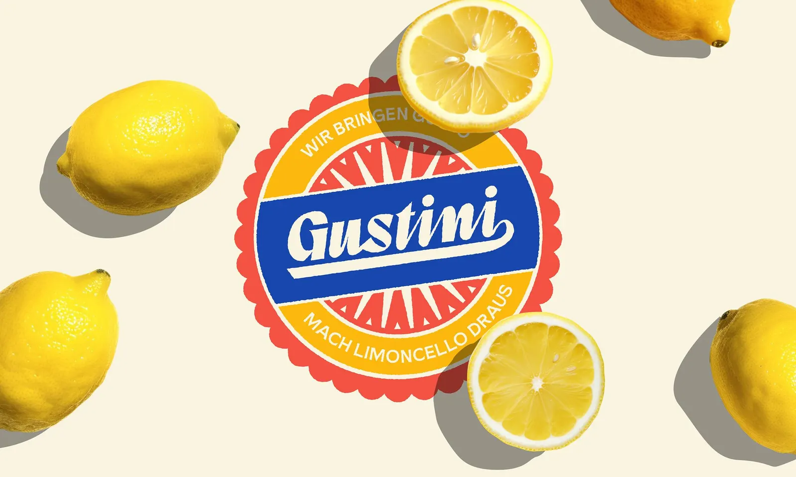
Logo
Typography
Images and video from koto.com, by Koto.