The Brand Monograph
Notion brand identity by Order
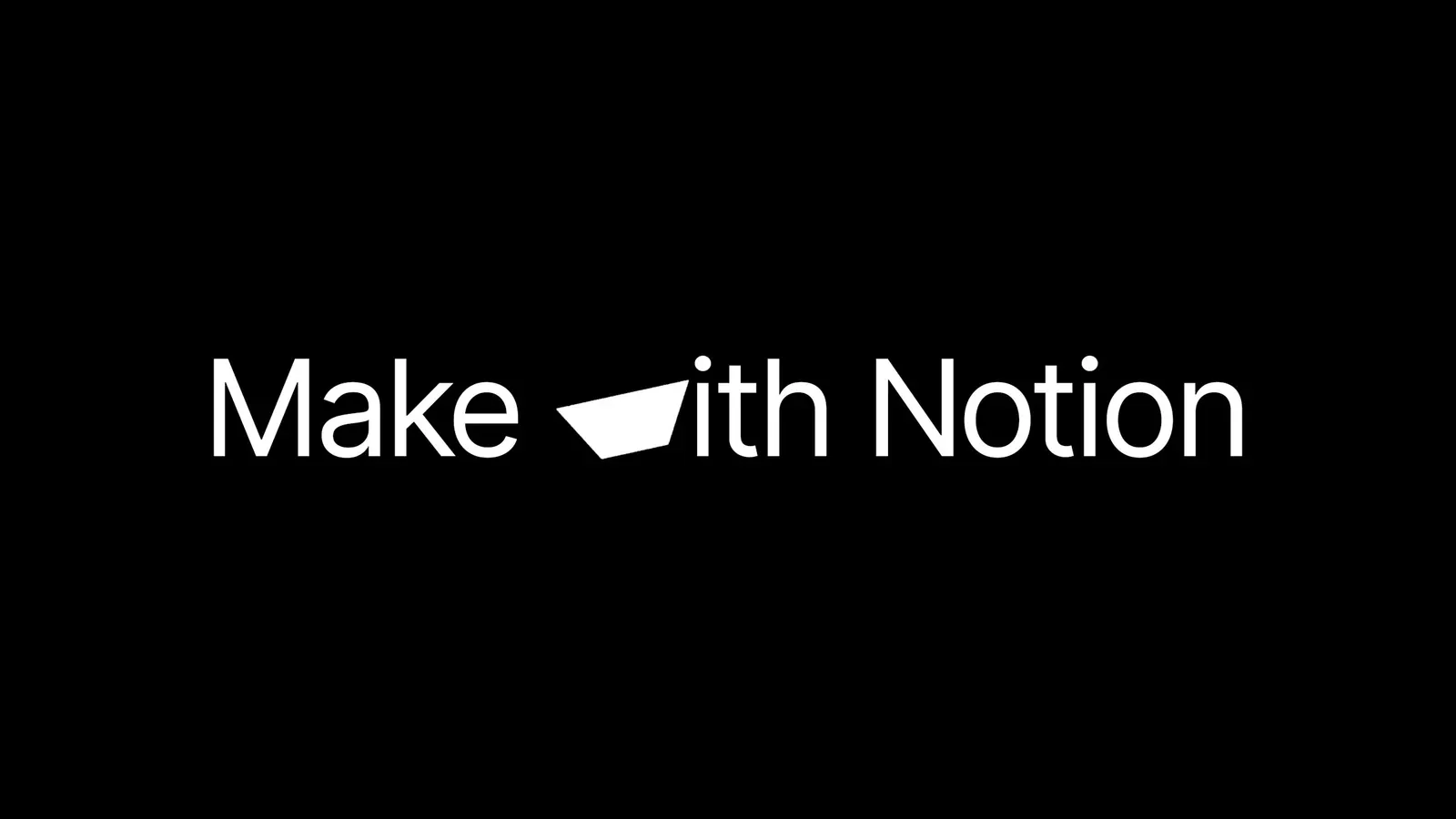
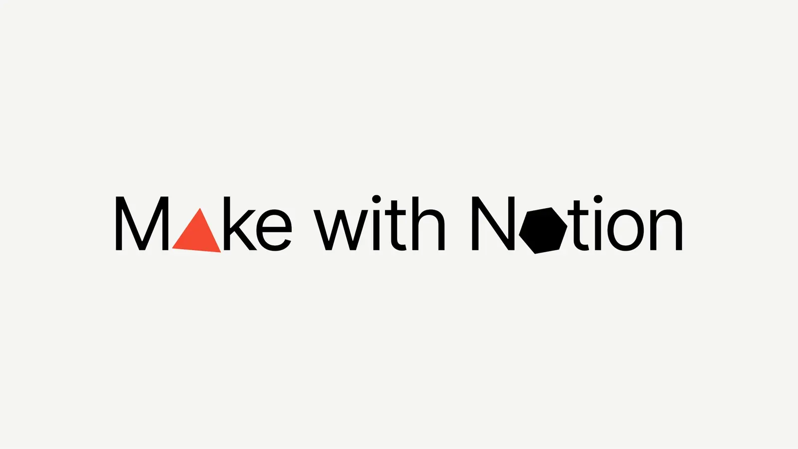
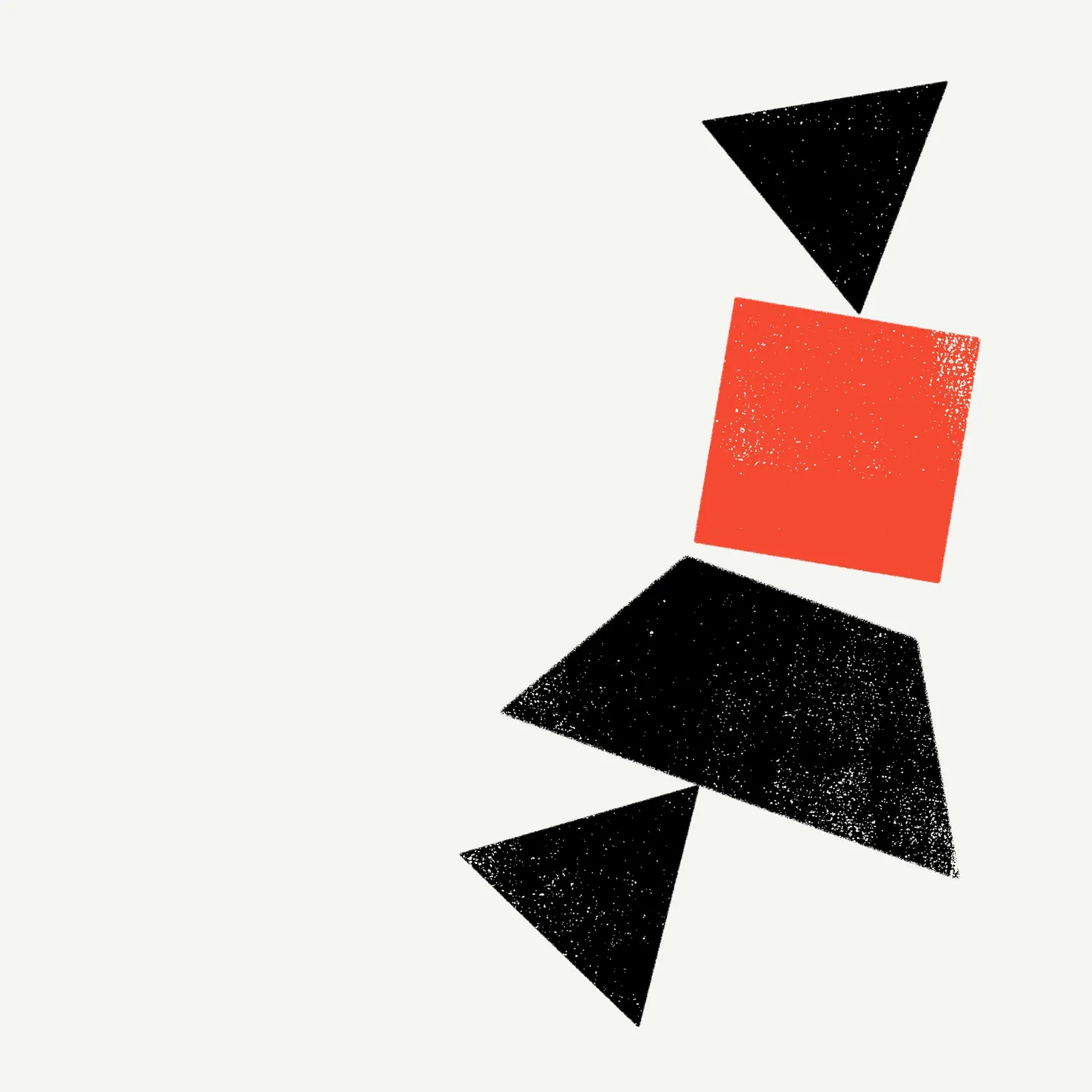
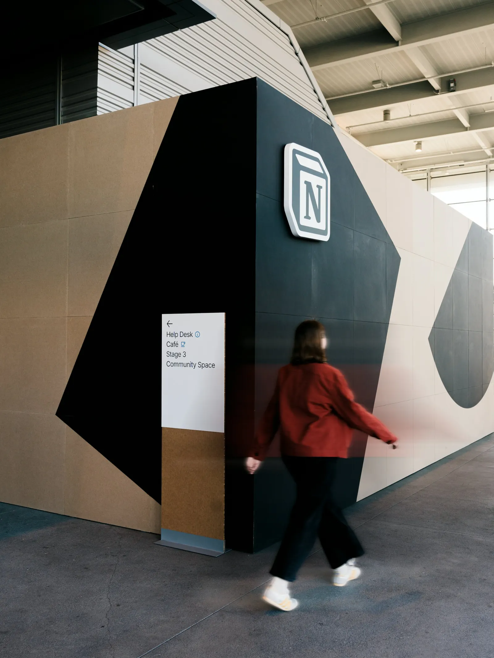
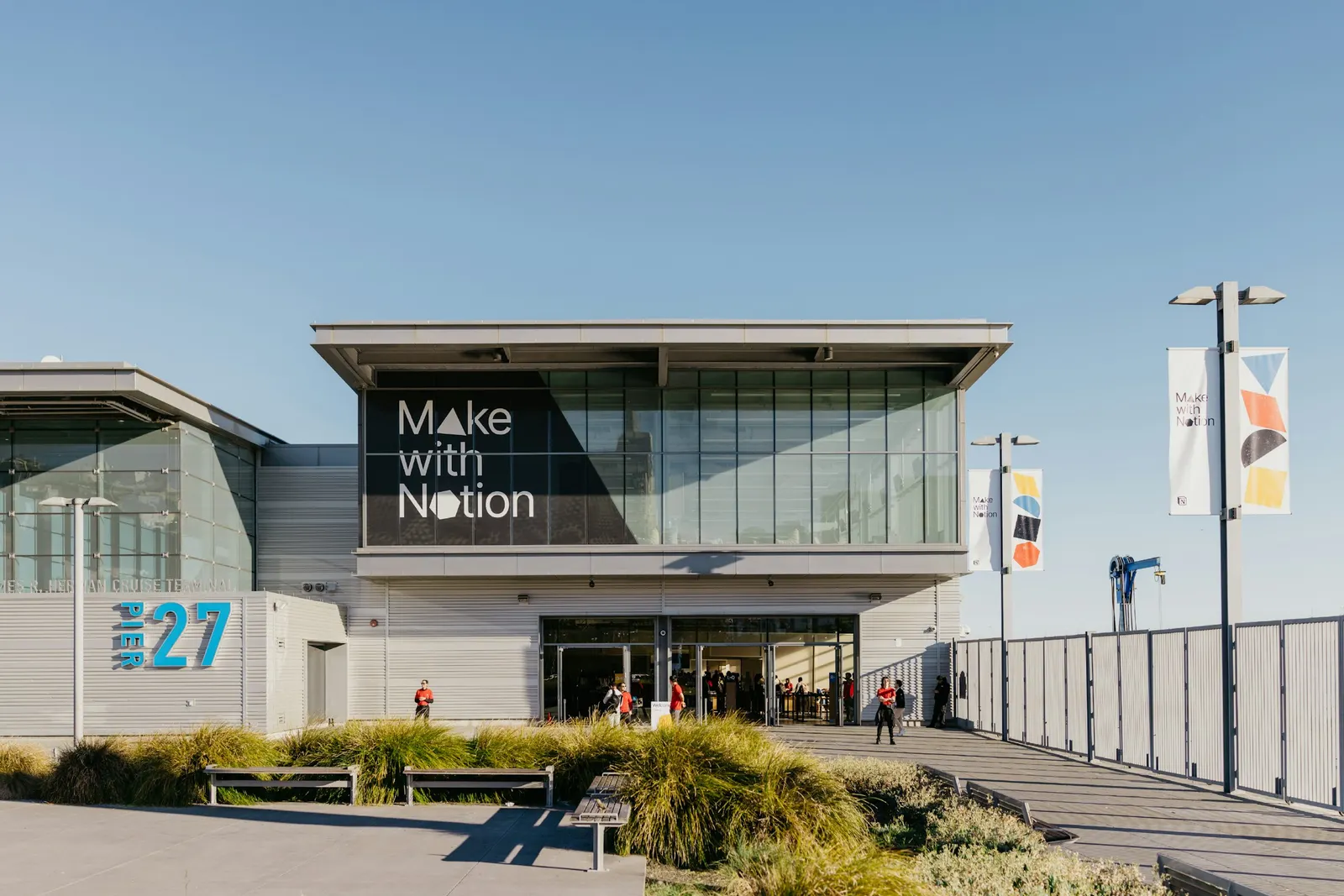
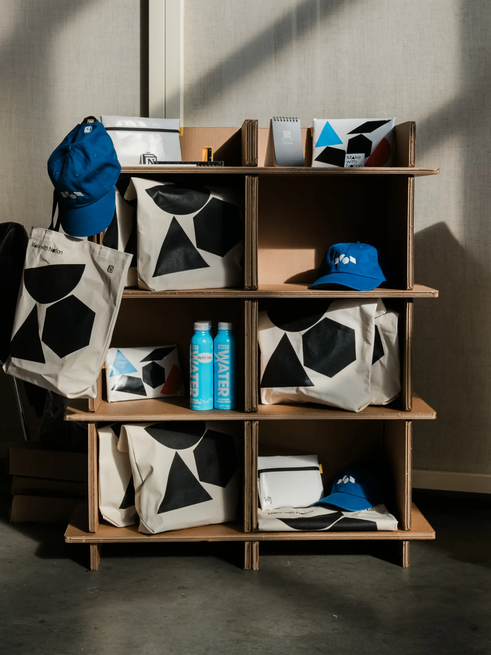
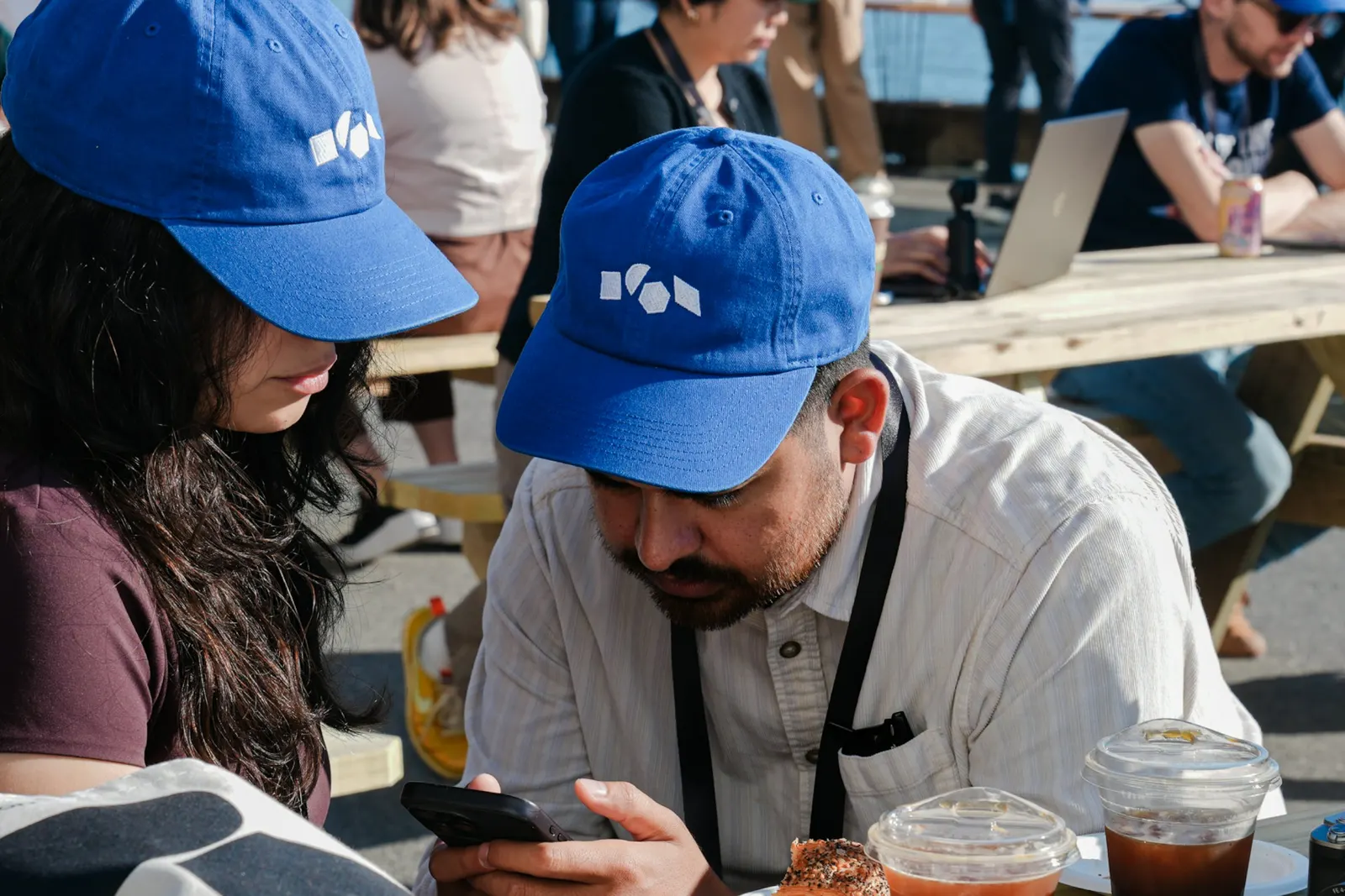
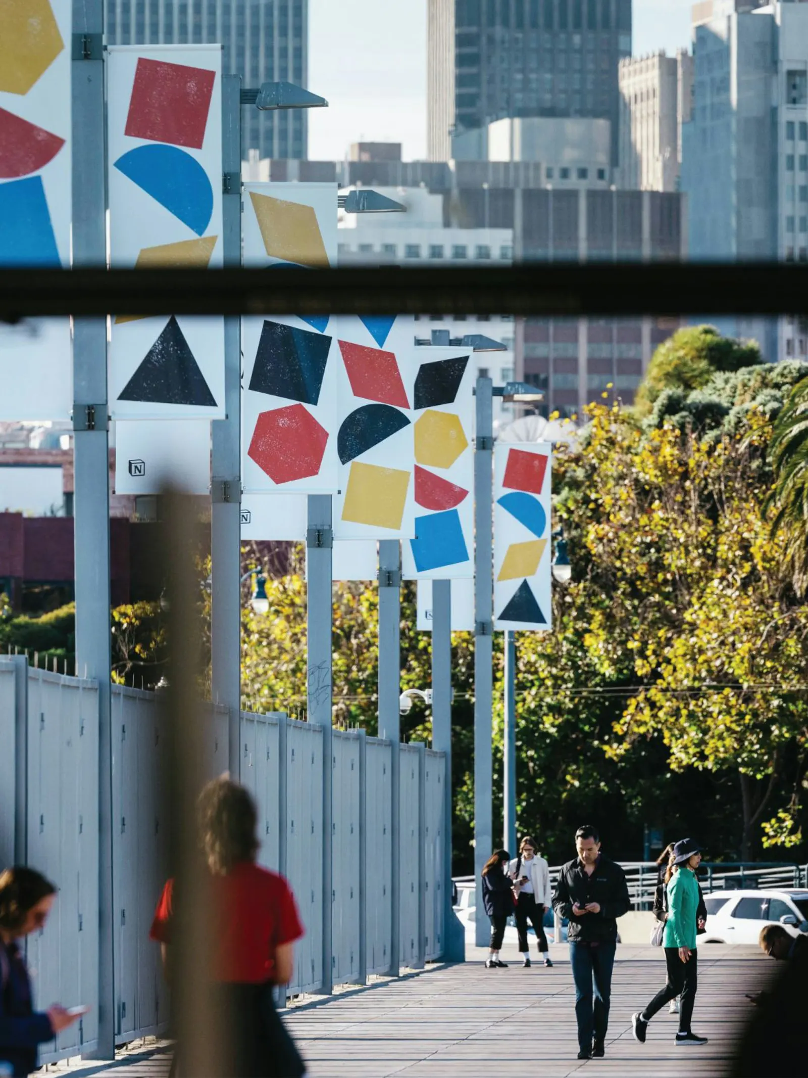
↗Order turned the Notion block into a kit of parts that an entire conference could be built from. For Make with Notion, the company's first in-person event, held at Pier 27 in San Francisco, the studio designed a library of interlocking shapes, then used them as letters, icons, patterns, and illustrations.
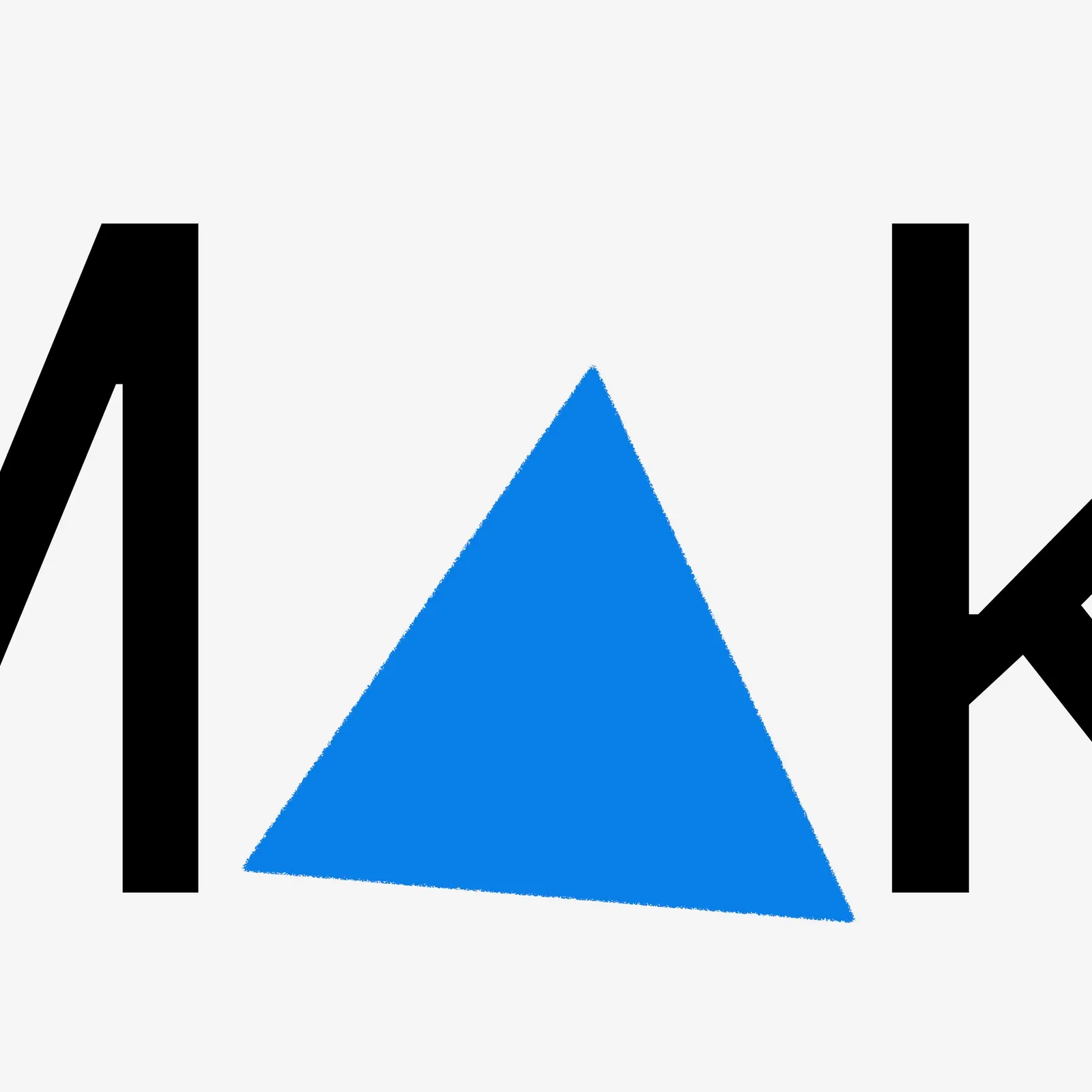
The challenge was giving a software company's live debut its own identity while staying close to the parent brand. Order swapped shapes into the wordmark to create a family of logos that still reads clearly, kept Inter for type, drew on primary colors, and added a custom block alphabet. Motion follows the same logic, with elements building themselves on and off. Working with Design, Bitches and Garrett Corcoran on design, Jesse Reed on strategy, and Seen Design on production, the studio also wrote guidelines so Notion's in-house team could run the system, which later traveled to five more cities.
Why it works
Notion's product is modular, and this identity makes that logic visible instead of illustrating it. Letting shapes replace letters in the wordmark gives the event variety without losing the name, which is the right trade for a debut. Inter and primary colors keep it recognizably Notion, so the shapes carry the new energy. And because the system is a set of parts rather than a fixed look, a small in-house team can extend it across cities without it going stale.
Logo
Typography
Applications
Images and video from order.design, by Order.