The Brand Monograph
Vevo brand identity by Porto Rocha
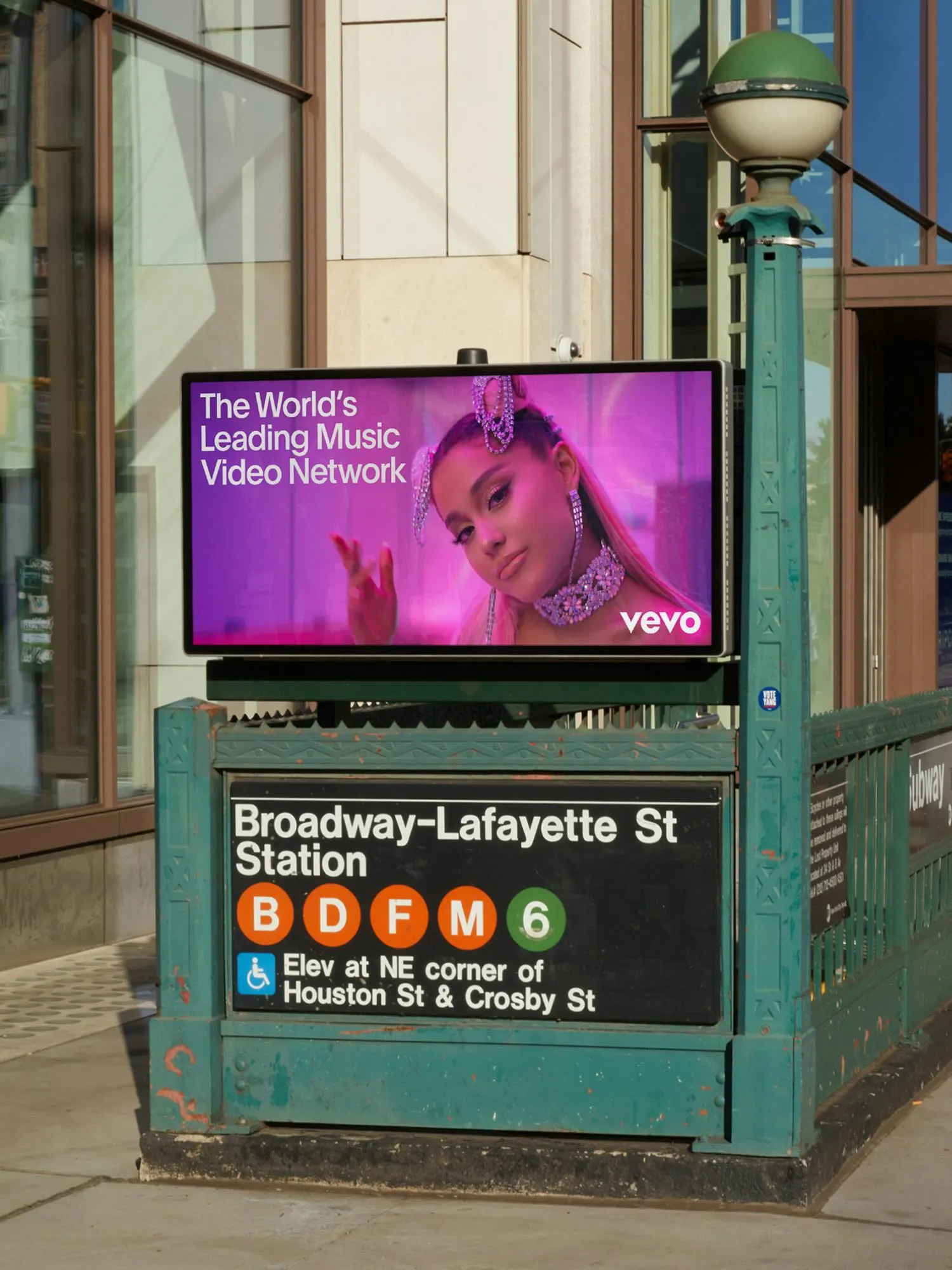
↗Most people have seen the Vevo logo without really looking at it. It sits in the corner of music videos, which is the problem Porto Rocha took on: a network with 26 billion monthly views and more than 500,000 videos, still read as a watermark. With strategists Bryan Wolff and Natalee Ranii-Dropcho, the studio built a new position around amplification, giving a brand that must speak to fans, advertisers, and the music industry room to be more than a stamp.
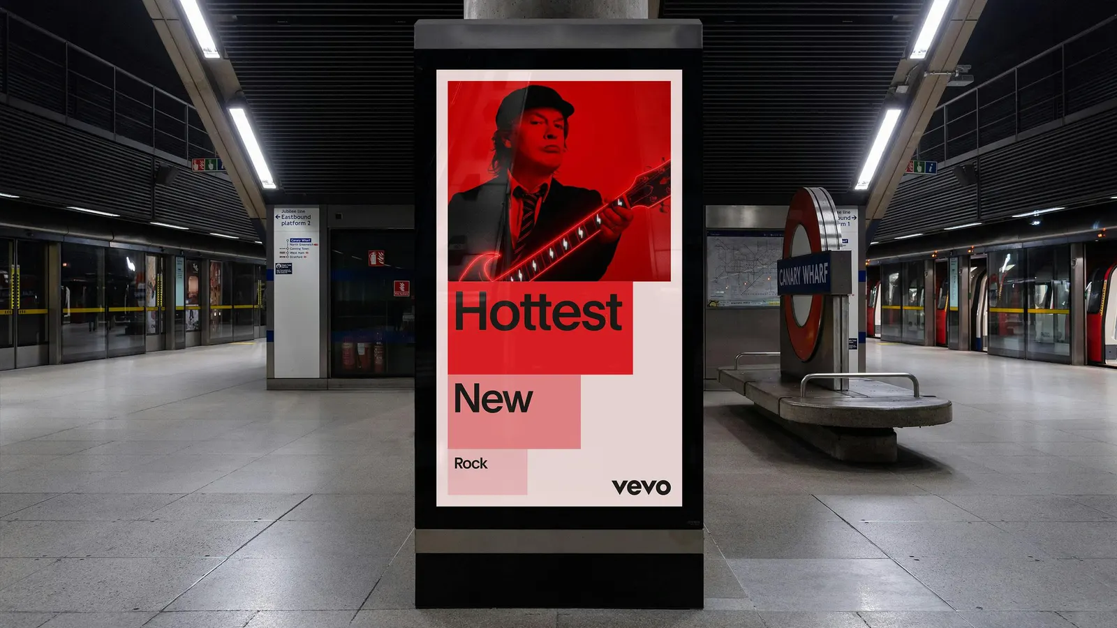
The identity runs on a scaling motion language, with Fionn Breen leading motion, and modular blocks that hold text, image, or video so artists stay the focus. Secondary colors organize information and tag genres. Plain, drawn by François Rappo for Optimo, sits alongside the geometric logo. Bruno Faiotto, Breen, Joseph Lebus, and Violet Office handled design, and Fluxo handled development.
Why it works
The smartest decision is treating the logo as something that moves rather than something that sits. Scaling turns a passive corner mark into a gesture, which suits a brand whose job is to push other people's work forward. Plain is neutral enough to stay out of the way of album art and thumbnails, and it holds up in data-heavy advertiser material. Genre colors do double duty, helping fans browse and giving the business side a clear way to organize information.
Applications
Logo
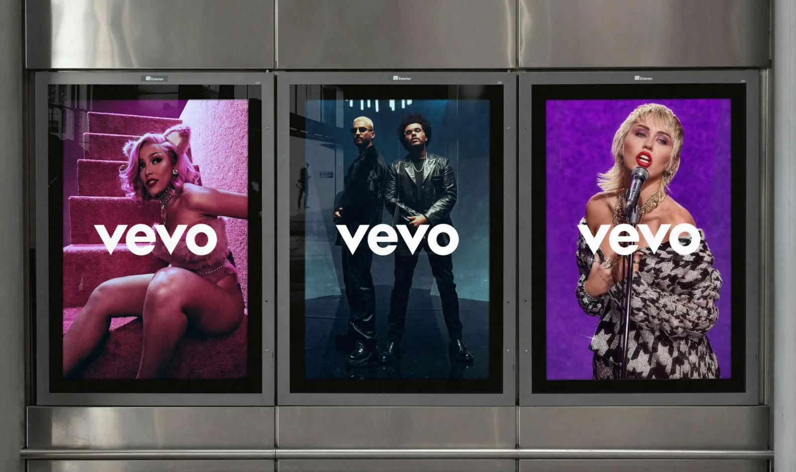
Images and video from portorocha.com, by Porto Rocha.