The Brand Monograph
PAC NYC brand identity by Porto Rocha
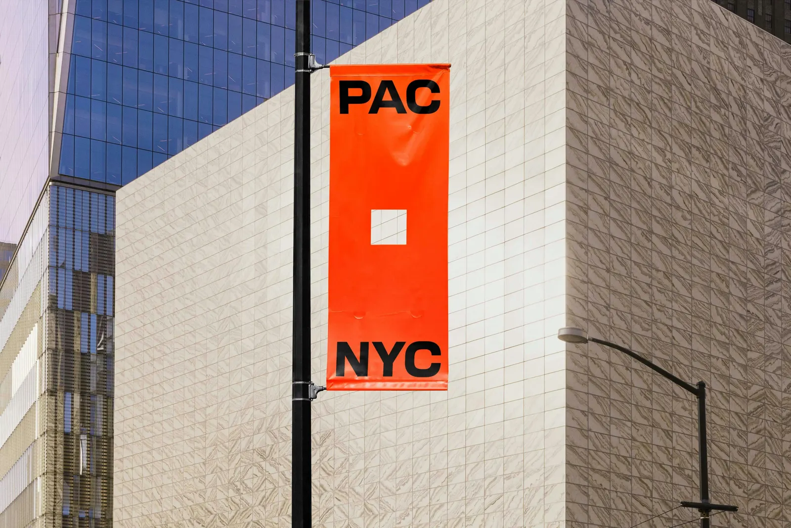
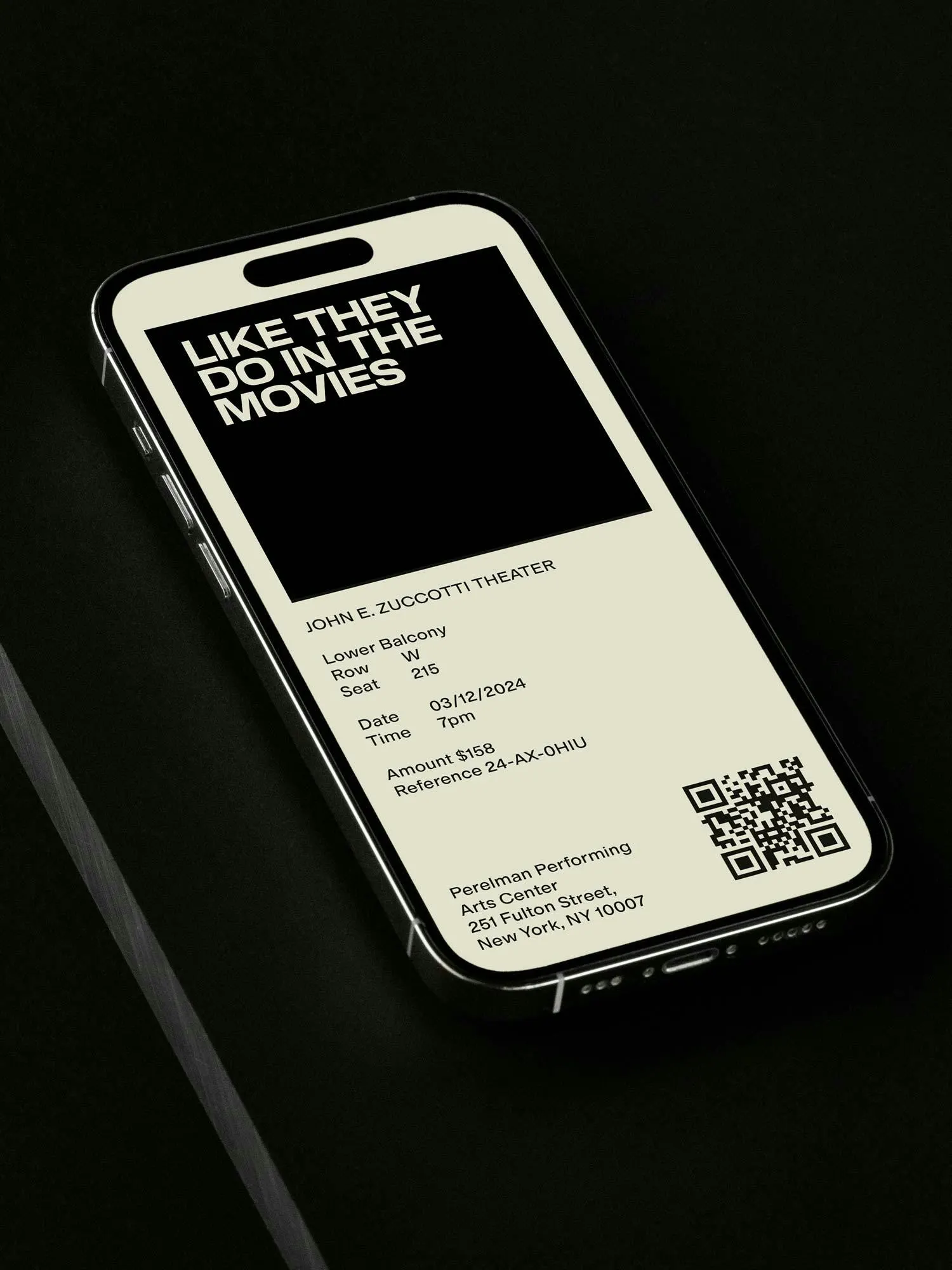
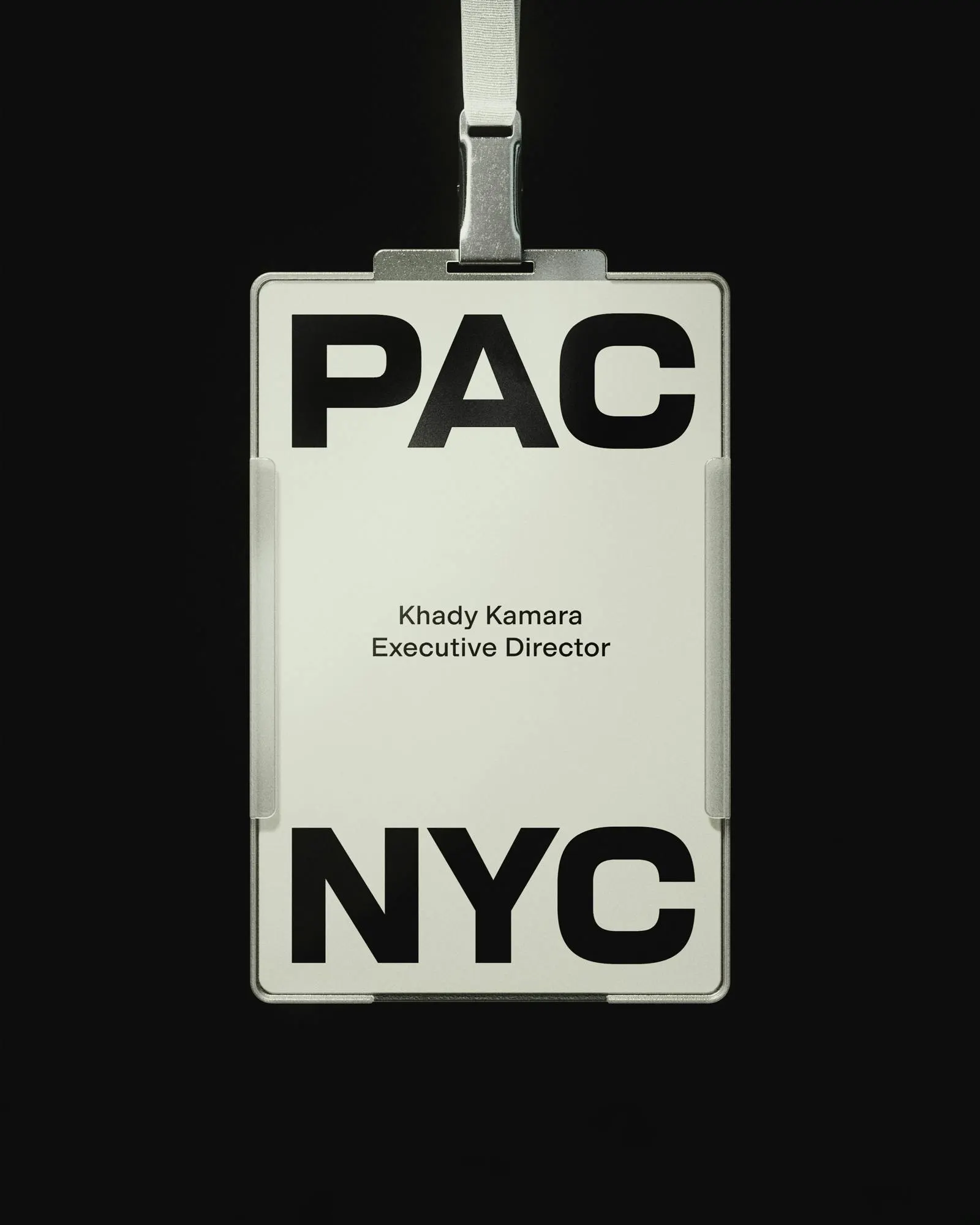
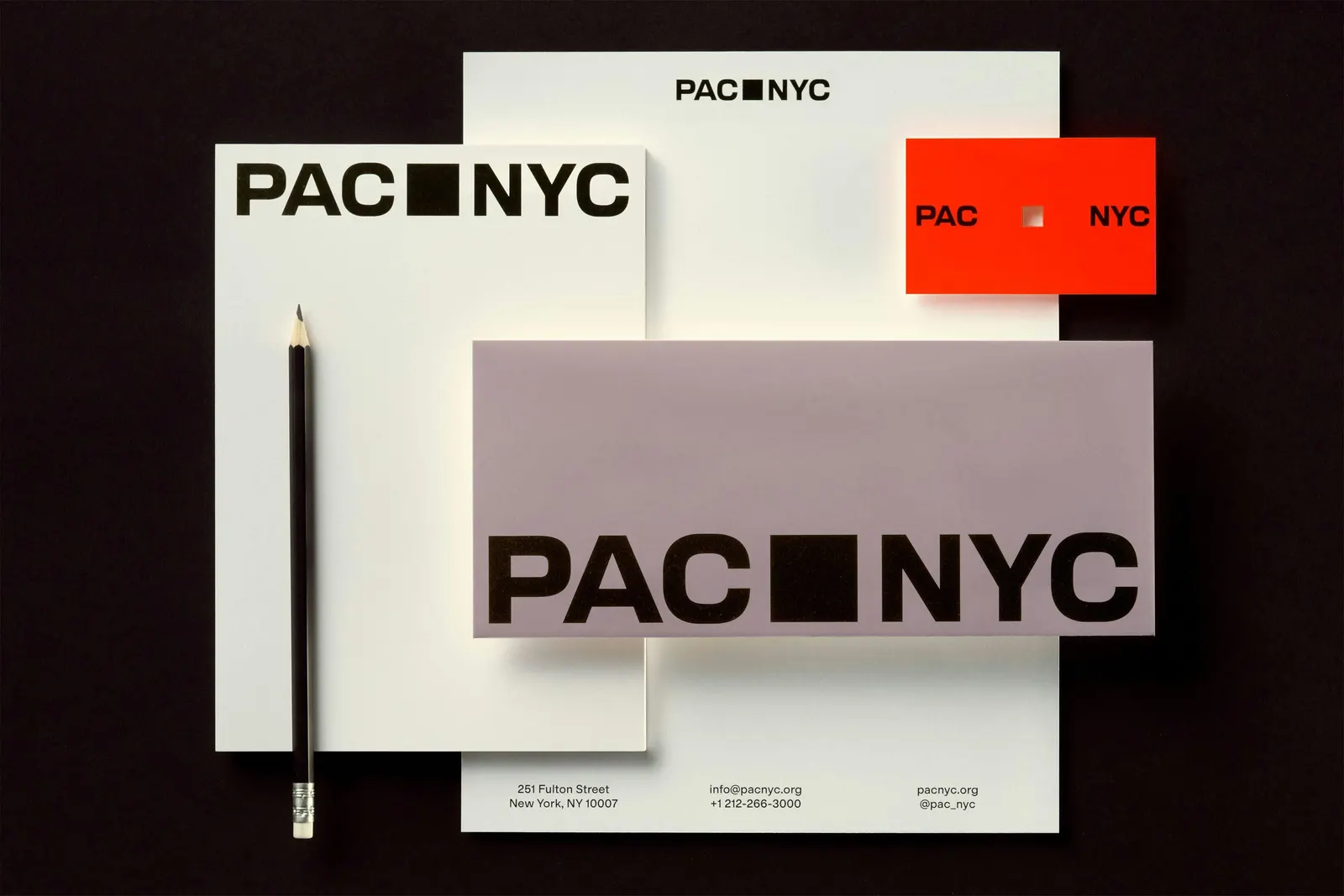
↗Porto Rocha built the identity for PAC NYC on one geometric decision, then let it do nearly all the work. The square, taken from the building itself, serves as logo, picture frame, and organizing logic for everything the center shows the public.
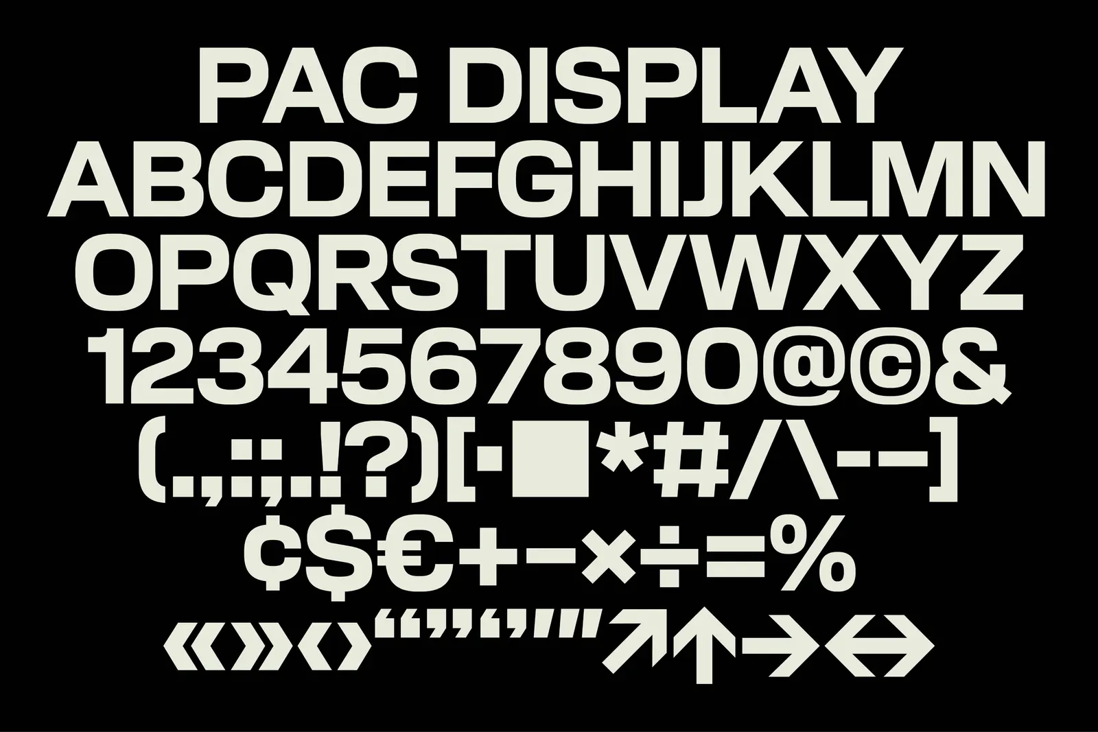
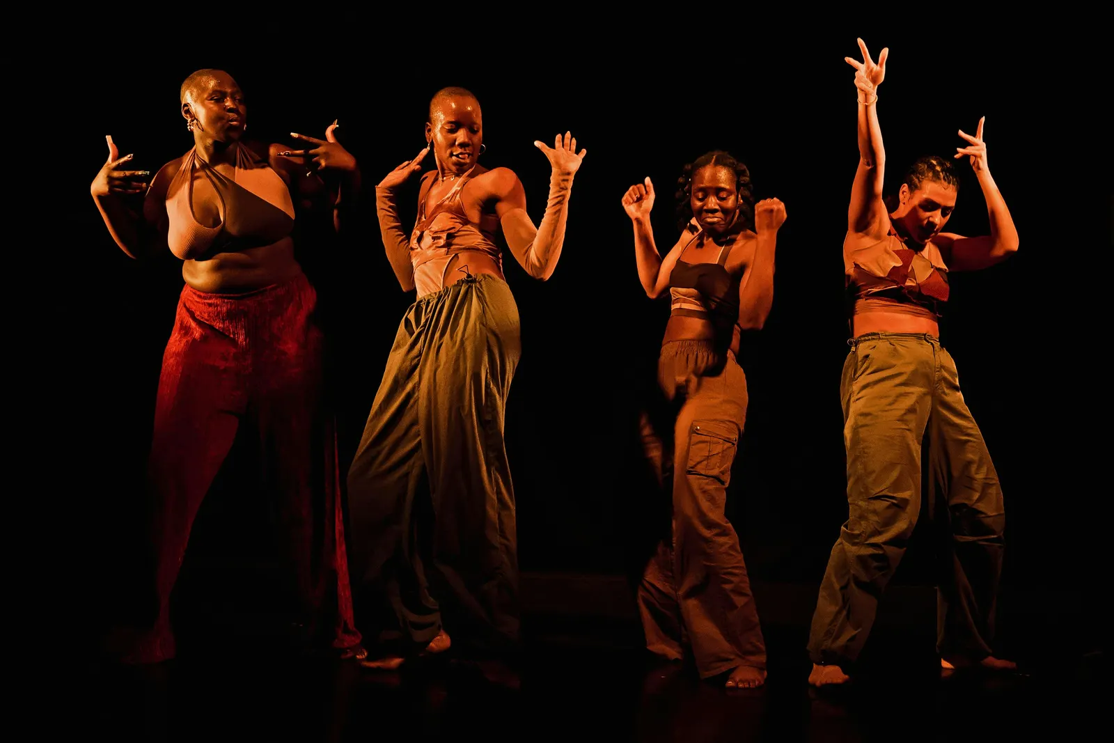
The brief was to open the last building of the rebuilt World Trade Center site to a city used to feeling shut out of performing arts, and to visitors who hadn't returned to the site since 9/11. Ahead of the first season, the studio handled strategy, naming, design, and voice, with strategy from Claren Walker and Natalee Ranii-Dropcho. Each letter is drawn in square proportions, which lets a plain block sit between PAC and NYC and later open up as a frame for programming. PAC Display, developed with AllCaps, echoes the building's form and old gothic street lettering. Photography by Dino Kužnik, Iwan Baan, and Mari Juliano, and motion by Thales Muniz, extend the system.
Why it works
A square is a risky thing to hang a cultural institution on, but here it solves real problems. It is blunt and legible from across a plaza or at thumbnail size, which suits a venue that needs mass appeal rather than a small base of subscribers. Because the frame holds changing images, the brand never competes with the art, and visitors can picture themselves inside it. The type does similar work: borrowing from street signs roots the center in New York instead of the polished vocabulary of traditional opera houses. Together, the pieces read as public, not precious.
Applications
Typography

Images and video from portorocha.com, by Porto Rocha.