The Brand Monograph
Freeform brand identity by Collins
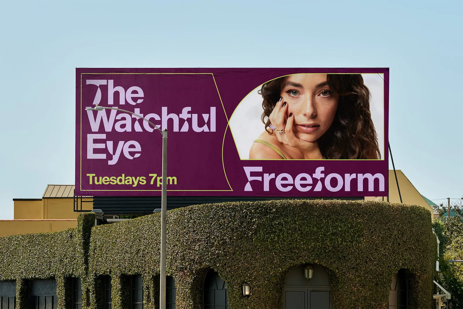
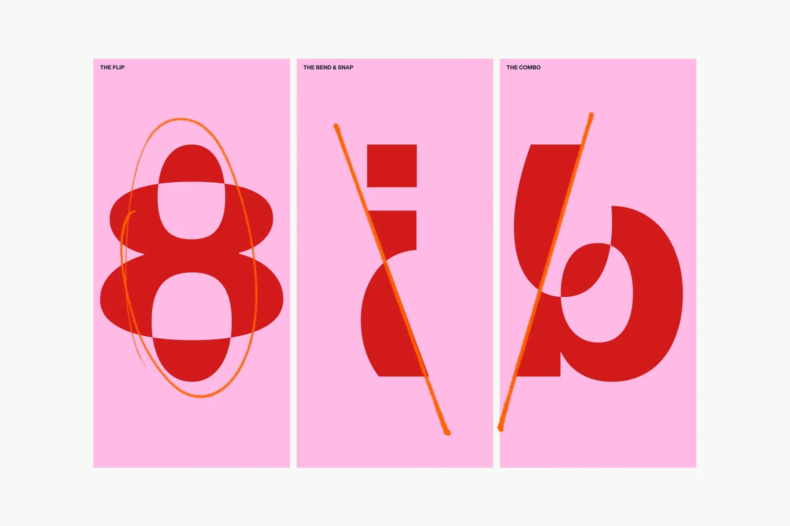
↗Freeform's identity is built around a typeface that refuses to settle. Collins worked with Monotype to take Neue Haas Grotesk, the face Helvetica grew out of, and keep bending it, so a famously resolved modernist classic becomes restless and a little unpredictable.
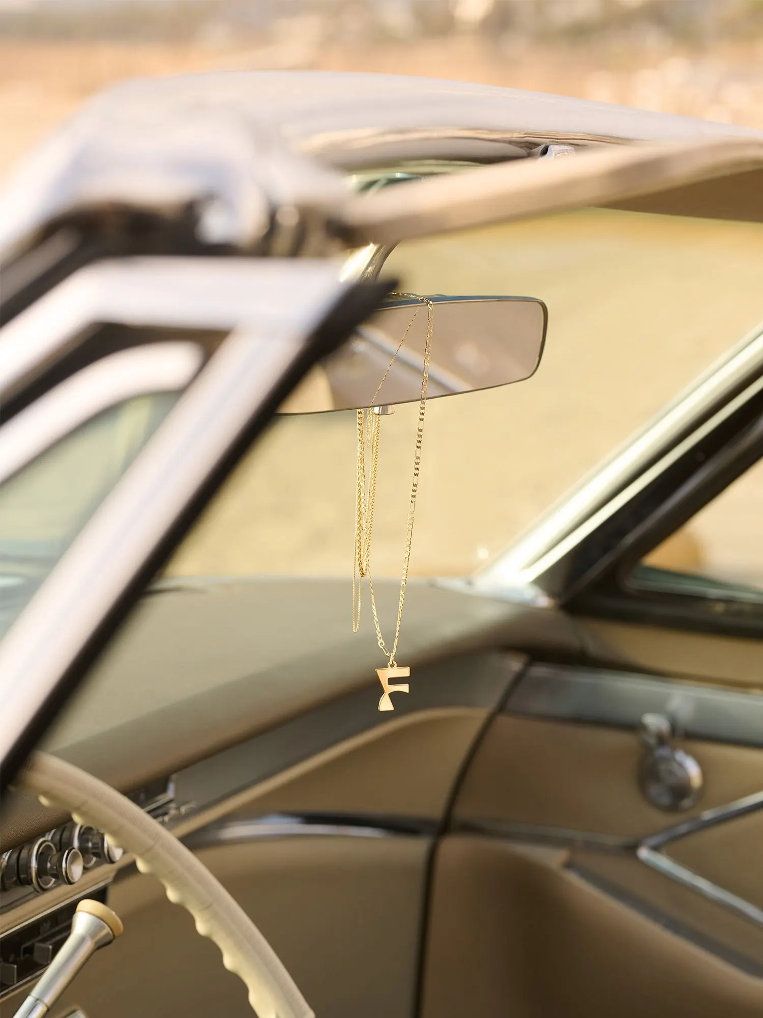
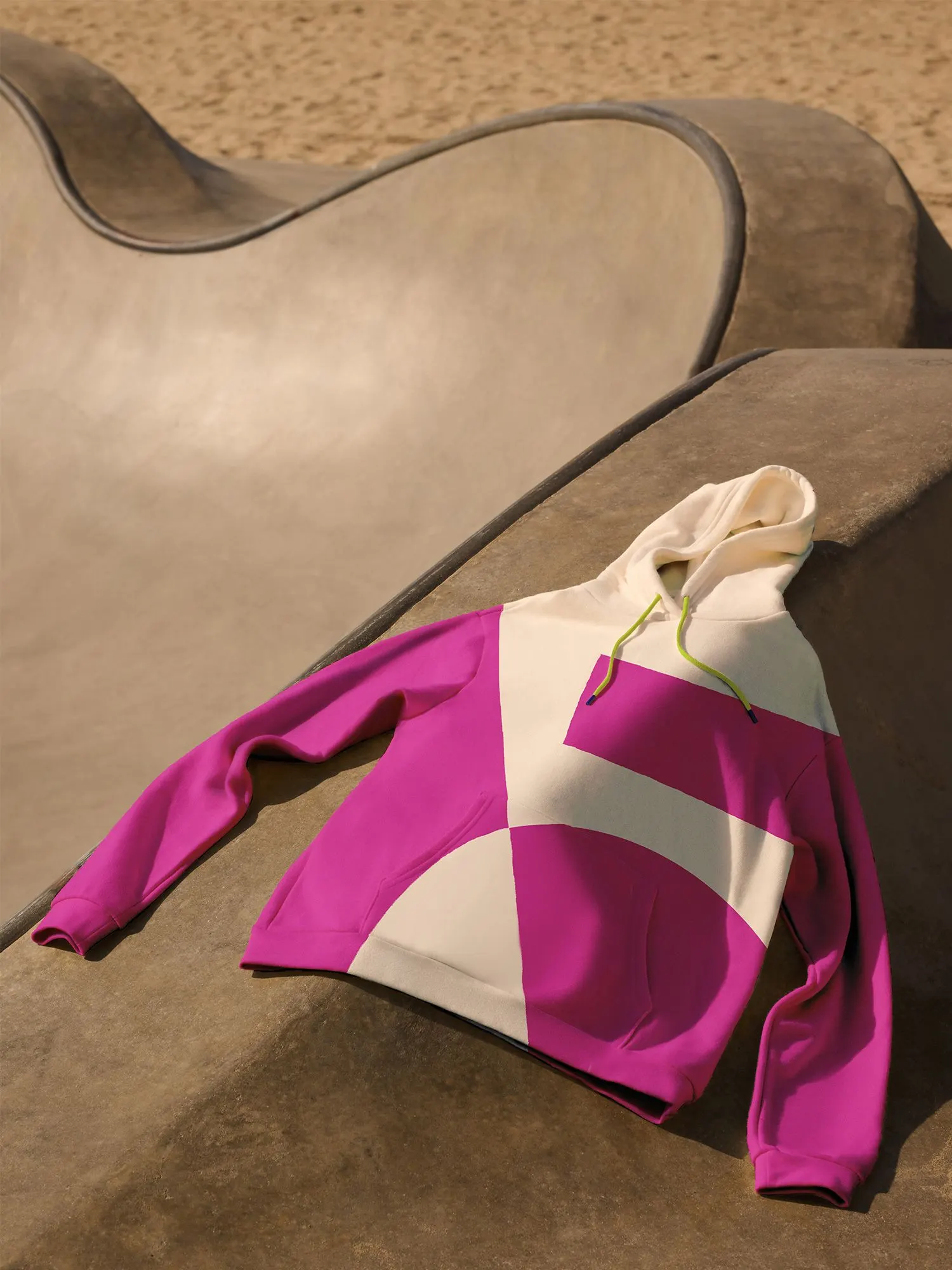
The brief arrived as the Disney division went streaming-first and its programming grew bolder than its look. Collins shifted Freeform's role from a place that shows stories to a maker of them, and addressed viewers as a community with a shared mindset rather than an age bracket. Those viewers, the studio found, want shows that widen their world instead of helping them escape it. The identity expresses that through color, shape, and movement that keep changing, alongside photography by Mari Juliano. Collins reports more consistent branding, renewed creative confidence among content teams and executives, and a clearer pitch to advertisers.
Why it works
Most entertainment brands compete by getting louder, usually with bespoke display faces. Starting from a neutral, trusted grotesque gives Freeform a stable base, and distorting it makes the instability look deliberate rather than careless. That suits an audience wary of polish. Because the system is a set of behaviors rather than a fixed look, the brand can keep reinventing itself and still be recognized, which matters on streaming screens where a wordmark is often small. The type does the positioning: Freeform sounds like a rule-bender in a category that mostly follows formulas.
Applications
Logo
Typography
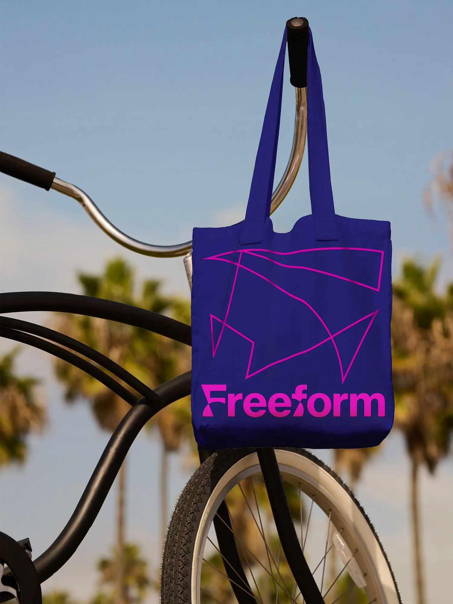
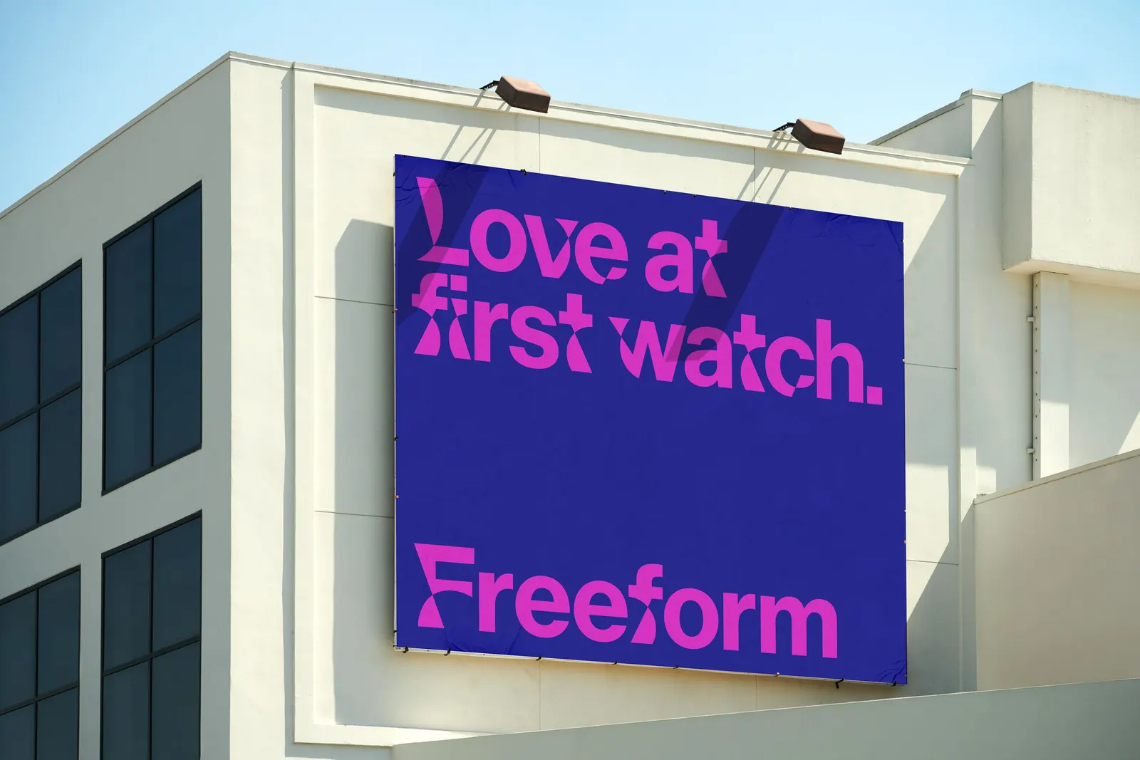
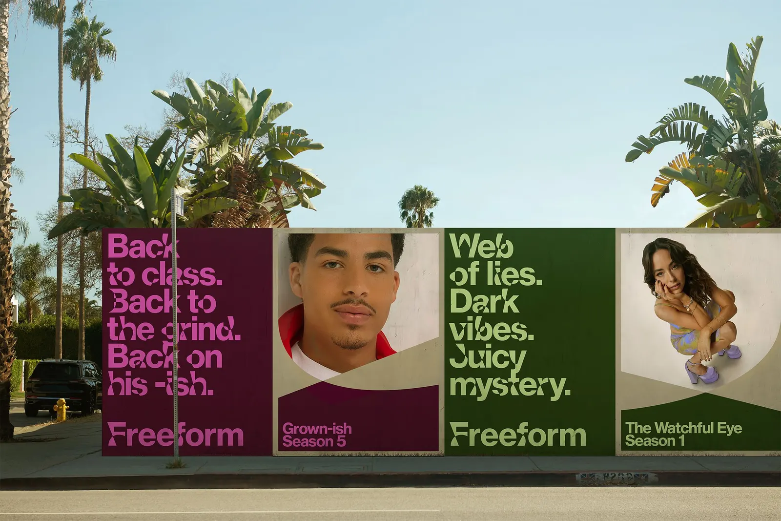
Images and video from wearecollins.com, by Collins.