The Brand Monograph
OpenWeb brand identity by Collins
↗Few rebrands change a company's understanding of itself as thoroughly as this one. Collins took Spot.IM, a platform with a worthwhile aim (making online conversation more civil and giving publishers a stronger hand) but a story that undersold it, and gave it a new name: OpenWeb. It sounds like a public commitment rather than a product feature, and the rest of the work builds on that.
The studio moved the focus from policing comments to improving how people talk to each other. Visually, Collins looked to early 20th-century newspapers for bold type and confident voices, a register publishers already trust, then tuned it for a digital forum. Chester Jenkins of Village supplied Galaxie Copernicus, the typeface that anchors the system, and the logo is built around the exchange of differing viewpoints. OpenWeb now reaches over 100 million monthly users and raised $170 million at a $1.5 billion valuation.
Why it works
The strongest decision is borrowing from the visual language of the press, since publishers are the customers and credibility is what they sell. It also sets OpenWeb apart from the soft, rounded sans-serif look common in tech. A sturdy editorial serif like Galaxie Copernicus gives the brand authority without stiffness, and a mark about exchange rather than a single voice suits a platform whose job is hosting disagreement. The name does similar work: it opens sales conversations with principle, not features.
Applications
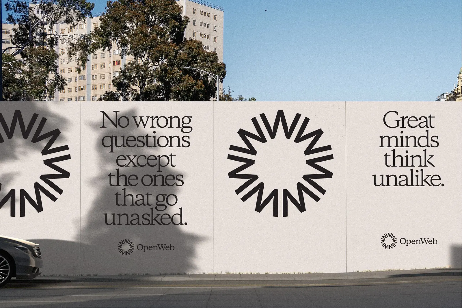
Logo
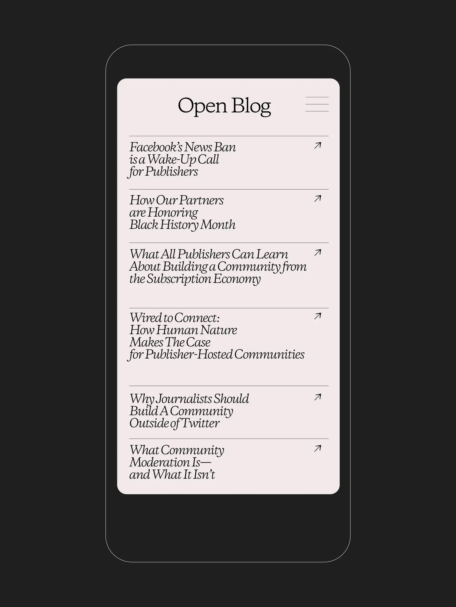
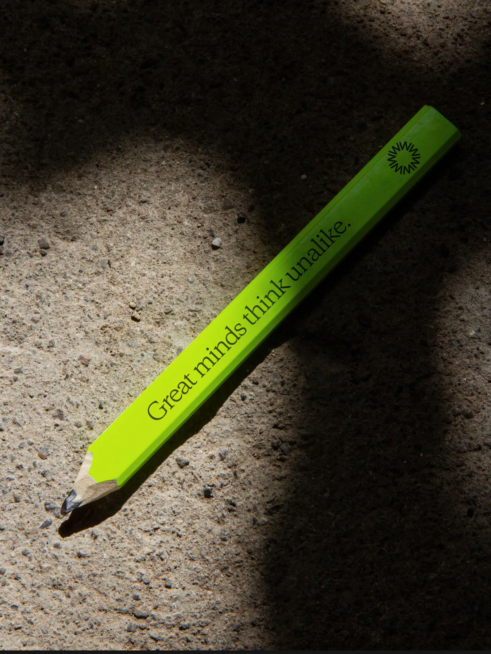
Images and video from wearecollins.com, by Collins.