The Brand Monograph
Spotify brand identity by Collins
↗What stands out about COLLINS's work for Spotify is how much of it happens before anything is drawn. Apple had bought Beats, and Google was pushing hard behind Google Play. Spotify asked the studio how it could stay ahead of rivals with deeper pockets and louder brands. COLLINS started from an uncomfortable observation: once every service offers the same near-endless catalog, access stops being a reason to choose one.
The studio pointed to playlist-making, the digital descendant of the mixtape, as the behavior most tied to engagement, paid conversion, and loyalty. From there it recast Spotify as a company built around personal listening rather than song delivery, and evolved the identity so the brand would read as part of music culture instead of a utility. The payoff showed up in product, with Wrapped, Discover Weekly, Blend, and DJ, as valuation grew from $6B to $19B.
Why it works
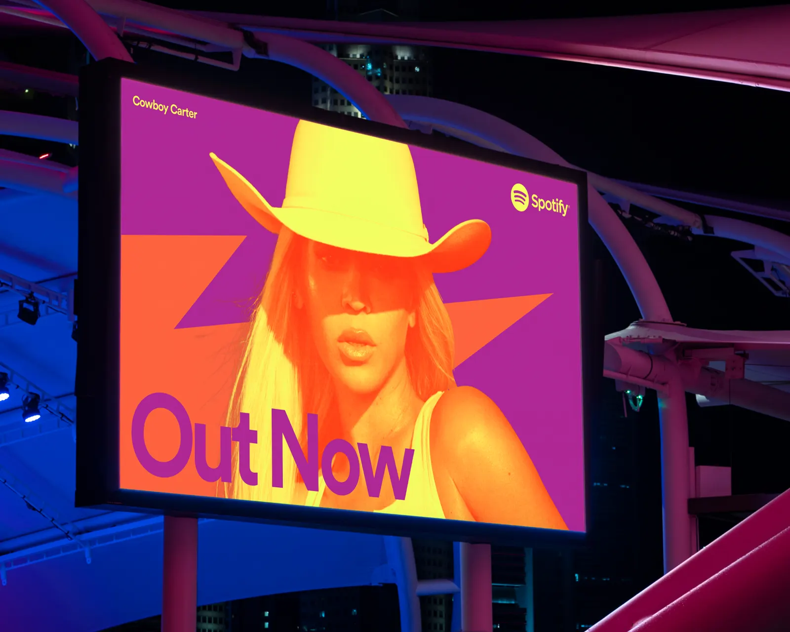
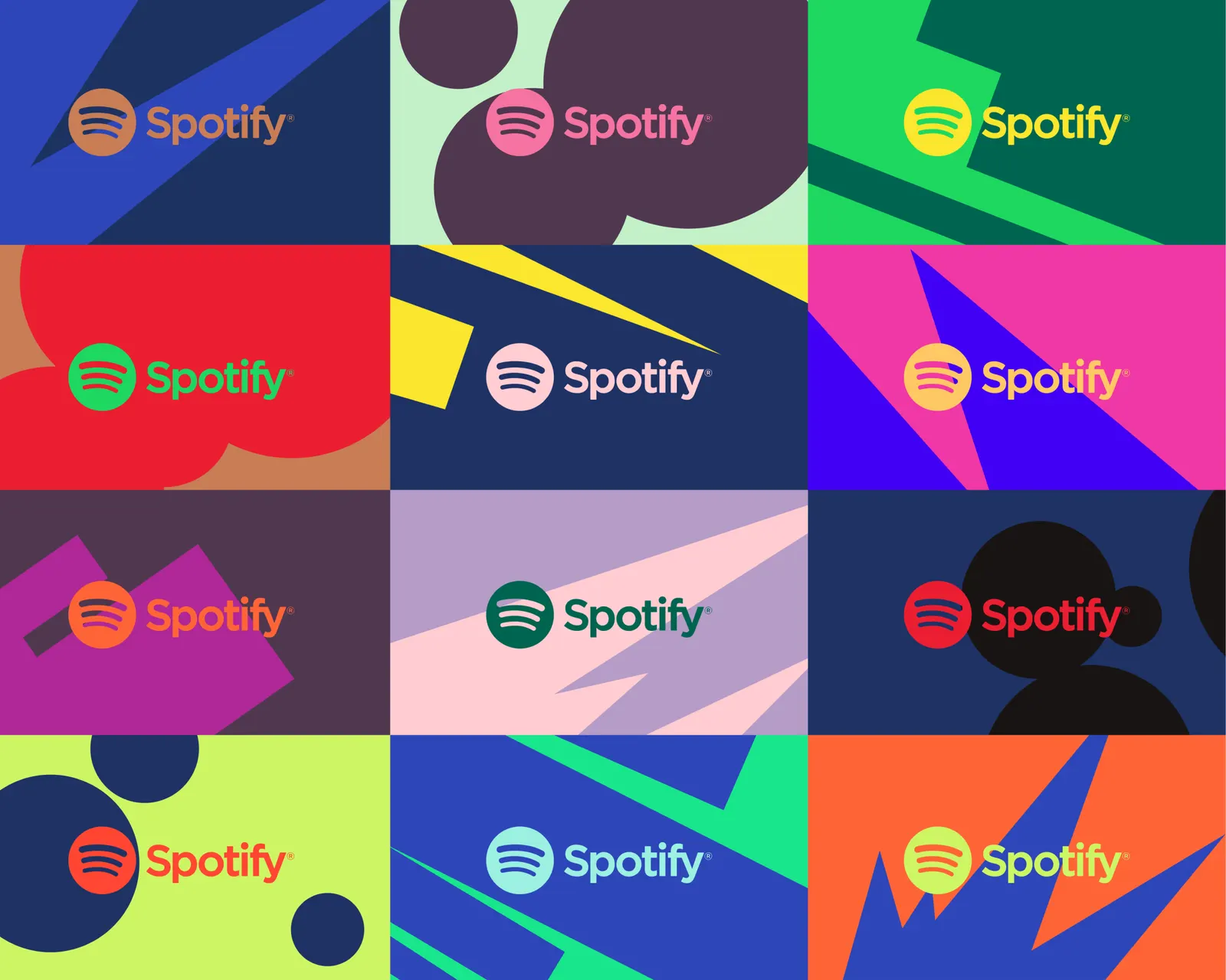
The identity gives a product that looks identical on paper a point of view. In a category where rivals match each other feature for feature, a brand that feels like culture, not infrastructure, gives listeners something to care about beyond the catalog. Anchoring the visual evolution in one idea, personal listening, also gives the brand a shared logic. New features like Wrapped or Blend can feel like natural extensions of Spotify, not add-ons, and the identity can stretch to hold them without losing coherence.
Applications
Logo
Typography


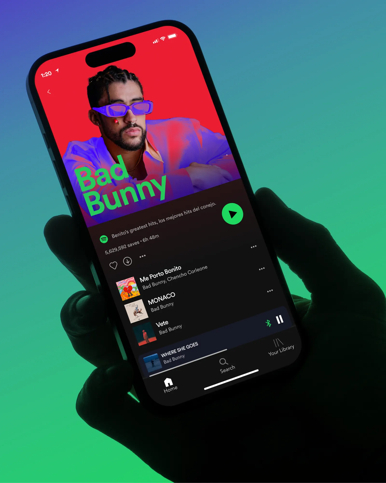
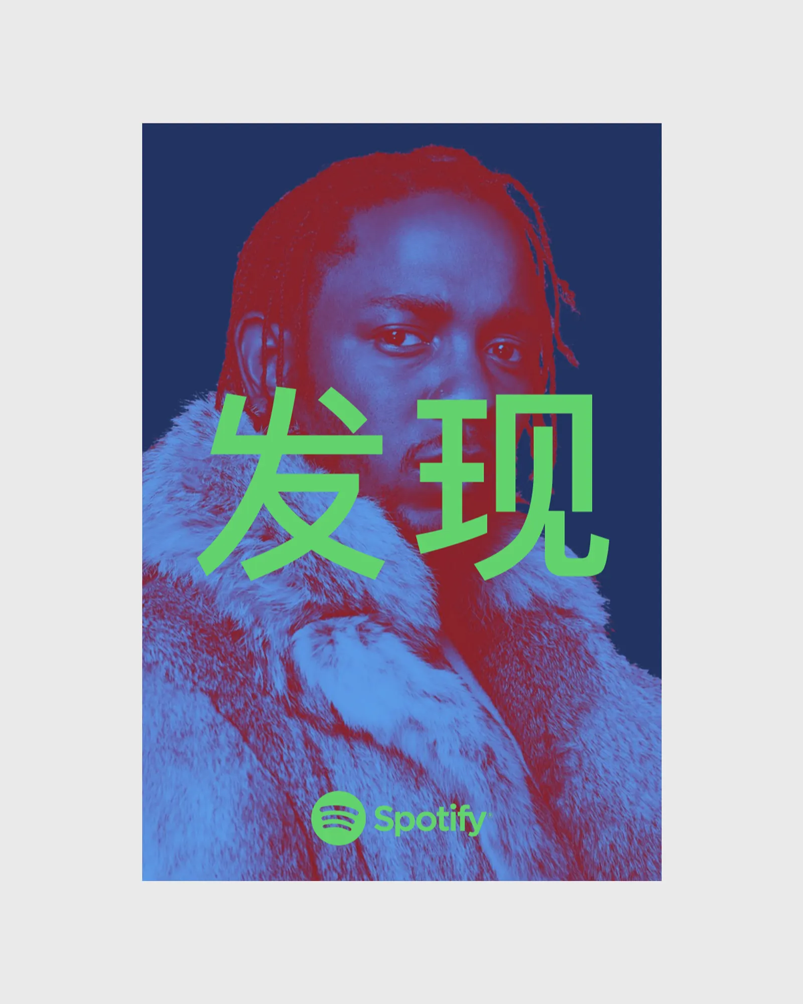
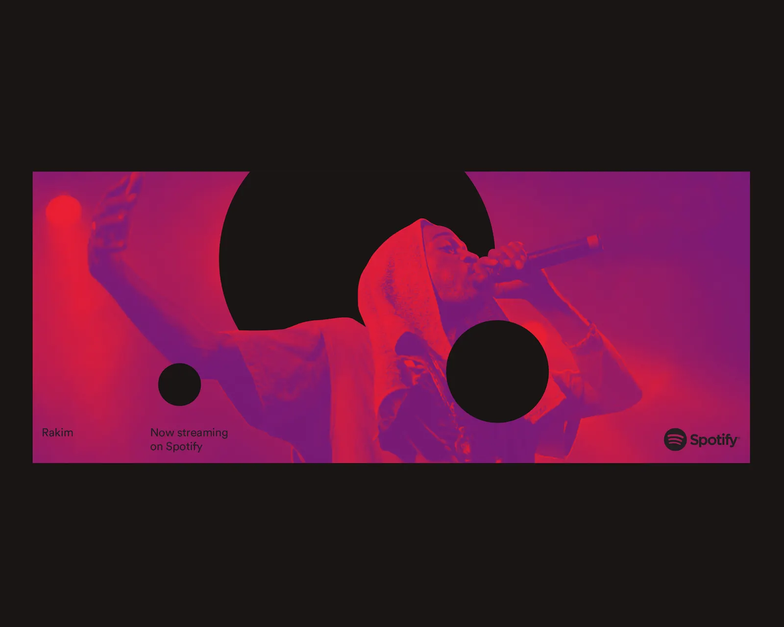
Images and video from wearecollins.com, by Collins.