The Brand Monograph
Guild brand identity by Collins
↗What stands out in COLLINS's work for Guild is where the studio chose to look. A benefit that offered free tuition and still went largely unused could have been treated as a messaging problem. COLLINS saw a category problem instead: most employers offer tuition assistance and few employees use it, because matching working adults with the right school is slow for them and costly for educators.
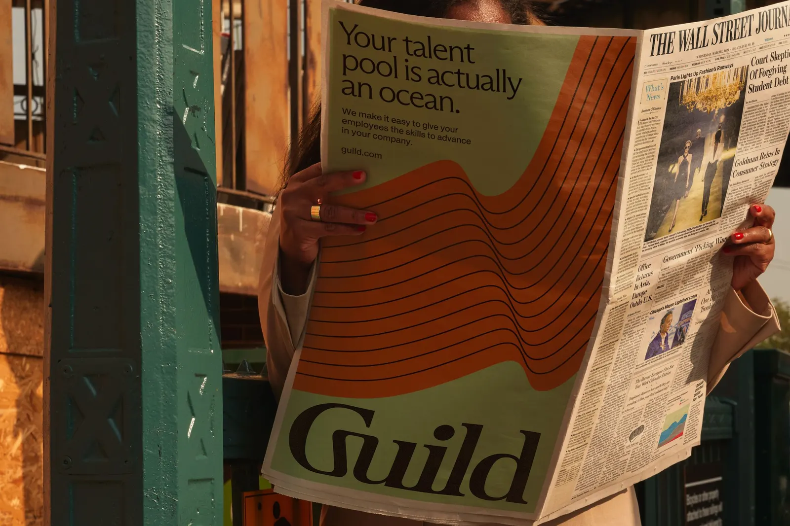
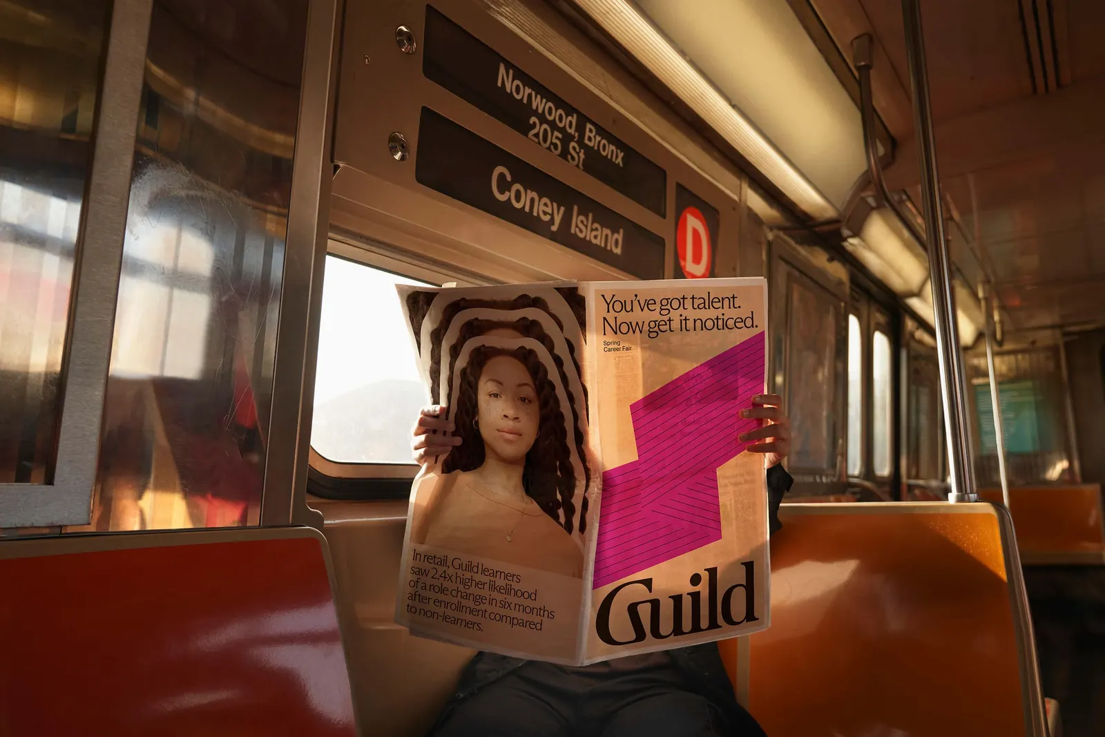
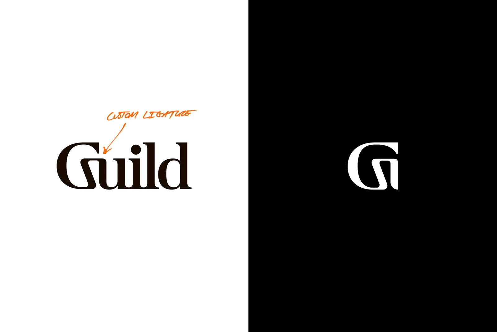
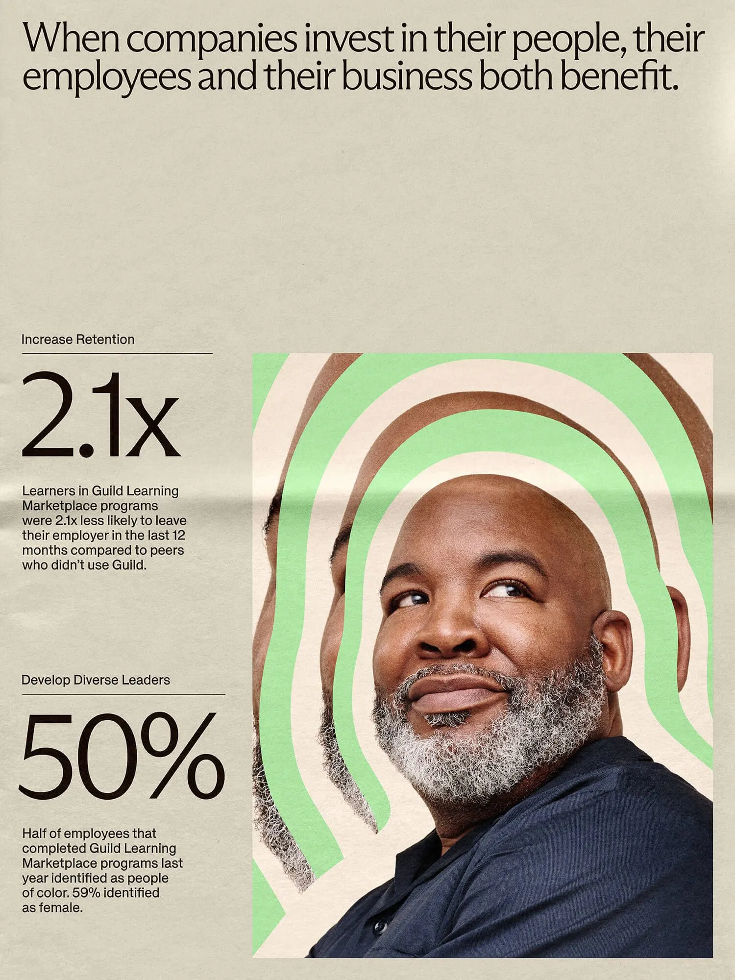
The studio moved Guild away from tuition finance and positioned it as an education market maker. The company earns when learners finish programs, so it has every reason to connect both sides. Its purpose became widening upward mobility for low-wage workers. A new identity and expression carries the change, with photography by Eric Van Nynatten and production by Liz Borger.
Why it works
The smartest decision is the one that comes before any visual choice: the identity is built to carry a new claim, not to decorate the old one. A finance label speaks to the people who pay for the benefit, while a market maker has to be credible to employers, educators, and the workers they serve. Launching a full identity and expression, instead of a messaging refresh, gives the change a visible moment. It also gives sales and partnership teams a clean break from the old story, which matters in a category where a benefit can look the same from one provider to the next.
Applications



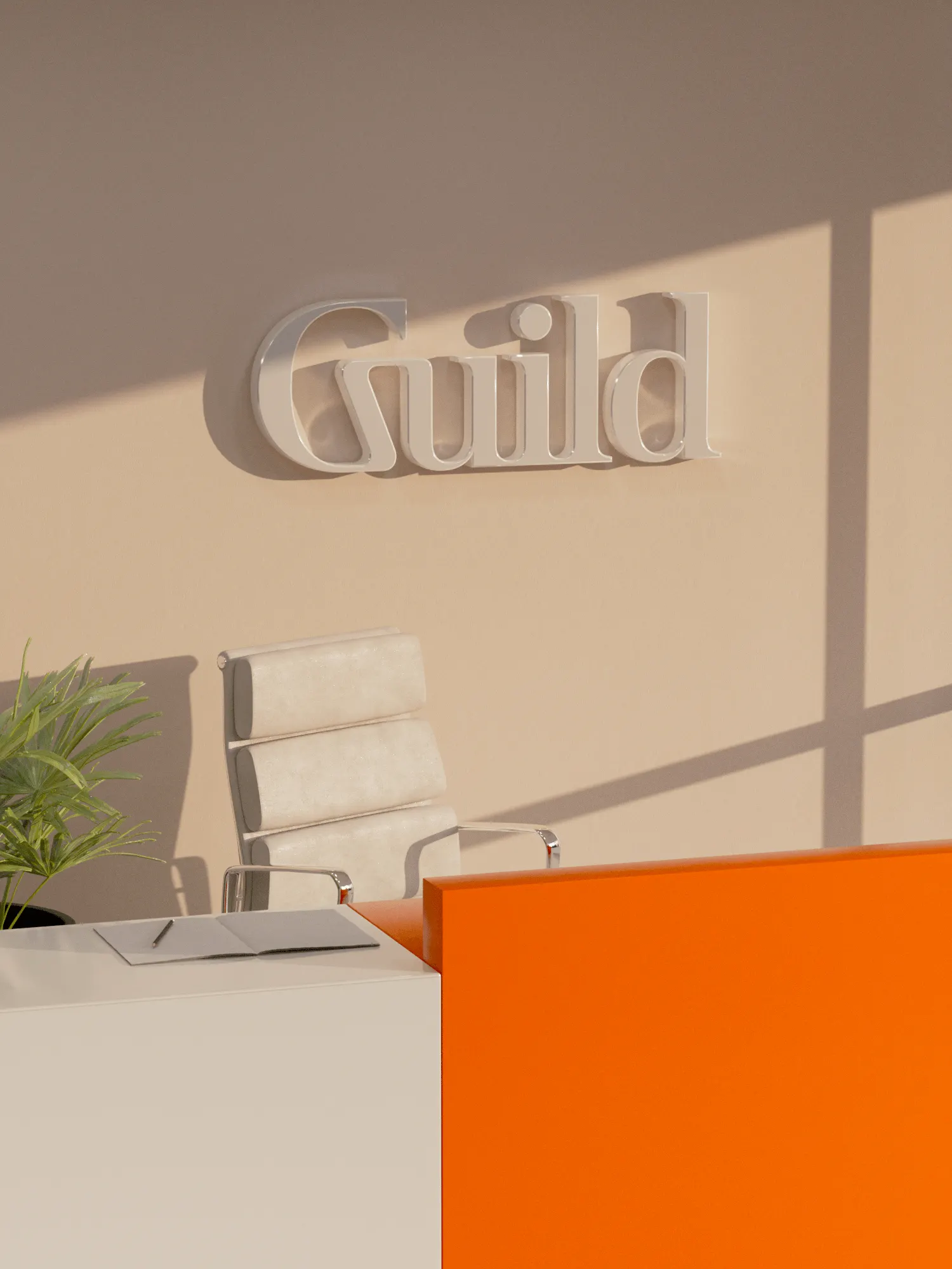
Logo
Images and video from wearecollins.com, by Collins.