The Brand Monograph
Panasonic brand identity by Further
↗Few categories sell an ideal as readily as personal care, which makes Further's work for Panasonic feel quietly radical. The studio took a company known for premium TVs and cameras and gave its personal care range an identity that talks about ordinary routines rather than polished perfection.
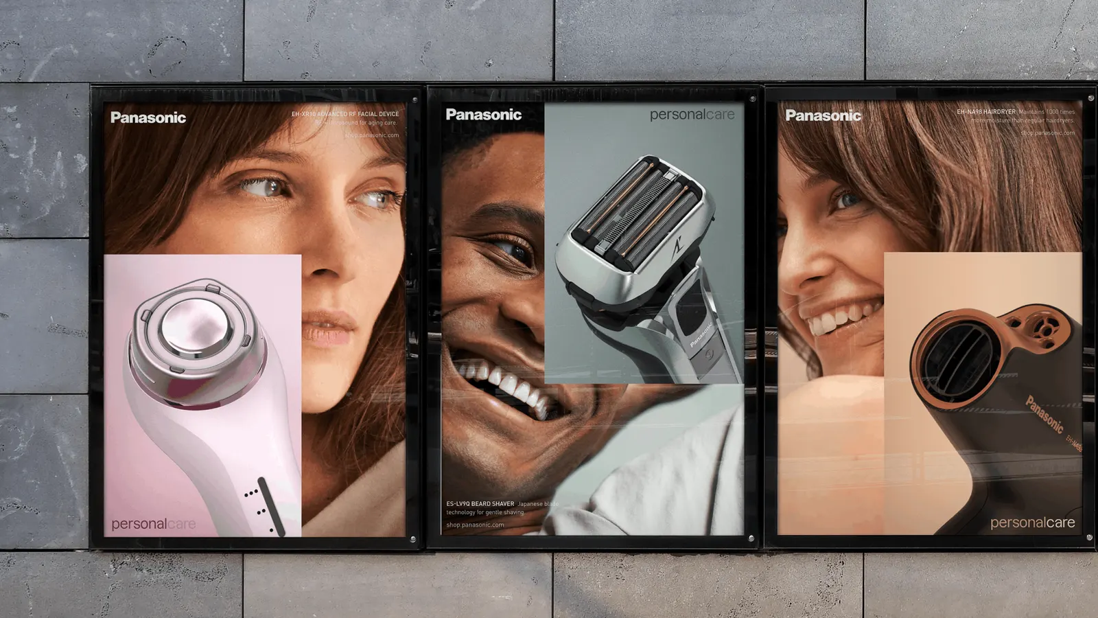
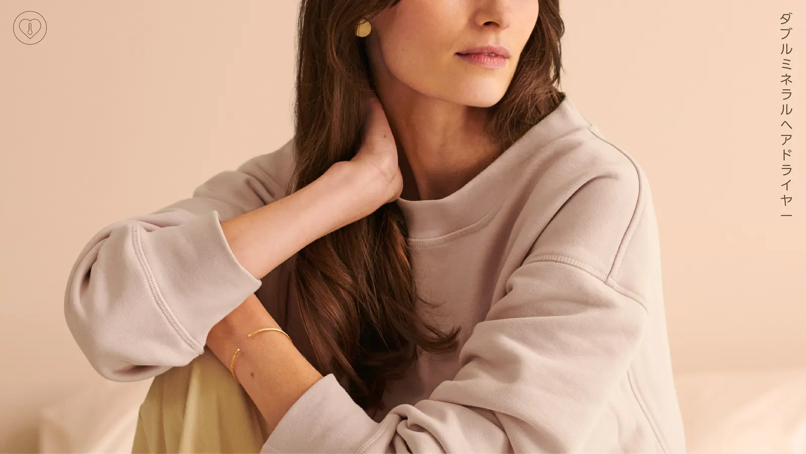
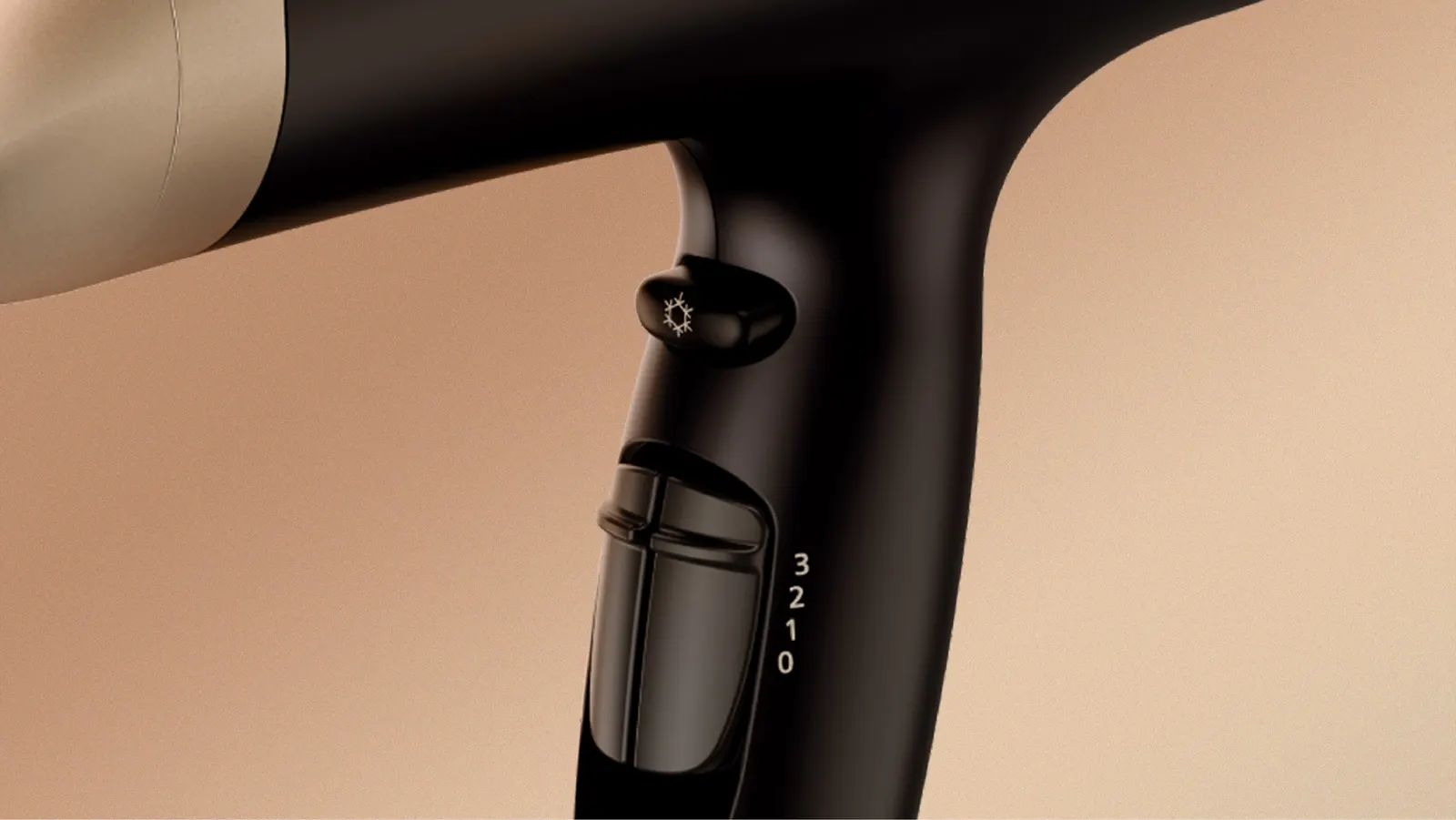
Panasonic wanted that perception to shift worldwide, so Further started with strategy and built the brand around honesty and the idea that looking after yourself is worth the time. The identity follows through in a clear layout system, a soft palette, and simple icons that keep information easy to read. Product renders sit alongside lifestyle photography, so the devices and the people using them share one warm, unforced world.
Why it works
The restraint is the strategy. Personal care often leans on gloss and aspiration, so a calm palette and plain iconography lower the temperature and make the products feel like part of a normal day rather than a promise of transformation. The tidy layouts carry Panasonic's electronics credibility into a category where trust matters. Pairing precise renders with natural-looking photography balances engineering and warmth, and it gives the brand a distinct place in its category without ever raising its voice.
Applications


Images and video from further.group, by Further.