The Brand Monograph
Microsoft Security brand identity by Koto
↗Koto's identity for Microsoft Security rejects the fear-based look most of the category relies on. Instead of padlocks and darkness, the studio built a bright, human, and calm system that talks about getting ahead of threats rather than recovering from them.
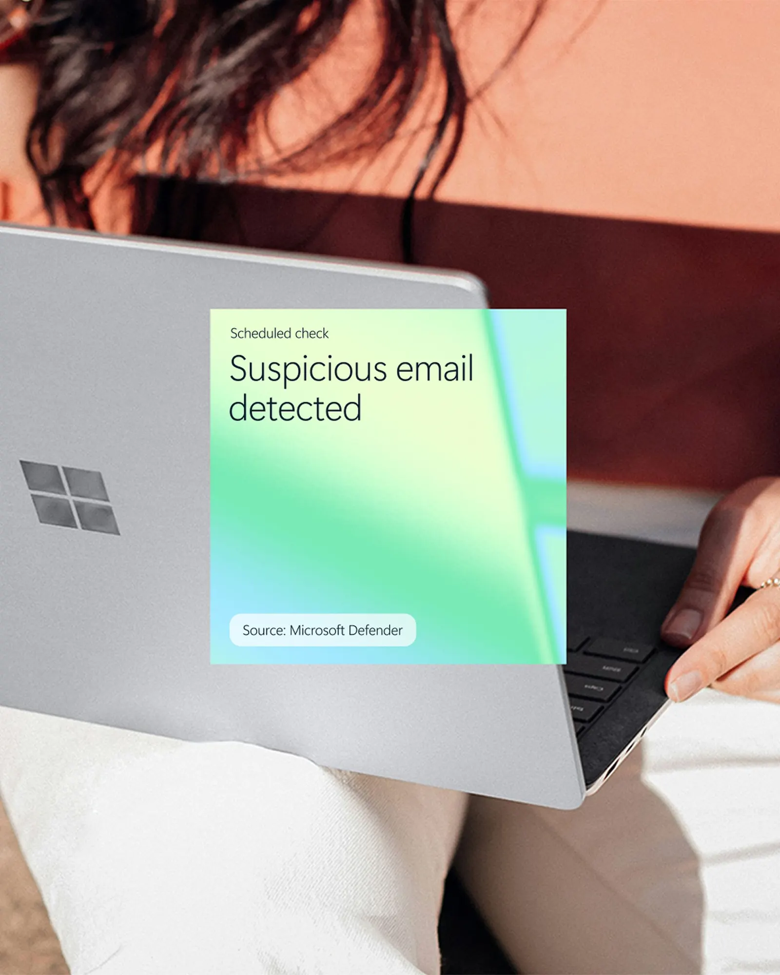
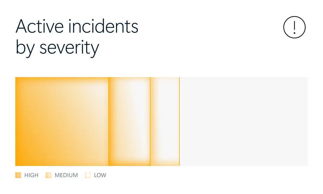
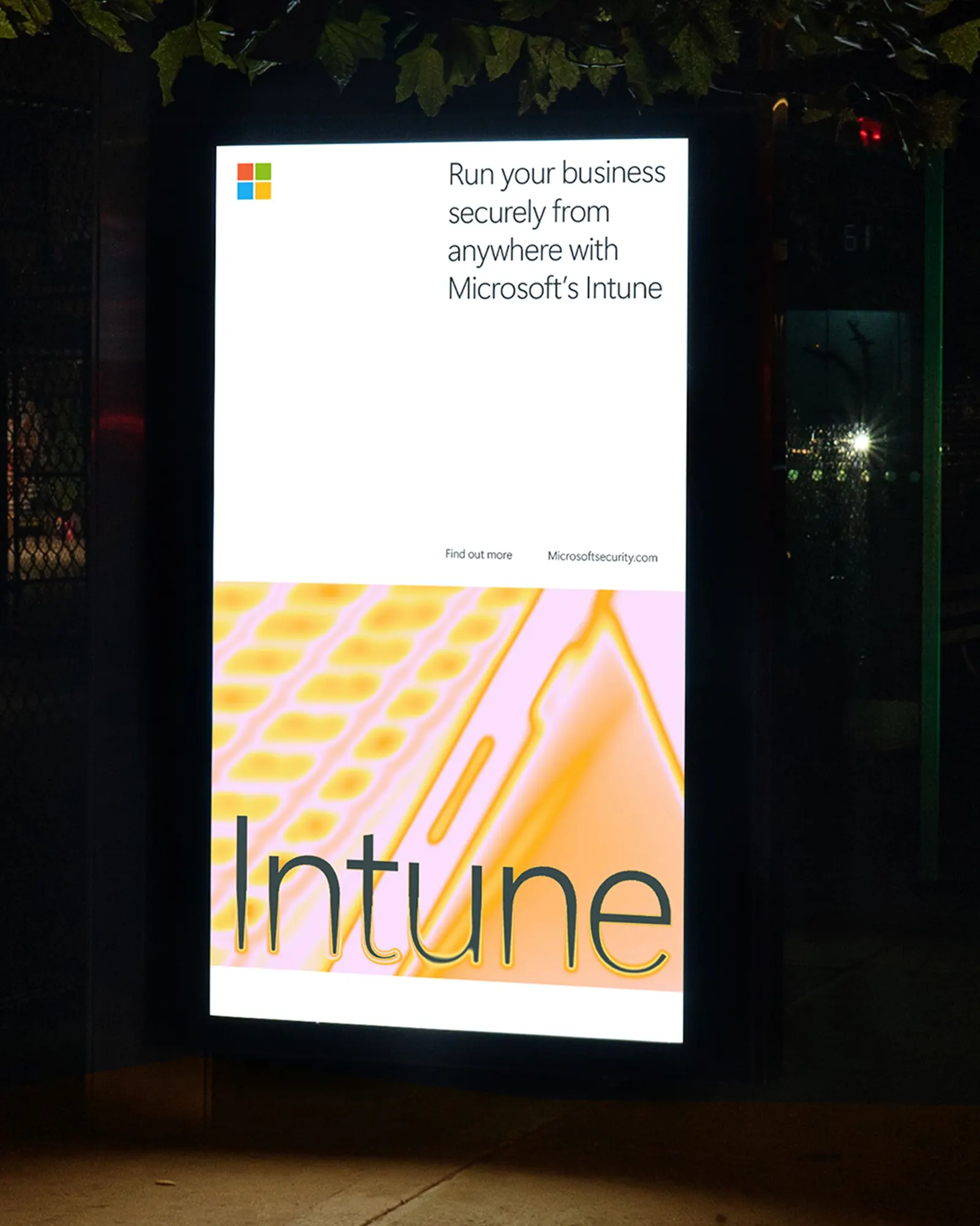
The brief called for a proactive stance, and Koto answered with a scanning motif borrowed from imaging technology, a device that reveals what's hidden. It is paired with a lively palette pulled from Microsoft's core colors, used to flag what matters in UI and infographics. The system carries into physical environments and messaging, where it adds interactivity, with AHRE Studio contributing sound. It also gathers Security's separate solutions under one presence that still reads as Microsoft.
Why it works
The scanning effect behaves the way the brand claims to: it shows the audience something they couldn't see before. That makes the idea demonstrable rather than just stated. Color does real work too. Because it highlights the important detail, it helps people who face dense information every day, while staying in Microsoft's own range keeps the sub-brand clearly part of the family. Set against the category's defensive visual habits, the result feels confident without being threatening.
Applications
Logo

Color

Images and video from koto.com, by Koto.