The Brand Monograph
Duckbill brand identity by Red Antler
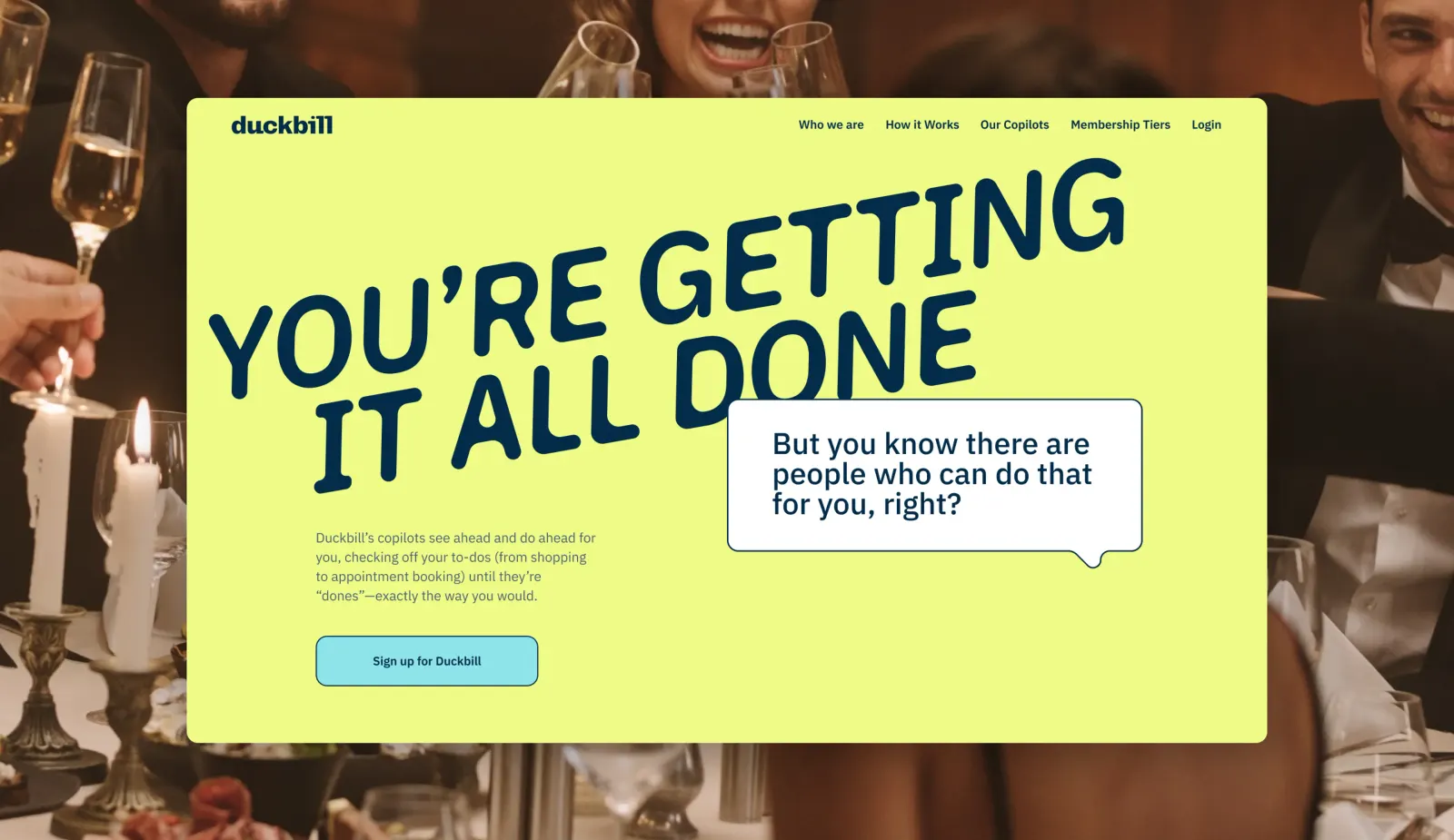
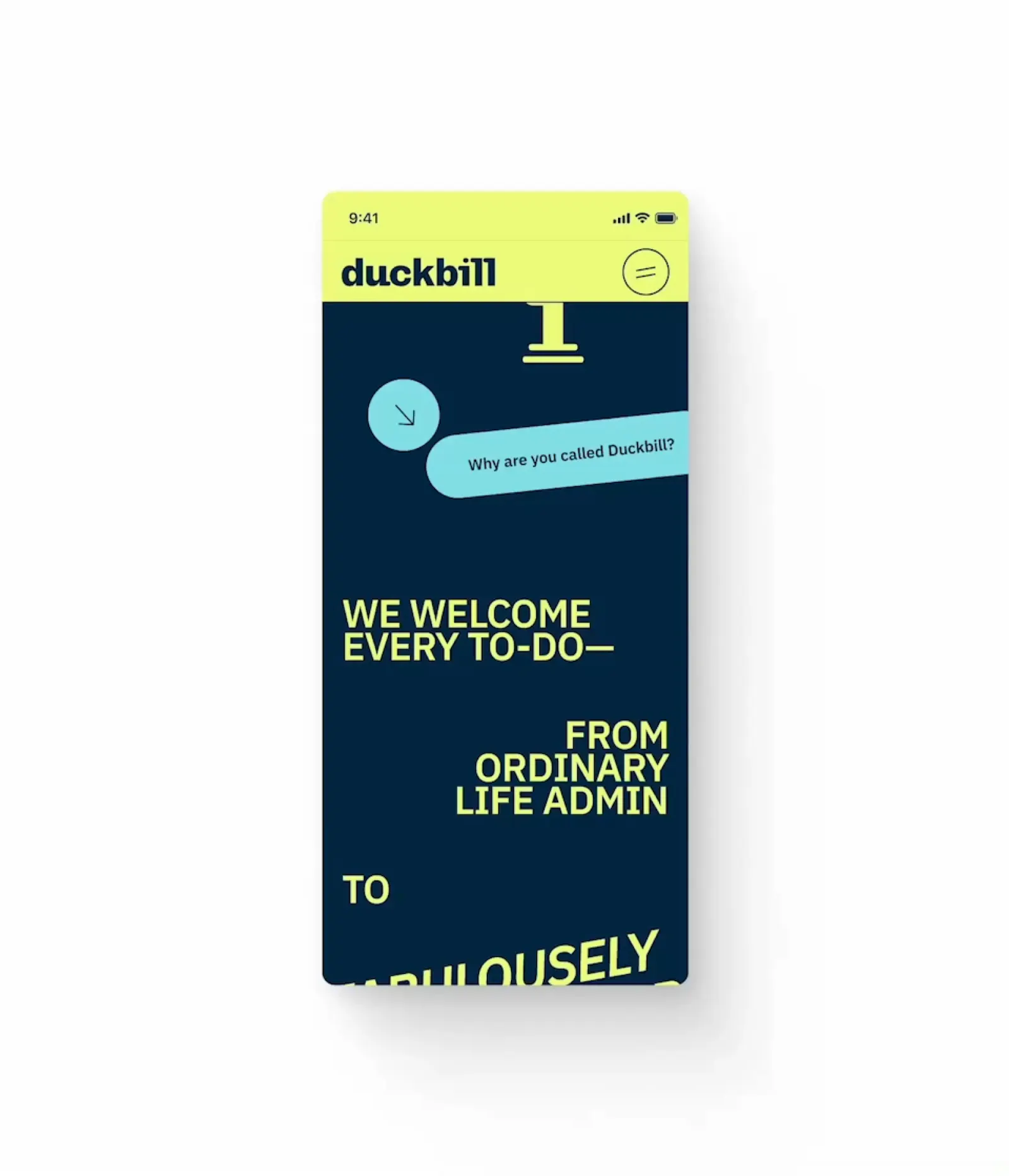
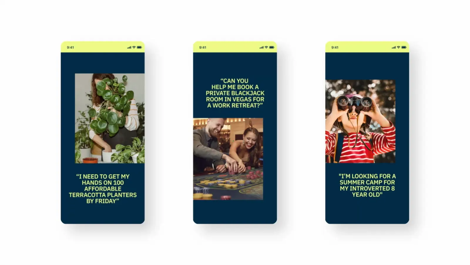
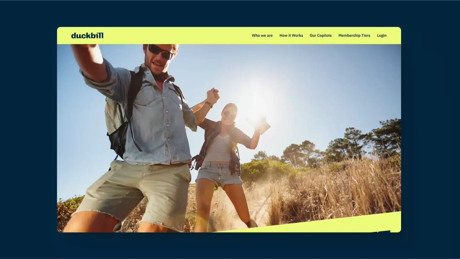
↗Most services that promise to take things off your plate look reassuringly calm. Red Antler's identity for Duckbill goes the other way, and it's more fun to look at for it. Duckbill pairs human Copilots with AI to handle errands and chores the way the customer would, from buying gifts to scouting summer camps to booking appointments.
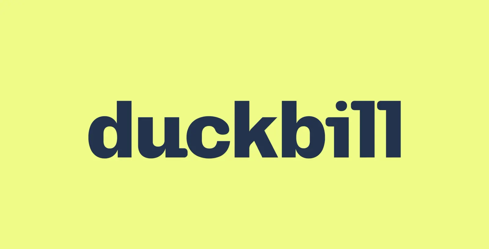
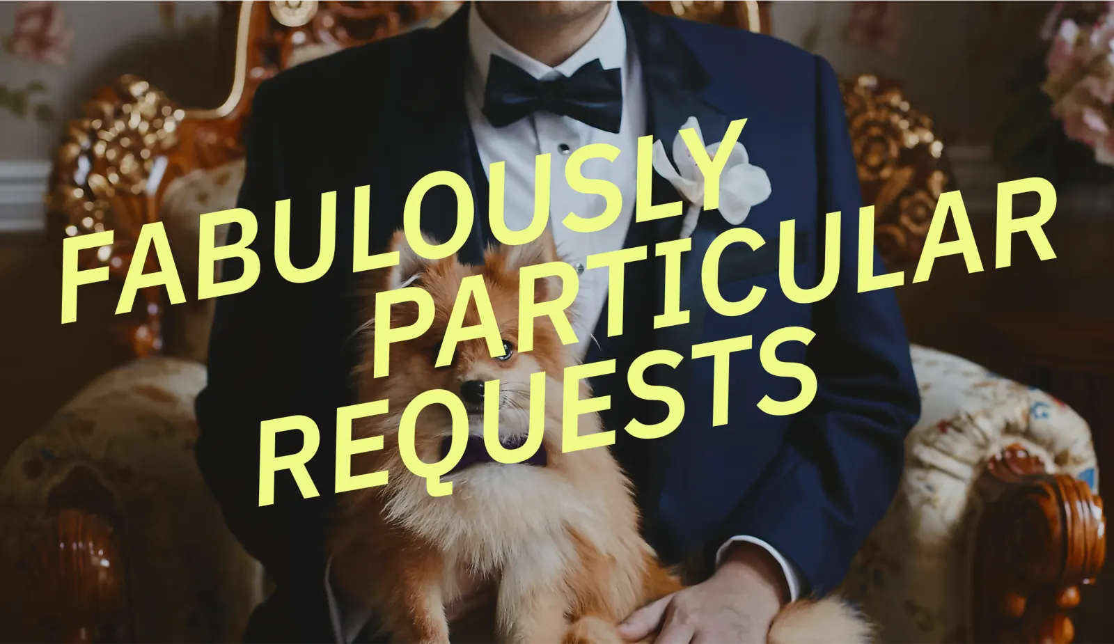
The studio found its idea in the name. A duck's bill digs, senses, and hooks, which suits a service whose workload has no fixed shape. Red Antler turned that range into a system: a bright spectrum of colors, a playful and wry voice, and type choices that keep surprising. Together they read as a brand with a sense of humor about the to-do list, rather than a sigh of relief about it.
Why it works
The palette does real work here. A service that books appointments one day and researches camps the next needs a brand that can stretch, and a full spectrum of color says that faster than a feature list. The humor matters too. People handing over personal errands want to sense a person on the other end, and a distinct voice and offbeat type do that better than the polished neutrality the category tends to default to. It also gives Duckbill a position that's easy to remember in a field that's easy to forget.
Applications
Logo

Typography


Images and video from redantler.com, by Red Antler.