The Brand Monograph
Naomi brand identity by Red Antler
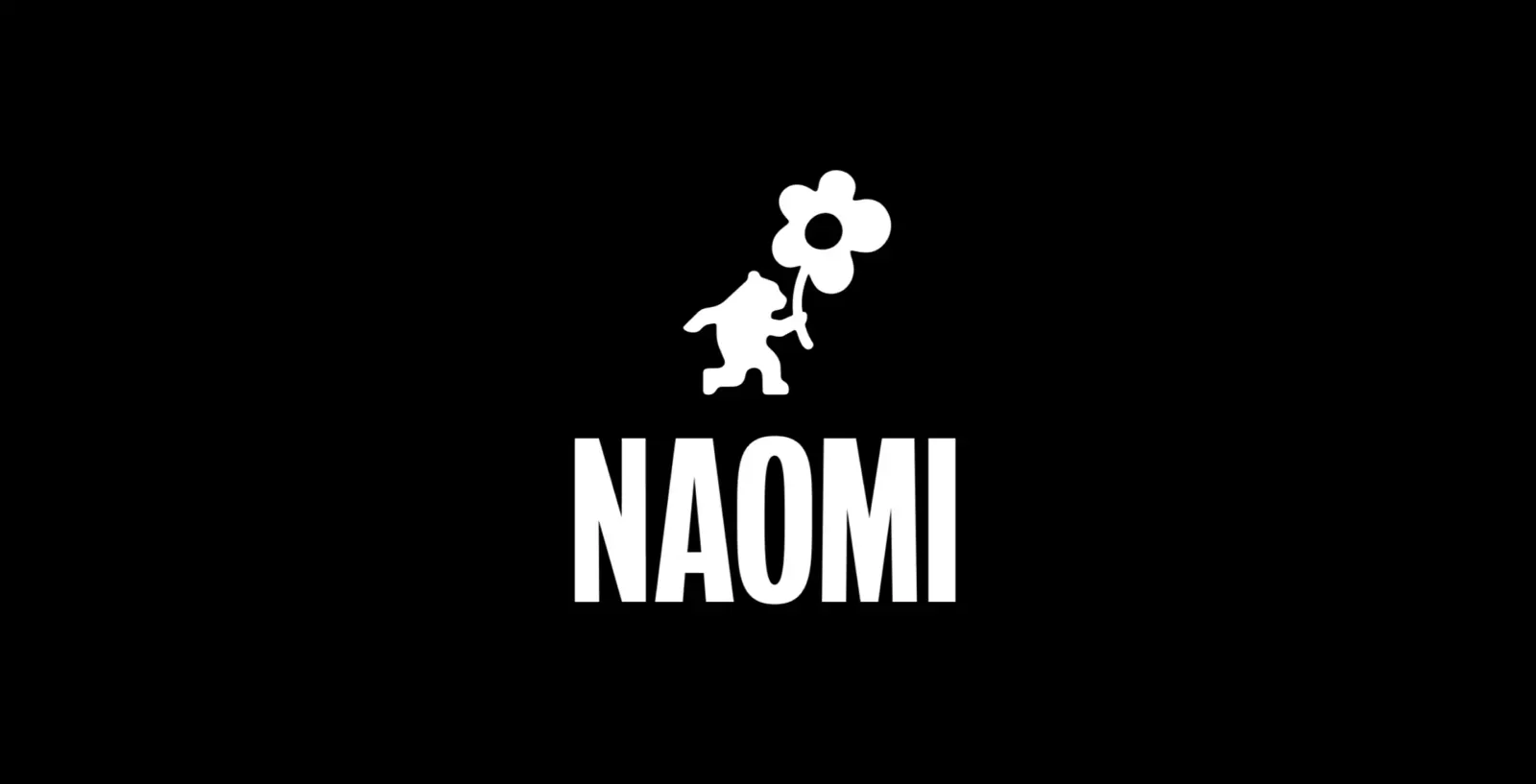
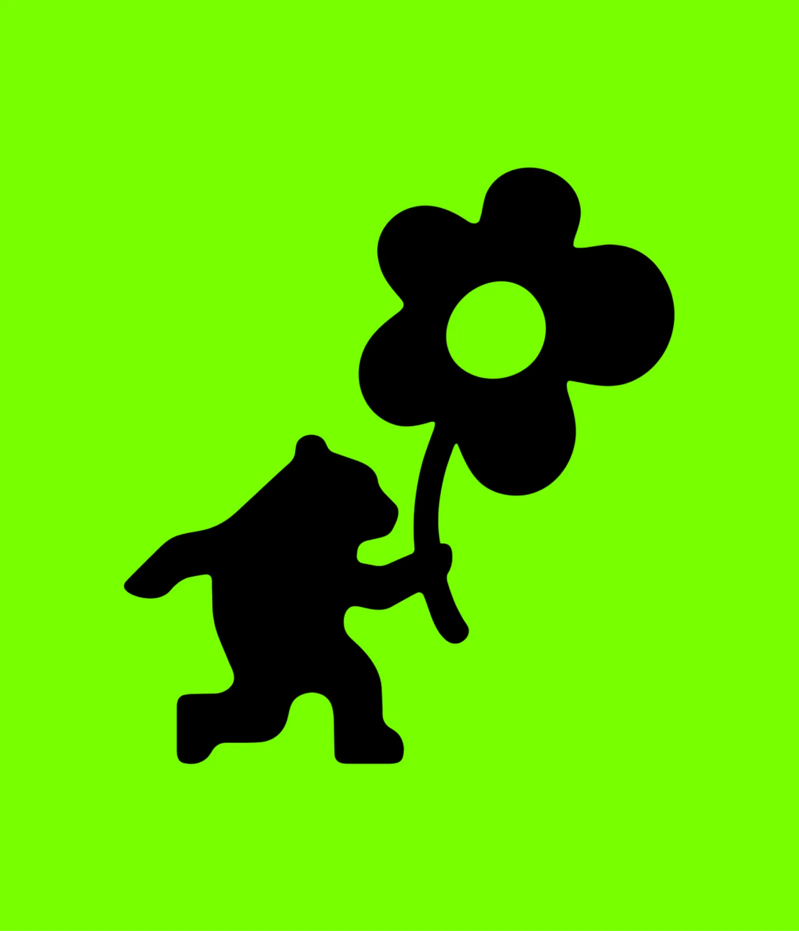
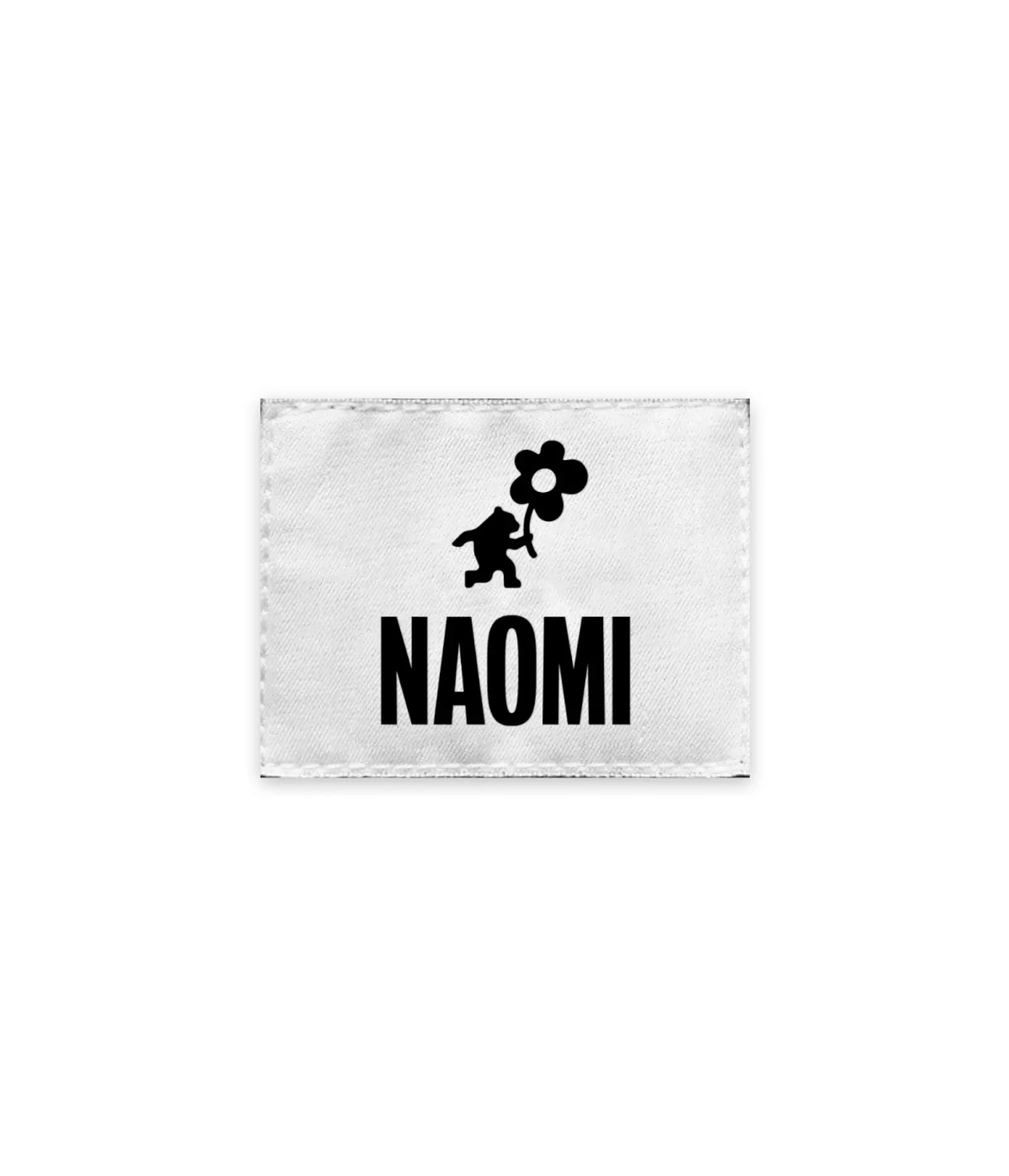
↗Most athlete logos lean on initials or a signature, built to look quick and confident. For Naomi Osaka, Red Antler went another way and gave her a small illustrated character instead of letters. A bear holds a flower, and that pairing does the job a wordmark would normally do.
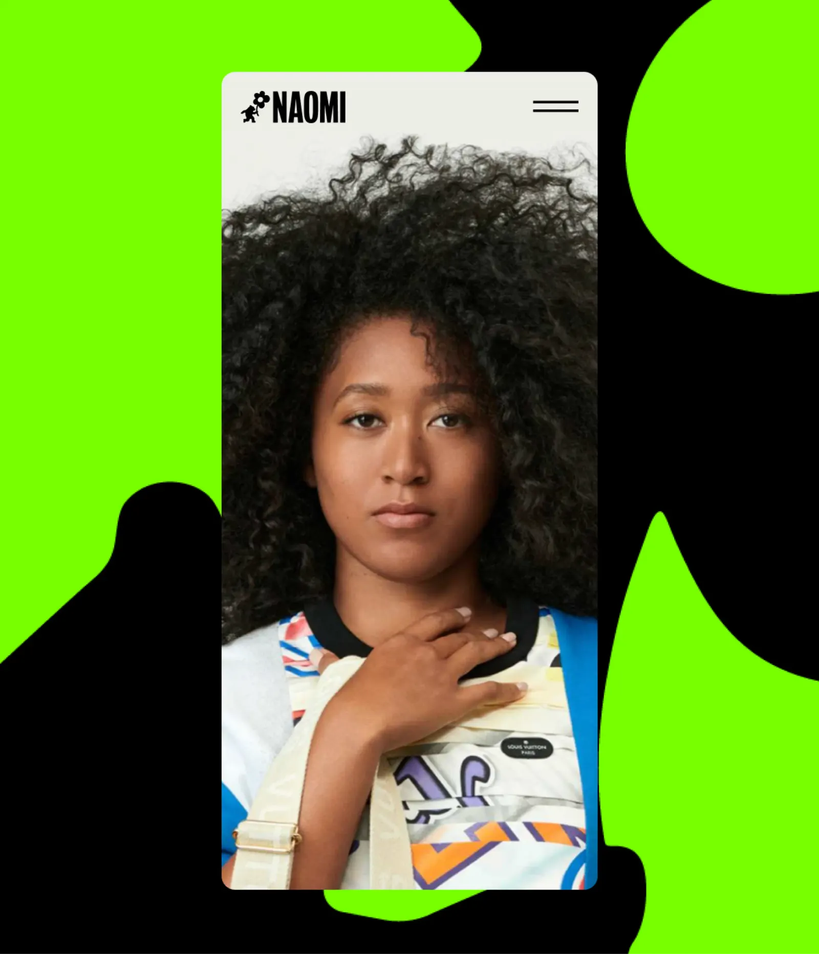
The brief called for a symbol that could represent her without spelling out her name, and that could sit comfortably next to other brands as her partnerships multiplied. Red Antler answered with an emblem built on contrast: a powerful animal holding something delicate. The mark has since moved from her equipment into collaborations with Levi's, Takashi Murakami, Tag Heuer, and Beats, a demanding range of company for a single symbol.
Why it works
The strength here is the gesture. The bear isn't just next to the flower, it's holding it, so the idea of power handled with care reads at a glance, with no explanation needed. A figurative mark also gives Osaka something initials can't: a personality that partners can place on their own products without it feeling borrowed. That matters beside a character-driven artist like Murakami, where a generic logo would fade. In a category full of monograms, a bear is easy to remember and hard to confuse with anyone else's.
Applications
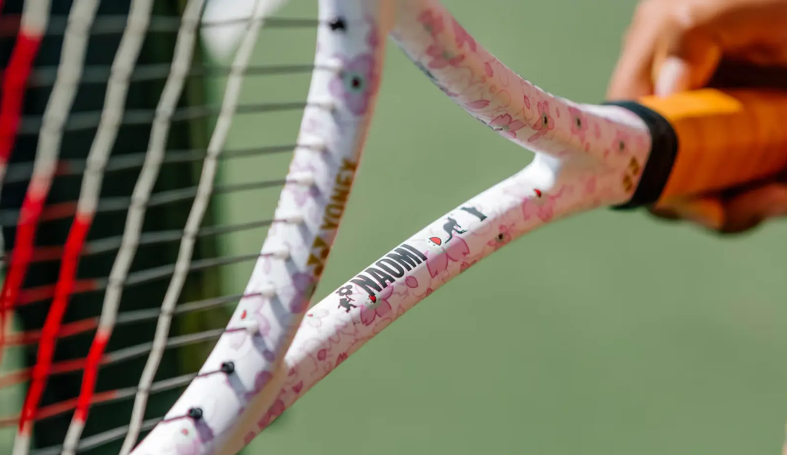
Logo
Images and video from redantler.com, by Red Antler.