The Brand Monograph
CANN brand identity by Red Antler
↗Few cannabis brands look like they belong at a dinner party, and that is what makes Red Antler's work for Cann stand out. Co-founders Jake Bullock and Luke Anderson brought the studio in during early 2019, before launch, to introduce the first commercial low-dose THC drink to a category built around potency and heavy-lidded clichés.
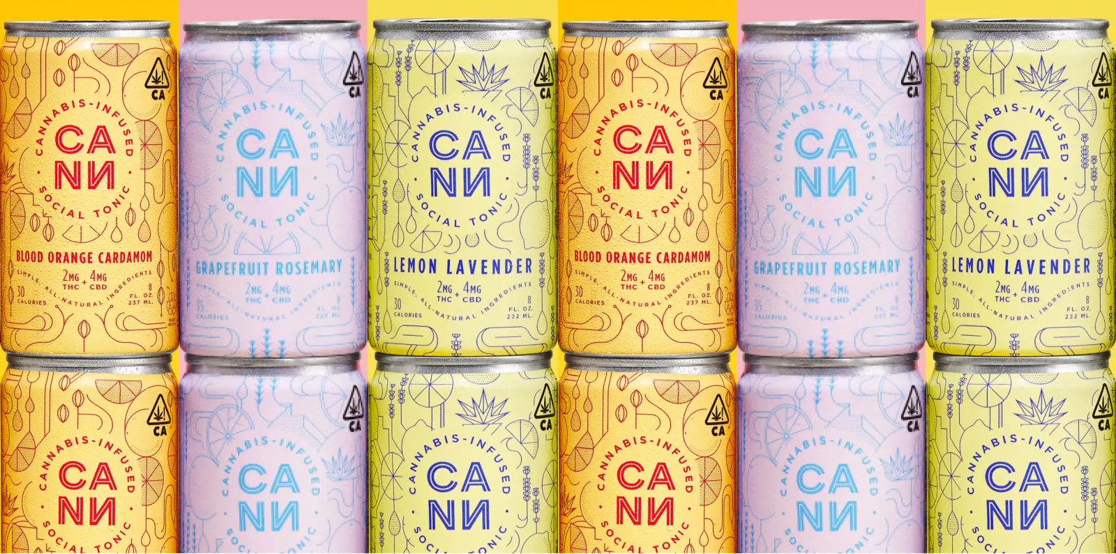
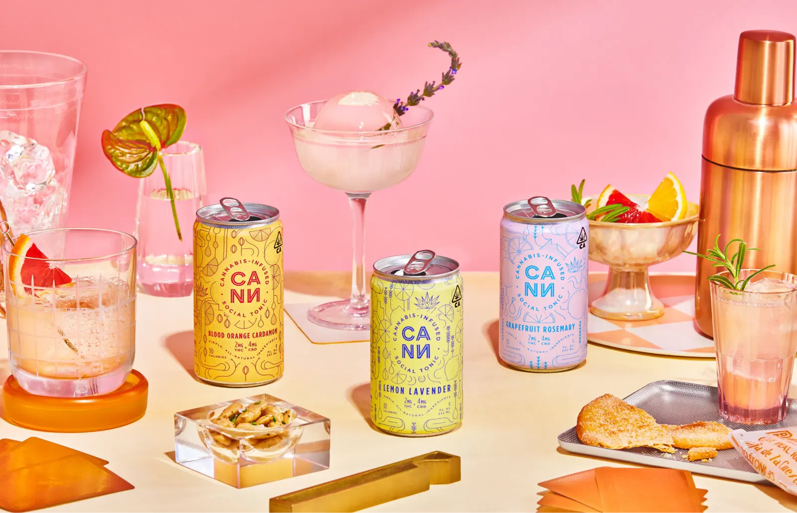
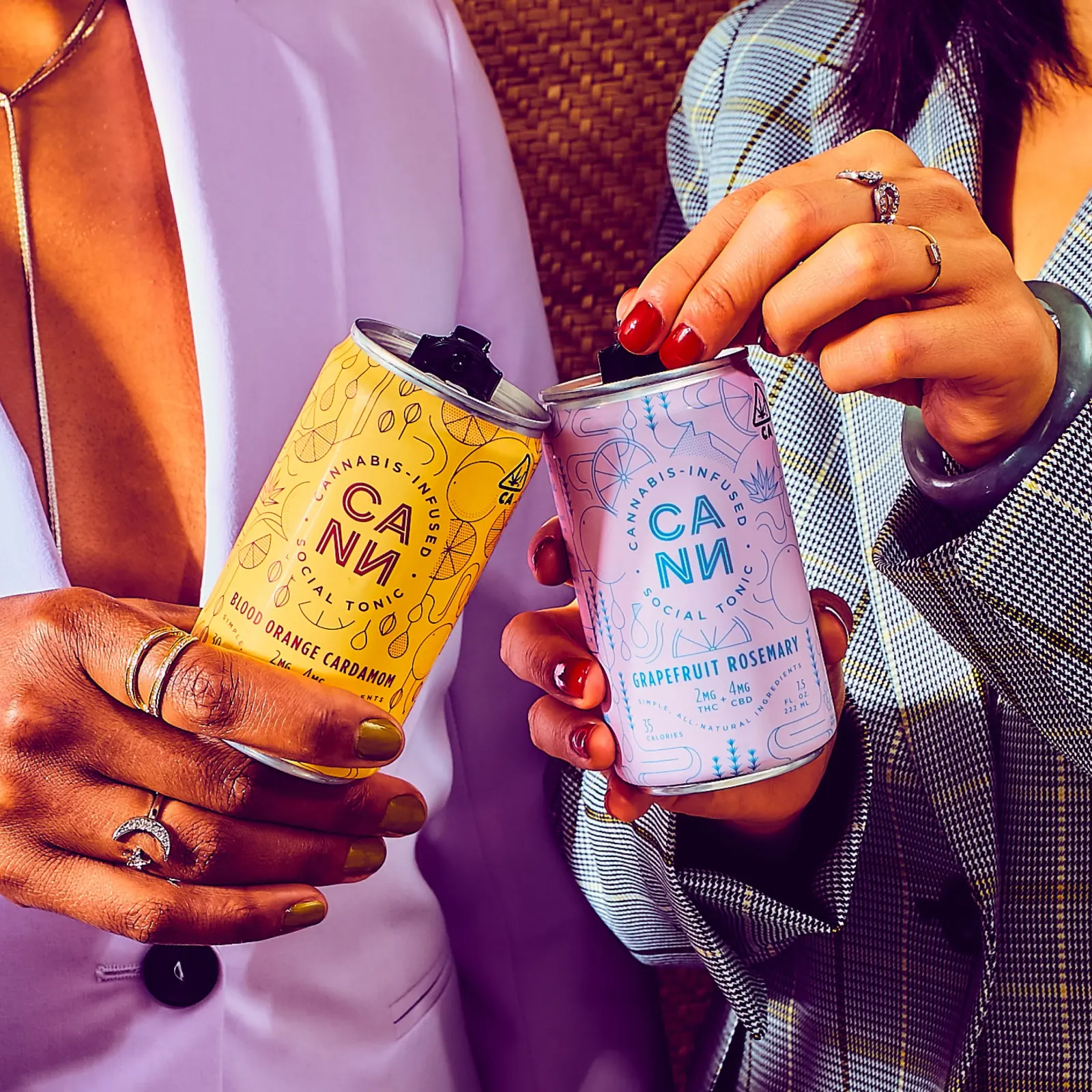
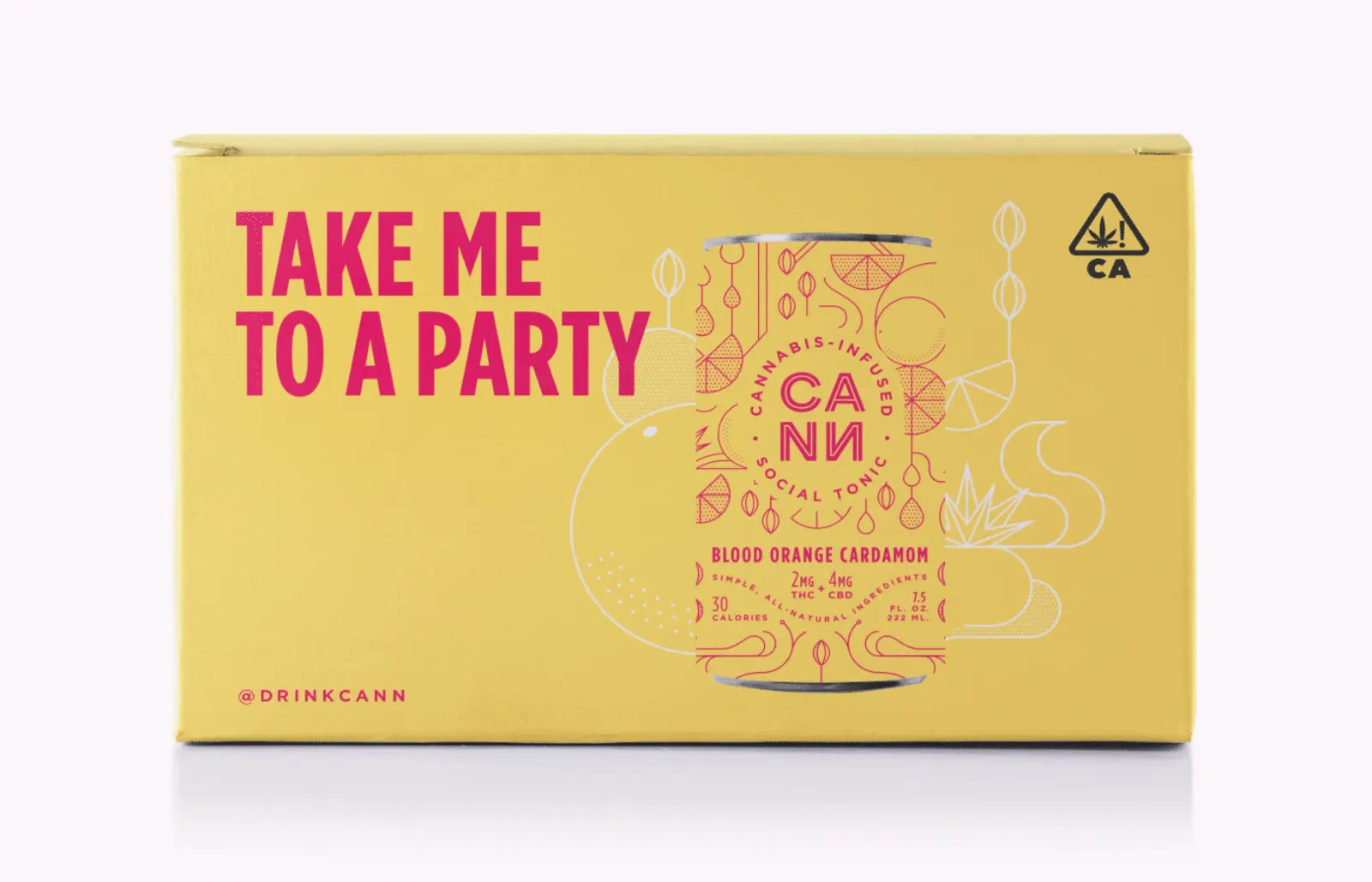
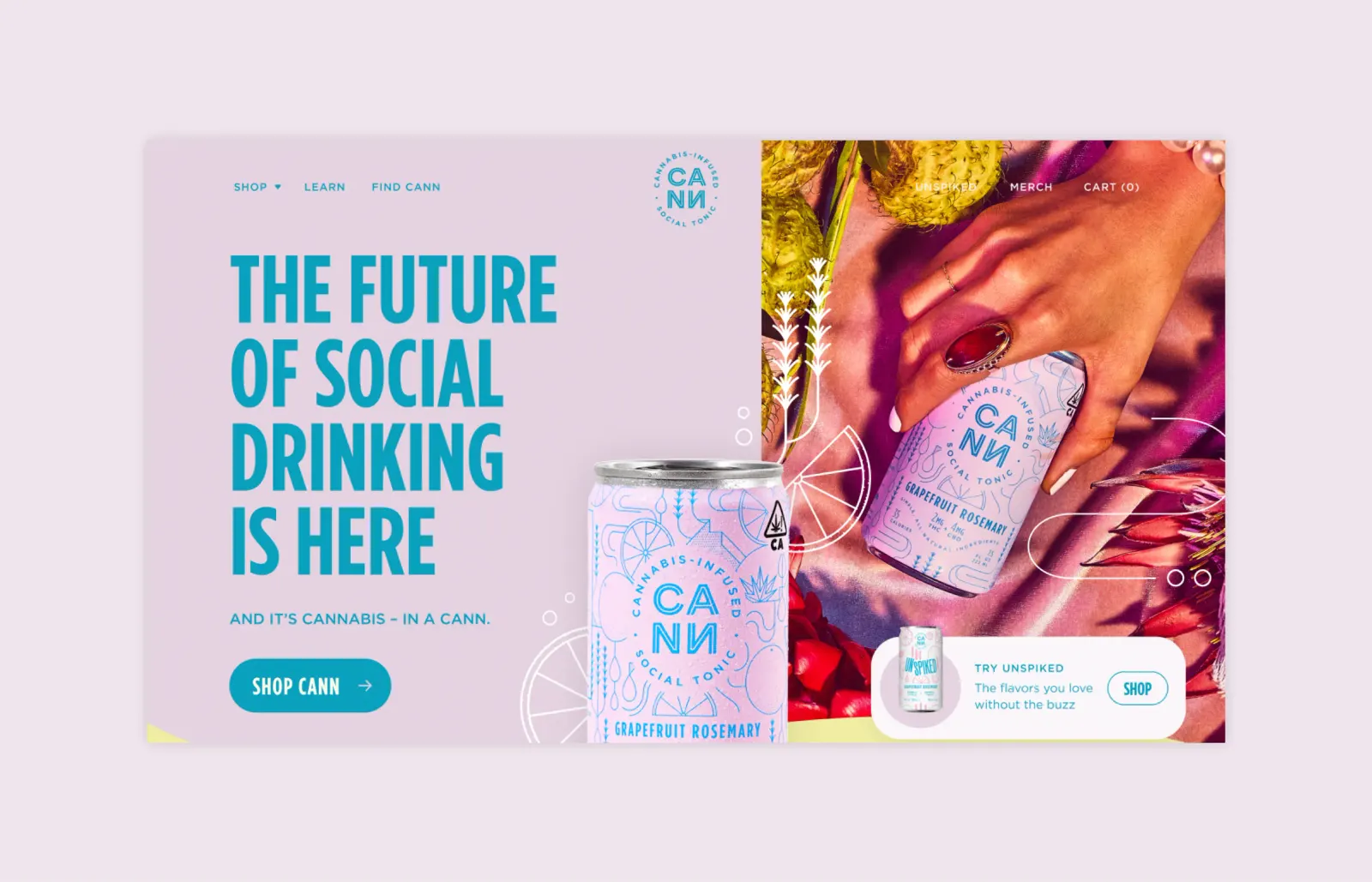
Red Antler framed the seltzer as something you pour for friends, closer to wine or beer than to a typical dispensary purchase. Bright hero colors, clean modern linework, and chatty, upbeat copy carry that idea across the packaging. The system has since stretched into digital and campaign work, and sales climbed quickly after launch.
Why it works
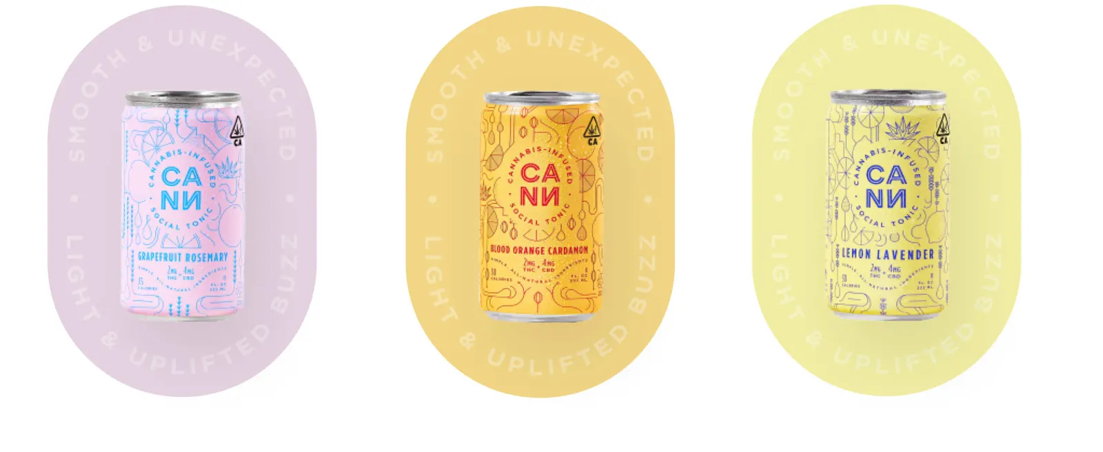
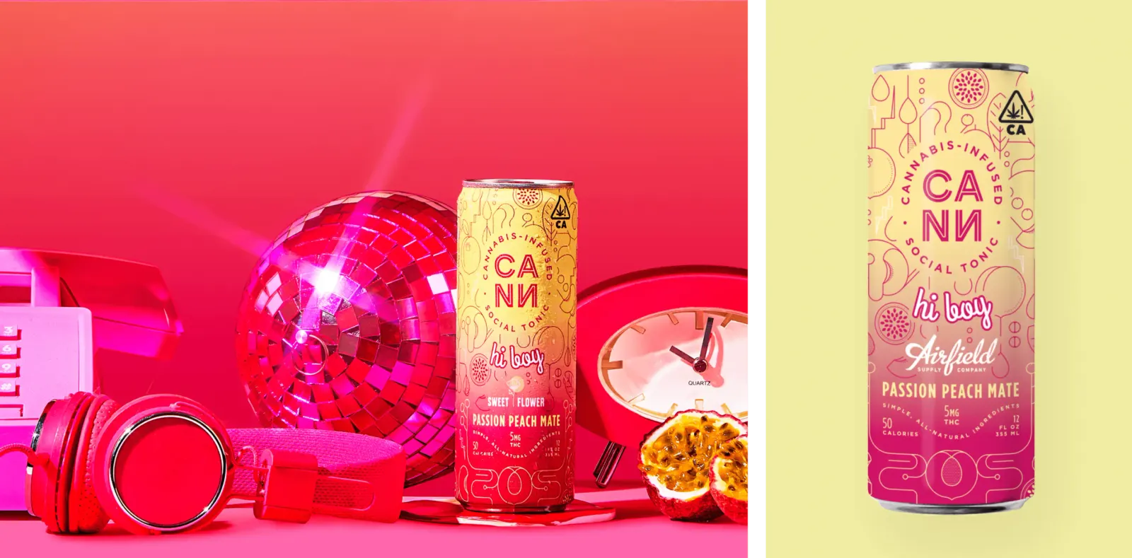
The color does the heavy lifting. Saturated, playful hues make the can read as a beverage first and a cannabis product second, which is the shift a newcomer needs to feel comfortable picking it up. The fine linework adds polish without seriousness, so the packaging feels designed rather than merely branded. The copy matters just as much. Its friendly, social tone invites people in instead of lecturing them. Because all three elements work together, the brand feels like one confident voice at every touchpoint.
Applications
Logo


Images and video from redantler.com, by Red Antler.