The Brand Monograph
Match brand identity by Collins
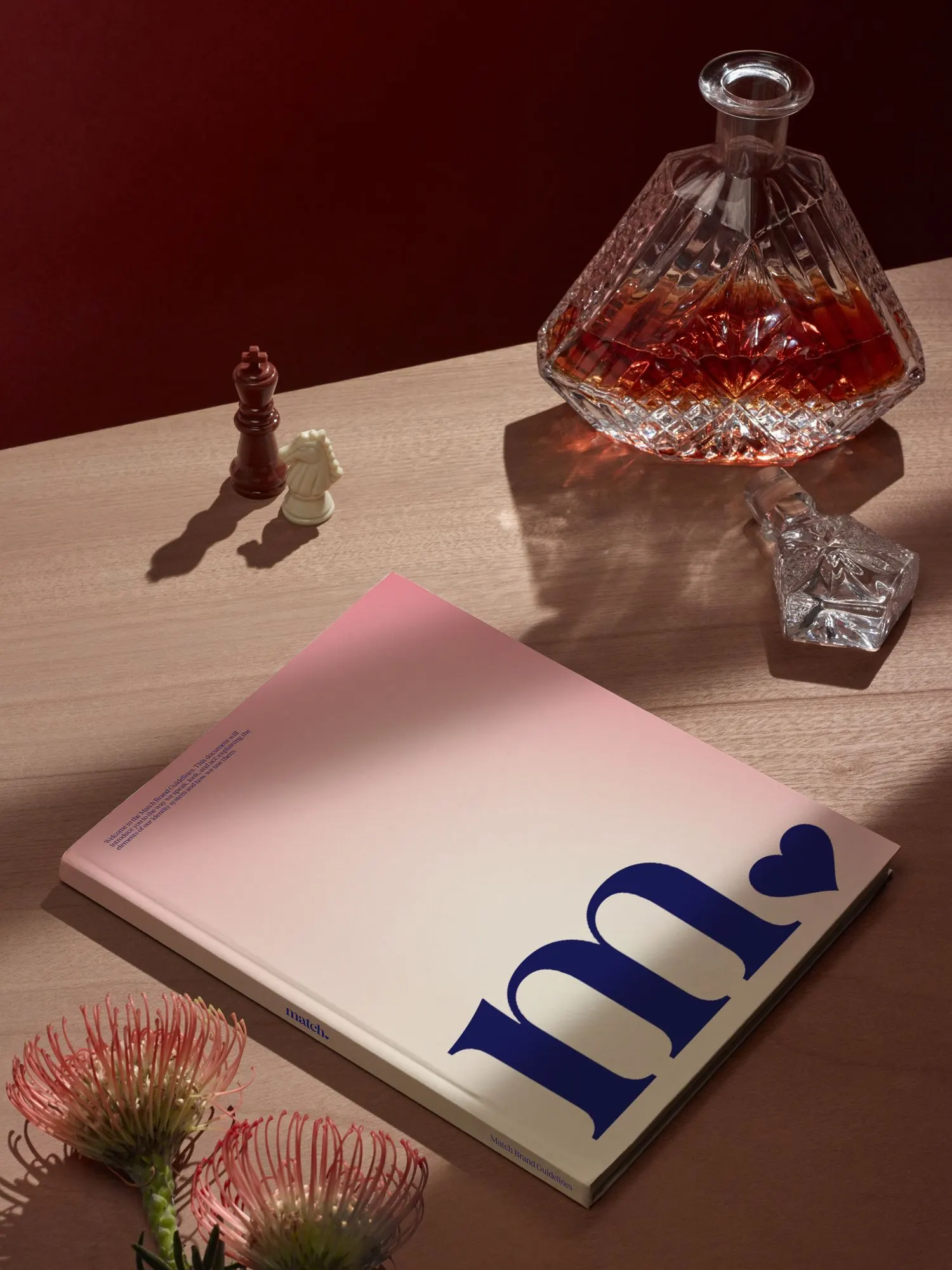
↗The most striking thing about Collins' work for Match is how much a single letter carries. The counter of the italic "a" is drawn as half a heart, so the product's name and what people hope to find through it share one shape. It's a quiet, confident move for a brand that launched in 1995 and now competes with swipe apps and a crowded field of niche rivals.
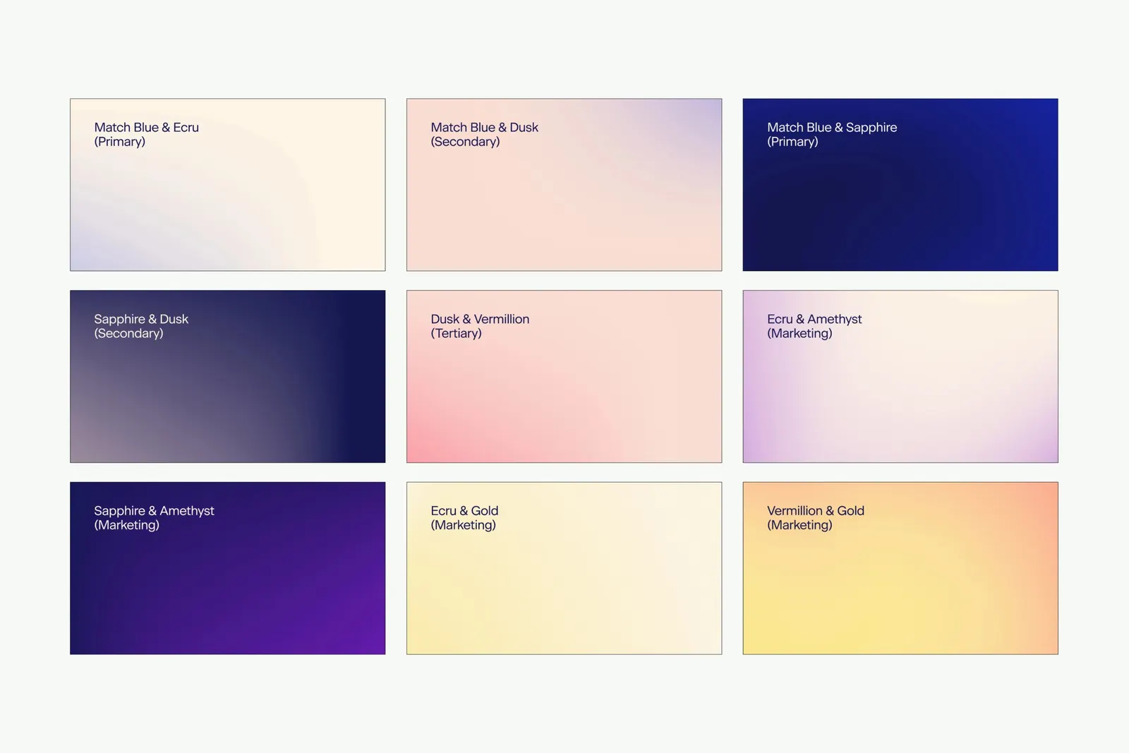
Collins went well beyond a new logo, reworking the language, product design, and features so Match behaves like a service for people who are serious. Typography came from Displaay, Fatype, and Jan Estrada-Osmycki, with photography by Ashley Batz, Mari Juliano, and Theo Livaudais. Blushes and creams meet burgundy, midnight blue, and black. Testing before launch showed a 13% lift across key metrics.
Why it works
The half heart works because it's unfinished. It asks the viewer to complete it, which is the promise of the service in miniature: two people making something whole. The italic gives the wordmark a personal, almost handwritten warmth that sets it apart from the bright, playful marks common in the category. The palette leans toward evening rather than playground, and deep reds and midnight blue read as grown-up without turning stuffy. That suits an audience that includes many people over 30, and a growing group over 50, who want to be taken seriously.
Applications
Color

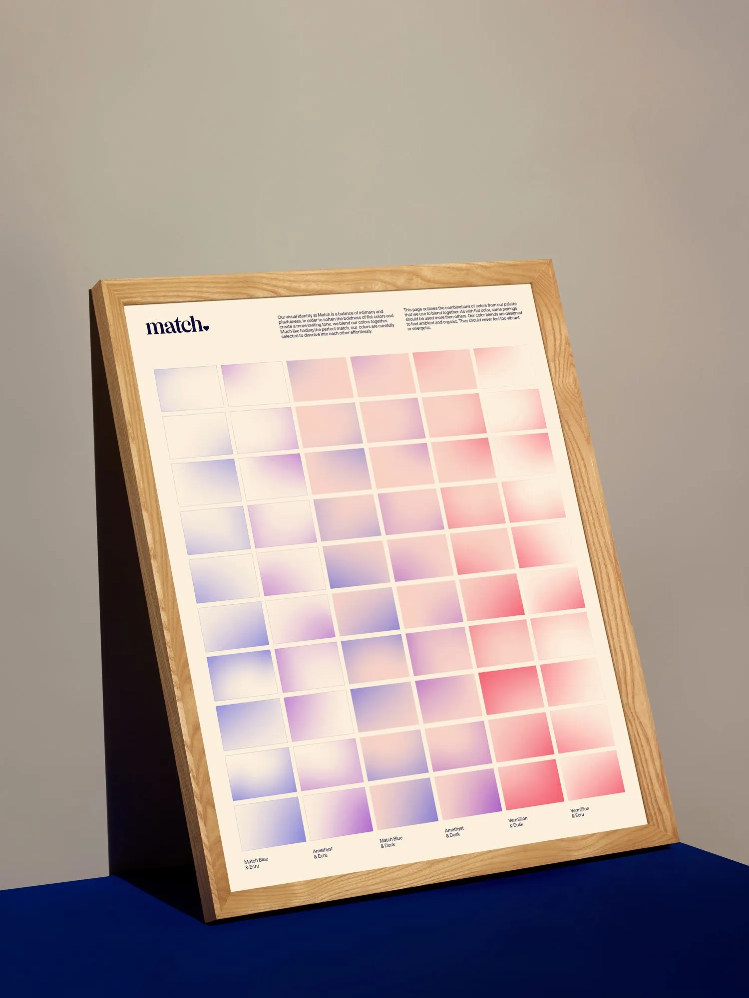


Images and video from wearecollins.com, by Collins.