The Brand Monograph
Orangetheory brand identity by Further
↗Further's work for Orangetheory stands out for how much it asks of one idea, and how well that idea holds up. The heart rate-based franchise had grown past 1,500 studios, but its story was blurring in a boutique market full of look-alikes. After time with members, coaches, and staff, the studio positioned the brand as the welcoming alternative to fitness that costs too much, shuts people out, and wears them down.
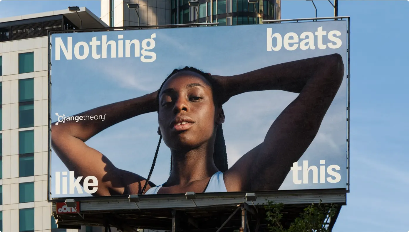
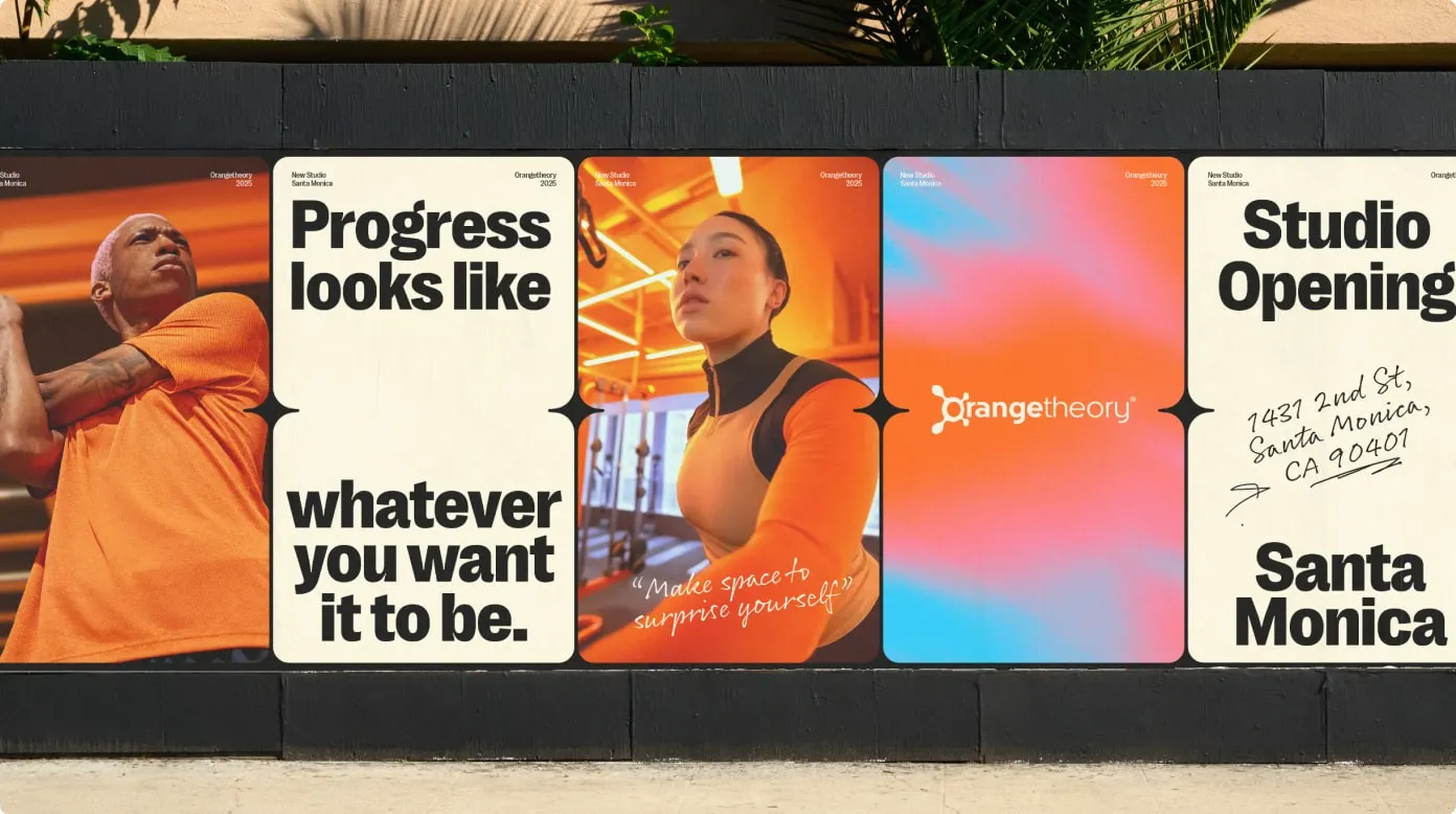
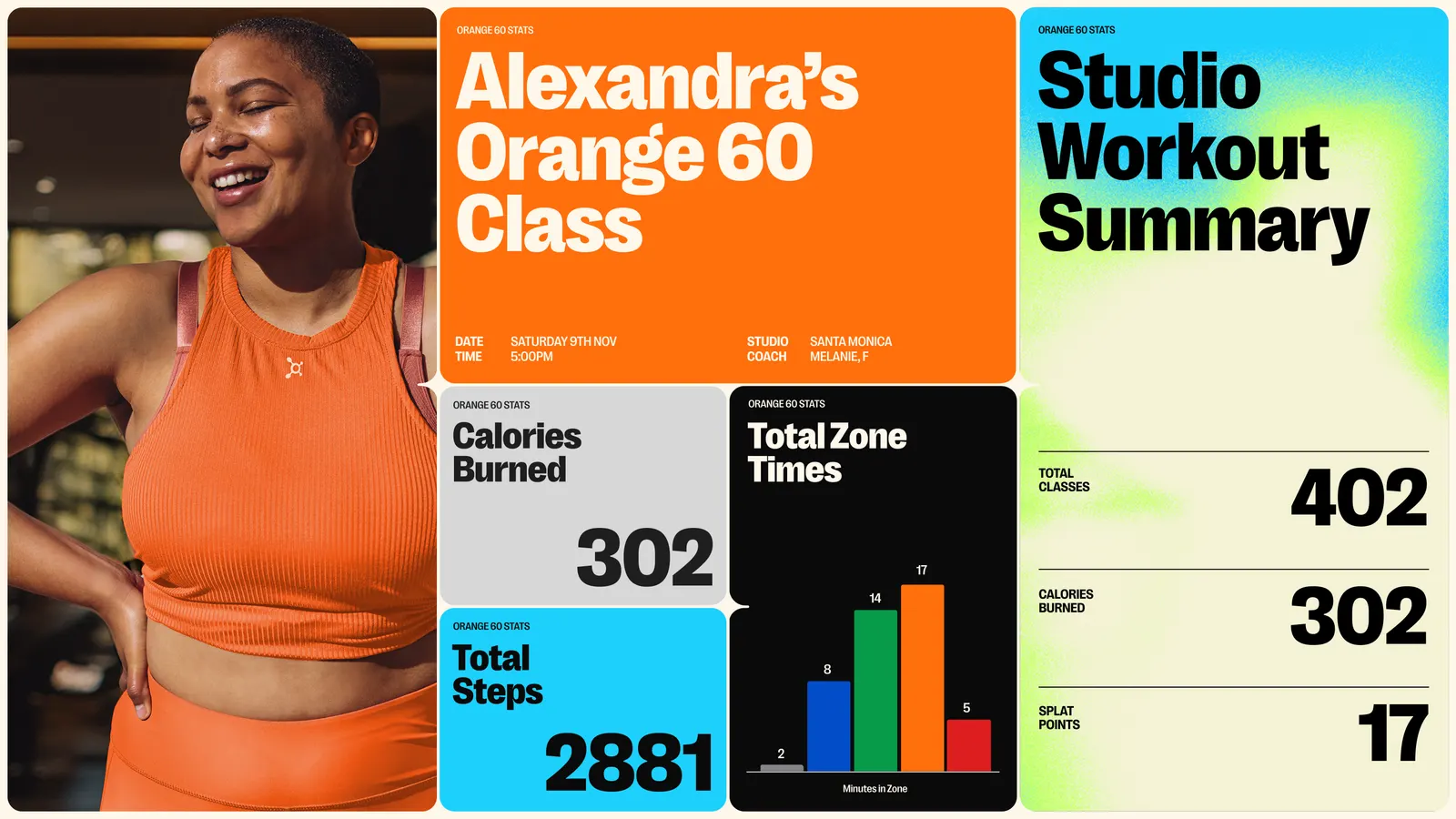
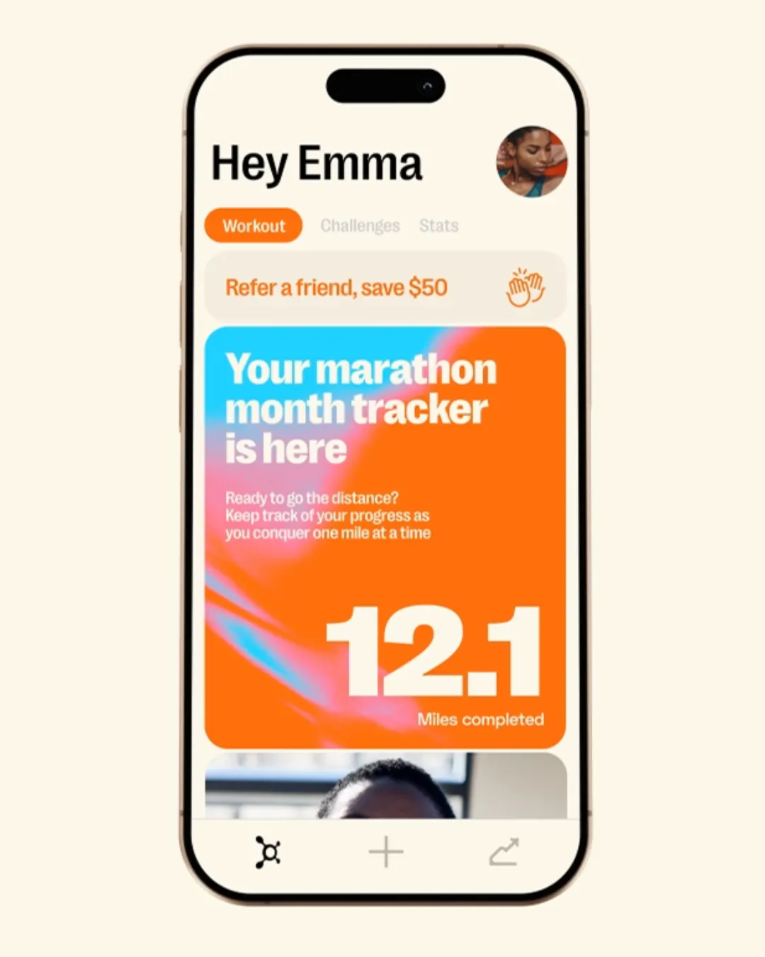
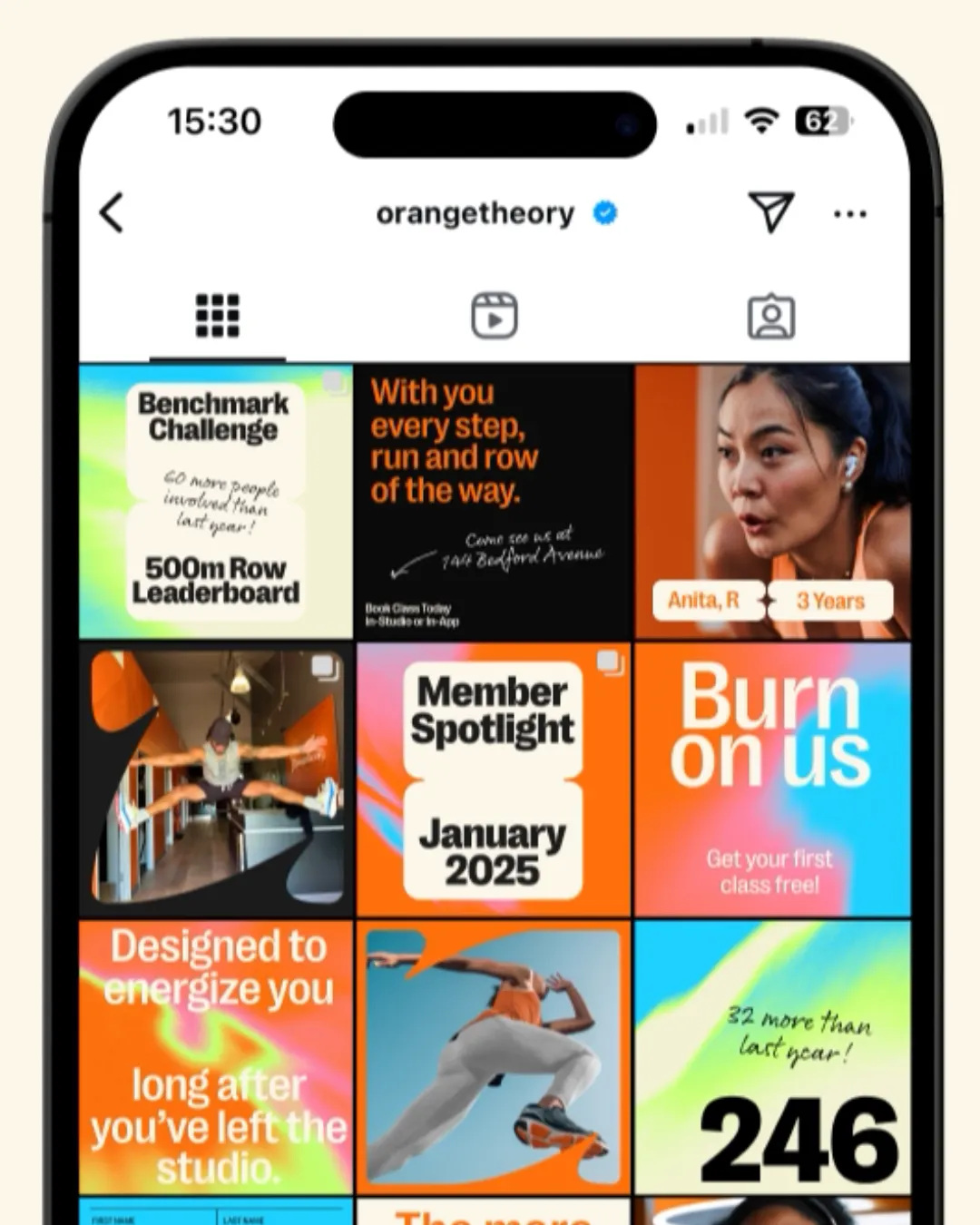
The identity is built from cards joined by a small spark, a format that covers basics, guidance, and inspiration. Four experience pillars give franchisees a shared target. Frames cut from the symbol's curves hold community content, orange gains secondary colors and a broader UI palette, and textures drawn from workout photography echo the Base, Push, and All Out paces. Motion energizes the studio display boards, and handwritten notes carry the coaches' voice. Monthly Active Users rose 248%.
Why it works
The cards give a network of local owners a clear structure to build inside, so the brand stays consistent without feeling templated. The handwriting and warm type do the most to set it apart, since most fitness brands rely on polished, aggressive typography. Here the voice sounds like a coach, not a campaign. Textures made from real workouts keep the orange tied to effort rather than decoration, and naming the visuals after the workout paces links the identity directly to the product.
Applications
Logo


Images and video from further.group, by Further.