The Brand Monograph
DNEG brand identity by Further
↗Few brands are judged on movement as harshly as a studio whose business is making images move, and Further's identity for DNEG holds up to that standard. The VFX and animation house, winner of eight Academy Awards, has grown from effects work into end-to-end production, including virtual production and immersive experiences. Its brand needed to signal that wider reach.
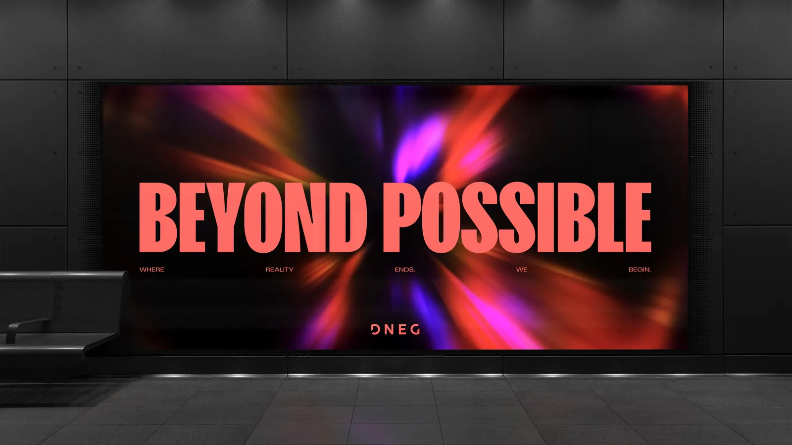
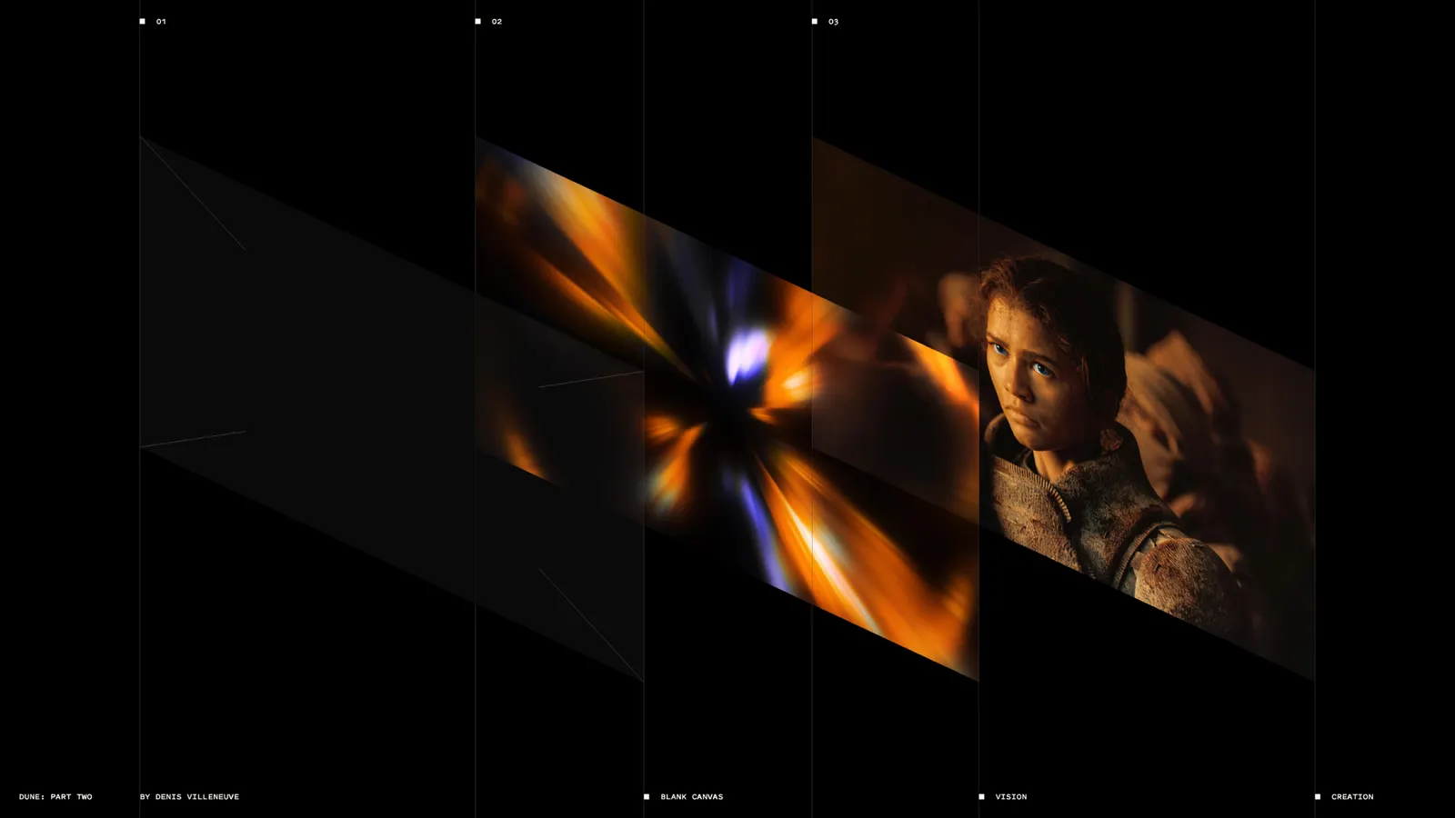
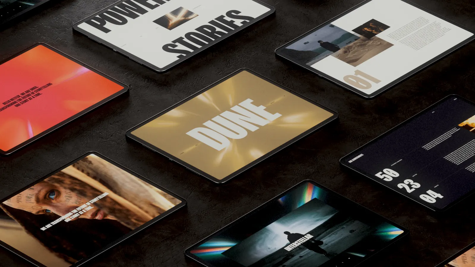
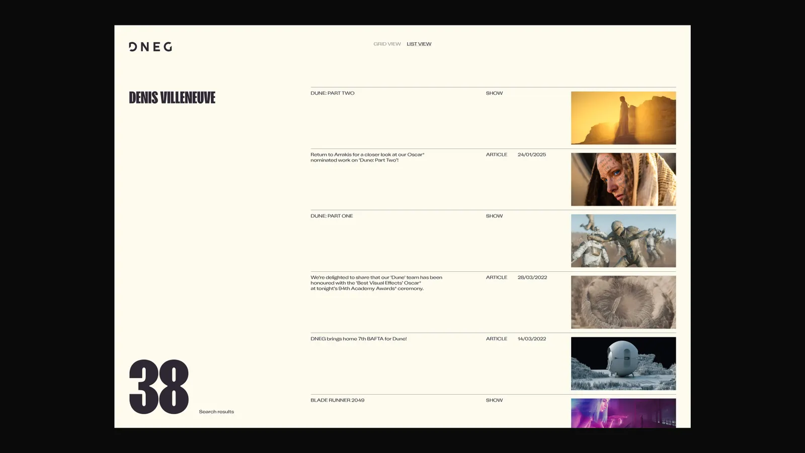
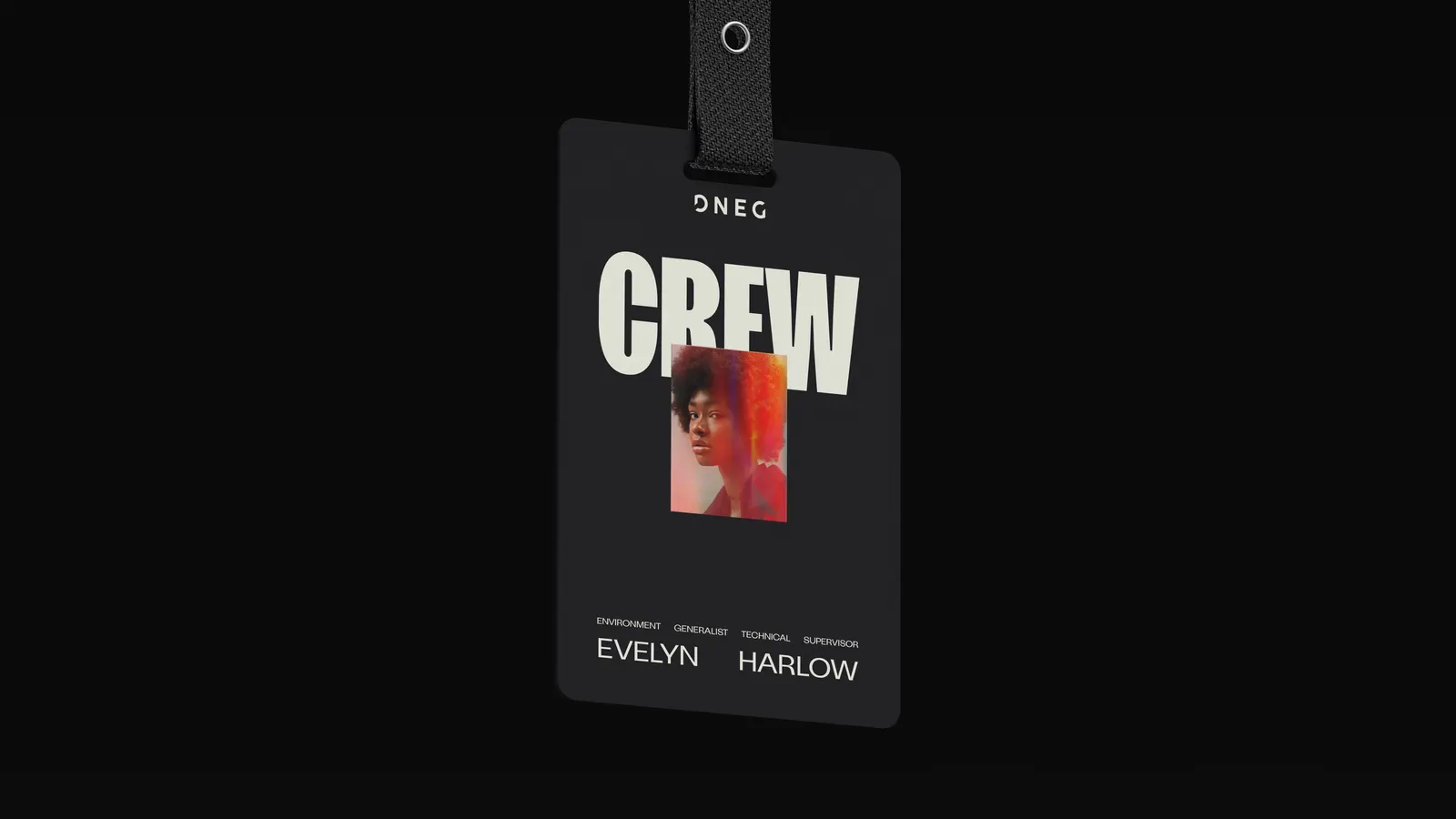
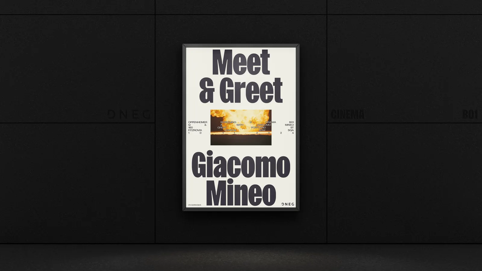
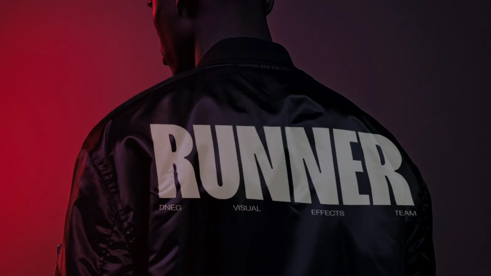
Further built the Start with Impossible platform and let motion drive the whole system. The Vision animation sends streaks of color through a lens-like eye toward a vanishing point, where they resolve into a finished piece of DNEG work. Typography includes DNEG Script, a custom headline face developed with Lift Type. The palette is restrained, with secondary colors drawn from project work, and the logo was lightly refined. On the website, sections expand in place and a cinematic zoom pulls visitors in. The system carries through out-of-home, social, and apparel.
Why it works
The Vision animation shows the transformation DNEG sells, from abstraction to finished image, so the brand demonstrates its claim instead of stating it. A restrained core palette leaves room for film imagery to supply the color, and project-derived secondary shades keep the identity tied to the work. The custom script gives headlines a voice in a category that often defaults to neutral sans serifs. Keeping the logo recognizable protects equity with clients and prospective talent.
Applications
Logo
Images and video from further.group, by Further.