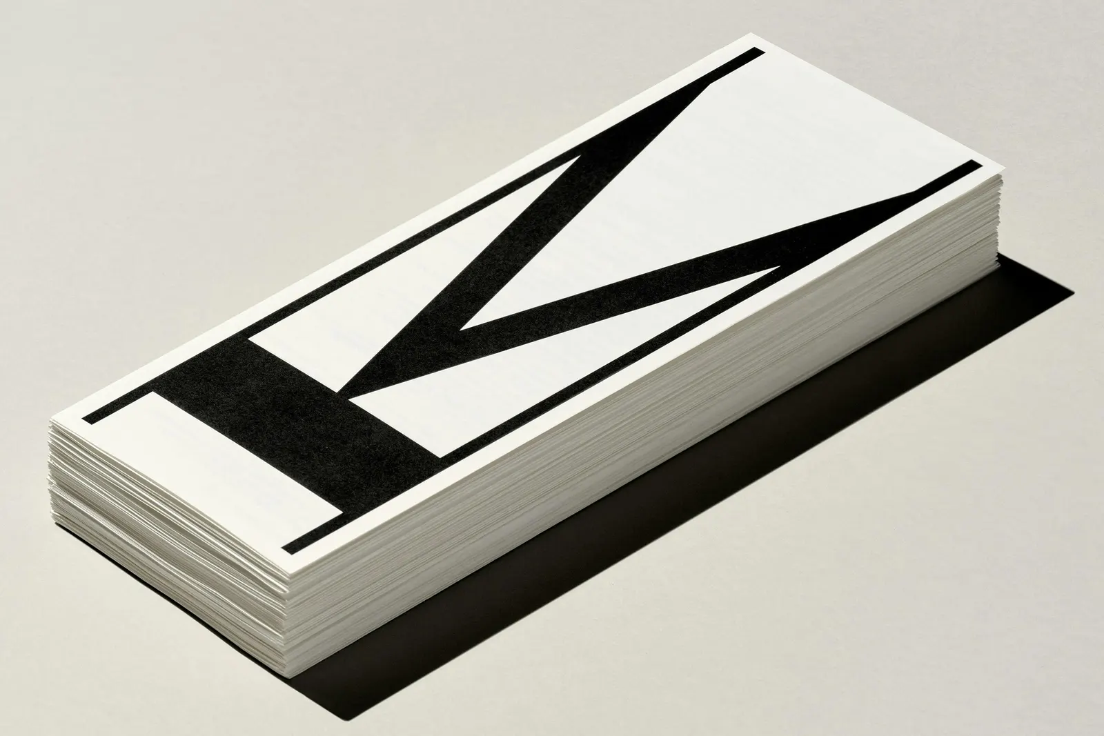
The Brand Monograph
Church brand identity by Porto Rocha
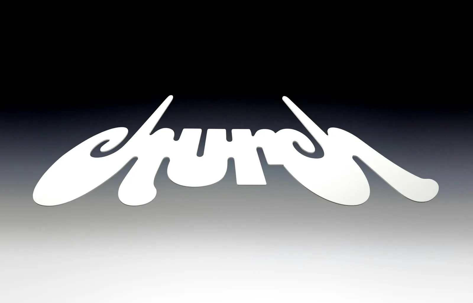
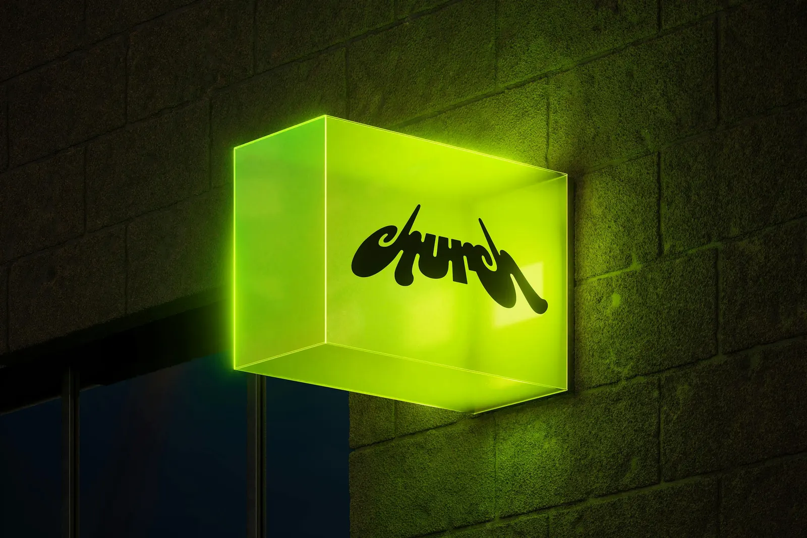
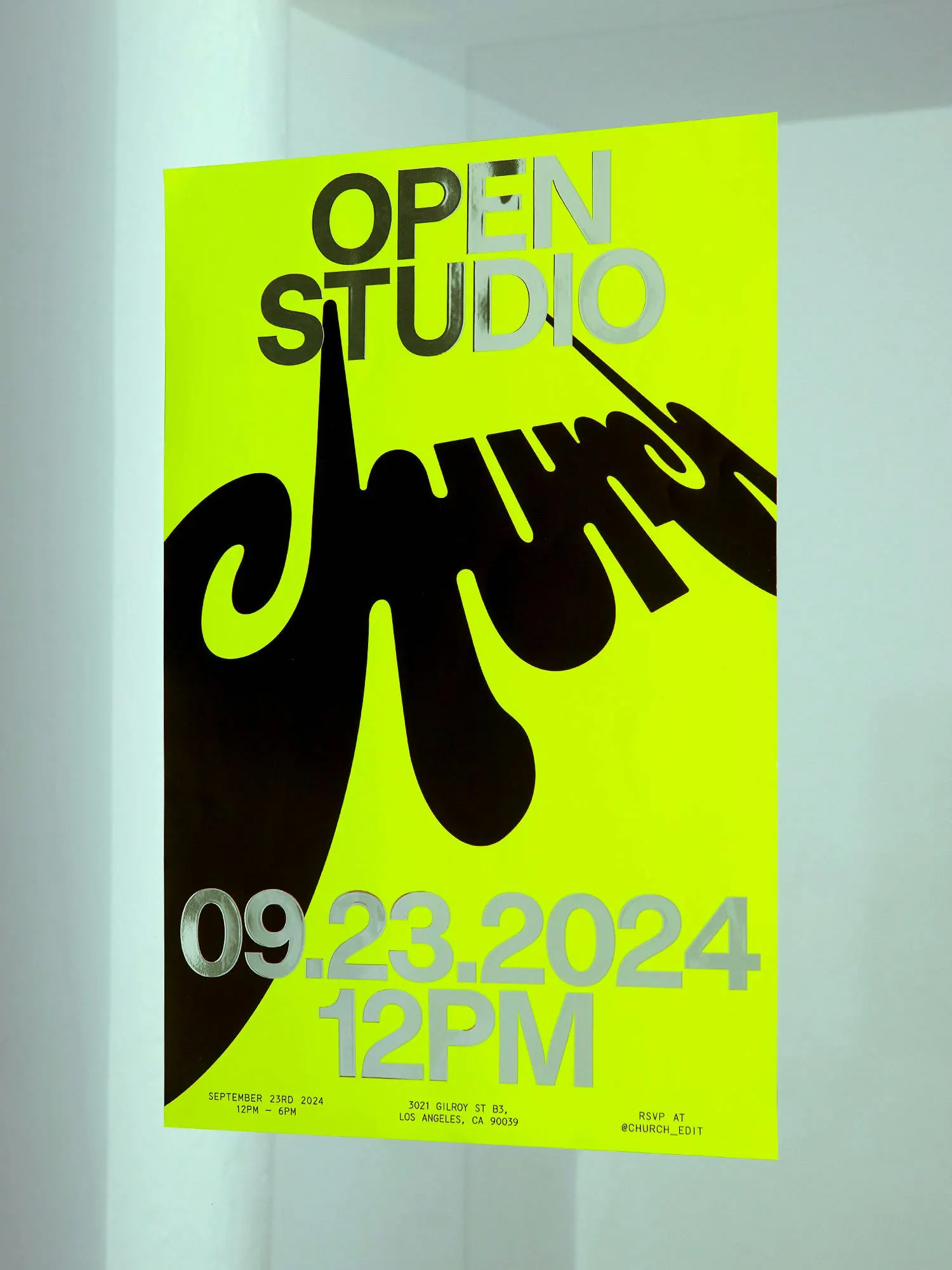
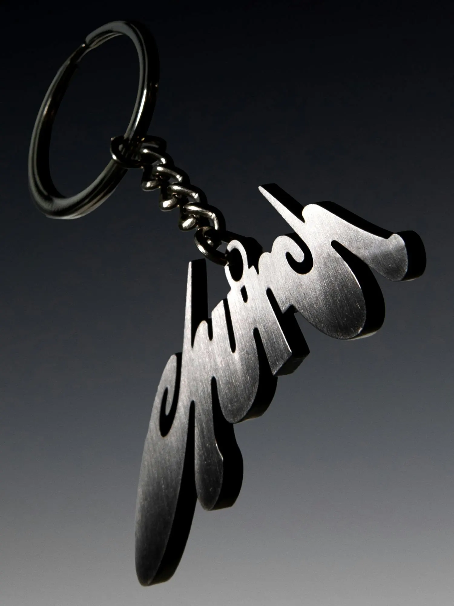
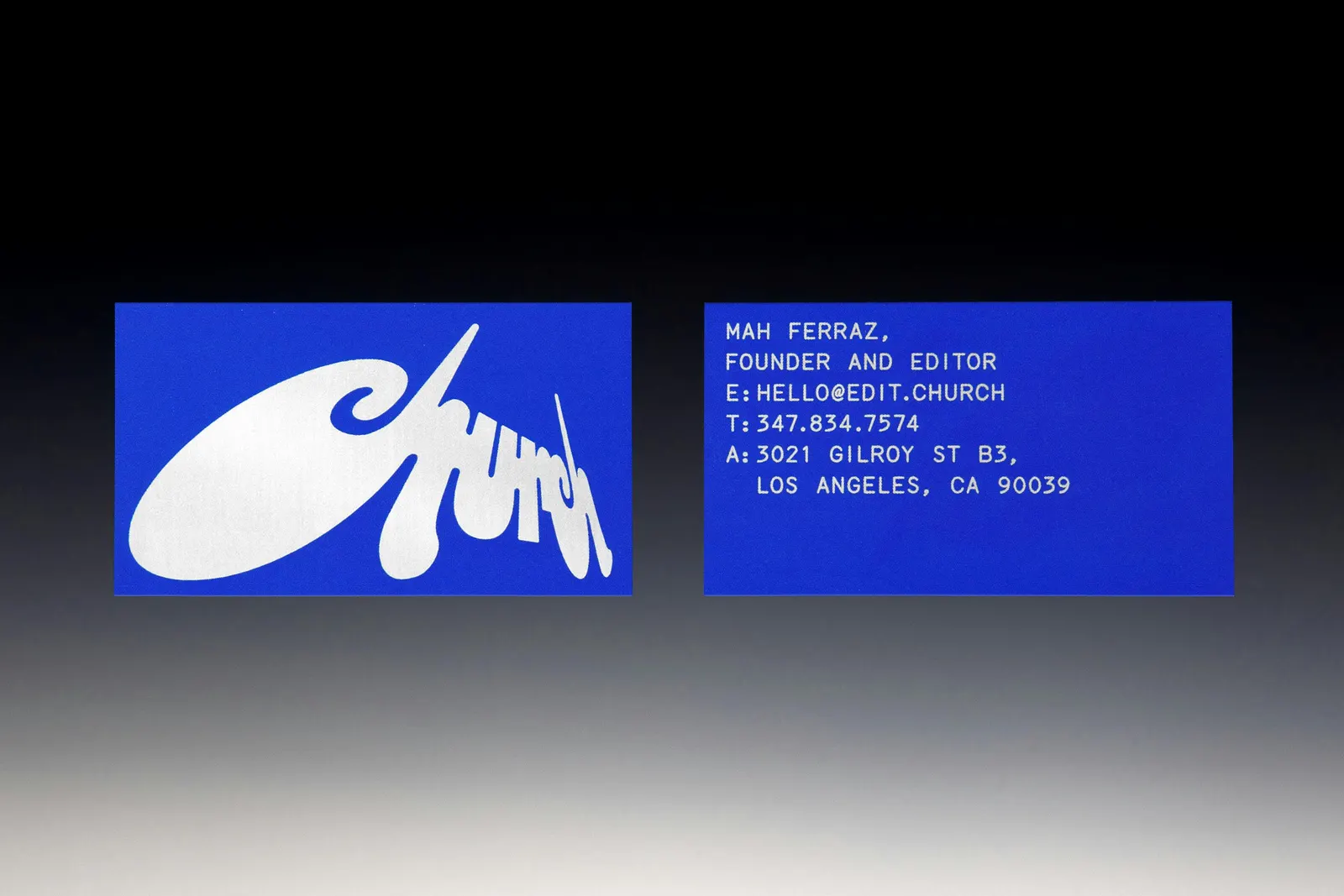
↗Most post house identities stay quiet so the reels can do the talking. For Church, the editing collective founded by Mah Ferraz and based in east LA, Porto Rocha went the other way with a logo drawn from the view up at a cathedral. Artist Chloe Corriveau concepted the wordmark, and the studio refined it into a bold, scalable mark that appears from multiple angles.
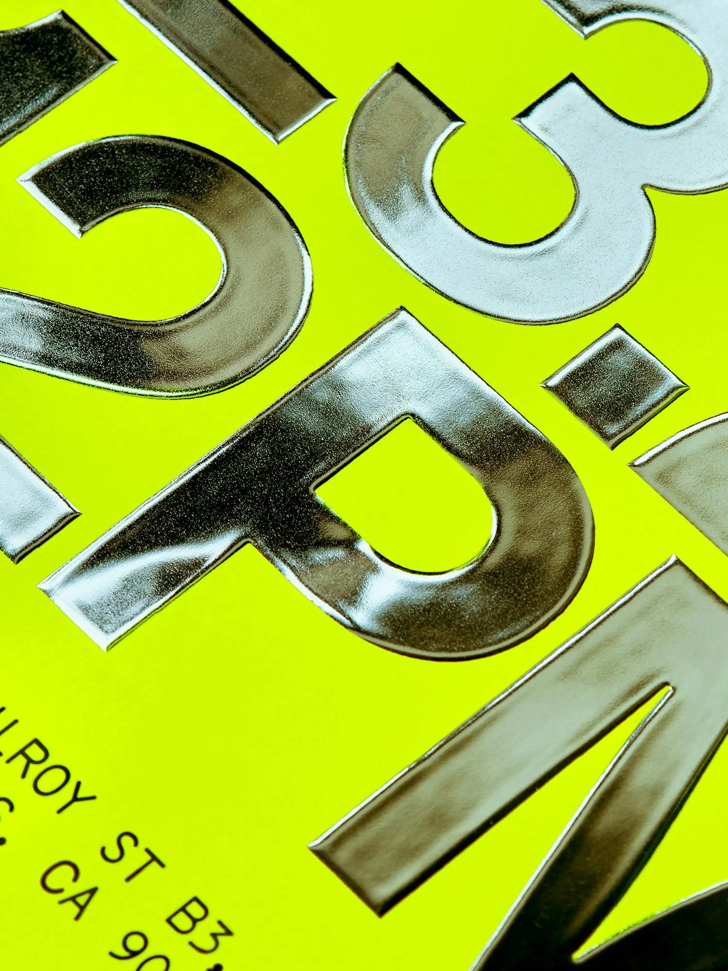
Typography splits the work between Super Studio, a light mono for utility, and the heavier Studio Pro for editor names and project titles. Motion designers Riccardo Agostinelli, Thales Muniz, and Vincenzo Marchese Ragona carry the logo's tilted viewpoint into zooms, rotations, and reframes. Open Statement built a website that works as a space to explore as much as a portfolio.
Why it works
Editing is about framing, and this identity frames itself. A mark that changes angle and motion built on reframing show the craft the studio sells, without a word of explanation. The bold wordmark and light mono create a clear hierarchy, so editor names and titles stay the stars. For a roster working with brands like Nike and artists like Travis Scott, the look signals ambition and a point of view, and it stands apart from the polished sameness of most post houses.
Applications
Typography
Logo

Images and video from portorocha.com, by Porto Rocha.