The Brand Monograph
CNET brand identity by Collins
↗Few legacy publications manage to look older and newer at the same time, but Collins's identity for CNET does. It pairs the gravity of mid-century television news with surreal imagery that is anything but sober. The brief was ambitious: take a brand known for gadget reviews since 1994 and make it credible as an editorial home for money, home, wellness, culture, cars, and climate.
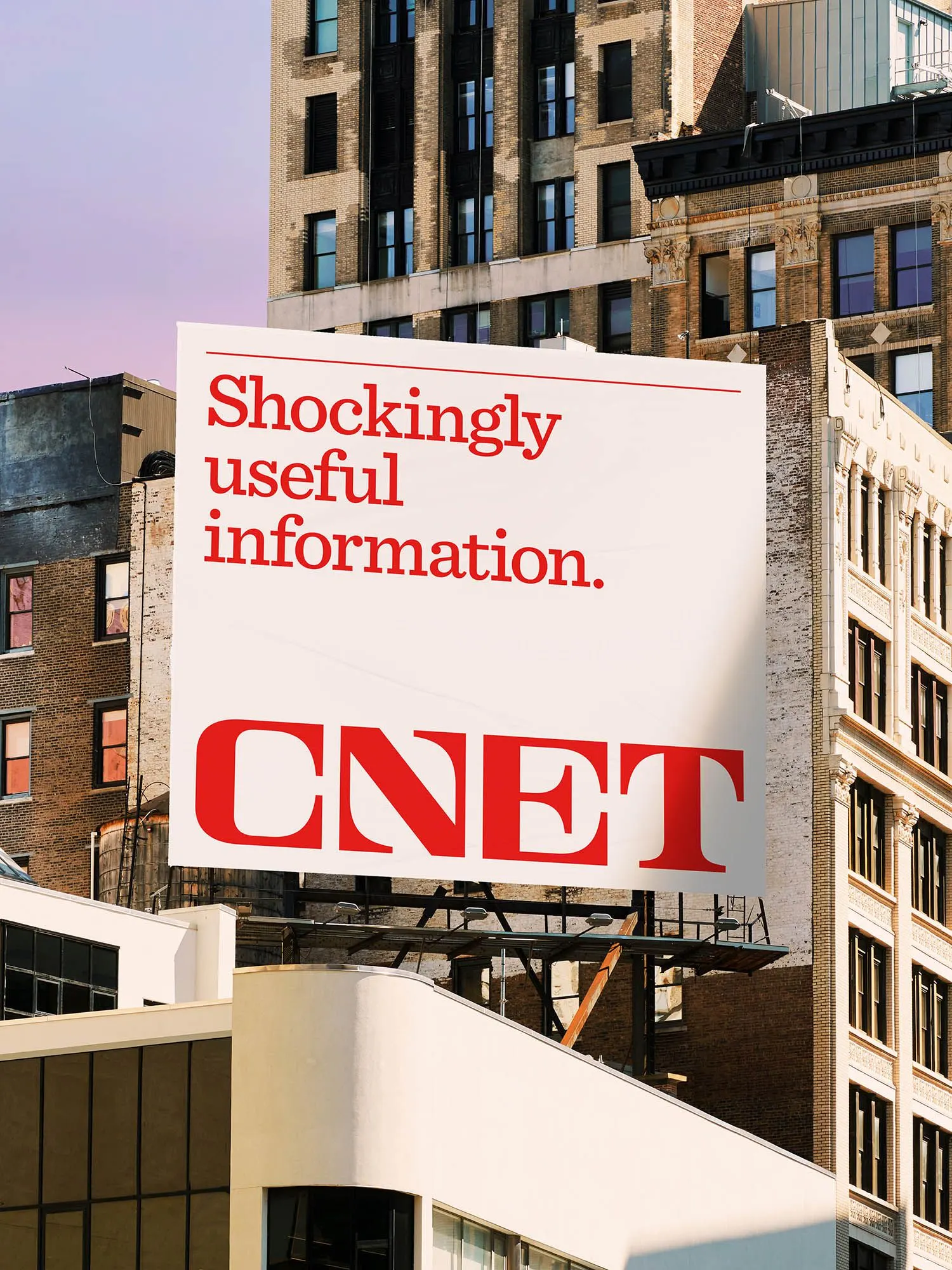
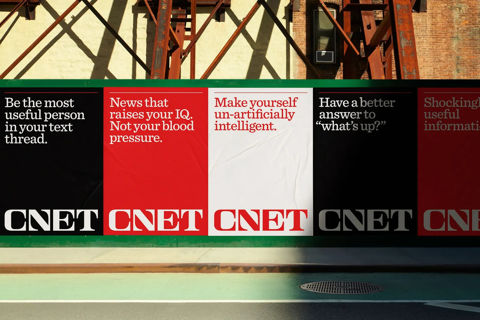
Collins developed the strategy, story, and identity together, drawing on broadcast journalism of the 1950s through the 1970s for a wordmark that carries authority and sits comfortably next to other headlines in any channel. Robert Beatty (design and illustration) and Mari Juliano (photography) shaped the imagery. A reworked brand voice keeps the tone of the news lighter than the subject matter.
Why it works
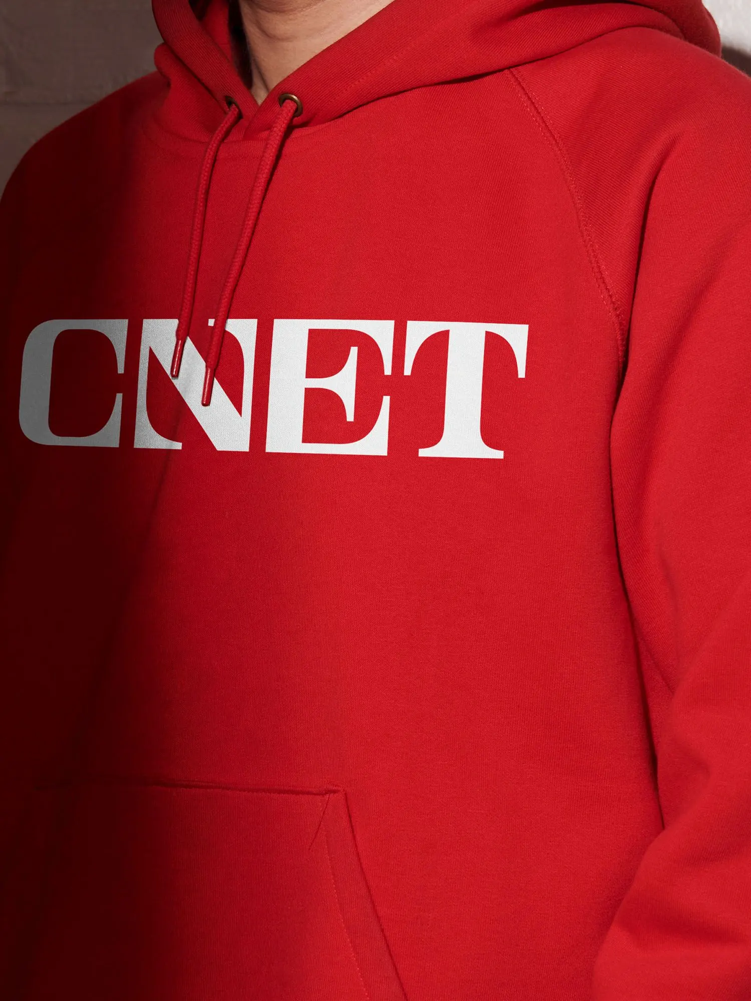
The wordmark is the smartest move. Borrowing from an era when news was treated as a public good gives CNET instant credibility in a category crowded with partisan outlets and clickbait, without relying on tech's usual glossy cues. Because it is confident but quiet, the headlines and advice can carry the weight. The surrealism does the opposite job, turning practical topics like money or home into something people want to open. Authority up front and imagination behind it is what lets a broad editorial range read as one brand.
Applications
Logo


Images and video from wearecollins.com, by Collins.