The Brand Monograph
ESPN brand identity by Collins
↗Few sports brands carry as much goodwill as 30 for 30, so Collins's work for ESPN is as much careful stewardship as redesign. The studio was asked to plan for the decade ahead. The series now competes in a crowded streaming field and has grown well beyond feature documentaries into shorts, podcasts, and live events.
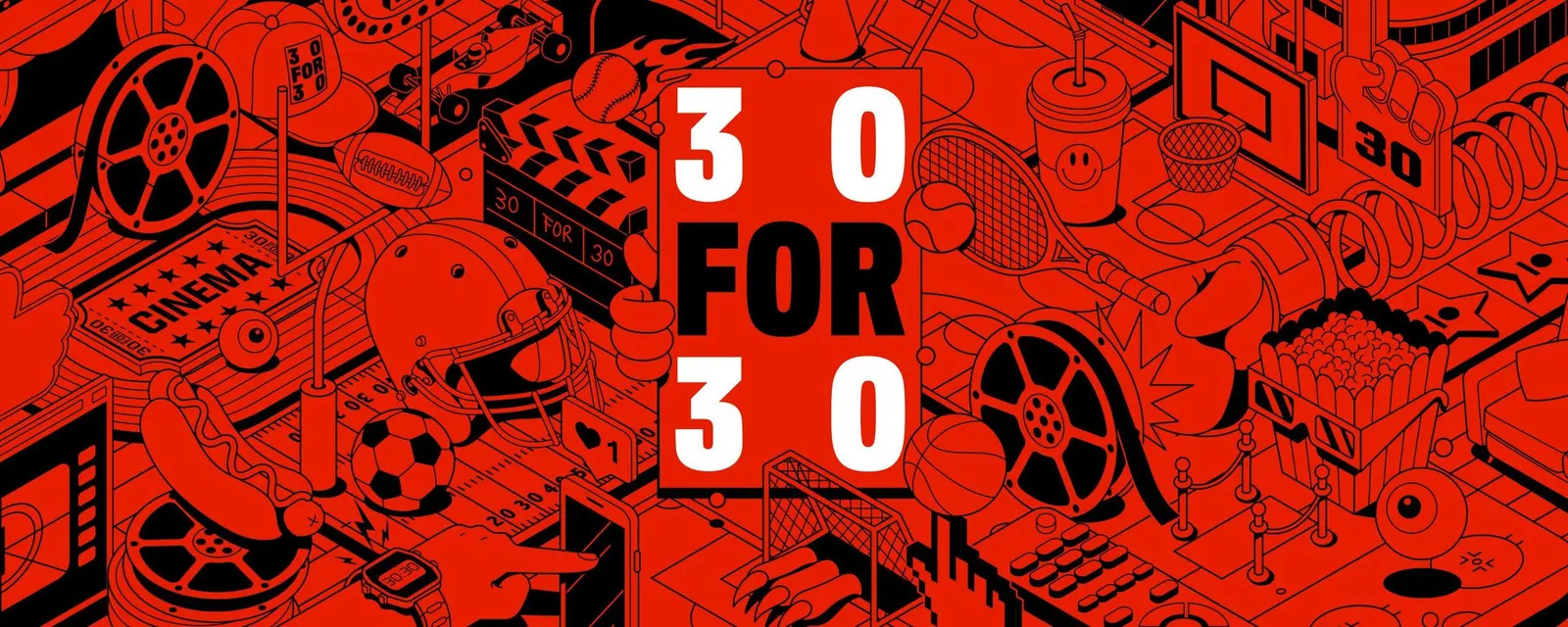
Collins started with research, talking with the ESPN Films team and with viewers, and found that people remember the sense of a particular time and place, and what it meant, more than the game itself. The identity reflects that. It draws on stadium scoreboards, mid-century title sequences, and 1990s football uniforms, collected the way the films gather their subjects. The result is a louder system that holds together across every format.
Why it works
The reference pool is the smart move. Scoreboards, title sequences, and team uniforms are visual languages that sports fans already read fluently, yet none belongs to a single sport or era, so the identity feels like the series itself: familiar, with a few surprises. Because the sources come from different media, the system has range. A podcast cover, a short, and a film poster can look distinct while sharing one voice. In a category where prestige streaming brands tend to look alike, this collage of sports and cinema memory gives 30 for 30 a point of view instead of generic polish.
Applications
Logo
Typography


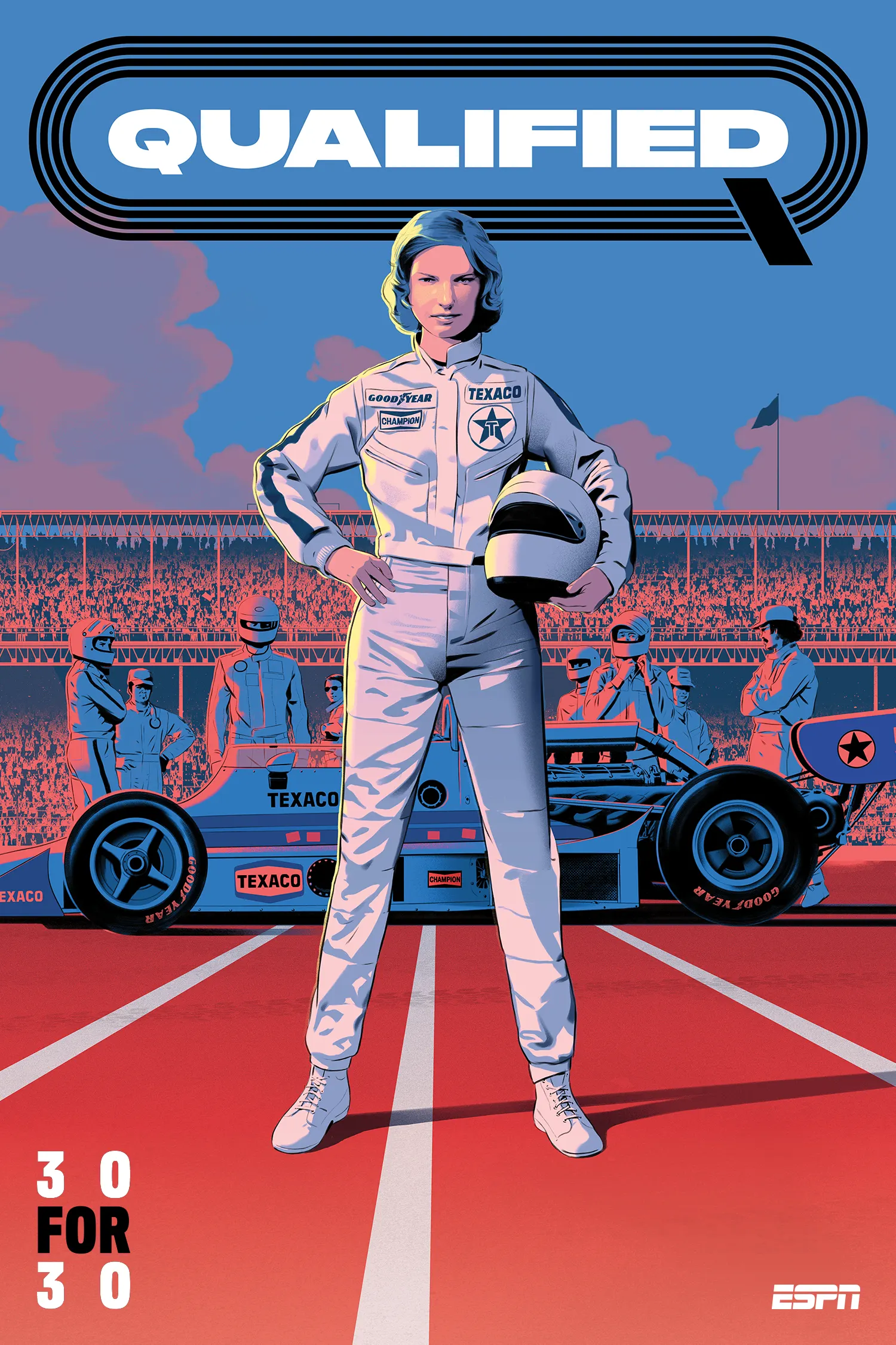
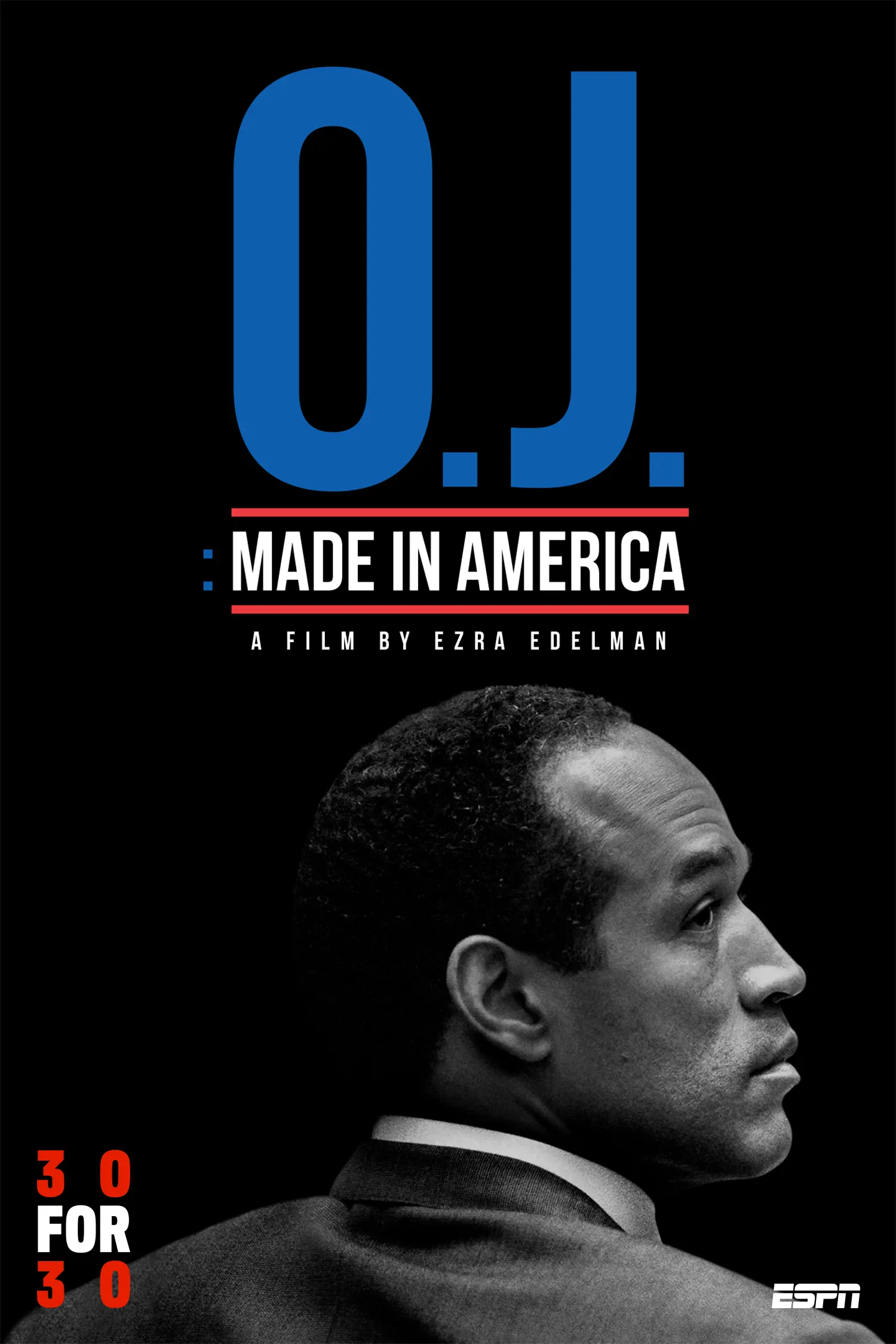
Images and video from wearecollins.com, by Collins.