The Brand Monograph
Girl Scouts brand identity by Collins
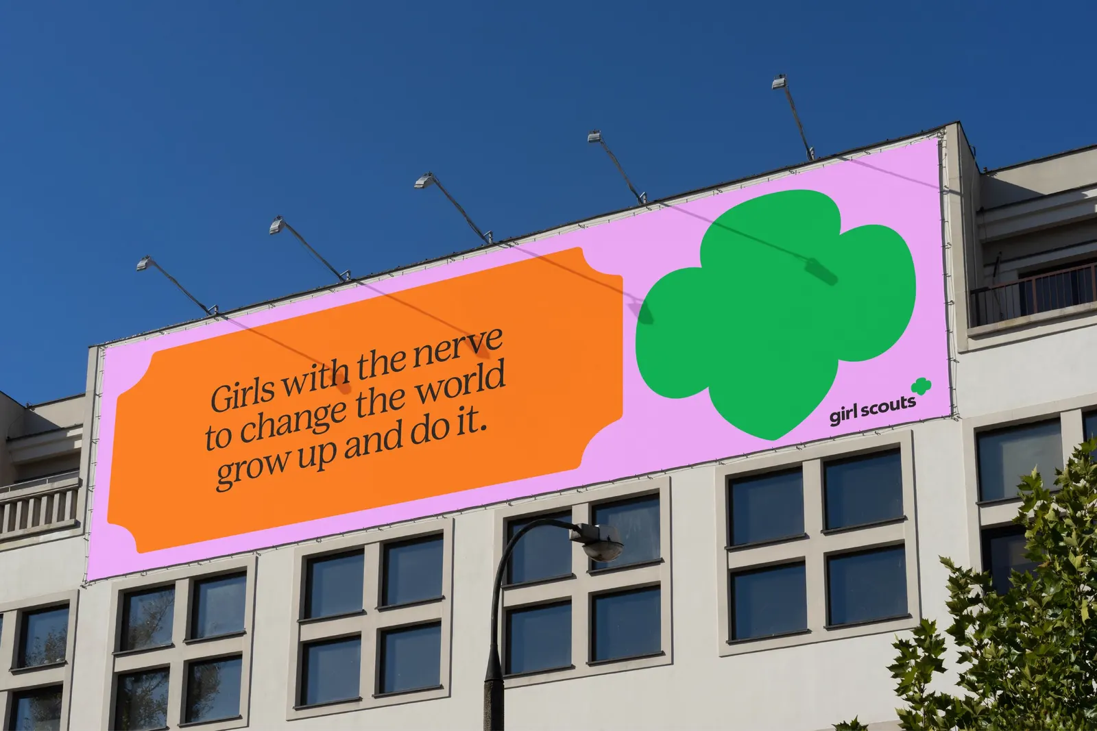
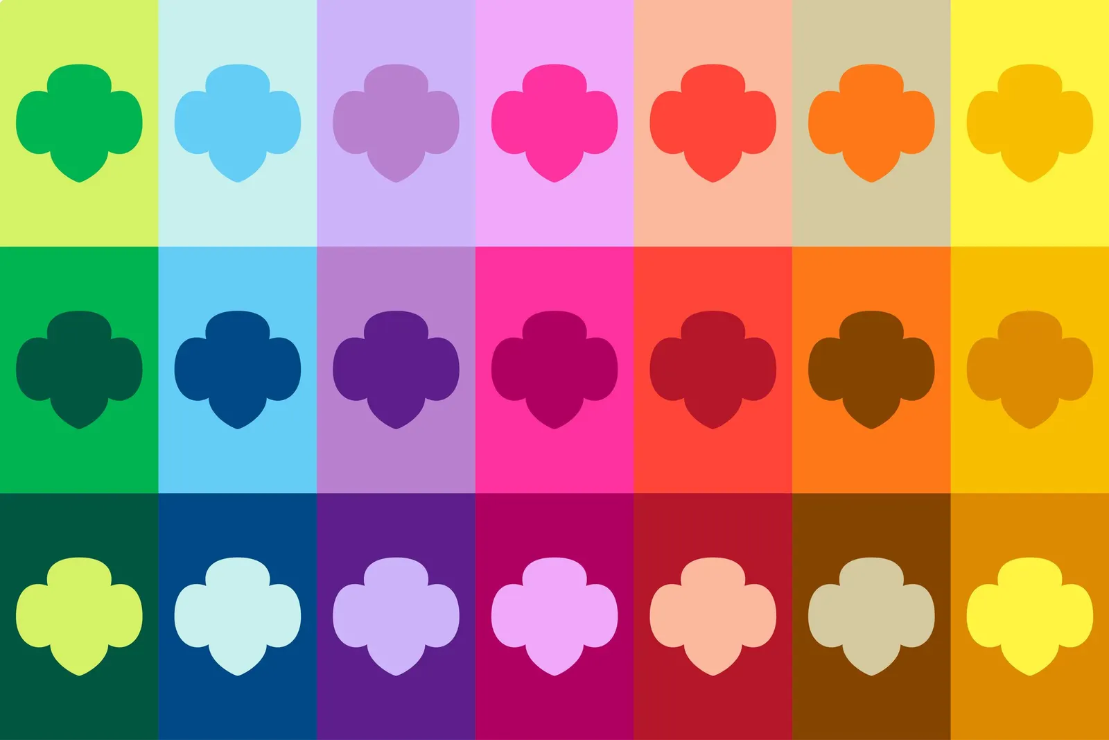
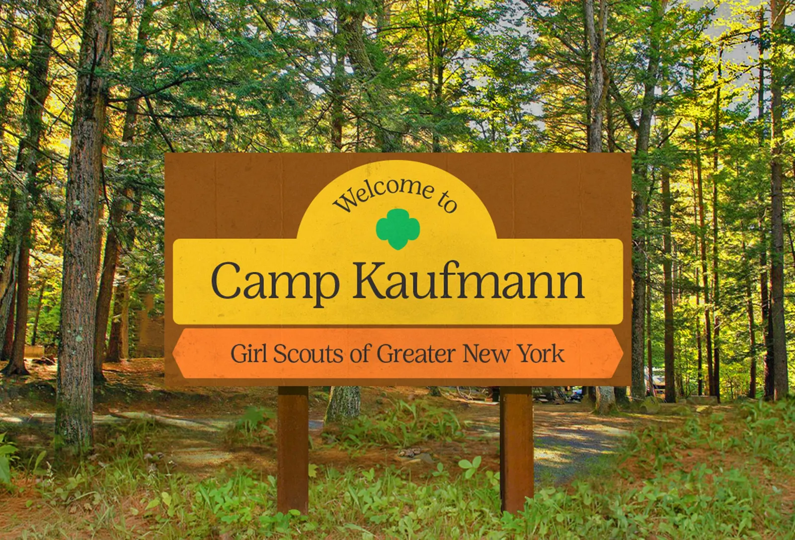
↗Collins' work for the Girl Scouts of the USA shows how to update a century-old emblem without freezing it or discarding it. The studio started in 2019 with a structural problem: more than 112 independent councils, each producing its own communications. Collins answered with a brand platform about backing girls' ambitions, expressed first through a pared-back Trefoil that keeps the symbol's familiar shape and drops what it didn't need.
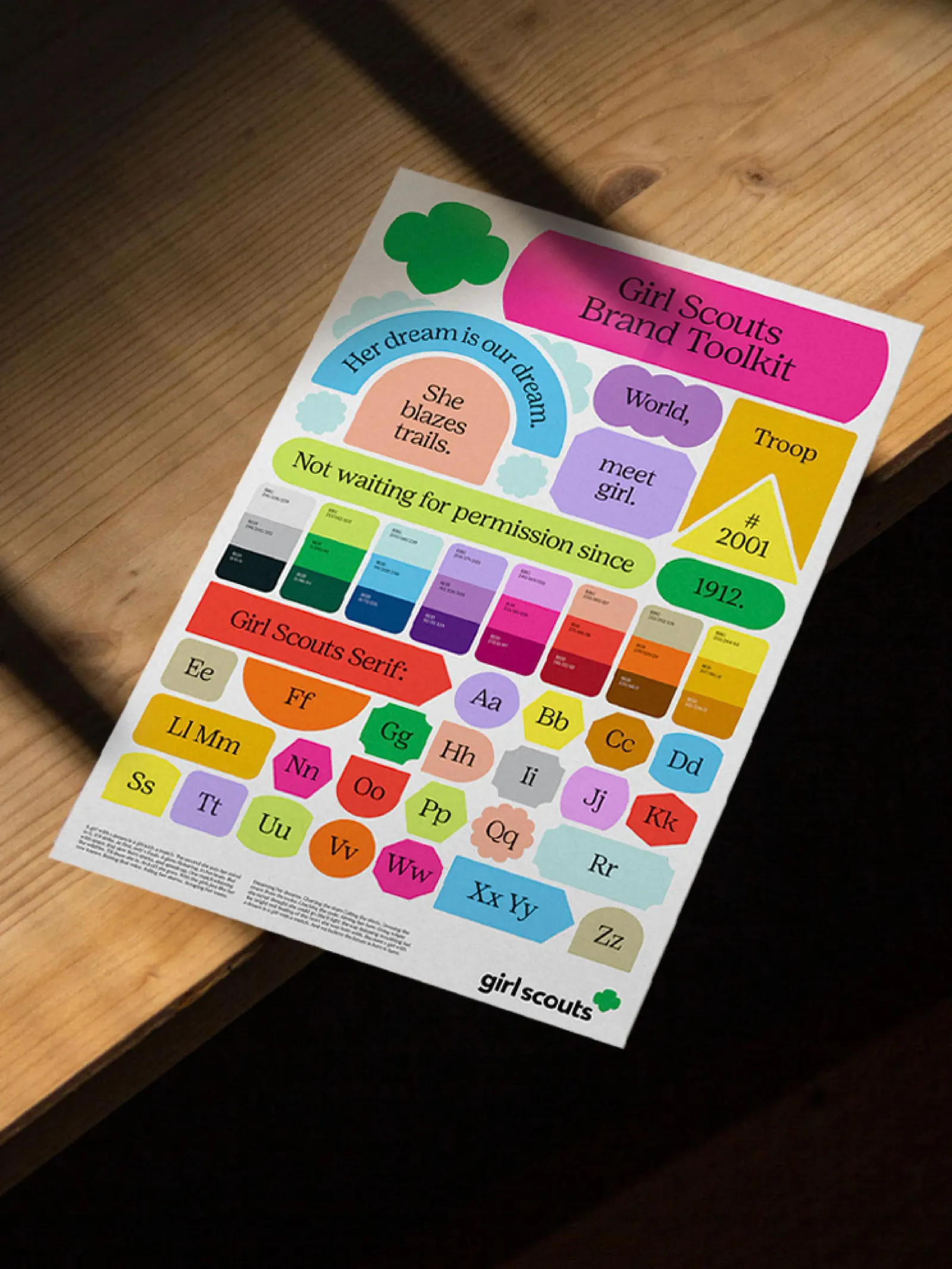
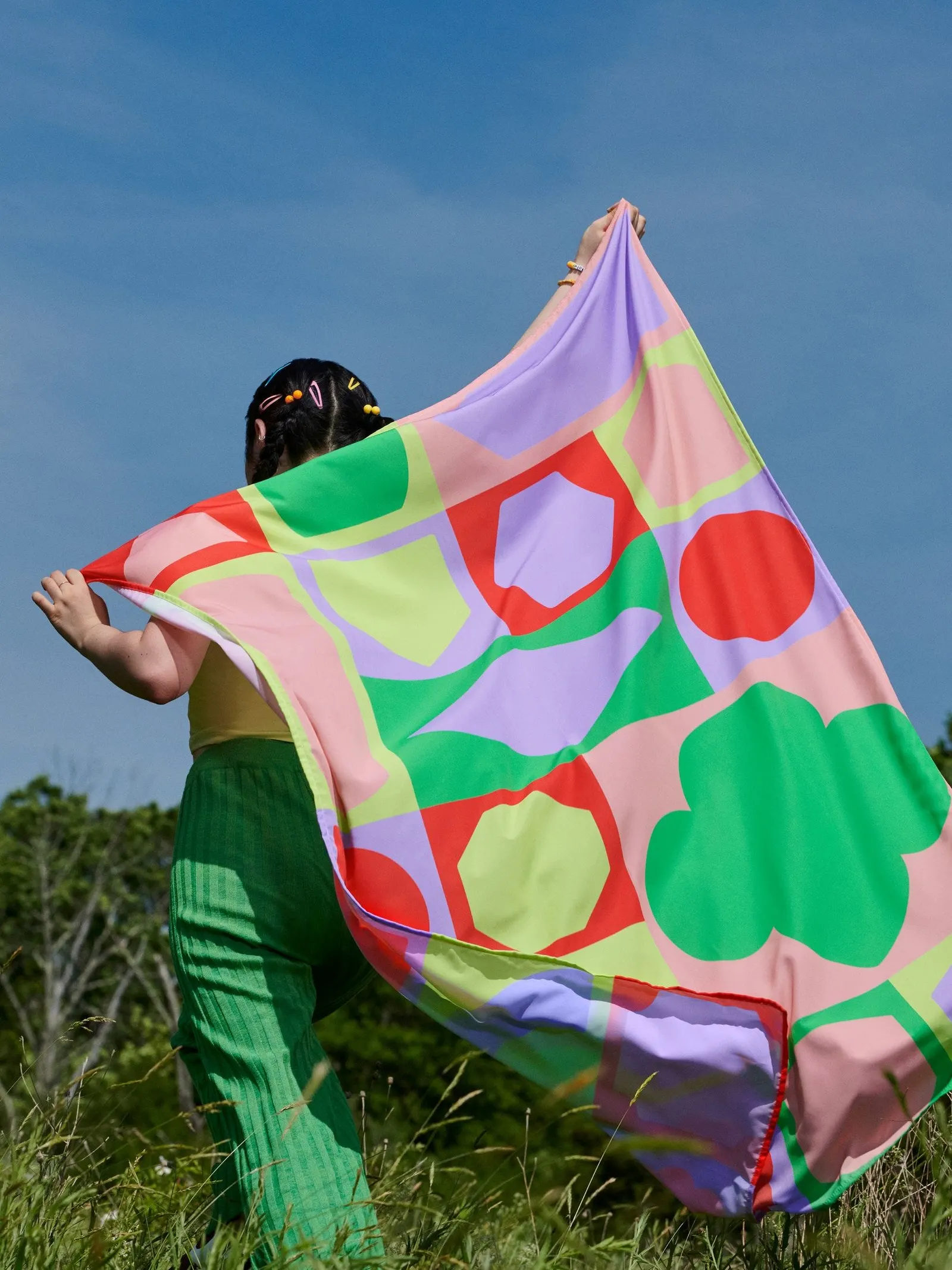
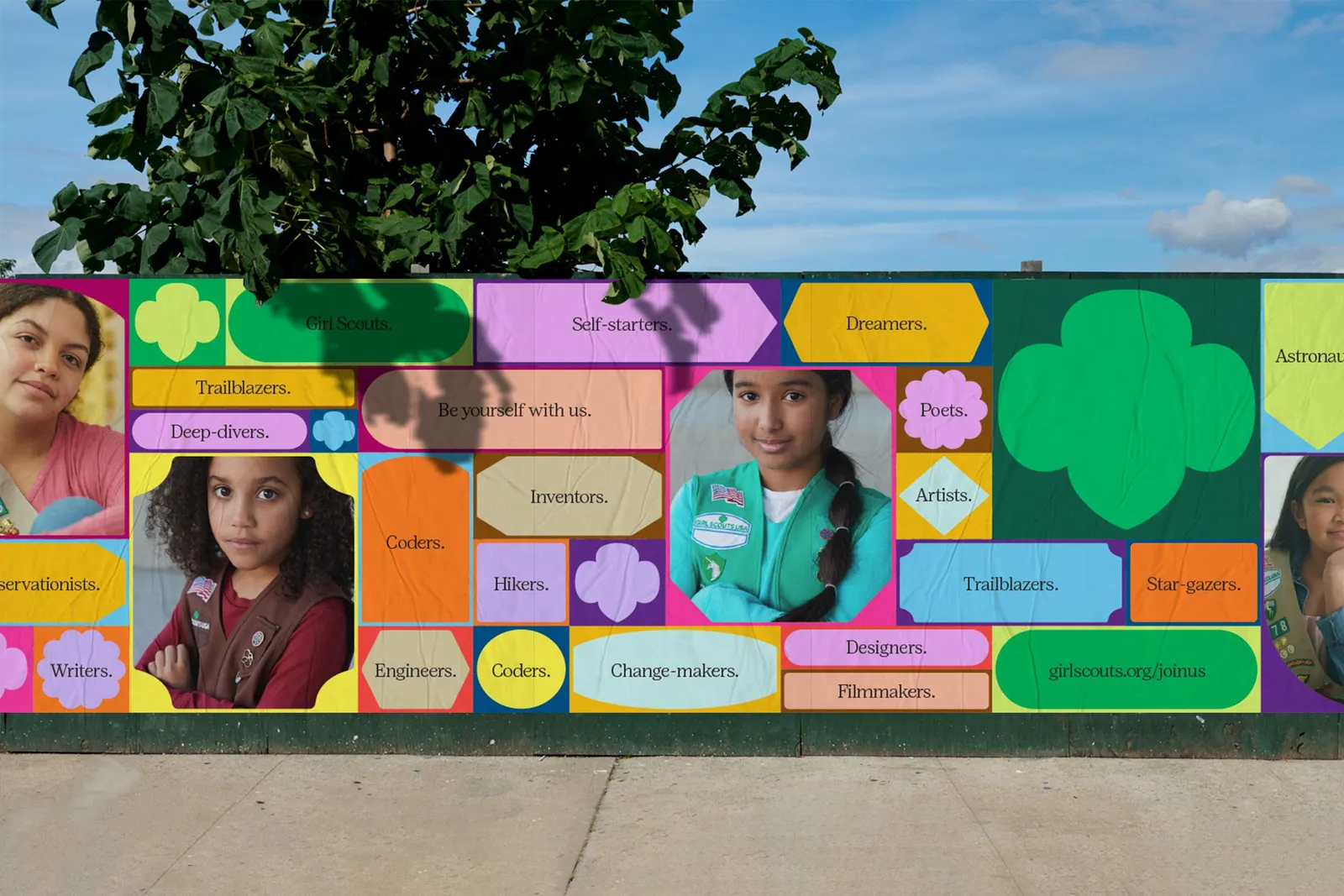
Around the mark, the studio turned the visual language of patches and badges into bold geometric forms that councils can assemble in their own ways. Positype built a custom typeface, and Collins wrote a direct, confident voice. Apparel revisits archive styles, and the Trefoil is no longer limited to green. Posters from women including Gail Anderson, Karin Fong, Debbie Millman, Noreen Morioka, and Cheryl Miller add personal perspectives. The studio reports 30% growth in Daisy membership and 98 councils growing in 2022.
Why it works
Badges are the one visual idea every Girl Scout already associates with earning something, so using them as the system's grammar feels inherited rather than imposed. The shapes are simple enough that a local council can use them without breaking the look. Freeing the Trefoil from green lets it work as a symbol instead of a color code. The overall result is more grown-up and self-assured than the mascots and cute illustration common in youth organizations.
Applications
Typography
Logo

Images and video from wearecollins.com, by Collins.