The Brand Monograph
OneGC brand identity by UNKNW
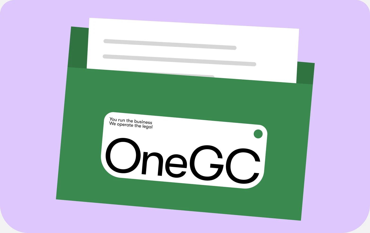
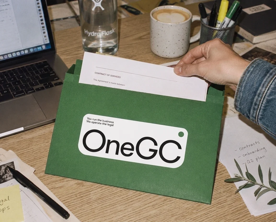
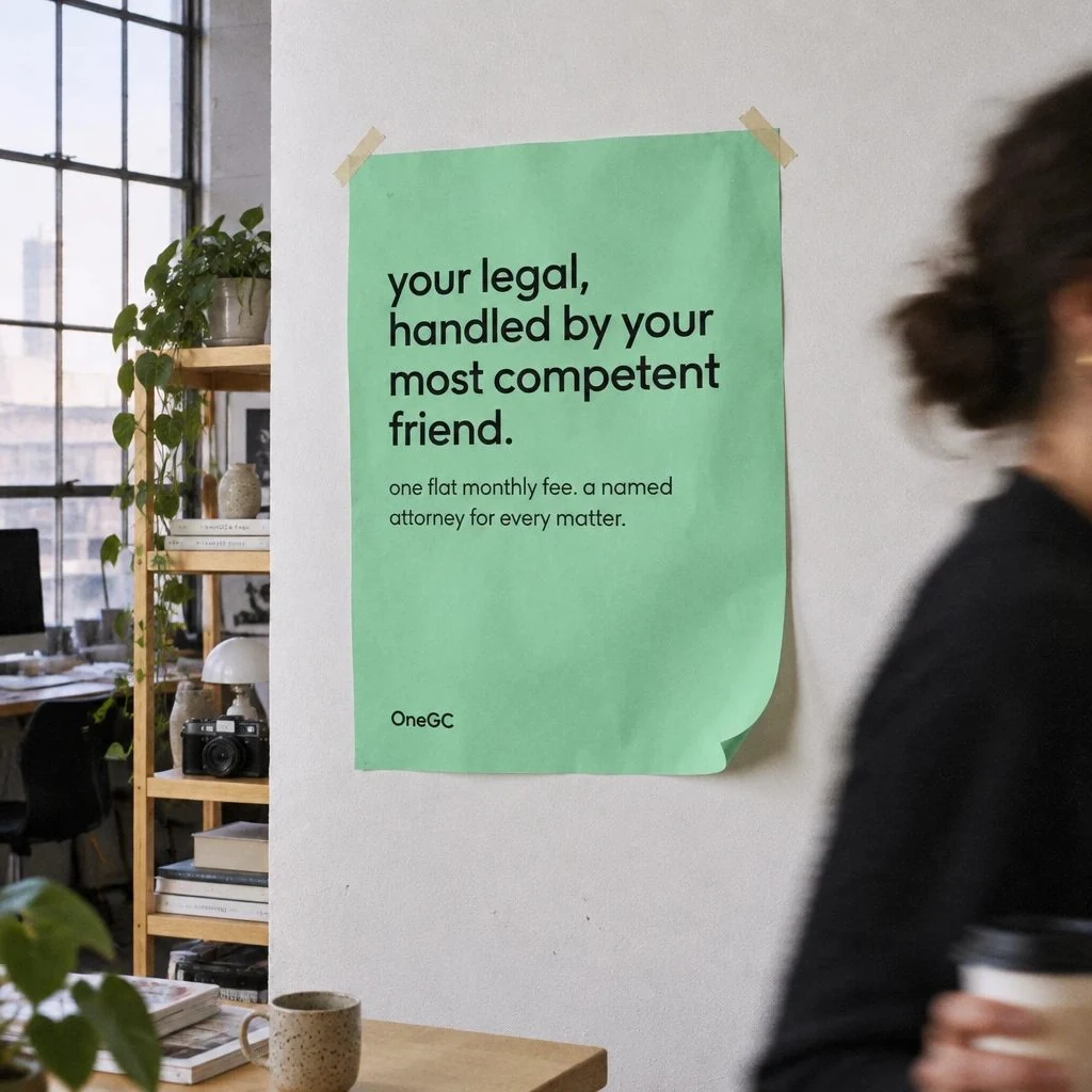
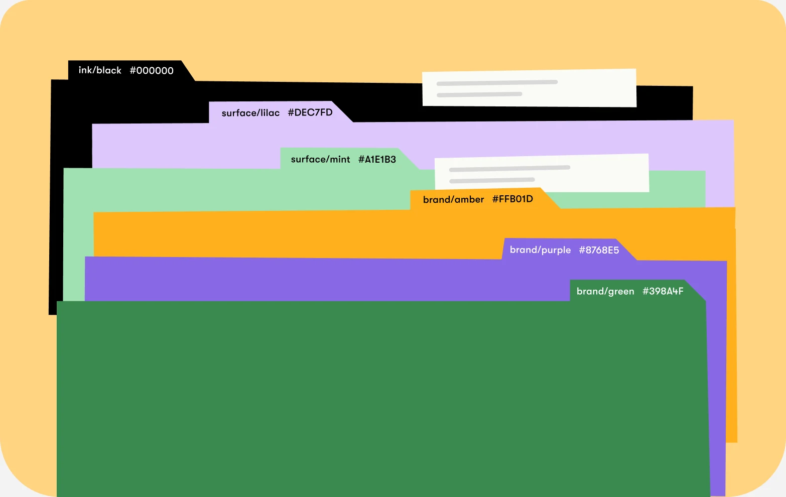
↗UNKNW took OneGC, an AI-accelerated legal platform, from stealth to public launch in three weeks, and the identity avoids the visual habits of both its competitors. Nothing here borrows the stone columns of traditional firms or the glowing gradients of AI startups. OneGC sells legal work as a flat-fee product with attorneys on every matter, so the studio built the look and voice around the comfort of having a capable friend on call. Cut-paper icons with a relaxed hand, bold and playful color, and a friendly but steady typeface carry that idea.
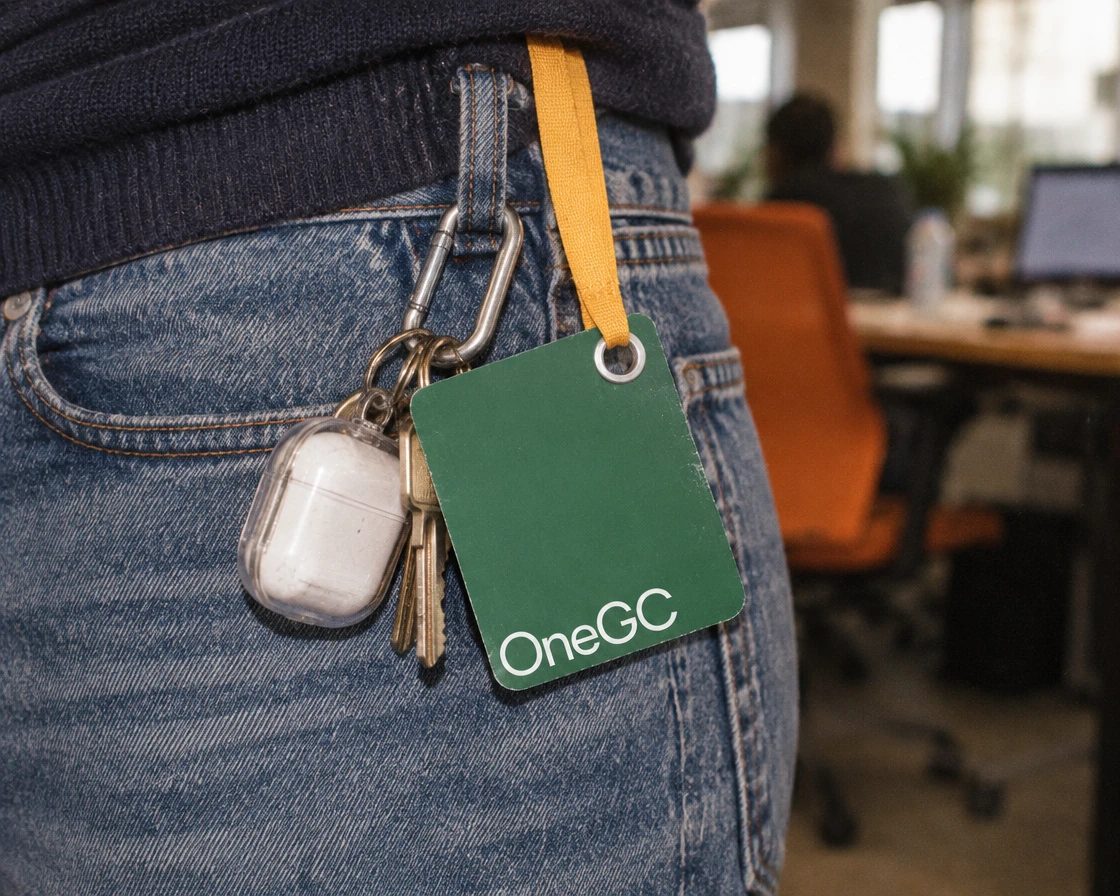
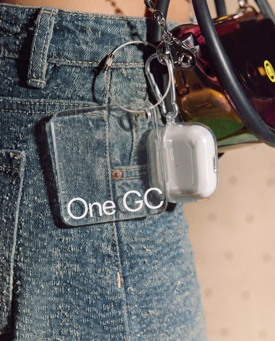
The system is as considered as the surface. UNKNW skipped the Figma handoff and designed in code, feeding color, type, and spacing tokens straight into the front end, so the design system and the landing page are one artefact. A photography guide with nine templates helps the team shoot its own imagery instead of leaning on stock, and the icons were made to work on merch as easily as on contracts.
Why it works
Legal branding usually asks founders to choose between reassurance and speed, and OneGC's audience has seen both pitches many times. The paper-cut icons do the heaviest lifting. Their handmade irregularity reads as human in a category full of generated polish, and they give the brand a recognizable vocabulary that stretches from product pages to hoodies. Bold color makes it easy to spot at a glance, while the steadier typography keeps the playfulness from tipping into a toy. The result is warm without being unserious, which is what a busy founder handing over their legal function needs to see.
Applications
Color



Images and video from unknw.com, by UNKNW.