The Brand Monograph
Replay brand identity by Koto
↗Gene therapy is a hard category to make approachable, and Koto's work for Replay does it by treating the science as a puzzle instead of a lecture. The founders had big ambitions and a story that was difficult to tell. The studio answered with one organizing idea of problem-solving, then built the strategy, identity, and website around it.
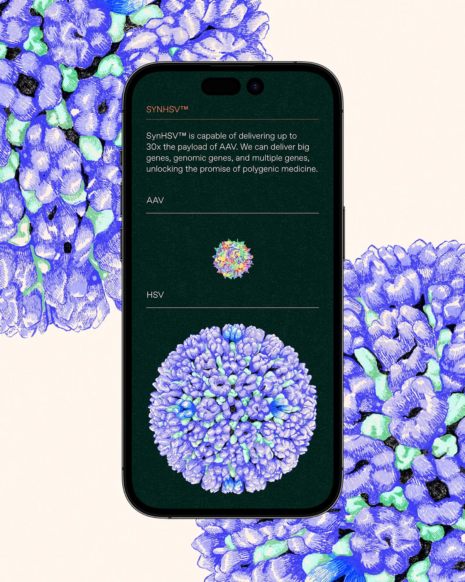
The mark is the first thing to notice. It regenerates and shifts rather than sitting still. Custom illustration and animation carry the puzzle thread through the rest of the system, and illustrator Uli Knörzer's expressive portraits put the people behind the research in view. Koto also designed the identity to work hard, from scientific diagrams and data visualizations to investor decks, internal communications, and the site.
Why it works
A logo that keeps rewriting itself suits a company whose business is rewriting code, and it gives Replay a signature that competitors with static marks can't easily borrow. The puzzle idea gives non-scientists a way in without talking down to the experts in the room. The portraits matter most to us. Biotech branding often hides its people behind abstraction, and Koto and Knörzer put them up front, which makes a technical company feel accountable and human.
Applications
Logo

Images and video from koto.com, by Koto.