The Brand Monograph
Yale Engineering brand identity by Pentagram
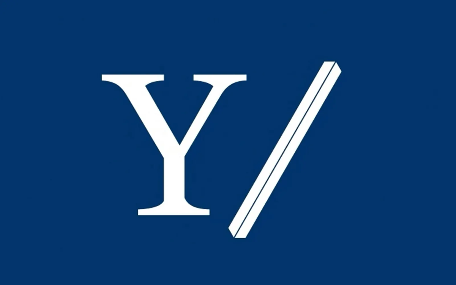
↗Pentagram gave Yale Engineering something it never had: an identity of its own that still sits comfortably under the university's famous name. Working with strategist Saundra Marcel, the studio shortened the school's name and built everything around a forward slash placed beside the Yale "Y." The slash comes from code, where it joins and separates at once, and it recurs in the masthead, typography, patterns, and 3D motion.
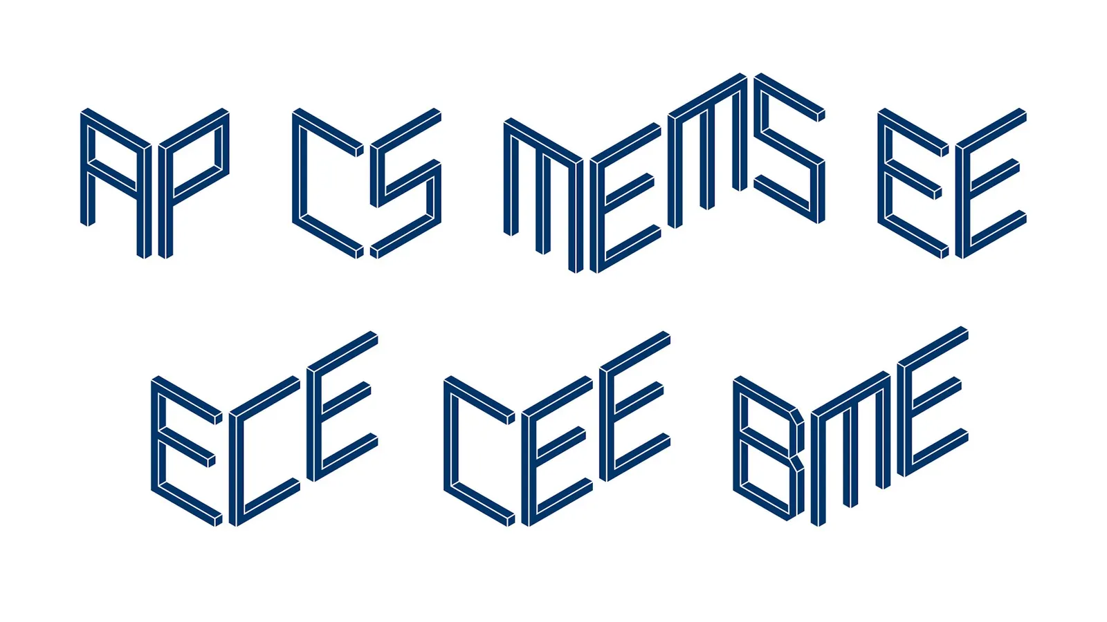
The details reward a closer look. Tobias Frere-Jones and Nina Stössinger customized Mallory with hexagonal tittles and added a bespoke icon set and a variable display face, so the school's team can build departmental marks in-house. Mat Hill and Misha Shyukin handled motion, development, and 3D, with movement drawn from the disciplines themselves. Image-makers from the Yale School of Art bring a more editorial approach to photography on the magazine cover.
Why it works
The slash is a typographic character, so it works at any size and in any medium, and engineering audiences read it instantly. It also looks nothing like the crests and classical serifs that dominate university branding, which makes the school feel like a place where things get built, while the Y keeps it unmistakably Yale. The hexagonal tittles add a recognizable detail that stays quiet in running text. Because the departmental typeface is variable, consistency doesn't depend on a gatekeeper, which suits an institution that will keep growing.
Applications
Logo
Typography

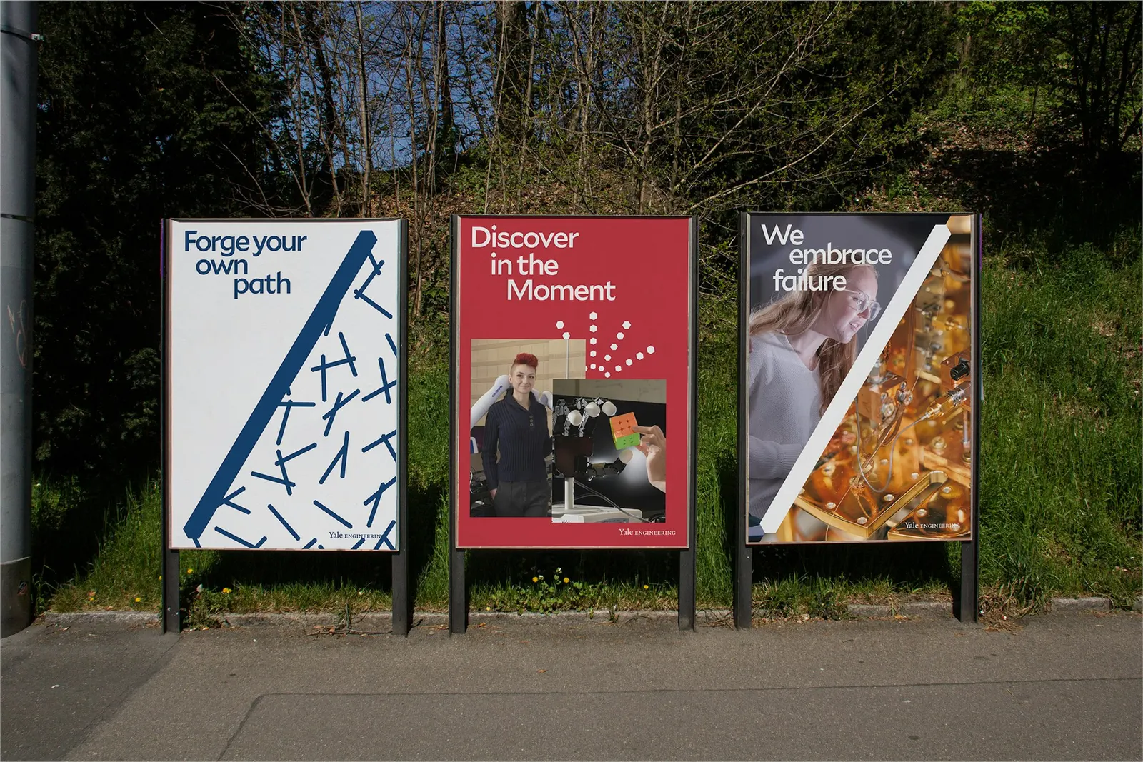
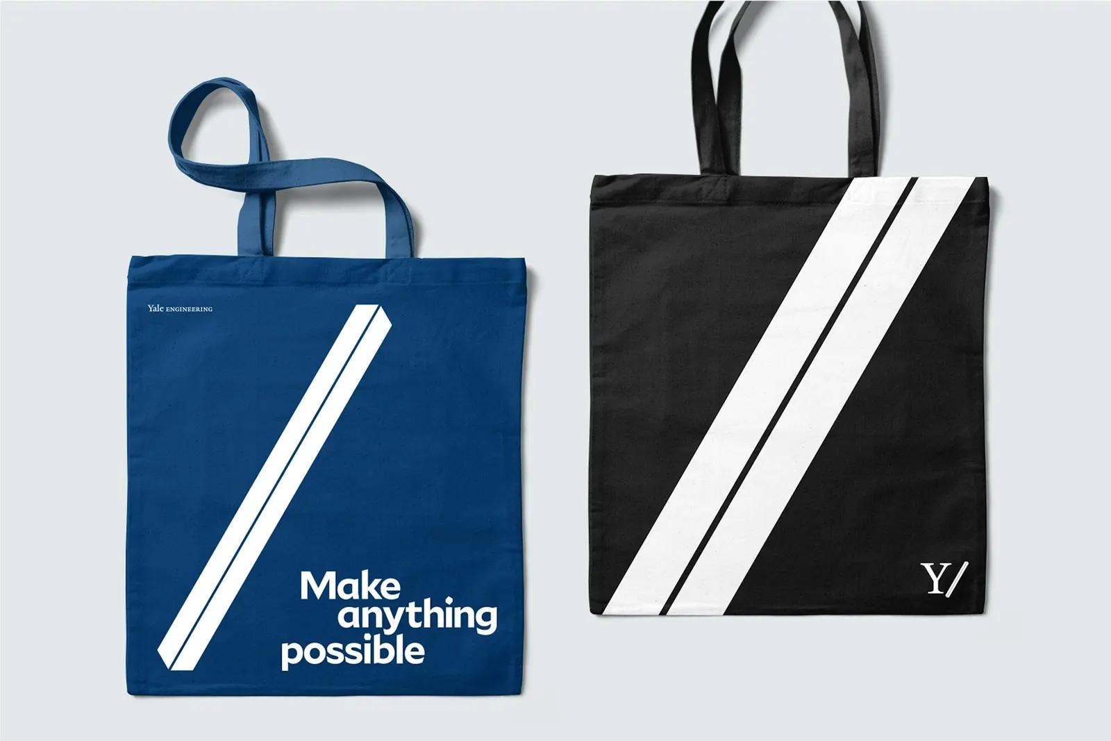
Images and video from pentagram.com, by Pentagram.