The Brand Monograph
Capacity brand identity by Pentagram
↗Pentagram's identity for Capacity treats data as part of the brand's visual language rather than something added at the end. Partner Giorgia Lupi led the project, with Ed Ryan, Julia Saimo, Meagan Hughes, Rachel Crawford, Ruby Powers, and Zach Scheinfeld on design. The studio redrew the logo, typography, and visual system for an agency that has outgrown its early days as an online-focused shop.
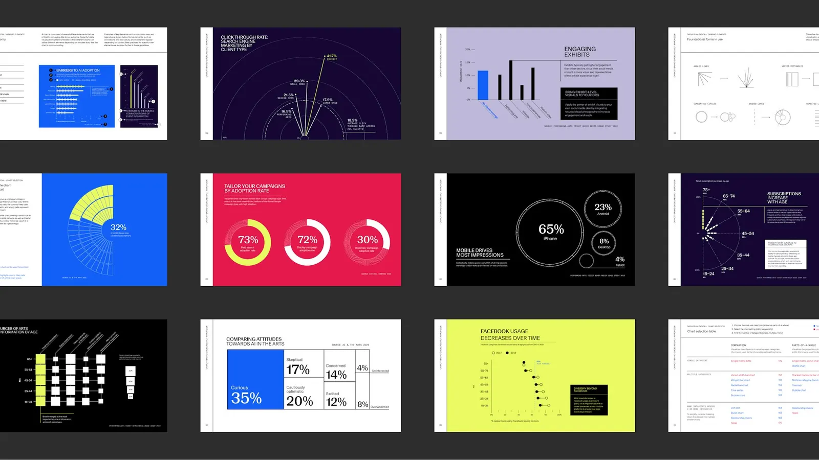
Patterns, color, and motion graphics (with Giorgia Roscini on motion) carry a sense of joy. References to seating charts, vintage promotional pieces, and Art Deco lettering tie the agency to the venues it serves. Pentagram also helped reshape Capacity's strategy, voice, and tone, then audited its datasets and reports to write a set of data principles. Two custom tools, plus templates and guidelines, let a fully remote team produce consistent patterns, bar charts, and donut charts without starting from scratch.
Why it works
Arts marketers are buyers of taste, so an agency in this category has to look like it has some. Seating charts and Art Deco give Capacity a vocabulary its clients recognize, and they set it apart from the neutral, tech-flavored look common among marketing firms. The smarter move is the data work. A company that sells insight is judged by how its charts look, and a generator makes sure every one carries the brand. It's a system built to be used, not just admired.
Logo
Typography
Applications
Images and video from pentagram.com, by Pentagram.