The Brand Monograph
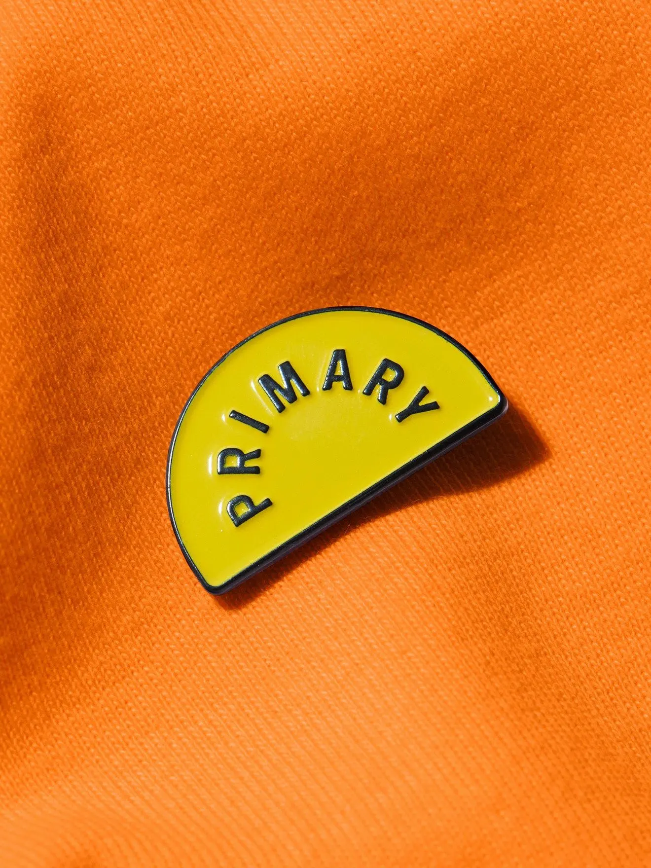
Primary brand identity by COLLINS
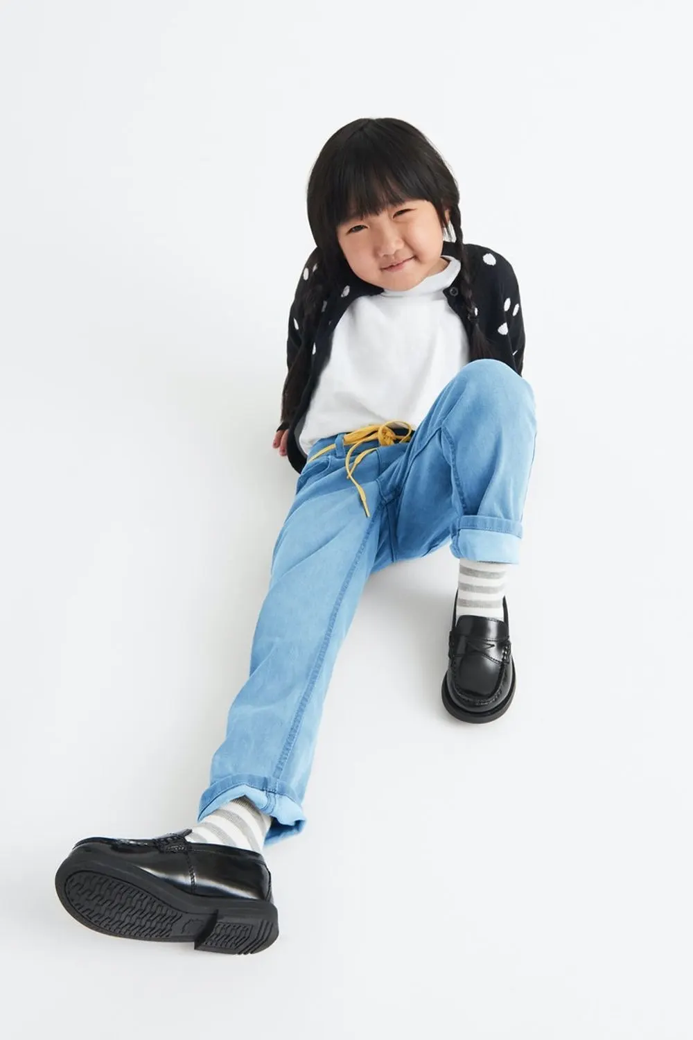
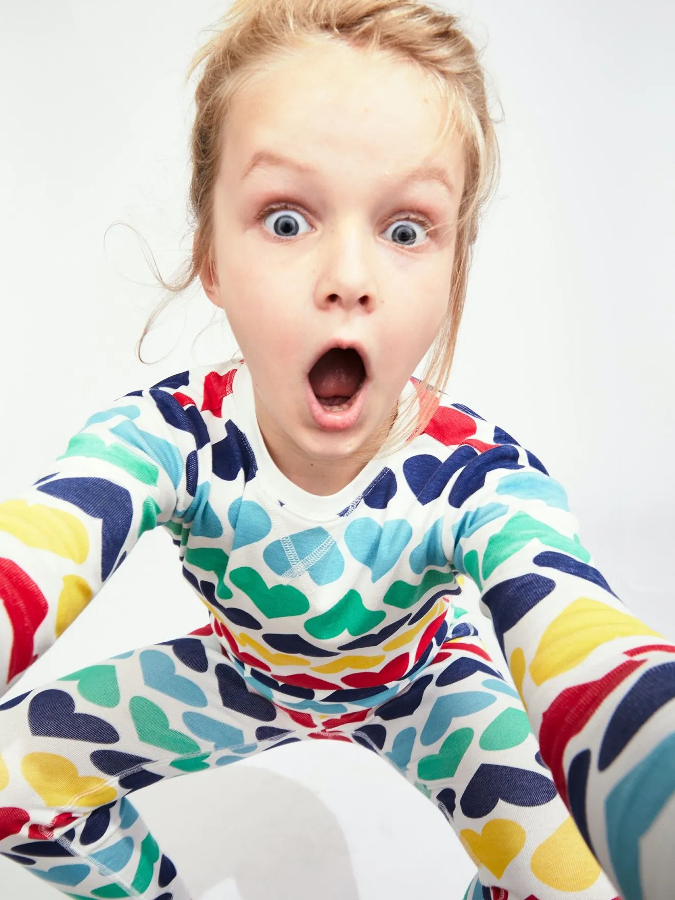
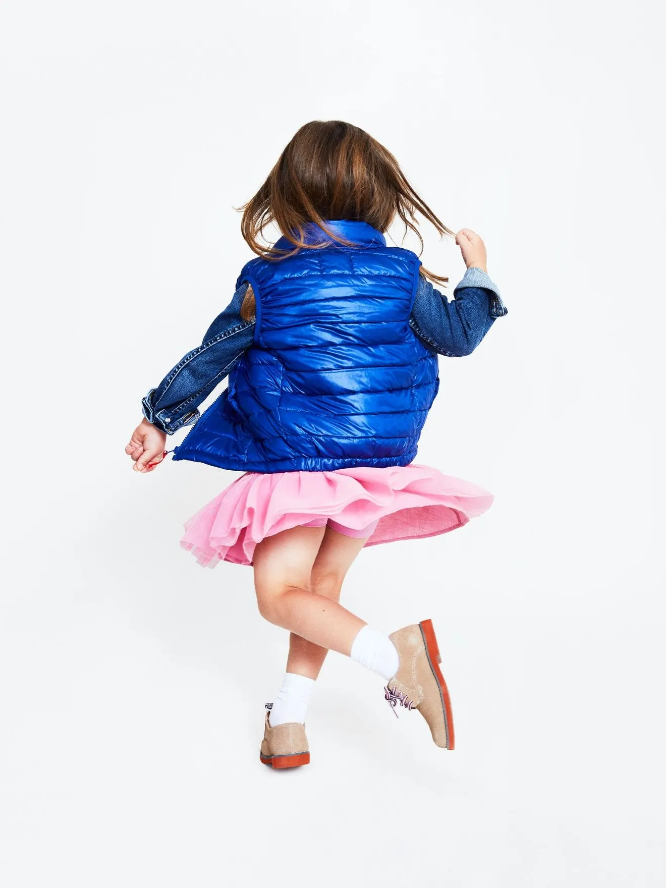
↗Primary sells plain clothes for kids, with no logos, slogans, or embellishments, which means the brand is the only place personality can live. COLLINS took on that problem for a company whose founders came from e-commerce rather than apparel, and who wanted a retail brand to match their counter positioning in a gendered, trend-driven category.
The studio's read was that the existing identity had the restraint right but left out the exuberance. It reframed Primary's purpose around kids' comfort, inside and out, and built a creative platform, "Live your true colors," that links gender-neutral design to self-expression. The identity system translates both into something made for retail, meant to pull people in. Recognition followed, including Fast Company's Brands That Matter and a 2022 Good Housekeeping Parenting Award.
Why it works
The smart move is where the color goes. Because the garments stay quiet, the brand can be loud without compromising the product, so the identity says what the clothes decline to. The platform also works on two levels: literally, as a promise of color, and figuratively, as a statement about who kids are. That lets gender neutrality read as an invitation rather than a rule, and it sets Primary apart from the pink-and-blue split that shapes much of the category. Minimalism alone could have looked austere or generic. The added warmth gives parents a reason to walk in.
Logo
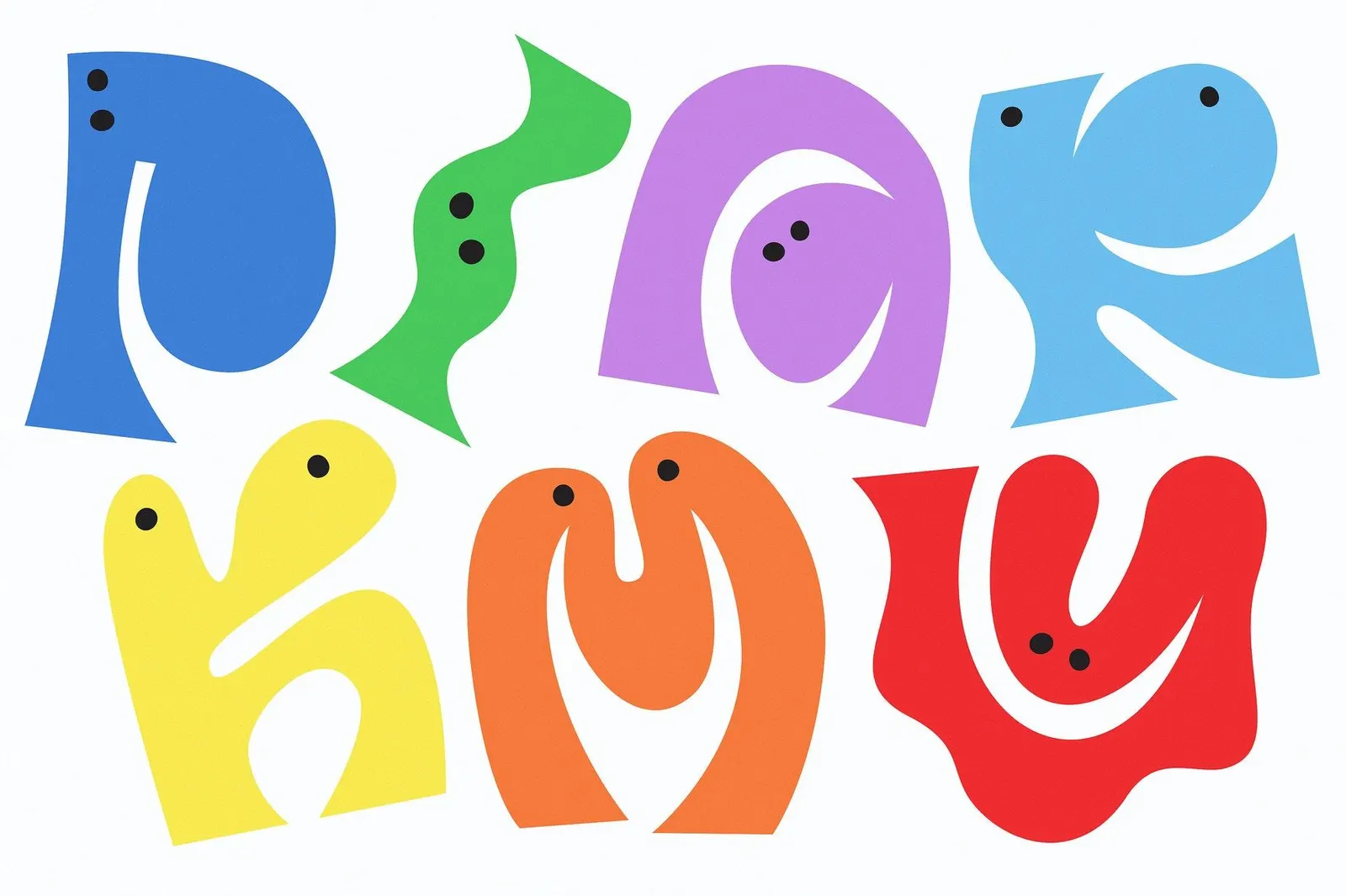
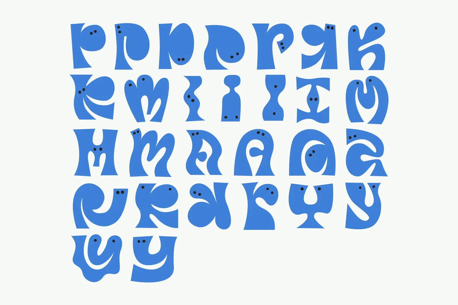
Typography
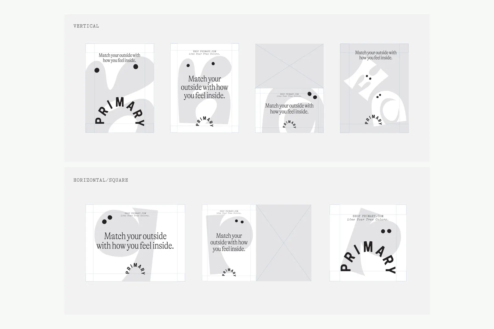
Applications
Images and video from wearecollins.com, by COLLINS.