 The Brand Monograph
Galante brand identity by Mucho
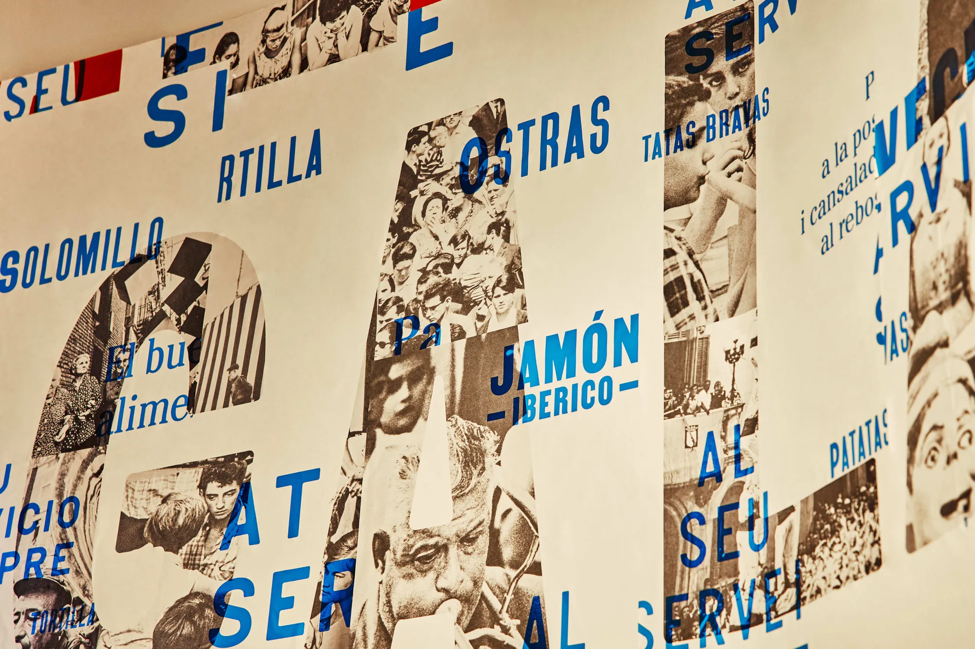
↗Mucho gives Galante, a Spanish restaurant in central Barcelona, an identity that behaves a bit like a good host: it knows when to speak up and when to step back. The studio splits the brand into three layers, red, blue, and photography, and lets them overlap, alternate, or take turns at the front.
The brief was to bring a sense of courtly politeness back to the table through a kitchen with a contemporary outlook. Working with the Galante team, Mucho gave each layer a job. Red carries the logo and the brand's warmth and intensity. Blue handles practical information, from essentials to menu highlights, and doubles as a stage for refranes, the proverbs on manners and eating well. Photographs of Catalan customs and everyday routines add a documentary note and tie the whole thing to place.
Why it works
Separating feeling from information is a smart call for a restaurant. Red can be loud and confident without crowding the menu, while blue gives practical content a calm, legible home. The refranes turn that functional layer into a source of personality, a wink that locals will recognize and visitors can enjoy. Documentary photography keeps the nostalgia honest, so the tradition reads as lived rather than staged. In a category full of rustic clichés, a flexible system like this feels current and still sounds unmistakably Spanish.
Logo
Applications




Images and video from wearemucho.com, by Mucho.


