 The Brand Monograph
Kaffeeform brand identity by Studio Bruch
↗Studio Bruch gave Kaffeeform an identity that mirrors the company's own material logic: take something familiar, then put it to a second use. Kaffeeform turns coffee grounds that would otherwise be thrown away into durable, robust products, pushing the reusable-cup idea further by making the material itself part of the cycle.
The brief was a brand to match that product world. Josef Heigl, Julian Nachtigall Lechner, and Kurt Glänzer built it around a simplified bean silhouette, the shape behind Kaffeeform's products, drawn as a negative. Around it sit earthy tones and a contemporary pairing of type and shape. Photography by Max Manavi Huber gives the system a recognizable look while leaving room for variation.
Why it works
The mark carries the idea without explanation. A negative bean is an absence that still reads as a bean, which hints at material that has been used and reshaped, and a silhouette this simple should hold up on a product as well as on a page. The earthy palette roots the brand in coffee, while the clean type and shape keep it from feeling rustic. That suits a sustainable product that wants to be judged as a well-made design object first.
Logo

Typography

Applications

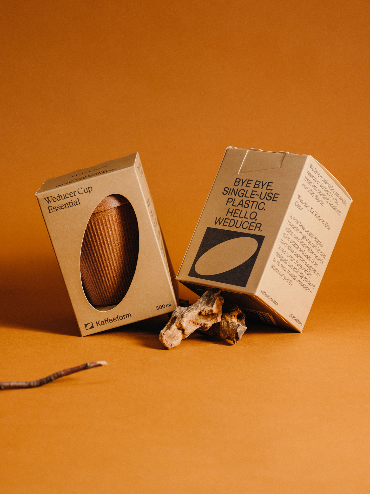





Images and video from studiobruch.com, by Studio Bruch.


