 The Brand Monograph
Blü Hotel brand identity by Studio Bruch
↗Studio Bruch's identity for Blü treats a hotel as something planted rather than built, then lets it grow a little unruly. The hotel sits in Hofgastein, in Austria's Gastein valley, and was conceived as a place where guests can unwind or stay active, with no one type of traveler in mind.
The studio found its starting point in local history. Emperor Franz I, remembered as the flower emperor for his love of plants, gave the hotel its name and its botanical thread. Designers Josef Heigl and Kurt Glänzer built a swinging wordmark and symbol, then paired them with a fresh set of colors and typefaces that feel current while still nodding to where the name comes from. Matthias Alber's copy and Medium Large's photography support the look. Sebastian Curi's illustrations carry the most personality: oversized, confident characters that poke gentle fun at the hotel and its surroundings.
Why it works
Hotels in mountain regions often lean on the same wood-and-peaks imagery, so a bold illustrated cast is a smart way to stand out. Curi's characters turn the guest's holiday mood into something visible, and the humor makes the hotel approachable for both the quiet and the energetic crowd. The loose, rounded mark supports that mood without losing legibility. Because the name's origin is baked into the concept, the playfulness feels earned rather than applied.
Applications


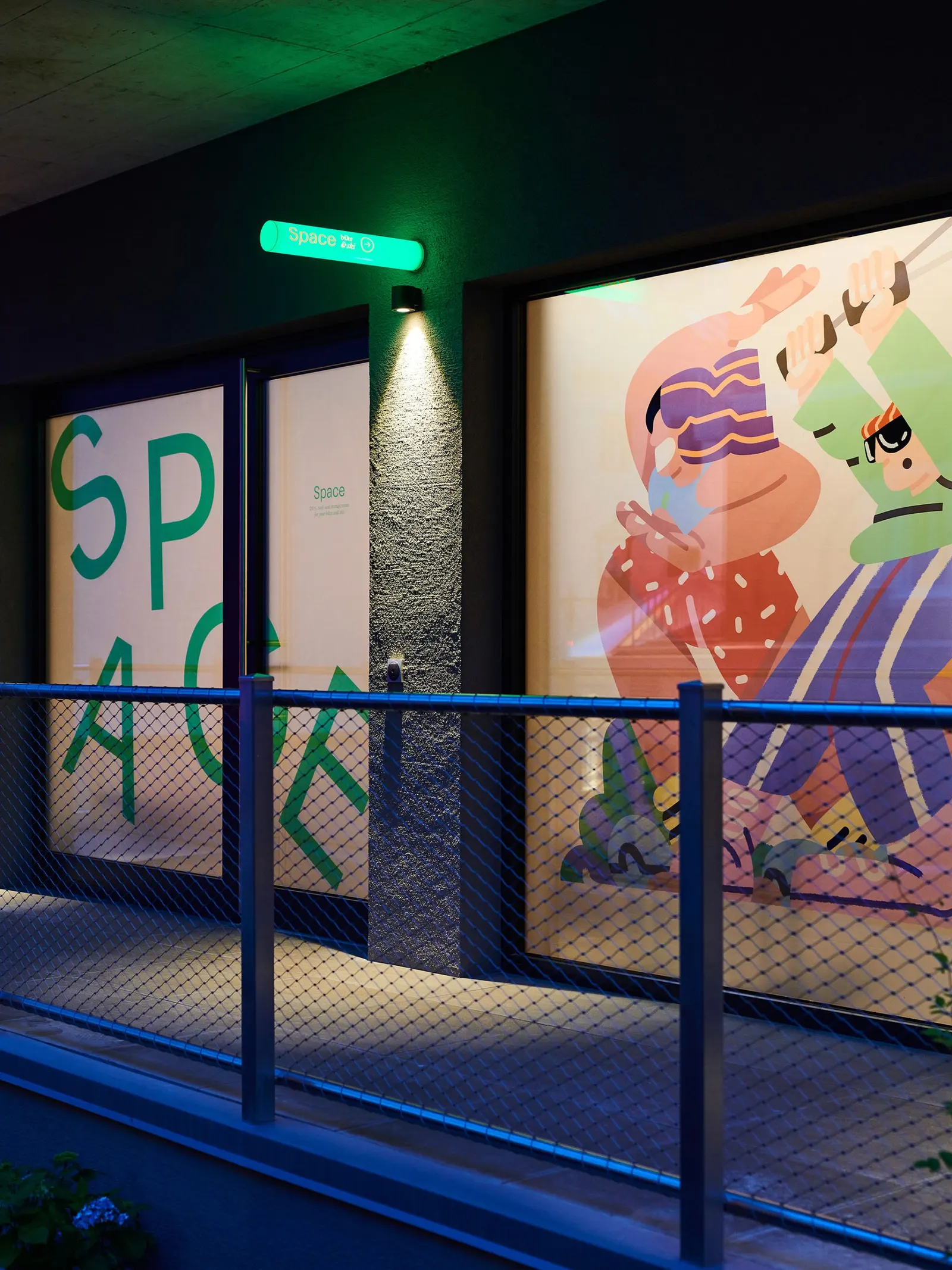
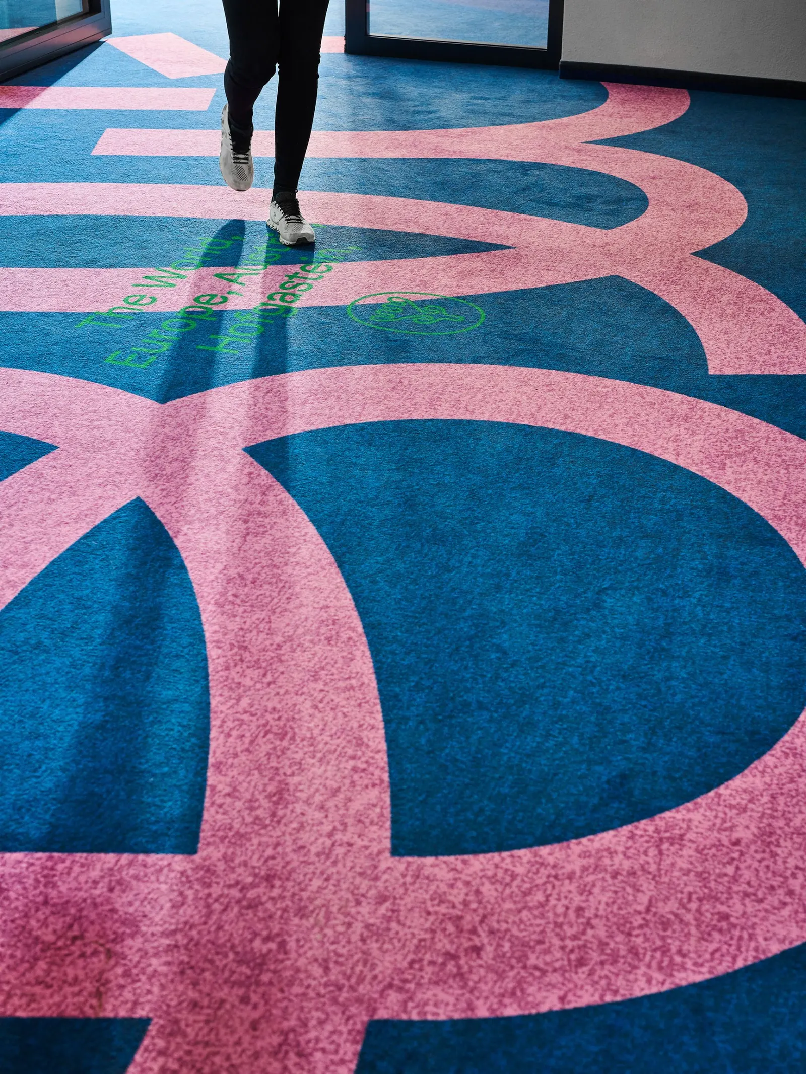
Images and video from studiobruch.com, by Studio Bruch.


