The Brand Monograph
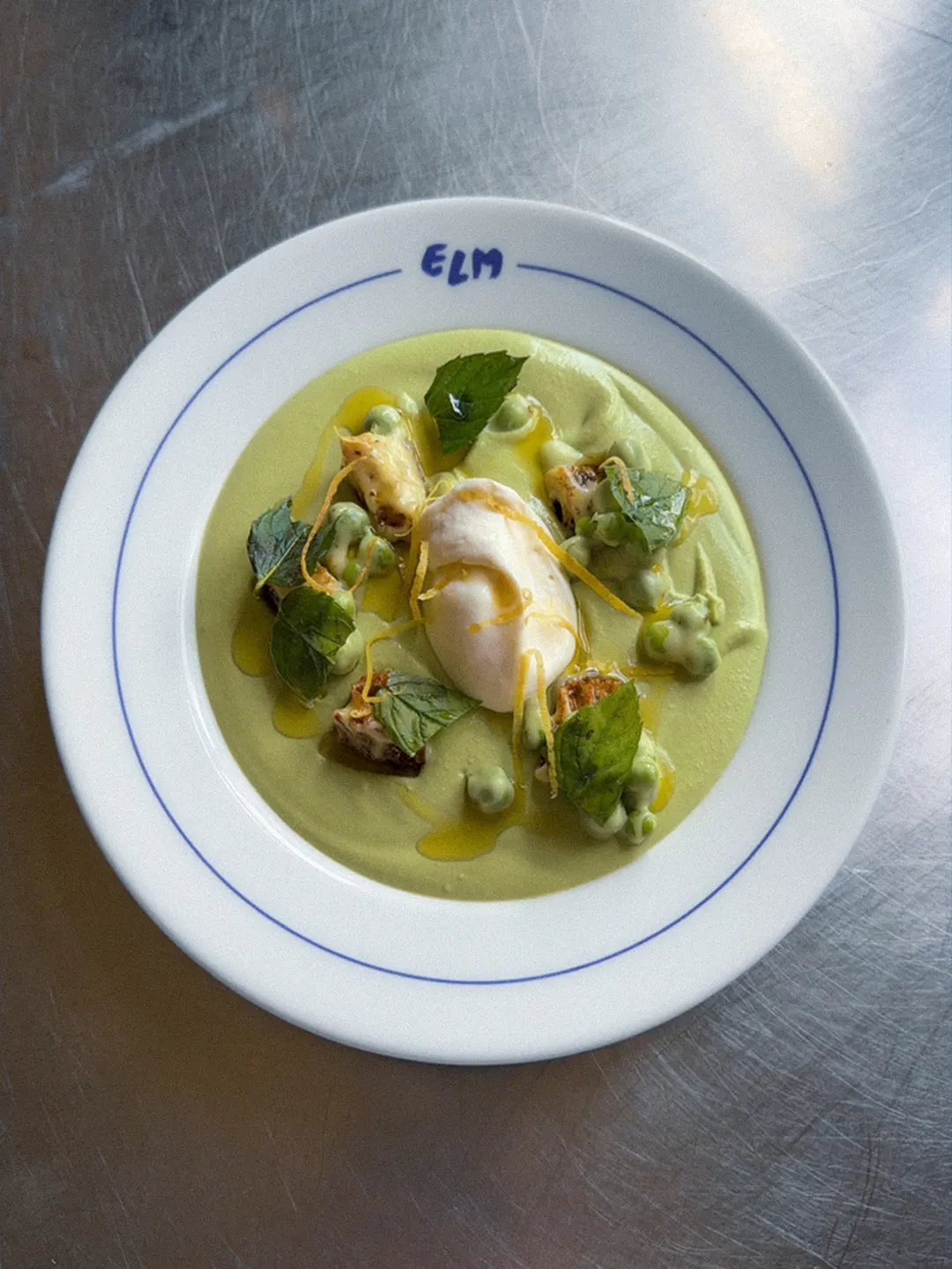
Restaurant Elm Brand Project brand identity by Classmate Studio
↗Most restaurant identities begin with a mood board. Classmate Studio's work for Restaurant Elm begins with something already hanging in the dining room: a painting by artist Linda Linko. Her recognizable hand became the source material for the whole identity, so the brand feels like it grew out of the space rather than being applied to it.
The identity holds two temperaments together, the exuberance of Mediterranean food culture and the restraint of Nordic design. Loose brush marks and unconventional typography supply the energy, while plain layouts and blue as the anchoring color keep everything composed. A set of cyanotypes, with photography by Sofia Kulianu, adds a handmade, light-printed quality to the imagery. Emma Ranne also contributed to the project.
Why it works
Blue does the heavy lifting. Cyanotype is a blue process, so the imagery and the palette feel like one idea rather than two decisions. With color settled, the type and brushwork can be expressive without the system turning chaotic. The painting also gives the brand something real to point to, which is rare in a category that leans on either rustic warmth or polished minimalism. Guests can find the source in the room, and that connection makes the identity feel earned.
Logo

Graphic elements

Applications



Images and video from classmatestudio.com, by Classmate Studio.