 The Brand Monograph
HelloFresh brand identity by Further
↗Further's HelloFresh identity makes a global food business feel at home in a domestic kitchen rather than a distribution center. The brief was to sharpen the position of the category leader as small, niche box brands crowded in. Before designing anything, the studio spent time in HelloFresh warehouses and alongside its teams, learning the printing limits and the need for one visual language across markets.
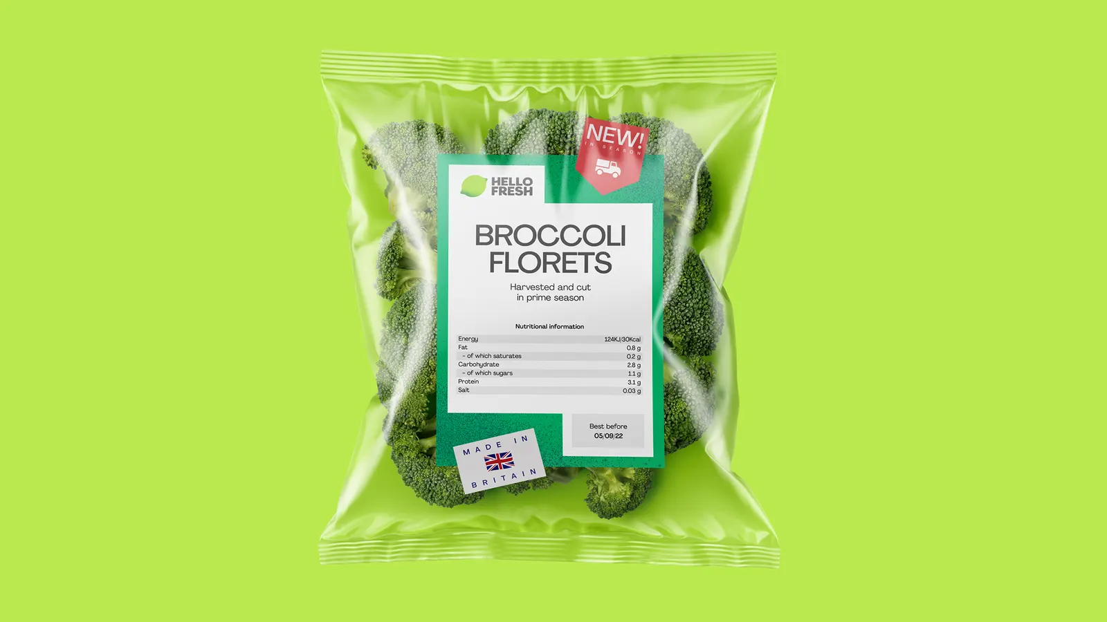
The result starts with a simplified lime logo that keeps the old mark's shape, scale, color, and angle, so it holds up on a box, a screen, or in animation. Around it sit five gestures drawn from kitchen utensils, a flexible grid-based layout system, and a set of icons and illustrations that speak the same language. Photography favors real kitchens over styled studio plates, and the bright palette meets AA accessibility for digital while still working on packaging.
Why it works
The smartest move is restraint with the mark. By refining the logo rather than replacing it, Further keeps the recognition HelloFresh built at scale and gains consistency. The utensil gestures do the differentiating. Niche competitors can easily claim craft, but a market leader rarely feels handmade, and these marks give it a human fingerprint. Real-kitchen photography backs that up by lowering the bar for customers, who see a lived-in counter instead of a restaurant plate. Accessible color means the energy isn't confined to the box.
Logo
Graphic elements


Applications


Images and video from further.group, by Further.


