The Brand Monograph
Sweetgreen brand identity by Collins
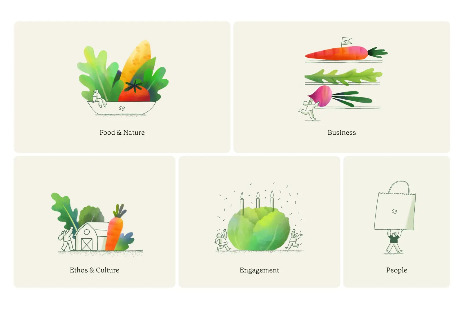
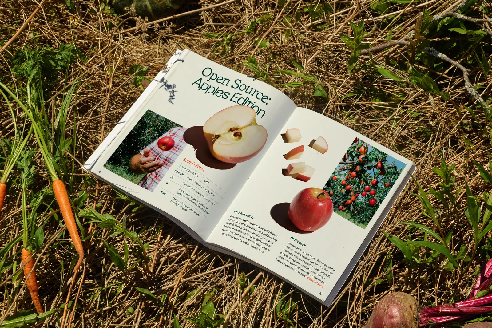
↗Collins gave Sweetgreen an identity that feels closer to a well-worn kitchen shelf than a fast food chain. Instead of the clean, clinical language many wellness brands default to, the studio looked to old cookbooks for a warmer, more human way to talk about salad.
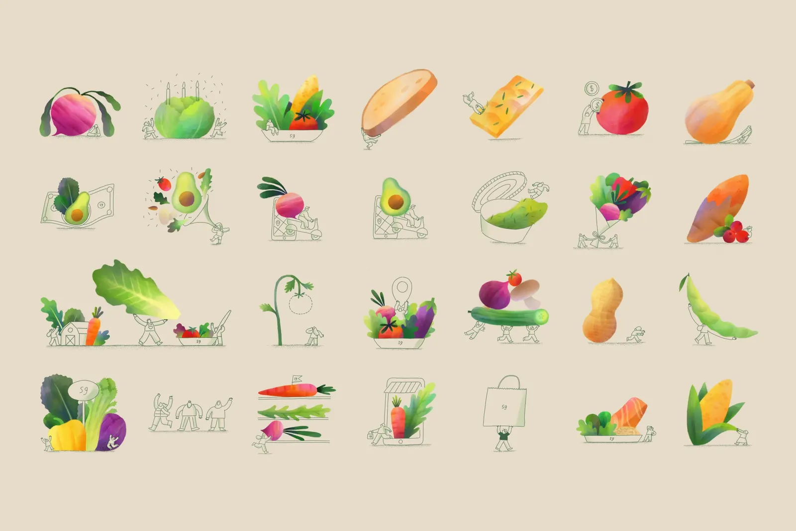
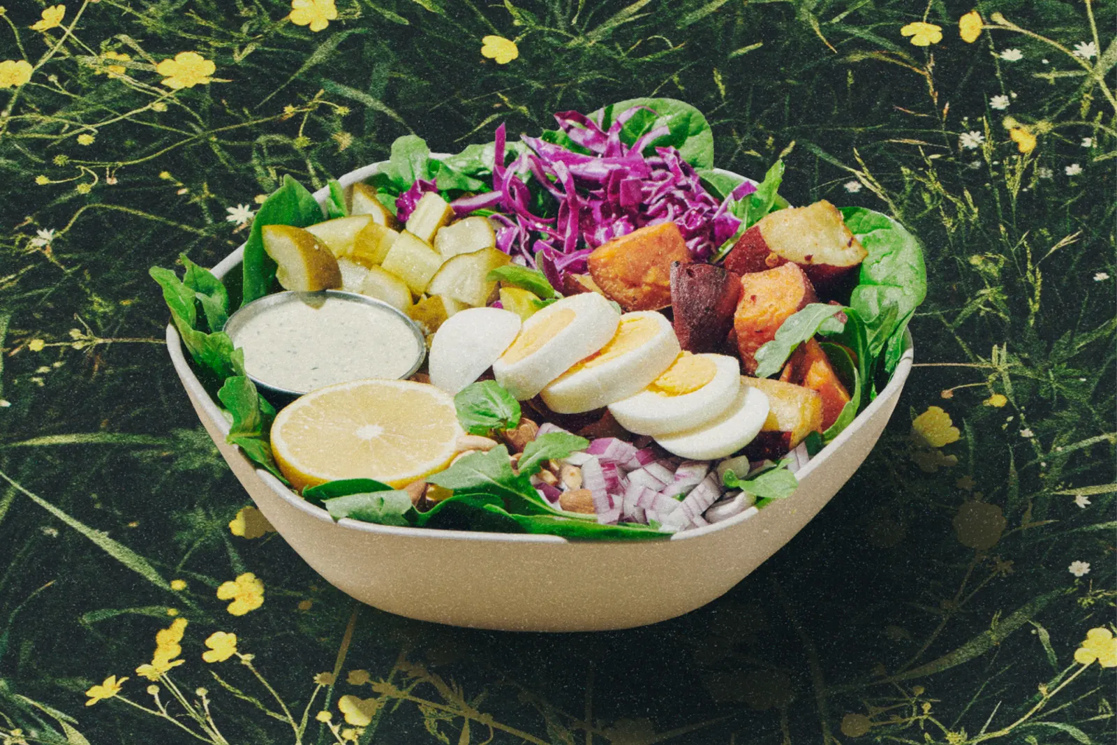
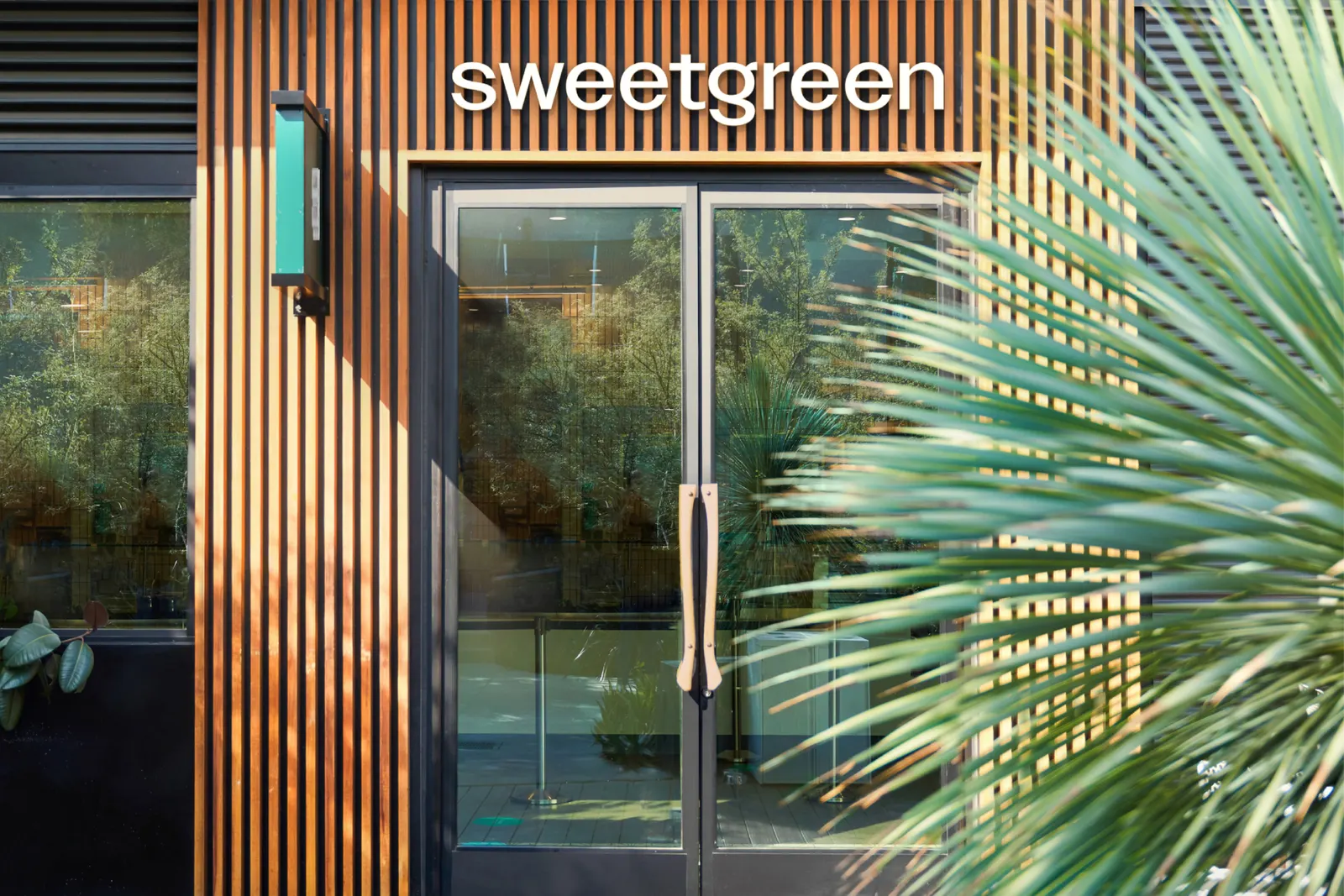
The brief arrived as Sweetgreen was preparing for its IPO: build a brand that could stretch across a growing footprint without losing the character fans already loved. Collins worked with Sweetgreen's in-house team and with Fictive Kin on design and development. Playful illustration sits alongside custom type from MCKL Type, photography by Mari Juliano, and a palette of earthy and vivid colors. The result is a flexible system that now covers stores, signage, packaging, digital products, and team uniforms, with room for a looser, more expressive voice.
Why it works
The cookbook reference gives healthy eating a point of view that is about craft and pleasure, not restraint. Illustration adds personality that stock-style food imagery can't, and custom type makes the brand ownable in a category full of similar sans serifs. The earthy tones read as produce, while the brighter accents keep the system energetic enough for a fast, on-the-go setting. Because these pieces are loose and modular, the identity can stay consistent as it grows without feeling like a template.
Applications
Logo
Typography
Images and video from wearecollins.com, by Collins.