 The Brand Monograph
QuintoAndar brand identity by Porto Rocha
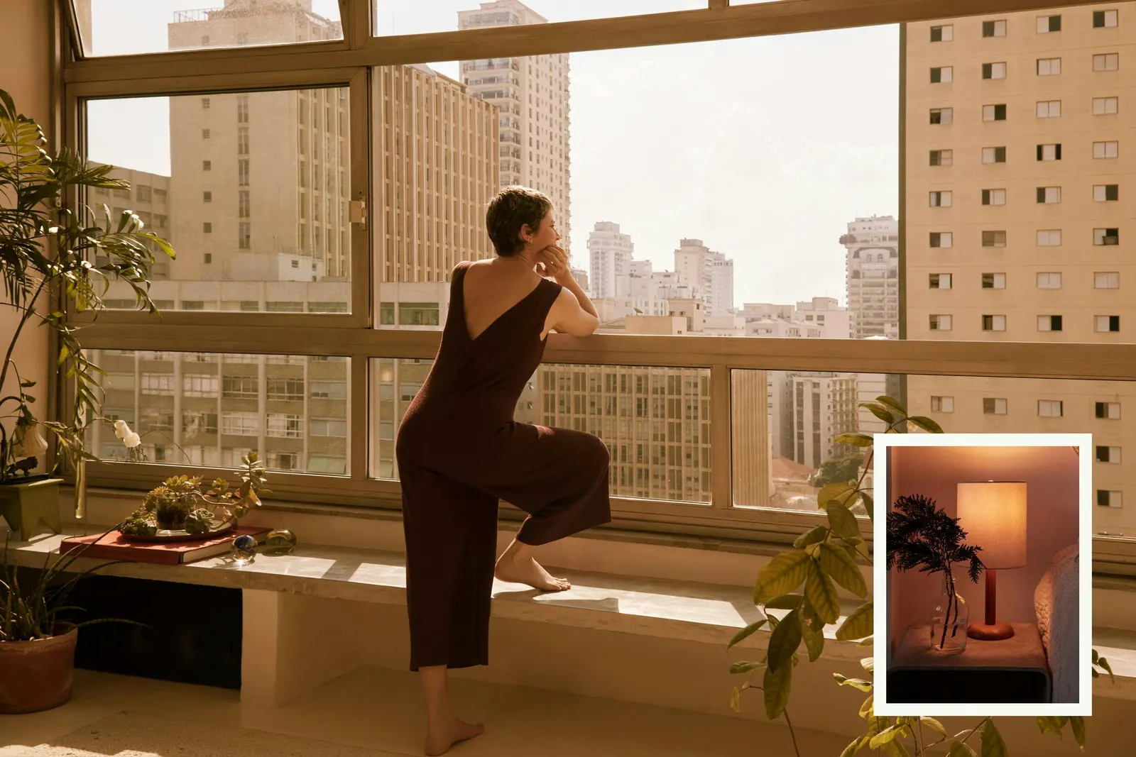
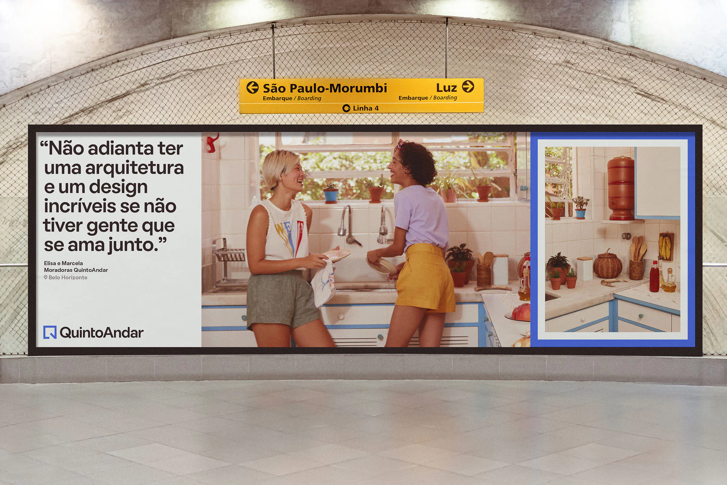
↗Porto Rocha's QuintoAndar identity makes a rental platform feel like it cares about the people using it. The studio set out to prepare Latin America's largest housing platform for international growth without losing the practical efficiency that built it. Its answer is the frame, a plain shape that can stand in for a window view or a photo on the wall. In layouts and motion, frames change size and stack up to hold photography, video, and type together.
The details reward a closer look. The new Q is drawn with the logic of a floor plan and hints at a doorway, while the signature blue stays and the palette around it widens. Lorena Dini's unposed photography and illustrations by Haley Tippmann and Rafaela Pascotto sit beside a rigorous icon library built for navigating the app. Boulevard LAB contributed typography, and motion designers including Duncan Brazzil and Giordano Caldas set the system moving.
Why it works
Property platforms tend to look alike: blue, tidy, transactional. Porto Rocha found a device that does real work instead of decorating. The frame is a layout rule, a motion behavior, and a metaphor at once, so the brand is recognizable well beyond the logo. Keeping the blue protects hard-won recognition, while hand-made illustration adds personality. Splitting the roles is smart: expressive imagery carries the feeling, and strict icons keep the product clear. That balance suits an audience making stressful, personal decisions.
Applications


Color
Graphic elements


Images and video from portorocha.com, by Porto Rocha.


