 The Brand Monograph
Upwork brand identity by Porto Rocha
↗Porto Rocha's Upwork identity makes a giant freelance marketplace feel like a place with people in it. The studio took on the brief as remote work went mainstream, when the platform needed to look as established as it had become without losing the sense of community behind the listings. Alongside strategy partner Alto and a team of illustrators, animators, and photographers, Porto Rocha built a system where the human side does as much work as the logo.
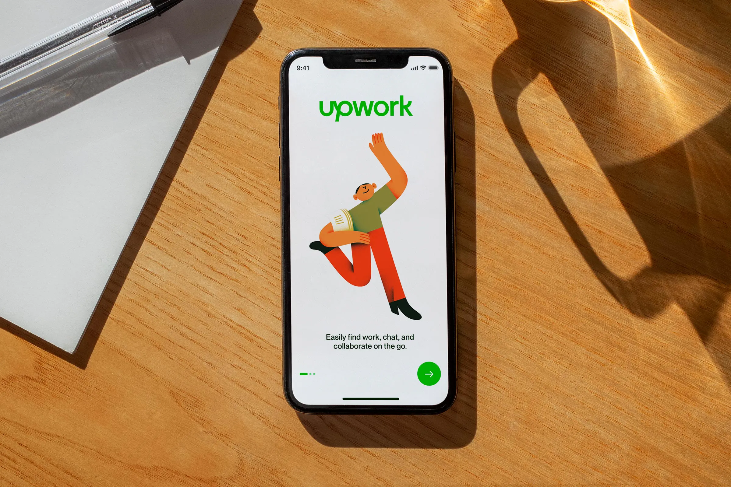
The mark is the clearest example. The studio fused "up" and "work" into a single monochrome wordmark, kept the linked U and P, and drew the letters in a custom cut of Neue Montreal. Beside it sits Upwork RZA, a bespoke serif for more personal moments. Upwork green stays as the anchor, now joined by a broader range of tones. Motion, flexible layouts, and editorial-style photography of real freelancers carry it across touchpoints.
Why it works
Keeping the green and the U and P link means Upwork loses none of its recognition, while the one-piece wordmark reads as a single confident company rather than two words side by side. The serif is the smartest move. In a category where clean sans serifs are the default, it adds a personal voice and lets freelancer stories feel authored rather than listed. Real photography does similar work for an audience used to stock imagery, because people deciding whom to hire, or where to find work, want proof that actual people are on the other side. Together, these choices make Upwork look established yet approachable.
Logo

Typography
Graphic elements
Applications


Images and video from portorocha.com, by Porto Rocha.


