The Brand Monograph
Olympikus brand identity by Porto Rocha
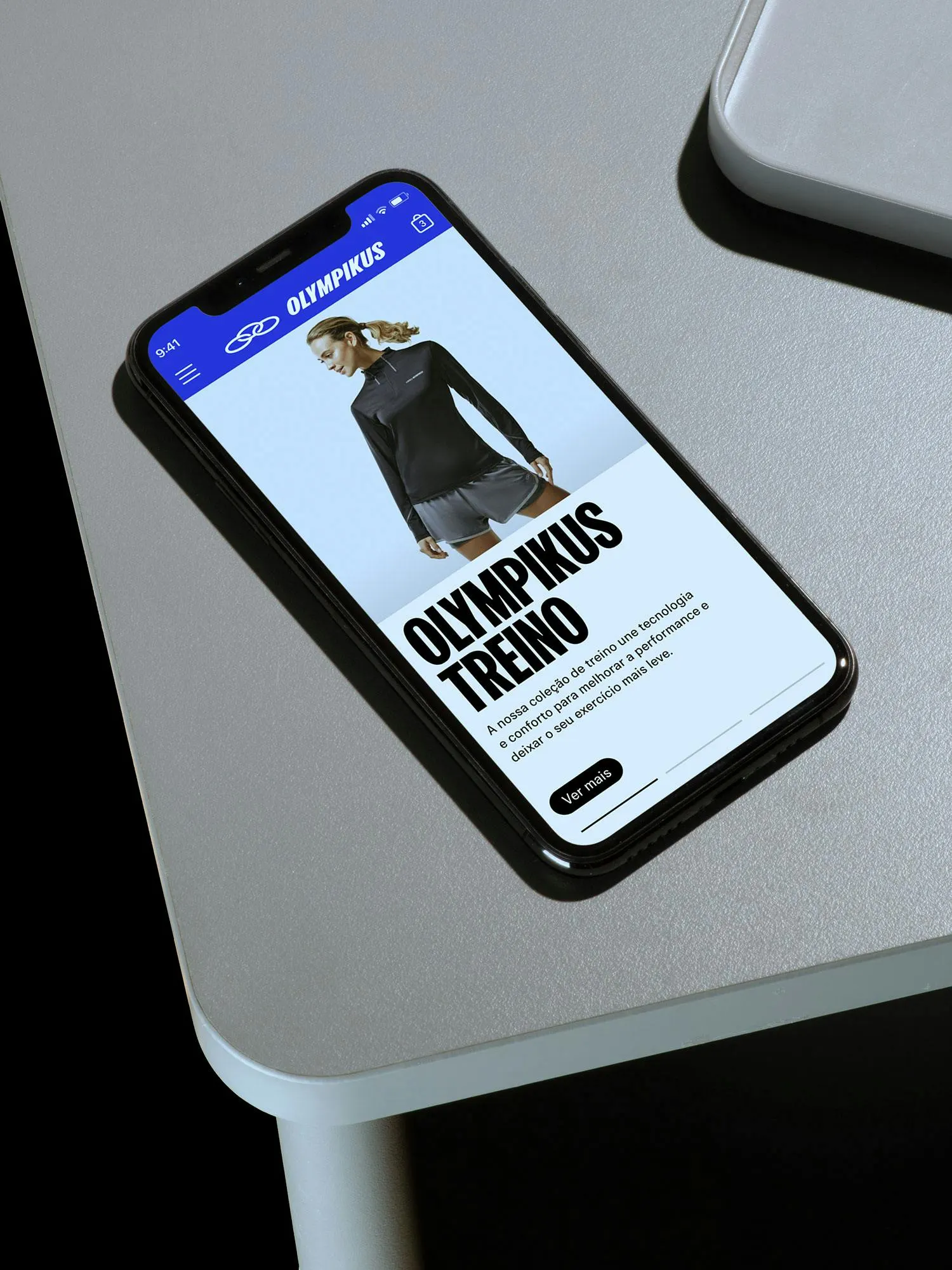
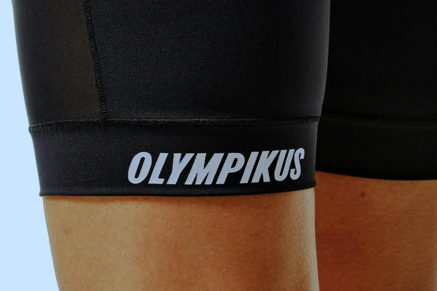
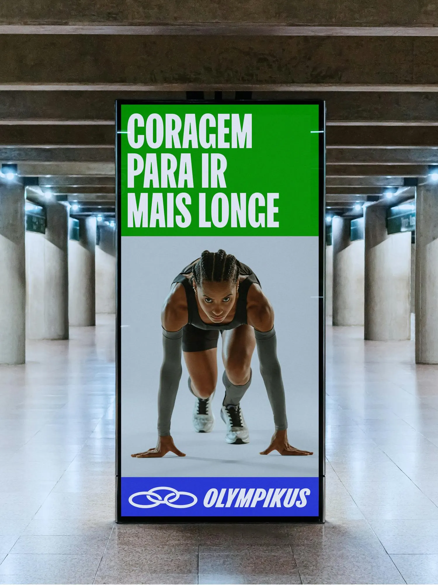
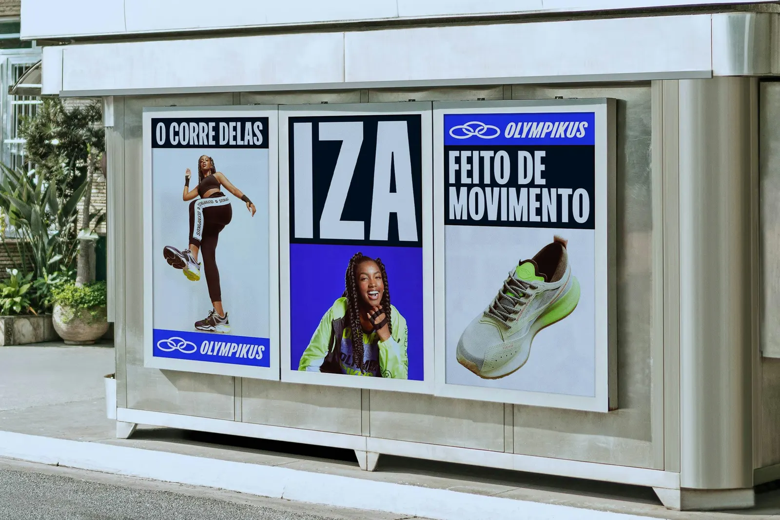
↗Porto Rocha's Olympikus identity doesn't replace what Brazilians already know. It commits to it harder. The brand sells more than 15 million pairs a year, yet its communication shifted from channel to channel and leaned heavily on price. Working with strategy consultancy Yöne, the studio pushed the existing slanted lettering, blue, and heavy wordmark into more assured versions, then added FK Olympikus, a custom display face developed with Production Type and typographer Florian Karsten.
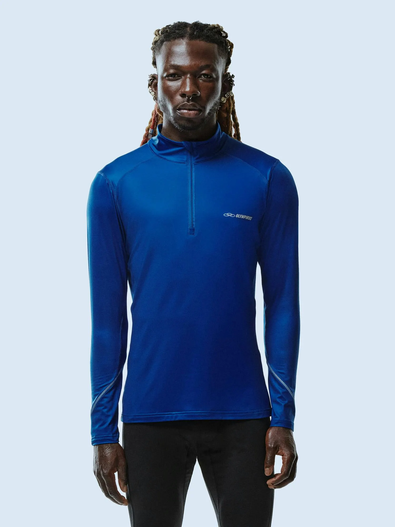
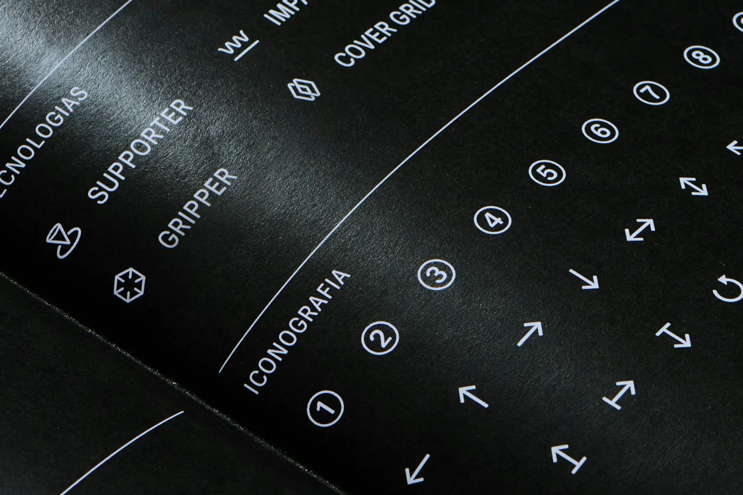
Two registers sit side by side. The brand voice is warm and colloquial, anchored by a new Portuguese tagline about everyday hustle, while technical illustrations, a monospaced face, and an icon library explain the proprietary technology. Stripes and geometry borrowed from running tracks and sports flags drive a modular layout system that stretches across retail, packaging, product, and e-commerce. A photography guide balances performance with ordinary Brazilian moments.
Why it works
The smartest decision is restraint. Keeping the familiar equities and sharpening them protects decades of recognition, which gives Olympikus room to move toward athleisure and pricier products without losing its core shoppers. The custom typeface gives the brand a voice it owns outright, and the track-and-flag modules feel native to sport while staying flexible. Splitting the system into a technical language and a human one lets a single brand speak to serious runners and casual buyers, and it gives the conversation a subject other than price.
Applications

Logo
Typography
Images and video from portorocha.com, by Porto Rocha.